The Adobe Illustrator CS Wow- P9 potx
Bạn đang xem bản rút gọn của tài liệu. Xem và tải ngay bản đầy đủ của tài liệu tại đây (3.55 MB, 30 trang )
help you see whether you're editing the characters or their
type object as you perform the following steps. Select the
Type tool from the Toolbox, click on the Artboard, and
type your text (Cohen used 72 pt Caslon). Select the char-
acters by dragging through the text with the Type tool;
the text will have a black fill. Then select the Fill attribute
in the Appearance palette and select your scribble pattern
from the Swatches palette.
3 Adding a new fill, applying the Offset effect and
using the Roughen effect. Cohen needed a way of
covering up the scribble pattern in the centers of the let-
ters. Using the Offset effect, she created a fill that covered
part of the lettering underneath. To do this, first select
the type object by clicking on it with the Selection tool.
Now, create a new fill by choosing Add New Fill from the
Appearance palette menu. The new fill, by default, will
be colored black and will completely cover the pattern
that filled the letters. With the new fill selected, choose
Effect > Path > Offset Path and, from the pop-up Offset
Path dialog box, enter a negative value in the Offset field.
Be sure that the Preview box is checked so you can gauge
the visual effect of the number you enter in the Offset
field. (Cohen used -1 pt for Offset.)
Complete the aging of your type by applying Roughen
to the type object's fill to warp its edges. Select the type
object with the Selection tool and choose Effect > Distort
& Transform > Roughen. Because Cohen used a font with
thin character strokes and serifs, she entered a small value
for Size (0.4 pt), and selected Absolute, to be sure that the
edges were not overly distorted.
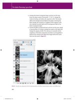
A Pattern of Change
Pattern swatches are global. If you edit or create a pat-
tern, simply drag the artwork with the Option (Mac)
or Alt (Windows) key depressed and drop it on the
swatch in the Swatches palette. The pattern filling your
type will automatically change to the new pattern.
Top, the type with default black fill; Below, the
black fill replaced by the pattern
Offset Path effect applied to the new fill (shown
here filled with gray instead of black)
Offset Path dialog box
Roughen effect applied to the new fill (shown
here in gray)
Chapter 6 Type
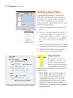
Roughen dialog box
215
Advanced Technique
Overview: Create a type object; copy
the object then style the text with
the Roughen effect; create an Opac-
ity Mask and paste the type object;
apply the Scribble effect to the opacity
mask; return to Outline mode.
Left, the original type object with letter char-
acters filled with black; Right, the type object
filled with a custom gradient
The Roughen dialog box
Every type is unique
Your settings for one type object
will look different applied to an-
other type object. Experiment!
When you want to recreate a hand-rendered or historical
look but don't want to stray from the fonts you're already
using in a project, consider using Illustrator's effects
menu and an opacity mask. For this book title, Steven
Gordon made an opacity mask that allowed him to chip
away the edges of lettering when applying the Scribble
effect, turning contemporary type into antiqued letters.
1 Creating text, adding a new Fill, and applying the
Roughen effect. Gordon began by typing his text and
dragging with the Type tool to select letters in order to
apply two different fonts (Zapfino for the Z and Optima
for the other letters). Before further styling his type, Gor-
don clicked on the Selection tool and then choose Edit >
Copy. (You'll need a copy of the type object for the opac-
ity mask you'll make in the next step.)
Now Gordon was ready to start styling his type. First,
he made sure the type object was still selected and then
opened the Appearance palette and chose Add New Fill
from the palette menu. Gordon clicked on the new Fill
attribute in the palette and applied a gradient to it. (For
information on creating or editing gradients, refer to the
Blends, Gradients & Mesh chapter.)
The Roughen effect changes the smooth edges of
objects to jagged or bumpy edges, which gives a hand-
drawn appearance. To roughen your type object, make
sure the Fill attribute is not selected (you can deselect it by
clicking in an empty area of the Appearance palette) so
the effect will be applied to the whole object. Then choose
Chapter 6 Type
Antiquing Type
Applying Scribble in an Opacity Mask
216
Effect > Distort & Transform > Roughen. In the Roughen
dialog box, adjust the Size, Detail, and Points controls.
(Gordon chose Size=0.5, Detail=10, and Points=Smooth
for his type object.)
2 Copying the type object, creating an opacity mask,
pasting the object and applying Scribble. You can
antique your roughened type by making it look chipped
or scratched. To do this, select your type object, open the
Transparency palette, and, from the palette menu, choose
Make Opacity Mask. Next, click on the opacity mask
thumbnail (the rightmost of the two thumbnails in the
palette) and select Invert Mask. Lastly, paste the type you
copied in the first step (use Paste in Front instead of Paste
so this copy will overlay the original you copied).
Changes you make in the opacity mask will affect the
transparency of the original type object—black artwork
in the mask will punch holes in the original type. With
the copy you just pasted still selected, choose Effect > Styl-
ize > Scribble. In the Scribble dialog box, choose one of
the ready made settings from the Settings menu, or cus-
tomize the effect using the dialog box's controls. Gordon
started with the Sharp setting and then changed several
of its values. With the dialog box's Preview enabled, he
moved the Path Overlap slider to 0.2" to thin some of the
chips in the edges. He also changed the Angle from the
default, 30°, to 15°, so the chips aligned better with the
angles in the type characters.
3 Editing the type. Once you've finished with the Scribble
effect, click the artwork thumbnail (the leftmost thumb-
nail) in the Transparency palette. If you need to edit the
type—in order to change the text or modify kerning, for
example—you'll have to do it in both the original type
object and in the copy in the opacity mask.
For some edits you make to the type, like scaling or
rotating, you only need to work with the type object. The
opacity mask will be changed simultaneously with the
type object.
Choosing the Opacity Mask in the Transparency
palette
Customizing the options in the Scribble dialog
Selecting the artwork mode (as opposed to
Opacity mask mode) in the Transparency palette
Getting your Fill
Chapter 6 Type
217
To ensure that the effects you will
apply later in the opacity mask
cut opaque holes in the artwork,
make sure that the characters are
filled with black. (Double-click
Characters in the Appearance pal-
ette and check the Fill attribute.)
If you then select the type object
with the Selection tool and paint
the object (rather than its char-
acters) by adding a new fill in the
Appearance palette, the copied
type object will not adversely af-
fect the opacity mask.
Steven Gordon / Cartagram, LLC
To create this label design, Steven Gordon
simulated a sunburst using the Flare tool in an
opacity mask. He started by drawing a rect-
angle and filling it with a three-color gradi-
ent. He then selected the Type tool and typed
"Zion" (he left the type object black so, when
used later as a mask, the artwork would remain
opaque). Next, Gordon clicked on the Selection
tool and copied the type object. He opened the
Transparency palette and chose Make Opac-
ity Mask from the palette menu. To select the
opacity mask and begin working in the mask,
Gordon clicked on the mask thumbnail (the
right thumbnail) and then clicked on Invert
Mask (he left the Clip option enabled). Next,
he chose Edit > Paste in Front to paste the type
object into the mask. To make the sunburst,
Gordon chose the Flare tool from the Rect-
angle tool pop-up menu. He positioned the
cursor between the о and n letters and clicked
and dragged the flare to extend it outward.
To fine-tune the look of the flare, he double-
clicked the Flare tool icon and, in the Flare Tool
Options dialog box, he adjusted the controls
for Diameter, Opacity, Direction, and other
options. To return to working with the non-
mask artwork, Gordon clicked on the artwork
thumbnail (the left thumbnail) in the Transpar-
ency palette. He finished the label by applying
a dark brown color to the selected type object.
Chapter 6 Type
218
220 Introduction
220 Blends
223 Gradients
225 Gallery: Rick Barry / DeskTop Design Studio
226 Examining Blends: Learning When to Use Gradients or Blends
228 Shades of Blends: Creating Architectural Linear Shading
229-233 Galleries: Janet Good, Gary Ferster, Linda Eckstein,
Peter Cassell, Steven Stankiewicz
234 Unlocking Realism: Creating Metallic Reflections with Blends
236-237 Galleries: Jared Schneidman, Andrea Kelley
238 Unified Gradients: Redirecting Fills with the Gradient Tool
239-243 Galleries: Filip Yip, Hugh Whyte, Caryl Gorska, Tim Webb
244 Rolling Mesh: Converting Gradients to Mesh and Editing
246 Advanced Technique: Mastering Mesh:
Painting with Areas of Color Using Mesh
249-251 Galleries: Ma Zhi Liang, Yukio Miyamoto
"W" Blend tool "G" Gradient tool
The speed of the blend
To control the speed of the blend,
create the blend and set the num-
ber of blend steps. This creates
the blend spine, which is editable
just like any other Illustrator path.
Using the Convert Anchor Point
tool, pull out control handles from
the anchor point at each end of
the blend spine. By extending or
shortening these control handles
along the spine, the speed of the
blend is controlled. This is very
similar to how blend speeds are
controlled in a gradient mesh.
—Derek Mah
Recolor after expanding blends
If you've expanded a blend, you
can use filters to recolor blended
objects. Direct-select and recolor
the fill for the start and/or end
objects, then select the entire
blend and choose Filter>Colors>
Blend Front to Back. Your objects'
fill colors will reblend using the
new start and end colors (this
won't affect strokes or compound
paths). Also try Blend Horizontally
or Vertically, Adjust Colors, and
Saturate.
Note: This doesn't work if your
blend includes gradients.
Blends, Gradients & Mesh
BLENDS
Think of blends as a way to "morph" one object's shape
and/or color into another. You can create blends between
multiple objects, and even gradients or compound paths
such as letters (see the Drawing & Coloring chapter for
more on compound paths). Blends are live, which means
you can edit the key objects' shape, color, size, location, or
rotation, and the resulting in-between objects will auto-
matically update. You can also distribute a blend along a
custom path (see details later in this chapter).
Note: Complex blends require a lot of RAM when drawing
to the screen, especially gradient-to-gradient blends.
The simplest way to create a blend is to select the
objects you wish to blend and choose Object >Blend >
Make. The number of steps you'll have in between each
object is based on either the default options for the tool,
or the last settings of the Blend Options (discussed in the
following section). Adjust settings for a selected blend by
selecting the blend, then double-clicking the Blend tool
(or via Objects >Blend >Blend Options).
A more reliable method of creating smooth blends
between two individual paths is to point map using the
Blend tool. (Keep in mind that a smooth blend will only
occur between two individual paths—as opposed to
compound paths or groups—that have the same number
of selected points.) First, select the two objects that you
want to blend (with the Group Selection tool), then use
the Blend tool to point map by clicking first on a selected
point on the first object, and then on the correlating
selected point on the second object.
When a blend first appears, it's selected and grouped.
If you Undo immediately, the blend will be deleted, but
your source objects remain selected so you can blend
again. To modify a key object, Direct-select the key object
first, then use any editing tool (including the Pencil,
Smooth, and Erase tools) to make your changes.
220 Chapter 7 Blends, Gradients & Mesh
Blend Options
To specify Blend Options as you blend, use the Blend
tool (see the point map directions in the previous sec-
tion) and press the Option/Alt key as you click the second
point. To adjust options on a completed blend, select it
and double-click the Blend tool (or Object > Blend > Blend
Options). Opening Blend Options without any blend
selected sets the default for creating blends in this work
session; these Options reset each time you restart.
• Specified Steps specifies the number of steps between
each pair of key objects. Using fewer steps results in
clearly distinguishable objects, while a larger number of
steps results in an almost airbrushed effect.
• Specified Distance places a specified distance between
the objects of the blend.
• Smooth Color allows Illustrator to automatically calcu-
late the ideal number of steps between key objects in a
blend, in order to achieve the smoothest color transition.
If objects are the same color, or are gradients or patterns,
the calculation will equally distribute the objects within
the area of the blend, based on their size.
• Orientation determines whether the individual blend
objects rotate as they follow the path's curves. Align to
Path (the default, first icon) allows blend objects to rotate
as they follow the path. Align to Page (the second icon)
prevents objects from rotating as they're distributed along
the path's curve (objects stay "upright" as they blend
along the curve).
Blends along a Path
There are two ways to make blends follow a curved path.
The first way is to Direct-select the spine of a blend (the
path automatically created by the blend) and then use
the Add/Delete Anchor Point tools, or any of the follow-
ing tools, to curve or edit the path: the Direct Selection,
John Kanzler created the fairy (top) with
multi-object blends and a replaced spine; Rick
Henkel used gradient-to-gradient blends for
the pedestal of his table (see his explanation in
"Henkel-Flared Effect.ai," on the Wow! CD for
full details)
To blend or not to blend.
In addition to blending between
individual paths, or groups of
objects, you can also blend be-
tween symbols (see the Brushes
& Symbols chapter for more on
symbols), or between Point type
objects (see the Type chapter
for more on Point type objects).
Some of the objects that you can't
include in a blend are meshes, ras-
ter images, and type objects that
aren't Point type. One last tip:
When blending between objects
containing brushes, effects, and
other complex appearances, the
effect options are blended, which
can help you create interesting
animations (see the Web & Ani-
mation chapter for more on how
to export animations).—Teri Petit
Chapter 7 Blends, Gradients & Mesh
221
Groups of objects blended into each other
(pumpkins into pumpkins, shadows into shad-
ows) using the Align to Path orientation. Speci-
fied Distance, and the "spines" edited into S
curves (for more about blends see "SteuerSha-
ron-Pumpkin Blend.ai" on the Wow! CD)
Reverse Front to Back
To reverse the order of a blend
with only two key objects, Direct-
select one of the key objects and
choose Object > Arrange, or for
any blend choose Object >Blend >
Reverse Front to Back.
Lasso, Convert Anchor Point, Pencil, Smooth, or even the
Erase tool. As you edit the spine of the blend, the blend
objects will automatically be redrawn to align to the
edited spine.
The second way is to replace the spine with a custom-
ized path: Select both the customized path and the blend,
and choose Object > Blend > Replace Spine. This command
moves the blend to its new spine.
It's a bit tricky, but you can also blend between mul-
tiple objects. Create your first set of objects and Group
them ( -G/Ctrl-G). Next, select this group. Then hold
down Option/Alt and drag off a copy (making sure that
you release your mouse button before releasing the key-
board—see "A Finger Dance" in the Zen of Illustrator
chapter for help). Select both sets of grouped objects, and
click on the first group with the Blend tool. Then hold
Option/Alt as you click on the second group to specify the
number of steps. As long as you maintain the same num-
ber of points, you'll get a predictable blending between
the groups. Once the objects are blended, you can rotate
and scale them, and use the Direct Selection tool to edit
the objects or the spine. (See "SteuerSharon-Pumpkin
Blend.ai" on the Wow! CD.)
Reversing, Releasing, and Expanding Blends
Once you've created and selected a blend, you can do any
of the following:
• Reverse the order of objects on the spine by choosing
Object > Blend > Reverse Spine.
• Release a blend (Object > Blend > Release) if you wish
to remove the blended objects between key objects and
maintain the spine of the blend (be forewarned—you may
lose grouping information!).
• Expand a blend to turn it into a group of separate,
editable objects. Choose Object >Expand.
222
Chapter 7 Blends, Gradients & Mesh
GRADIENTS
Gradients are color transitions. To open the Gradient pal-
ette: double-click the Gradient tool icon on the Toolbox,
or choose Window > Gradient. Gradients can be either
radial (circular from the center) or linear.
To apply a gradient to an object, select the object and
click on a gradient swatch in the Swatches palette. To
view only gradient swatches, click on the gradient icon at
the bottom of the Swatches palette.
To start adjusting or creating a new gradient, click on
the gradient preview in the Gradient palette. Only after
clicking on the preview will you see the color stops and
midpoints. Make your own gradients by adding and/or
adjusting the stops (pointers representing colors) along
the lower edge of the gradient preview, and adjust the
midpoint between the color stops by sliding the diamond
shapes along the top of the preview.
You can adjust the length, direction, and centerpoint
location of a selected gradient. In addition, you can apply
a gradient to multiple selected objects across a unified
blend by clicking and dragging with the Gradient tool
(see the "Unified Gradients" lesson later in this chapter,
and for a lesson incorporating radial gradients, see Lau-
rie Grace's "Distort Filter Flora" lesson in the Drawing &
Coloring chapter). Hint: A special feature of the Gradient
palette is, even if it's docked with other palettes, you can
expand it both taller and wider so you can get a better view
of the Gradient bar.
To create the illusion of a gradient within a stroke,
convert the stroke to a filled object (Object >Path > Out-
line Stroke). You can use this method to create a "trap"
for gradients (for more about this technique of trapping
gradients, see the Christopher Burke Gallery in the Draw-
ing & Coloring chapter).
To turn a gradient into a grouped, masked blend, use
Object >Expand (see the Advanced Techniques chapter for
more on masks and masked blends).
To insert objects into a blend
Direct-select a key object and
Option/Alt-drag to insert a new
key object (the blend will reflow)
that you can Direct-select and
edit. You can also insert new ob-
jects by dragging them into the
blend in the Layers palette.
Reset gradients to defaults
After you select an object that
has an altered gradient angle (or
highlight), new objects you draw
will have the same altered angle.
To "re-zero" gradient angles,
Deselect All and fill with None by
pressing the "/" key. When you
next choose a gradient, angles
will have the default setting. Or,
for linear gradients, you can type
a zero in the Angle field.
Adding color to your gradient
• Drag a swatch from the Color or
Swatches palette to the gradi-
ent slider until you see a vertical
line indicating where the new
color stop will be added.
• If the Fill is a solid color, you can
drag color from the Fill icon at
the bottom of the Toolbox.
• Hold down the Option/Alt key
to drag a copy of a color stop.
• Option/Alt-drag one stop over
another to swap their colors.
• Click the lower edge of a gradi-
ent to add a new stop.
Chapter 7 Blends, Gradients & Mesh
223
The amazing work with mesh only starts in
this chapter—don't miss the additional mesh
artwork in the Advanced Techniques chapter—
including this work by Yukio Miyamoto (cat) and
Ann Paidrick (olives and tomatoes) !
Expanding
Items such as gradients, meshes,
blends, and patterns are com-
plex and can't be used to define
other complex art unless the art
is Expanded first using Object >
Expand. Once expanded, you can
use the objects within the art to
define a brush, pattern, or blend.
GRADIENT MESH
If you see an amazing photorealistic image created in
Illustrator, chances are it was created using gradient
mesh. A mesh object is an object on which multiple colors
can flow in different directions, with smooth transitions
between specially defined mesh points. You can apply a
gradient mesh to a solid or gradient-filled object (but you
can't use compound paths to create mesh objects). Once
transformed, the object will always be a mesh object, so
be certain that you work with a copy of the original if it's
difficult to re-create.
Transform solid filled objects into gradient mesh
objects either by choosing Object >Create Gradient Mesh
(so you can specify details on the mesh construction) or
by clicking on the object with the Mesh tool. To trans-
form a gradient-filled object, select Object >Expand and
enable the Gradient Mesh option.
Use the Mesh tool to add mesh lines and mesh points
to the mesh. Select individual points, or groups of points,
within the mesh using the Direct Selection tool or the
Mesh tool in order to move, color, or delete them. For
details on working with gradient meshes (including a
warning tip about printing mesh objects), see Galleries
and lessons later in this chapter, and see the Advanced
Techniques chapter as well. Hint: Instead of applying a
mesh to a complex path, try to first create the mesh from
a simpler path outline, then mask the mesh with the more
complex path.
Get back your (mesh) shape!
When you convert a path to a mesh, it's no longer a
path, but a mesh object. To extract an editable path
from a mesh, select the mesh object, choose Object >
Path > Offset Path, enter 0, and press OK. If there are
too many points in your new path, try using Object >
Path >Simplify (for more on Simplify see "Map Tech-
niques" in the Brushes chapter). —Pierre Louveaux
224
Chapter 7 Blends, Gradients & Mesh
Rick Barry / DeskTop Design Studio
To demonstrate the difference between blends
and gradients, Rick Barry took an image he
created in Illustrator (upper left Preview mode,
lower left Outline mode), selected the blends
(by clicking twice with the Group Selection
tool on one of the blend objects) and deleted
them. The objects used to create the blends
remained, and Barry filled these objects with
custom gradients and then adjusted the rate
and range of the gradients with the Gradient
tool (upper right Preview mode, lower right
Outline mode).
Chapter 7 Blends, Gradients & Mesh 225
Examining Blends
Learning When to Use Gradients or Blends
Overview: Examine your objects;
for linear or circular fills, create basic
gradients; for contouring fills into
complex objects, create blends.
Adjusting the placement of colors, and then rate
of color transition in the Gradient palette
Selecting a gradient from the Swatches palette
and setting the gradient Angle
One gradient duplicated and altered for applica-
tion to different related objects
You need to take a number of factors into consideration
when you're deciding whether to create color transitions
with blends or gradients. Steve Hart's magnifying glass,
created for Time magazine, is a clear-cut example that
demonstrates when to use gradients or blends.
1 Designing gradients. Select an object you'd like to fill
with a linear gradient. Open the Gradient palette. Click
on the gradient icon at the bottom of the Swatches palette.
Choose Name from the Swatches pop-up menu and click
on the "White, Black" gradient. This minimal gradient
has two colors: white (at the left) and black (at the right).
Click on the left gradient slider to display its position on
the scale from 0-100% (in this case 0%). Move the slider
to the right to increase the percentage displayed in the
scale, and increase the black area of the gradient. Click
on the bottom edge of the scale to add additional point-
ers. Click on a slider to access its numeric position, or to
change its color or tint. Between every two pointers is a
diamond icon indicating the midpoint of the color transi-
tion (from 0-100% between each color pair). Grab and
drag a diamond to adjust the color transition rate, or type
a new position into the percent field.
2 Storing and applying gradients and making adjust-
ments. To store a new gradient you've made within a
226
Chapter 7 Blends, Gradients & Mesh
selected object, hold Option or Alt and click the New
Swatch icon and name your gradient. Hart filled his mag-
nifying glass handle with a gradient set at a 135° angle (in
the Gradient palette). He created slightly different vari-
ants for gradients representing the metal rings around
the outside, along the inside, and inside behind the glass.
To create variants of a current gradient, make color
adjustments first, then Option-click/Alt-click the New
Swatch icon to name your new gradient. Although you
can experiment with changing the angle of a gradient, be
forewarned that continued adjustments to a gradient in
the Gradient palette will not update the gradient stored in
the Swatches palette! (See the intro to this chapter.)
3 Using blends for irregular or contoured transitions.
A blend is often best for domed, kidney-shaped or con-
toured objects, such as shadows (for Gradient Mesh, see
later in this chapter). Scale and copy one object to create
another and set each to the desired color. With the Blend
tool, click an anchor point on one, then Option-click/Alt-
click a related point on the other. The default blend set-
ting, "Smooth Color," often means many steps; however,
the more similar the colors, the fewer steps you'll actually
need. You can manually choose "Specified Steps" from
the pop-up and experiment with fewer steps. Hart speci-
fied 20 steps for the glow in the glass, 22 for the handle
knob and 12 for the shadow. To re-specify the steps of a
selected blend, double-click the Blend tool (you may have
to uncheck and recheck Preview to see the update). To
blend selected objects using previous settings, click with
the Blend tool without holding the Option/Alt key.
Automatically updating colors
Changing a spot or global color definition (see the
Drawing & Coloring chapter) automatically updates
blends and gradients containing that color. Blends be-
tween tints of the same spot color (or a spot color and
white) update when changes are made to that color,
even if the blend isn't "live."—Agnew Moyer Smith
With the Blend tool, clicking first on a selected
point of one path, then Option I Alt-clicking on
a selected point of the other to open Blend Op-
tions; choosing Specified Steps from the
pop-up and entering 20; the blended objects
Selected paths before and after a 22-step blend
Before and after a 12-step blend to create a
shadow
The final image as it appeared in Time
Chapter 7 Blends, Gradients & Mesh
227
Shades of Blends
Creating Architectural Linear Shading
Overview: Create an architectural
form using rectangles; copy and paste
one rectangle in front; delete the top
and bottom paths and blend between
the two sides.
A selected rectangle copied and pasted in front
in full view, and in close-up
The top and bottom deleted with the sides se-
lected
The full blend and a close-up detail
Without much difficulty, Illustrator can help simulate the
traditional artistic conventions for rendering architec-
tural details. Jared Schneidman Design developed a sim-
ple, but exacting, method to apply vertical line shading.
1 Creating an architectural structure. After establishing
the overall form, color and tonality of your illustration,
select and copy one rectangle. Choose Edit > Paste in Front
to place the copy on top, then set the fill to None and the
stroke to .1 pt Black. Choose Window > Info to note the
line's width in points (to change your ruler units, see Tip,
"Changing measurement units," in the Illustrator Basics
chapter). Calculate the width of the rectangle, divided by
the spacing you'd like between lines. Subtract 2 (for the
sides you have) to find the proper number of steps for this
blend.
2 Deleting the top and bottom and blending the sides.
Deselect the copy, Shift-Direct-select the top and bot-
tom paths and delete, leaving the sides selected. With the
Blend tool, click on the top point of each side and specify
the number of steps you determined above.
228
Chapter 7 Blends, Gradients & Mesh
Janet Good/Industrial Illustrators
Illustrator Janet Good's image of the white-hot
glow of molten metal spraying inside a cham-
ber of liquid nitrogen is based on a drawing
by Crucible Research. For the fiery glow at the
top of the chamber, she first drew yellow and
orange objects and then blended them. (By
making the edge of the orange object jagged,
she created a blend that appears to have rays.)
On a layer above the blend, Good drew several
pairs of yellow and white lines, blending the
pairs to form a fan of glowing light rays.
Chapter 7 Blends, Gradients & Mesh
229
Gary Ferster
For his client Langeveld Bulb, Gary Ferster used
blends to create the in-between layers in this
flower bulb. He began by styling the outer
peel with a .5 pt stroke in a dark brown cus-
tom color and filled the object with a lighter
brown custom color. He then created the inner
layer, filled it with white and gave it a .5 pt
white stroke. Selecting both objects, Ferster
specified a six-step blend that simultane-
ously "morphed" each progressive layer into
the next while lightening the layers towards
white. Blends were also used to create the leafy
greens, yellow innards and all the other soft
transitions between colors.
230 Chapter 7 Blends, Gradients & Mesh
Linda Eckstein
Linda Eckstein used blends in Illustrator to
create these beautiful seascapes. In addi-
tion to controlling the regularity of blends to
depict the ocean, Eckstein needed to control
the irregularity of the blends as well. On the
bottom layer of her image are blends that
establish both the general composition and the
broad color schemes. On top of these tonal-
filled object blends are irregularly shaped linear
blends that form the waves and surf. Using the
Direct Selection tool, she isolated individual
points and groups of points to stretch and dis-
tort the waves.
Chapter 7 Blends, Gradients & Mesh
231
Peter Cassell
Using the Blend tool is a great way to save
time; it lets Illustrator automatically create the
intermediate paths between two paths. In this
adoption announcement for Morgan Katia
Hurt, Peter Cassell drew the two outermost
lines of longitude for the globe using the Pen
tool. With the two paths selected, he chose the
Blend tool and clicked on the end-points of the
two paths (to blend properly, be sure to pick
two points that have the same relative position
on their respective paths). He set the number
of intermediate paths by double-clicking the
Blend tool, choosing Specified Steps from the
Spacing pop-up menu, and keying in 4 in the
Spacing field. To create the bulging effect of
a sphere, Cassell wanted to spread out the
intermediate paths. To do this, he selected the
blend, chose Object > Expand and then Object >
Ungroup. After selecting the four intermediate
paths, Cassell double-clicked the Scale tool and
in the Scale dialog box, entered 125 in the Hor-
izontal field, while keeping the Vertical field
at 100. He spread the two inner paths farther
apart by applying horizontal scaling again.
232 Chapter 7 Blends, Gradients & Mesh
Steven Stankiewicz
Steven Stankiewicz uses a technique he calls
"blends to blends" to smooth one colorful
blend with another in his illustrations. To cre-
ate a butterfly wing, he first drew the wing
shape and its spots with the Pen tool and then
colored each object. For the wing blend, he
copied the wing object, pasted it in front,
and scaled it smaller with the Scale tool. After
selecting the original and the copy, he used
the Blend tool to click on an anchor point on
the original wing and Option-click on the cor-
responding point of the copied (smaller) wing.
From the pop-up Blend Options dialog box,
Stankiewicz chose the Smooth Color option.
Then he performed the same steps to create
blends for each of the wing spots. Stankie-
wicz decided to smooth the color transition
between each wing spot blend and the wing
blend behind it. To accomplish this, he chose
the Direct Selection tool and selected the out-
ermost object in one of the wing spot blends;
then he Shift-selected the innermost object of
the wing blend behind it. With both objects
selected, Stankiewicz clicked points on both
objects that were in roughly the same position
on each object. As a result, a new blend was
created that smoothly bridged the blend of a
wing spot with the blend of the wing behind it.
Chapter 7 Blends, Gradients & Mesh
233
Unlocking Realism
Creating Metallic Reflections with Blends
Overview: Form the basic shapes
of objects; create tonal boundaries for
future blends that follow the contours
of the objects; copy, scale, recolor
and adjust the anchor points of tonal
boundaries; blend highlights and
shadows.
Designing the basic objects and choosing a base
tone (Note: Gray strokes added to distinguish
objects)
Creating tonal boundaries for future blends by
following the contours of the objects
Achieving photorealism with Illustrator may appear pro-
hibitively complex and intimidating, but with a few sim-
ple rules-of-thumb, some careful planning and the eye of
an artist, it can be done. Brad Neal, of Thomas • Bradley
Illustration & Design, demonstrates with this image that
you don't need an airbrush to achieve metallic reflectivity,
spectacular highlights or warm shadows.
1 Preparing a detailed sketch that incorporates a
strong light source, and setting up your palette.
Before you actually start your illustration, create a sketch
that establishes the direction of your light source. Then,
in Illustrator, set up your color palette (see the Drawing
& Coloring chapter). Choose one color as a "base tone,"
the initial tint from which all blends will be built, and
fill the entire object with that value. After you create the
basic outlines of your illustration, work in Outline mode
to create separate paths—following the contours of your
objects—for each of your major color transitions. After
completing the initial line drawing of the lock set, Neal
visually, and then physically, "mapped" out the areas that
234
Chapter 7 Blends, Gradients & Mesh
would contain the shading. He added a few highlights
and reflections in the later stages of the project, but the
majority of blends were mapped out in advance.
2 Using your color transition paths to create blends.
Next, use the contouring paths you've created to map out
your tonal boundaries. Choose one of the objects and fill
it with the same color and tonal value as its underlying
shape. In the Neal locks, this initial color is always the
same color and value selected for the base color. Then,
copy the object and Paste in Front (Edit > Paste in Front).
Next, fill this copy with a highlight or shadow value, scale
it down and manipulate it into the correct position to
form the highlight or shadow area. You can accomplish
this step by one of two methods: by scaling the object
using the Scale tool, or by selecting and pulling in indi-
vidual anchor points with the Direct Selection tool. In
order to ensure smooth blends without ripples or irregu-
lar transitions, the anchor points of the inner and outer
objects must be as closely aligned as possible and should
contain the same number of points. To then complete
this highlight or shadow, use the Blend tool to point map
(see the intro to this chapter for details). The blend in
Figure 2 required eight in-between steps. If your blend
isn't smooth enough, then use the Direct Selection tool to
select anchor points on the key objects and adjust their
position or Bezier handles until the blend smooths.
3 Blending in smaller increments. Some blend situations
may require more than two objects to achieve the desired
look. For instance, to control the rate at which the tone
changes or the way an object transforms throughout the
blended area, you may wish to add an intermediate object
and blend in two stages, instead of one.
4 Using blends to soften hard transitions. Always use
blends when making tonal transitions, even when you
need a stark contrast shadow or highlight. A close look at
Neal's shadow reveals a very short but distinct blend.
Pasting in Front a scaled down and adjusted copy
with the same number of aligned points
Adding an in-between contour to help control
the rate and shape of blends; blending with too
few contours flattens the image
Long, close-up, and Outline close-up views of
highlight and shadow transitions
Chapter 7 Blends, Gradients & Mesh
235
Jared Schneidman / JSD
Illustrator blends helped Jared Schneidman
convey the murky depth and bright exploring
lights in this Newsweek infographic about deep
trenches in the Pacific Ocean. Schneidman cre-
ated the subdued highlights and shadows of
the subterranean trench using blended objects.
For the searchlights emanating from the
explorer vehicles, Schneidman first made cone
objects filled with a pale yellow. He then made
companion objects using the dark colors of
the ocean and trench. Finally, he made blends
between each cone and its companion object.
236
Chapter 7 Blends, Gradients & Mesh
Andrea Kelley
To illustrate this North Face camping equip-
ment, designer Andrea Kelley carefully ana-
lyzed fabric folds, stitched seams, and the play
of light and shadow. She began the sleeping
bag by drawing the outline of the bag, creat-
ing a blend object and masking it with a copy
of the sleeping bag outline. She drew each
stitched seam as a solid line, and the fabric
folds around the seams as jagged, filled shapes.
Over the sleeping bag, Kelley drew light-gray-
filled objects for the fabric highlights between
the seams. Kelley created the tent by first
drawing its outline, and then creating a mul-
tiple-object blend, which she masked with the
tent outline. Kelley created additional masked
blends to define other shapes that make up the
tent. For the front flap, Kelley created a blend
object and masked it with an oval, and then
drew light and dark triangles on top of it to
show wrinkles in the fabric.
Chapter 7 Blends, Gradients & Mesh 237
Unified Gradients
Redirecting Fills with the Gradient Tool
Overview: Fill objects with gradi-
ents; use the Gradient tool to adjust
fill length, direction, center location
and unify fills across multiple objects.
The Gradient palette, and the Gradient tool
(This tool has the same name and icon as the
one in Photoshop, but is completely different.)
Filling the first group with the cyan gradient,
then the other group with the purple gradient
Clicking and dragging with the Gradient tool to
unify the gradient fill across multiple objects,
and to establish the gradient's rate and direction
How long can a gradient be?
Click and drag the Gradient tool
anywhere in your image window;
you don't need to stay within the
objects themselves. Also, see the
Elberg-Comet Gradient Lesson.ai
by Eve Elberg, on the Wow! CD.
The Gradient tool allows you to customize the length and
direction of gradient fills, and to stretch gradients across
multiple objects. For this Medical Economics magazine
illustration, Dave Joly used the Gradient tool to customize
each gradient and unify the checkerboard floor.
1 Filling objects with the same gradient. Select multiple
objects and fill them with the same gradient by click-
ing on a gradient fill in the Swatches palette. Keep your
objects selected.
2 Unifying gradients with the Gradient tool. Using
the Gradient tool from the Toolbox, click and drag from
the point you want the gradient to begin to where you
want it to end. Hold down the Shift key if you want to
constrain the angle of the gradient. To relocate a radial
gradient's center, just click with the Gradient tool. Exper-
iment until you get the desired effect. To create his
checkerboard, Joly used the Knife tool to segment the
floor, grouped every other tile together and filled these
with a cyan-to-white gradient fill. He then duplicated the
gradient, changed the start color to purple and applied
this purple gradient to the remaining tiles. With all tiles
selected, he again applied the Gradient tool.
238 Chapter 7 Blends, Gradients & Mesh