Xây dựng ứng dụng cho Android với HTML, CSS và javascript - part 4 ppsx
Bạn đang xem bản rút gọn của tài liệu. Xem và tải ngay bản đầy đủ của tài liệu tại đây (3.7 MB, 10 trang )
CHAPTER 2
Basic Styling
Ultimately, we are going to build a native Android app using HTML, CSS, and Java-
Script. The first step on this journey is to get comfortable styling HTML to look like a
mobile app. In this chapter, I’ll show you how to apply CSS styles to a bunch of existing
HTML pages so that they are easily navigable on an Android phone. So, in addition to
moving closer to building a native app, you’ll be learning a practical (and valuable) skill
that you can use immediately.
Don’t Have a Website?
If you’ve been testing all your web pages locally on your personal computer, you won’t
be able to view them on your Android phone without setting up a server. You have a
couple choices:
• Host your web pages on a web server and connect to that server from your Android
phone. Chances are good that your Internet Service Provider (ISP) offers compli-
mentary web hosting, but this usually only supports basic features such as HTML.
By the time we get to Chapter 6, we’re going to need to use PHP, a scripting lan-
guage that runs on the web server, so you should look into an inexpensive hosting
service. Many companies, such as Laughing Squid, offer entry-level hosting with
PHP for under $10 a month.
• Host them on a web server running on your computer and connect to the web
server running on your computer from your Android phone. This only works when
your Android phone and computer are on the same WiFi network.
This chapter is set up so you can try the examples as you go through it. So, no matter
which option you choose for viewing the web pages, try reloading them in a browser
(preferably the Android browser) each time you add something new to one of the sam-
ples. However, be sure to save your file in your text editor before you reload it in the
browser or you won’t see your changes.
13
Download from www.eBookTM.com
Running a Web Server Locally
All current mainstream operating systems (Linux, Windows, Mac OS X) include some
sort of web server. On Mac OS X, open System Preferences, choose Sharing, and enable
Web Sharing. Once you’ve started Web Sharing, the Web Sharing preferences will
display the URL of your personal website (this includes anything you’ve put in the
Sites directory in your home directory). It will be of the form http://local-hostname/
~your-username.
On some versions of Linux, such as Ubuntu, you will need to go through some addi-
tional steps to install and enable a web server. First, install Apache at the command
line with sudo aptitude install apache2. Next, enable the user directory module with
sudo a2enmod userdir. Once that’s done, restart Apache with this command:
sudo /etc/init.d/apache2 restart. After you’ve done that, you can create a directory
called public_html in your home directory and access any files in there with a URL such
as http://local-hostname/~your-username.
On Windows, things are a little more involved. You need to be running a version of
Windows that includes Internet Information Services (IIS) and enable it by going into
the Control Panel and making your way to Turn Windows Features On or Off. After
you’ve done this, put your web documents in your IIS document root, which is typically
located at C:\inetpub\wwwroot. If you’d prefer to run Apache on Windows, check out
a prepackaged solution such as EasyPHP, or check out the Wikipedia page on this topic
at />First Steps
Theory is great, but I’m a “show me, don’t tell me” kinda guy so let’s dive in.
Imagine you
have a website that you want to “mobile-ize” (Figure 2-1). In this scenario,
there are a number of easy things you can do to optimize a site for Android. I’ll go over
your options in this chapter.
Figure 2-2 shows what this web page looks like on the Android phone. It’s usable, but
far from optimized for Android.
Example 2-1 shows an abbreviated version of the website shown in Figure 2-2. This is
the HTML you’ll be working with in this chapter. You can download it from this book’s
website if you’d like to try styling it as you go through the chapter. The desktop style-
sheet (screen.css) is not shown as it is not essential, but you can use the stylesheet from
the previous chapter if you’d like to have something to play with.
14 | Chapter 2: Basic Styling
Download from www.eBookTM.com
Figure 2-1. Desktop version of a typical website looks fine in Chrome on a desktop
Example 2-1. The HTML document we’ll be styling
<html>
<head>
<link rel="stylesheet" href="screen.css" type="text/css" />
<title>Jonathan Stark</title>
</head>
<body>
<div id="container">
<div id="header">
<h1><a href="./">Jonathan Stark</a></h1>
<div id="utility">
<ul>
<li><a href="about.html">About</a></li>
<li><a href="blog.html">Blog</a></li>
<li><a href="contact.html">Contact</a></li>
</ul>
</div>
<div id="nav">
First Steps | 15
Download from www.eBookTM.com
<ul>
<li><a href="consulting-clinic.html">Consulting Clinic</a></li>
<li><a href="on-call.html">On Call</a></li>
<li><a href="development.html">Development</a></li>
<li><a href="">O'Reilly Media, Inc.</a></li>
</ul>
</div>
</div>
<div id="content">
<h2>About</h2>
<p>Jonathan Stark is a web developer, speaker, and author. His
consulting firm, Jonathan Stark Consulting, Inc., has attracted
clients such as Staples, Turner Broadcasting, and the PGA Tour.
</p>
</div>
<div id="sidebar">
<img alt="Manga Portrait of Jonathan Stark"
src="jonathanstark-manga-small.png"/>
<p>Jonathan Stark is a mobile and web application developer who the
Wall Street Journal has called an expert on publishing desktop
data to the web.</p>
</div>
<div id="footer">
<ul>
<li><a href="services.html">Services</a></li>
<li><a href="about.html">About</a></li>
<li><a href="blog.html">Blog</a></li>
</ul>
<p class="subtle">Jonathan Stark Consulting, Inc.</p>
</div>
</div>
</body>
</html>
For years, web developers used tables to lay out elements in a grid. Ad-
vances
in
CSS and HTML have rendered that approach not only obso-
lete, but undesirable. Today, we primarily use the div element (along
with a variety of attributes) to accomplish the same thing, but with more
control. Although a complete explanation of div-based layouts is well
outside the scope of this book, you’ll see plenty of examples of it as you
read through the book. To learn more, please check out Designing with
Web Standards by Jeffrey Zeldman (New Rider Press), which covers the
issue in greater detail.
16 | Chapter 2: Basic Styling
Download from www.eBookTM.com
Figure 2-2. Desktop version of a typical website looks all right on an Android phone, but we can do
a lot better
Prepare a Separate Android Stylesheet
I’m as
DRY as the next guy, but in the real world you’re better off making a clean break
between your desktop browser stylesheet and your Android stylesheet. Take my word
for it and just make two completely independent files; you’ll sleep better. The alterna-
tive is to wedge all of your CSS rules into a single stylesheet, which is a bad idea for a
number of reasons, the most obvious of which is that you’d be sending a bunch of
irrelevant desktop style rules to the phone, which is a waste of precious bandwidth and
memory.
DRY stands for “don’t repeat yourself,” and is a software development
principle that
states, “Every piece of knowledge must have a single, un-
ambiguous, authoritative representation within a system.” The term
was coined by Andrew Hunt and David Thomas in their book The
Pragmatic Programmer (Addison-Wesley Professional).
To specify a stylesheet specifically for Android, replace the stylesheet link tag in the
sample HTML document with ones that use the following expressions:
<link rel="stylesheet" type="text/css"
href="android.css" media="only screen and (max-width: 480px)" />
<link rel="stylesheet" type="text/css"
href="desktop.css" media="screen and (min-width: 481px)" />
First Steps | 17
Download from www.eBookTM.com
I specifically used max-width and min-width here so that you can resize
your desktop browser and see the mobile version of the page. If you
would prefer to serve the desktop.css stylesheet to desktop users regard-
less of their browser window size, use max-device-width and min-
device-width instead.
The Wireless Universal Resource File (WURFL) contains information
you can use to identify a huge number of wireless devices, including
Android devices. If you need to detect Android devices with a width
greater than 480px (such as a tablet) or if you don’t want the mobile
version of the site to appear when users resize their browser window
below 480px, you can use WURFL’s PHP API to precisely detect specific
browsers. See the Appendix for more information on WURFL.
Here, desktop.css refers to your existing desktop stylesheet, and android.css is a new file
that we’ll be discussing in detail in a bit. The desktop.css file is not essential, but you
can use the stylesheet from the previous chapter if you’d like.
If you’re following along using the sample HTML document shown in
Example 2-1, you’ll need to rename screen.css to desktop.css, but since
we’re focused on the Android stylesheet, you can ignore the desktop
stylesheet completely. If it fails to load, your browser won’t get too
upset.
However, if you’d like to use Chrome to test the Android-optimized
version of the site, you should replace the reference to desktop.css with
a reference to android.css. That way, you’ll get to run the Android ver-
sion of your site whether you load it from a phone or the desktop
browser.
Regrettably, Internet Explorer will not understand these expressions, so we have to add
a conditional comment (shown in bold) that links to the desktop version of the CSS:
<link rel="stylesheet" type="text/css"
href="android.css" media="only screen and (max-width: 480px)" />
<link rel="stylesheet" type="text/css"
href="desktop.css" media="screen and (min-width: 481px)" />
<! [if IE]>
<link rel="stylesheet" type="text/css" href="explorer.css" media="all" />
<![endif] >
So now it’s time to edit the HTML document (if you haven’t already done that as you
were following along): delete the existing link to the screen.css file, and replace it with
the lines just shown. This way, you will have a clean slate for the Android-specific CSS
in this chapter.
18 | Chapter 2: Basic Styling
Download from www.eBookTM.com
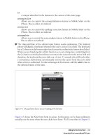
Control the Page Scaling
Unless you tell it otherwise, the Android browser will assume your page is 980px wide
(Figure 2-3). In the majority of cases, this works great. However, you are going to format
the content specifically for the smaller dimensions of the Android phone, so you must
let the mobile browser know about it by adding a viewport meta tag to the head element
of the HTML document:
<meta name="viewport" content="user-scalable=no, width=device-width" />
Desktop browsers will ignore the viewport meta tag, so
you can include
it without worrying about the desktop version of your site.
Figure 2-3. Android assumes a normal web page is 980px wide
Merely by suppressing
the desktop stylesheet and configuring your viewport, you will
have already given your Android users an enhanced experience (Figure 2-4). To really
impress them, let’s start building the android.css stylesheet.
First Steps | 19
Download from www.eBookTM.com
If you don’t set the viewport width, the page will be zoomed out when
it first loads.
It’s tough to say exactly what the zoom level will be because
the Android browser includes a setting that allows users to set the de-
fault zoom. The options are Far, Medium (the default), or Close. Even
if you do set the viewport width, these user-defined settings will affect
the zoom level of your app.
Adding the Android CSS
There are a number of UI conventions that make an Android app look like an Android
app. In the next section, we’ll add the distinctive title bar, lists with rounded corners,
finger-friendly links that look like glossy buttons, etc. With the text editor of your
choice, create a file named android.css and add the code shown in Example 2-2 to it,
then save the file in the same directory as your HTML document.
Figure 2-4. Setting the viewport to the width of the device makes your pages a lot more readable on
Android
20 | Chapter 2: Basic Styling
Download from www.eBookTM.com
Example 2-2. Setting some general site-wide styles on the HTML body element
body {
background-color: #ddd; /* Background color */
color: #222; /* Foreground color used for text */
font-family: Helvetica;
font-size: 14px;
margin: 0; /* Amount of negative space around the
outside of the body */
padding: 0; /* Amount of negative space around the
inside of the body */
}
All text on Android is rendered using a custom font named Droid. The
Droid font
family was specifically built for mobile devices, has excellent
character set support, and contains three variants: Droid Sans, Droid
Sans Mono, and Droid Serif. Therefore, specifying a font family of Hel-
vetica as we’ve done here will only have an effect on devices other than
Android.
Now let’s attack the header div that contains the main home link (i.e., the logo link)
and the primary and secondary site navigation. The first step is to format the logo link
as a clickable title bar. Add the following to the android.css file:
#header h1 {
margin: 0;
padding: 0;
}
#header h1 a {
background-color: #ccc;
border-bottom: 1px solid #666;
color: #222;
display: block;
font-size: 20px;
font-weight: bold;
padding: 10px 0;
text-align: center;
text-decoration: none;
}
We’ll format the primary and secondary navigation ul blocks identically, so we can just
use the generic tag selectors (i.e., #header ul) as opposed to the tag IDs (i.e., #header
ul#utility, #header ul#nav):
#header ul {
list-style: none;
margin: 10px;
padding: 0;
}
#header ul li a {
background-color: #FFFFFF;
border: 1px solid #999999;
color: #222222;
Adding the Android CSS | 21
Download from www.eBookTM.com
display: block;
font-size: 17px;
font-weight: bold;
margin-bottom: -1px;
padding: 12px 10px;
text-decoration: none;
}
Pretty
simple
so far, right? With this little bit of CSS, we have already made a big
improvement on the Android page design (Figure 2-5). Next, add some padding to the
content and sidebar divs to indent the text from the edge of the screen a bit (Figure 2-6):
#content, #sidebar {
padding: 10px;
}
You might be wondering why we’re adding padding to the content and
sidebar elements
instead of setting it globally on the body element itself.
The reason is that it’s very common to have elements displayed edge to
edge (as with the header in this example). Because of this, padding ap-
plied to the body or some other element that’s wrapped around lots of
others can become more trouble than it’s worth.
Figure 2-5. A little bit of CSS can go a long way toward enhancing the usability of your Android app
22 | Chapter 2: Basic Styling
Download from www.eBookTM.com


