Learning Web Design Third Edition- P21 potx
Bạn đang xem bản rút gọn của tài liệu. Xem và tải ngay bản đầy đủ của tài liệu tại đây (349.33 KB, 10 trang )
187
IN THIS CHAPTER
The benefits and power
of Cascading Style
Sheets (CSS)
How (X)HTML markup
creates a document
structure
Writing CSS style rules
Attaching styles to the
(X)HTML document
The big CSS concepts of
inheritance, the cascade,
specificity, rule order, and
the box model
You’ve seen style sheets mentioned quite a bit already, and now we’ll finally
put them to work and start giving our pages some much needed style.
Cascading Style Sheets (CSS) is the W3C standard for defining the pre-
sentation of documents written in HTML, XHTML, and, in fact, any XML
language. Presentation, again, refers to the way the document is displayed or
delivered to the user, whether on a computer screen, a cell phone display, or
read aloud by a screen reader. With style sheets handling the presentation,
(X)HTML can get back to the business of defining document structure and
meaning, as intended.
CSS is a separate language with its own syntax. This chapter covers CSS ter-
minology and fundamental concepts that will help you get your bearings for
the upcoming chapters, where you’ll learn how to change text and font styles,
add colors and backgrounds, and even do basic page layout using CSS. Will
you be a style sheet expert by the end of Part III? Probably not. But you will
have a solid foundation for further reading, and lots of practice.
N o t e
See the section, Moving Forward with CSS, at the end of this chapter for books and
sites that will help you continue your education.
The Benefits of CSS
Not that you need further convincing that style sheets are the way to go, but
here is a quick run-down of the benefits of using style sheets.
Better type and layout controls. Presentational (X)HTML never gets
close to offering the kind of control over type, backgrounds, and layout
that is possible with CSS.
Less work. You can change the appearance of an entire site by editing one
style sheet. Making small tweaks and even entire site redesigns with style
sheets is much easier than when presentation instructions are mixed in
with the markup.
•
•
CASCADING STYLE
SHEETS ORIENTATION
CHAPTER
11
Part III: CSS for Presentation
188
How Style Sheets Work
Potentially smaller documents and faster downloads. Old school prac-
tices of using redundant font elements and nested tables make for bloated
documents. Not only that, you can apply a single style sheet document to
all the pages in a site for further byte savings.
More accessible sites. When all matters of presentation are handled by
CSS, you can mark up your content meaningfully, making it more acces-
sible for nonvisual or mobile devices.
Reliable browser support. Nearly every browser in current use supports
all of CSS Level 1 and the majority of CSS Level 2. (See the sidebar, Meet
the Standards, for what is meant by CSS “levels.”)
Come to think of it, there really aren’t any disadvantages to using style sheets.
There are some lingering hassles from browser inconsistencies, but they can
either be avoided or worked around if you know where to look for them. It’s
by no means a reason to put off using CSS right away.
The power of CSS
We’re not talking about minor visual tweaks here, like changing the color
of headlines or adding text indents. When used to its full potential, CSS is
a robust and powerful design tool. My eyes were opened by the variety and
richness of the designs at CSS Zen Garden (www.csszengarden.com). Figure
11-1 shows just a few of my favorites. All of these designs use the exact same
XHTML source document. Not only that, it doesn’t include a single img ele-
ment (all of the images are used as backgrounds). But look how different each
page looks—and how sophisticated—that’s all done with style sheets.
Granted, it takes a lot of practice to be able to create CSS layouts like those
shown in Figure 11-1. Killer graphic design skills help too (unfortunately, you
won’t get those in this book). I’m showing this to you up front because I want
you to be aware of the potential of CSS-based design, particularly because the
examples in this beginners’ book tend to be simple and straightforward. Take
your time learning, but keep your eye on the prize.
How Style Sheets Work
It’s as easy as 1-2-3!
Start with a document that has been marked up in HTML or XHTML.
Write style rules for how you’d like certain elements to look.
Attach the style rules to the document. When the browser displays the
document, it follows your rules for rendering elements (unless the user
has applied some mandatory styles, but we’ll get to that later).
OK, so there’s a bit more to it than that, of course. Let’s give each of these steps
a little more consideration.
•
•
•
1.
2.
3.
Meet the Standards
The first official version of CSS (the
CSS Level 1 Recommendation, a.k.a
CSS1) was officially released in 1996,
and included properties for adding
font, color, and spacing instructions
to page elements. Unfortunately,
lack of dependable browser support
prevented the widespread adoption
of CSS for several years.
CSS Level 2 (CSS2) was released
in 1998. It most notably added
properties for positioning that
allowed CSS to be used for page
layout. It also introduced styles for
other media types (such as print,
handheld, and aural) and more
sophisticated methods for selecting
elements for styling. CSS Level 2,
Revision 1 (CSS2.1) makes some
minor adjustments to CSS2 and is
a working draft as of this writing.
Fortunately, most current browsers
support the majority of the CSS1,
CSS2, and CSS2.1 specifications.
In fact, some browsers are already
supporting features from CSS Level
3 (CSS3) that is still in development.
It adds support for vertical text,
improved handling of tables and
international languages, better
integration with other XML
technologies, and other little perks
like multiple background images in
a single element and a larger list of
color names.
Keep up to date with the W3C’s
development of CSS at www.w3.org/
Style/CSS.
How Style Sheets Work
Chapter 11, Cascading Style Sheets Orientation
189
Faded Flowers
by Mani Sheriar
CSS Zen Dragen
by Matthew Buchanan
Shaolin Yokobue
by Javier Cabrera
By the Pier
by Peter OngKelmscott
Organica Creativa
by Eduardo Cesario
Kelmscott
by Bronwen Hodgkinson
Contemporary Nouveau
by David Hellsing
Figure 11-1. These pages from the CSS Zen Garden use the same XHTML source
document, but the design is changed using exclusively CSS (used with permission of CSS
Zen Garden and the individual designers).
Part III: CSS for Presentation
190
How Style Sheets Work
1. Marking up the document
You know a lot about marking up content from the previ-
ous chapters. For example, you know that it is important
to choose (X)HTML elements that accurately describe the
meaning of the content. You’ve also heard me say that the
markup creates the structure of the document, sometimes
called the structural layer, upon which the presentation
layer can be applied.
In this and the upcoming chapters, you’ll see that having
an understanding of your document’s structure and the
relationships between elements is central to your work as
a style sheet author.
To get a feel for how simple it is to change the look of a
document with style sheets, try your hand at Exercise 11-1.
The good news is that I’ve whipped up a little XHTML
document for you to play with.
2. Writing the rules
A style sheet is made up of one or more style instructions
(called rules) that describe how an element or group of ele-
ments should be displayed. The first step in learning CSS is
to get familiar with the parts of a rule. As you’ll see, they’re
fairly intuitive to follow. Each rule selects an element and
declares how it should look.
The following example contains two rules. The first makes
all the h1 elements in the document green; the second
specifies that the paragraphs should be in a small, sans-
serif font.
h1 { color: green; }
p { font-size: small; font-family: sans-serif; }
N o t e
Sans-serif fonts do not have a little slab (a serif) at the ends of strokes and tend to look
more sleek and modern. We’ll talk a lot more about fonts in Chapter 12, Formatting
Text.
In CSS terminology, the two main sections of a rule are the selector that iden-
tifies the element or elements to be affected, and the declaration that provides
the rendering instructions. The declaration, in turn, is made up of a property
(such as color) and its value (green), separated by a colon and a space. One or
more declarations are placed inside curly brackets, as shown in Figure 11-3.
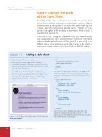
exercise 11-1
|
Your first style sheet
In this exercise, we’ll add a few simple styles to a short
article. The XHTML document, twenties.html and its
associated image, twenty_20s.jpg, are available at www.
learningwebdesign.com/materials/. First, open the
document in a browser to see how it looks by default
(it should look something like Figure 11-2). You can also
open the document in a text editor and get ready to
follow along when this exercise continues in the next
section.
Figure 11-2. This what the article looks like without
any style sheet instructions. Although we won’t be
making it beautiful, you will get a feel for how styles
work.
How Style Sheets Work
Chapter 11, Cascading Style Sheets Orientation
191
selector { property: value; } selector {
property1: value1;
property2: value2;
property3: value3;
}
declaration declaration block
Figure 11-3. The parts of a style sheet rule.
Selectors
In the previous small style sheet example, the h1 and p elements are used as
selectors. This most basic type of selector is called an element type selector.
The properties defined for each will apply to every h1 and p element in the
document, respectively. In upcoming chapters, I’ll introduce you to more
sophisticated selectors that you can use to target elements, including ways to
select groups of elements and elements that appear in a particular context.
Mastering selectors—that is, choosing the best type of selector and using it
strategically—is an important step in becoming a CSS Jedi Master.
Declarations
The declaration is made up of a property/value pair. There can be more than
one declaration in a single rule; for example, the rule for p element above
has both the font-size and font-family properties. Each declaration must
end with a semicolon to keep it separate from the following declaration (see
note). If you omit the semicolon, the declaration and the one following it will
be ignored. The curly brackets and the declarations they contain are often
referred to as the declaration block (Figure 11-3).
Because CSS ignores whitespace and line returns within the declaration
block, authors typically write each declaration in the block on its own line,
as shown in the following example. This makes it easier to find the properties
applied to the selector and to tell when the style rule ends.
p {
font-size: small;
font-family: sans-serif;
}
Note that nothing has really changed here—there is still one set of curly
brackets, semicolons after each declaration, etc The only difference is the
insertion of line returns and some character spaces for alignment.
The heart of style sheets lies in the collection of standard properties that
can be applied to selected elements. The complete CSS specification defines
dozens of properties for everything from text indent to how table headers
should be read aloud. This book covers the most common and best sup-
ported properties (see note).
N o t e
Technically, the semicolon is not required
after the last declaration in the block, but
it is recommended that you get into the
habit of always ending declarations with
a semicolon. It will make adding declara-
tions to the rule later that much easier.
N o t e
Technically, the semicolon is not required
after the last declaration in the block, but
it is recommended that you get into the
habit of always ending declarations with
a semicolon. It will make adding declara-
tions to the rule later that much easier.
N o t e
For a complete list of properties in the
current CSS2.1 standards, go straight
to the W3C Recommendation at www.
w3.org/TR/CSS21/propidx.html, or con-
sult a comprehensive CSS reference book
such as CSS: The Definitive Guide by
Eric Meyer or Web Design in a Nutshell
by Jennifer Robbins (that’s me), both
published by O’Reilly Media.
Part III: CSS for Presentation
192
How Style Sheets Work
Values are dependent on the property. Some proper-
ties take length measurements, some take color values,
others have a predefined list of keywords. When using
a property, it is important to know which values it
accepts; however, in many cases, simple common sense
will serve you well.
Before we move on, why not get a little practice writing
style rules yourself in the continuation of Exercise 11-1.
Open twenties.html in a text editor. In the
head
of the
document you will find that I have set up a
style
element for
you to type the rules into. The
style
element is used to embed
a style sheet in the
head
of an (X)HTML document.
To begin, we’ll just add the small style sheet that we just looked
at in this section. Type the following rules into the document,
just as you see them here.
<style type="text/css">
h1 {
color: green;
}
p {
font-size: small;
font-family: sans-serif;
}
</style>
Save the file and take a look at it in the browser. You should
notice some changes (if your browser already uses a sans-serif
font, you may only see size change). If not, go back and check
that you included both the opening and closing curly bracket
and semicolons. It’s easy to accidentally omit these characters,
causing the style sheet not to work.
Now we’ll change and add to the style sheet to see how easy
it is to write rules and see the effects of the changes. Here
are a few things to try (remember that you need to save the
document after each change in order for the changes to be
visible when you reload it in the browser).
Make the
h1
element “gray” and take a look at it in the
browser. Then make it “blue”. Finally, make it “red”. (We’ll
run through the complete list of available color names in
Chapter 13, Colors and Backgrounds.)
Add a new rule that makes the
h2
elements red as well.
Add a 100 pixel left margin to paragraph (
p
) elements using
this declaration:
margin-left: 100px;
Remember that you can add this new declaration to the
existing rule for
p
elements.
Add a 100 pixel left margin to the
h2
headings as well.
Add a red, 1-pixel border to the bottom of the
h1
element
using this declaration:
border-bottom: 1px solid red;
Move the image to the right margin and allow text to flow
around it with the
float
property. The shorthand
margin
property shown in this rule adds zero pixels space on the
top and bottom of the image and 12 pixels space on the left
and right of the image (the values are mirrored in a manner
explained in Chapter 14, Thinking Inside the Box).
img {
float: right;
margin: 0 12px;
}
When you are done, the document should look something like
the one shown in Figure 11-4.
exercise 11-1
|
Your first style sheet (continued)
Figure 11-4. The article after adding the small style sheet from
the example. As I said, not beautiful, just different.
Providing Measurement Values
When providing measurement values, the unit must
immediately follow the number , like this:
{ margin: 2em; }
Adding a space before the unit will cause the property not to
work.
INCORRECT: { margin: 2 em; }
It is acceptable to omit the unit of measurement for zero values:
{ margin: 0; }
How Style Sheets Work
Chapter 11, Cascading Style Sheets Orientation
193
3. Attaching the styles to the document
In the previous exercise, we embedded the style sheet right in the XHTML
document using the style element. That is just one of three ways that style
information can be applied to an (X)HTML document. You’ll get to try each
of these out soon, but it is helpful to have an overview of the methods and
terminology up front.
External style sheets. An external style sheet is a separate, text-only docu-
ment that contains a number of style rules. It must be named with the
.css suffix. The .css document is then linked to or imported into one or
more (X)HTML documents (we’ll discuss how in Chapter 13). In this way,
all the files in a web site may share the same style sheet. This is the most
powerful and preferred method for attaching style sheets to content.
Embedded style sheets. This is the type of style sheet we worked with in the
exercise. It is placed in a document using the style element and its rules
apply only to that document. The style element must be placed in the
head of the document and it must contain a type attribute that identifies
the content of the style element as “text/css” (currently the only available
value). This example also includes a comment (see Comments in Style
Sheets sidebar).
<head>
<title>Required document title here</title>
<style type="text/css">
/* style rules go here */
</style>
</head>
The style element may also include the media attribute used to target
specific media such as screen, print, or handheld devices. These are dis-
cussed in Chapter 13 as well.
Inline styles. You can apply properties and values to a single element using
the style attribute in the element itself, as shown here:
<h1 style="color: red">Introduction</h1>
To add multiple properties, just separate them with semicolons, like this:
<h1 style="color: red; margin-top: 2em">Introduction</h1>
Inline styles apply only to the particular element in which they appear.
Inline styles should be avoided, unless it is absolutely necessary to over-
ride styles from an embedded or external style sheet. Inline styles are
problematic in that they intersperse presentation information into the
structural markup. They also make it more difficult to make changes
because every style attribute must be hunted down in the source. These
disadvantages sound a lot like those for the obsolete font element, don’t
they?
Comments in Style
Sheets
Sometimes, it is helpful to leave
yourself or your collaborators
comments in a style sheet. CSS has
its own comment syntax, shown
here:
/* comment goes here */
Content between the
/*
and
*/
will
be ignored when the style sheet is
parsed, which means you can leave
comments anywhere in a style sheet,
even within a rule.
body { font-size: small;
/* temporary */ }
Part III: CSS for Presentation
194
The Big Concepts
Exercise 11-2 gives you an opportunity to write an inline style and see
how it works. We won’t be working with inline styles after this point for
the reasons listed earlier, so here’s your chance.
The Big Concepts
There are a few big ideas that you need to get your head around to be com-
fortable with how Cascading Style Sheets behave. I’m going to introduce you
to these concepts now so we don’t have to slow down for a lecture once we’re
rolling through the style properties. Each of these ideas will certainly be
revisited and illustrated in more detail in the upcoming chapters.
Inheritance
Are your eyes the same color as your parents’? Did you inherit their hair
color? Your unique smile? Well, just as parents pass down traits to their chil-
dren, (X)HTML elements pass down certain style properties to the elements
they contain. Notice in Exercise 11-1, when we styled the p elements in a small,
sans-serif font, the em element in the second paragraph became small and
sans-serif as well, even though we didn’t write a rule for it specifically (Figure
11-5). That is because it inherited the styles from the paragraph it is in.
p {font-size: small; font-family: sans-serif;}
Unstyled paragraph
Paragraph with style
rule applied
The emphasized text (em) element is small and sans-serif even
though it has no style rule of its own. It inherits the styles from
the paragraph that contains it.
Figure 11-5. The em element inherits styles that were applied to the paragraph.
Document structure
This is where an understanding of your document’s structure comes in. As
I’ve noted before, (X)HTML documents have an implicit structure or hierar-
chy. For example, the sample article we’ve been playing with has an html root
element that contains a head and a body, and the body contains heading and
paragraph elements. A few of the paragraphs, in turn, contain inline elements
like images (img) and emphasized text (em). You can visualize the structure as
an upside-down tree, branching out from the root, as shown in Figure 11-6.
exercise 11-2
|
Applying an inline
style
Open the article, twenties.html,
in whatever state you last left it in
Exercise 11-1. If you worked to the
end of the exercise, you will have
a rule that applies a color to the
h2
elements.
Now, write an inline style that makes
the second
h2
purple. We’ll do that
right in the opening
h2
tag using the
style
attribute as shown here:
<h2 style="color: purple">
Connect-the-Dots</h2>
Now that heading is purple,
overriding whatever color it had
been set before. The other
h2
heading is unaffected.
The Big Concepts
Chapter 11, Cascading Style Sheets Orientation
195
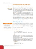
html
head
body
title style
h1 p p h2 p p p h2 p p
em img em em
Figure 11-6. The document tree structure of the sample document, twenties.html.
Parents and children
The document tree becomes a family tree when it comes to referring to the
relationship between elements. All the elements contained within a given
element are said to be its descendants. For example, all of the h1, h2, p, em,
and img elements in the document in Figure 11-6 are descendants of the body
element.
An element that is directly contained within another element (with no inter-
vening hierarchical levels), is said to be the child of that element. Conversely,
the containing element is the parent. For example, the em element is the child
of the p element, and the p element is its parent.
All of the elements higher than a particular element in the hierarchy are its
ancestors. Two elements with the same parent are siblings. We don’t refer to
“aunts” or “cousins,” so the analogy stops there. This may all seem academic,
but it will come in handy when writing CSS selectors.
Pass it on
When you write a font-related style rule using the p element as a selector, the
rule applies to all of the paragraphs in the document as well as the inline text
elements they contain. We’ve seen the evidence of the em element inheriting
the style properties applied to its parent (p) back in Figure 11-5. Figure 11-7
demonstrates what’s happening in terms of the document structure diagram.
Note that the img element is excluded because font-related properties do not
apply to images.
When you learn a new property,
it is a good idea to note whether
it inherits. Inheritance is noted for
every property listing in this book.
For the most part, inheritance
follows your expectations.
c S S t I P
When you learn a new property,
it is a good idea to note whether
it inherits. Inheritance is noted for
every property listing in this book.
For the most part, inheritance
follows your expectations.
c S S t I P

