ADOBE INDESIGN CS2 REVEALED- P14 pot
Bạn đang xem bản rút gọn của tài liệu. Xem và tải ngay bản đầy đủ của tài liệu tại đây (954.56 KB, 15 trang )
Lesson 2 Apply Color INDESIGN 5-13
colors—no fill and a black stroke. Clicking
this button will apply a black stroke and no
fill to a selected object. The Swap Fill and
Stroke button swaps the fill color with the
stroke color.
Finally, the three “Apply” buttons at the
bottom of the Toolbox are useful for speed-
ing up your work. The Apply color and
Apply gradient buttons display the last
color and gradient that you’ve used. This
makes for quick and easy access when you
are using the same color or gradient repeat-
edly. The Apply None button is available
for removing the fill or stroke from a
selected object, depending on which button
(Fill or Stroke) is active in the Toolbox.
FIGURE 15
Fill and stroke buttons in palettes
FIGURE 16
Fill and Stroke buttons in the Color and Swatches palettes
FIGURE 17
Useful color buttons in the Toolbox
Fill and Stroke
buttons
Fill and Stroke
buttons
Swap Fill and
Stroke button
Apply None
button
Default Fill and
Stroke button
Apply gradient
button
Apply color
button
When mouse is
released square will
be filled with yellow
Understanding the Paper
Swatch
If I gave you a white piece of paper and a
box of crayons and asked you to draw a
white star against a blue background, you
would probably color all of the page blue
except for the star shape, which you would
leave blank. The star would appear as white
because the paper is white. The Paper
swatch, shown in Figure 18, is based on
this very concept. Use the Paper swatch
whenever you want an object to have a
white fill or stroke.
Don’t confuse a Paper fill with a None fill.
When you fill a frame with Paper, it is
filled with white. When you fill it with
None, it has no fill—its fill is transparent.
Figure 19 illustrates this distinction. In
the figure, two text frames are positioned
in front of a frame with a yellow fill. The
text frame on the left has None as its fill;
therefore the yellow frame is visible
behind the text. The text frame on the
right has Paper as its fill.
INDESIGN 5-14 Working with Color
FIGURE 18
Paper swatch
FIGURE 19
Understanding a Paper fill
Paper swatch
Frames with yellow fill
Text frame
with None fill
Text frame with
Paper fill
Lesson 2 Apply Color INDESIGN 5-15
Applying Color to Text
Applying color to text is easy. There are two
different methods for applying color to text,
depending on which tool you are using to
select the text.
When you select text with the Type Tool, the
Fill and Stroke buttons in the Toolbox dis-
play the letter T, as shown in Figure 20.
This is a visual indication that you are fill-
ing or stroking text. Click a swatch in the
Swatches palette or mix a color in the Color
palette and the text will be filled or stroked
with that color.
QUICKTIP
The color of the letter T in the Fill and Stroke buttons is the
same color as the selected text.
When you select a text frame with a selec-
tion tool, you need to tell InDesign what
you want to do—apply a fill or stroke to
the frame itself or apply a fill or stroke to
the text in the frame. If you want to apply
color to the text, click the Formatting
affects text button in the Toolbox, as
shown in Figure 21. If you want to apply
color to the frame, click the Formatting
affects container button. It’s that simple.
Note that the two buttons can also be
found in the Swatches and Color palettes.
FIGURE 20
Fill and Stroke buttons applied to text
FIGURE 21
Formatting buttons
Fill and Stroke
buttons
Formatting affects
container button
Formatting affects
text button
INDESIGN 5-16 Working with Color
Creating Black Shadow Text
When you position text against a back-
ground color or against a photographic
image, sometimes it’s not easy to see the
text, as shown in Figure 22. To remedy
this, many designers use the classic tech-
nique of placing a black copy of the text
behind the original text, as shown in
Figure 23. This trick adds much-needed
contrast between the text and the image
behind it.
QUICKTIP
Placing a black copy of text behind original text produces
a different effect than using InDesign’s Drop Shadow
command.
Modifying and Deleting
Swatches
Once you’ve created a swatch in or added a
swatch to the Swatches palette, it is a
named color and will be saved with the
document. Any swatch can be modified
simply by double-clicking it, which opens
the Swatch Options dialog box, as shown in
Figure 24. Any modifications you make to
the swatch will be updated automatically in
any frame that uses the color as a fill or a
stroke.
You can also delete a swatch from the
Swatches palette by selecting the swatch,
then clicking the Delete Swatch button in
the Swatches palette or clicking the Delete
Swatch command on the Swatches palette
menu. If you are deleting a swatch that is
FIGURE 22
Text positioned against an image
FIGURE 23
Text with a black copy behind it
Black text placed
behind purple text
Lesson 2 Apply Color INDESIGN 5-17
used in your document, the Delete Swatch
dialog box opens, as shown in Figure 25.
You use the Delete Swatch dialog box to
choose a color to replace the deleted
swatch. For example, if you’ve filled (or
stroked) a number of objects with the color
Warm Green and then you delete the Warm
Green swatch, the Delete Swatch dialog
box wants to know what color those objects
should be changed to. You choose another
named color that is already in the Swatches
palette by clicking the Defined Swatch list
arrow, clicking a color, and then clicking
OK. When you do so, all the objects with a
Warm Green fill or stroke will change to
the named color you chose. Note that this
can be a very quick and effective method
for changing the fill (or stroke) color of
multiple objects simultaneously.
If you click the Unnamed Swatch option
button in the Delete Swatch dialog box, all
the objects filled or stroked with the
deleted color will retain their color.
However, since that color is no longer in
the Swatches palette, those objects are now
filled with an unnamed color.
FIGURE 24
Swatch Options dialog box
FIGURE 25
Delete Swatch dialog box
INDESIGN 5-18 Working with Color
Drag and drop colors onto
objects
1. Click View on the menu bar, then click Hide
Frame Edges.
2. Drag and drop the Green swatch on top of
the blue frame, as shown in Figure 26, then
release the mouse button.
The frame is filled with green.
3. Click the Toggles visibility button on
the Photo layer in the Layers palette to hide
the background image.
4. Drag the Pink swatch to the inside of the
large white frame.
The fill changes to pink.
You dragged and dropped colors from the Swatches
palette to objects in the document window.
FIGURE 26
Dragging and dropping a color swatch
Using the Color Picker
In addition to using the Toolbox and the Swatches palette to apply colors, you can
use the Color Picker, which lets you choose and mix colors using an interface similar
to Photoshop. Select the object you want to fill, then double-click the Fill or Stroke
box in the Toolbox to open the Color Picker. In the color spectrum, click or drag to
select a color, drag the color slider triangles, or type values in the text boxes. To save
the color as a swatch, click Add CMYK Swatch, Add RGB Swatch, or Add Lab Swatch.
The color appears in the Swatches palette, displaying its color values as a name.
Lesson 2 Apply Color INDESIGN 5-19
Use the Swap Fill and Stroke
and Default Fill and Stroke
buttons
1. Click the Selection Tool , if necessary,
select the pink frame, then note the Fill and
Stroke buttons in the Toolbox.
The Fill button is activated—it is in front of
the Stroke button.
2. Press [X] to activate the Stroke button in the
Toolbox, then click Gold in the Swatches
palette.
3. Click the Swap Fill and Stroke button .
In the selected frame, the fill and stroke
colors are swapped.
4. Click the Default Fill and Stroke button .
The fill color of the selected frame is
removed and replaced with no fill, and the
stroke changes to black as shown in
Figure 27.
5. Press [X] to activate the Fill button, click the
Paper swatch in the Swatches palette, then
compare your work to Figure 28.
You used the Swap Fill and Stroke and Default Fill
and Stroke buttons to explore ways to modify your
document, and then applied the Paper swatch to
the center frame.
FIGURE 27
Applying the Default Fill and Stroke button to the frame
FIGURE 28
Viewing an object with a Paper fill color
Green fill of backmost
frame shows through the
frame filled with no color
Stroke of frame is
black and fill of
frame is gone
Frame with
Paper fill
INDESIGN 5-20 Working with Color
Apply color to text
1. Click the Selection Tool , click the
TWIST & SHOUT text frame, then click the
Formatting affects text button in the
Toolbox.
As shown in Figure 29, the Fill and Stroke
buttons display the letter T, indicating that
any color changes will affect the text in the
selected frame, not the frame itself.
2. Click Gold in the Swatches palette.
3. Click the A•MAZE•ING text frame, then note
that the Formatting affects container button
is active in the Toolbox because you have
selected a frame.
4. Click the Type Tool , then select all of
the text in the A•MAZE•ING text frame.
TIP When you select text with the Type
Tool, the Formatting affects text button in
the Toolbox is automatically activated.
5. Click Pink in the Swatches palette.
6. Click the Selection Tool , click the
MAVERICK text frame, then click the
Formatting affects text button in
the Swatches palette.
7. Click the Green 25% swatch in the Swatches
palette so that your document resembles
Figure 30.
You explored two methods for applying color to
text, the first by selecting text with the Selection
Tool, then clicking the Formatting affects text but-
ton before choosing a color, and the second by
selecting text with the Type Tool, then choosing a
new color.
FIGURE 29
Toolbox with the Formatting affects text button activated
FIGURE 30
Viewing the colors applied to text
Fill button
Formatting affects
text button
Lesson 2 Apply Color INDESIGN 5-21
Create black shadow text
1. Click the Toggles visibility button (in its
off state) on the Photo layer in the Layers
palette, then assess the legibility of the text
in the three text frames against the back-
ground graphic.
The text is legible, but some letters like the
M in Maverick are more difficult to distin-
guish from the background.
2. Click the Original Black Text layer in the
Layers palette, click the Layers palette list
arrow, then click Duplicate Layer “Original
Black Text”.
3. Type Color Headlines in the Name text box,
click the Color list arrow, then click Orange,
so that your Duplicate Layer dialog box
resembles Figure 31.
4. Click OK, then hide the Original Black
Text layer.
5. Delete the Fall 2005 text frame on the Color
Headlines layer since you will not need a
duplicate of this text.
6. Hide the Color Headlines layer, then show
the Original Black Text layer.
7. Press and hold [Alt] (Win) or [option]
(Mac), then click the Original Black Text
layer in the Layers palette.
TIP Pressing and holding [Alt] (Win) or
[option] (Mac) when clicking a layer selects
all objects on the layer.
(continued)
FIGURE 31
Duplicate Layer dialog box
INDESIGN 5-22 Working with Color
8. Click the Formatting affects text button
in the Swatches palette, then apply a 100%
black fill to all the text.
9. Show the Color Headlines layer, press and
hold [Alt] (Win) or [option] (Mac), then click
the Color Headlines layer.
The three text frames on the Color Headlines
layer are now selected.
10.Click Object on the menu bar, point to
Transform, then click Move.
11.Click the Preview check box to add a check
mark (if necessary), type 04 in the
Horizontal text box, type 04 in the Vertical
text box, click OK, deselect all, then compare
your work to Figure 32.
You duplicated a layer containing text. You
changed the fill color of the text on the lower layer
to black, then repositioned the colored text on the
upper layer so that the black text acts as a shadow.
By doing so, you added contrast to the colored
text, making it more legible against the color
graphic.
FIGURE 32
Viewing the colored text with a black shadow
Black text placed
behind colored
text adds contrast
Lesson 2 Apply Color INDESIGN 5-23
Modify and delete swatches
1. Drag the Gold swatch onto the Green frame
to change its fill color to Gold.
2. Double-click the Gold swatch in the
Swatches palette.
3. Click the Preview check box to add a check
mark (if necessary), then drag the Black
slider to 20%.
You may need to move the Swatch Options
dialog box to see the effect on the
document page.
4. Drag the Black slider to 5%, then drag the
Yellow slider to 50%.
5. Click OK, then compare your work to
Figure 33.
All usages of the Gold swatch—the frame
and the “Twist & Shout” text—are updated
with the modification.
6. Drag the Gold swatch to the Delete Swatch
button in the Swatches palette.
7. Click the Defined Swatch list arrow, click
Pink, as shown in Figure 34, then click OK.
As shown in Figure 35, all usages of the
Gold swatch in the document are replaced
by the Pink swatch.
You modified a swatch and noted that it updated
throughout the document. You then deleted the
swatch, replacing all of its usages with a
different swatch.
FIGURE 34
Delete Swatch dialog box
FIGURE 33
Viewing the modifications to the Gold swatch
FIGURE 35
Viewing the result of replacing gold with pink
Gold swatch will be
replaced with Pink
LESSON 3
What You’ll Do
INDESIGN 5-24 Working with Color
Understanding Spot Colors
Spot colors are non-process inks that are
manufactured by companies. Though
printing is based on the four process col-
ors, CMYK, it is not limited to them. It is
important to understand that though
combinations of CMYK inks can produce a
wide variety of colors—enough to repro-
duce any color photograph quite well—
they can’t produce every color. For this
reason, and others, designers often turn to
spot colors.
Imagine that you are an art director
designing the masthead for the cover of a
new magazine. You have decided that the
masthead will be an electric blue, vivid and
eye-catching. If you were working with
process tints only, you would have a prob-
lem. First, you would find that the almost-
neon blue that you want to achieve is not
within the CMYK range; it can’t be
printed. Even if it could, you would have
an even bigger problem with consistency
issues. You would want that blue to be the
same blue on every issue of the magazine,
month after month. But offset printing is
never perfect; variations in dot size are fac-
tored in. As the cover is printed, the blue
color in the masthead will certainly vary,
sometimes sharply.
Designers and printers use spot colors to
solve this problem. Spot colors are special
pre-mixed inks that are printed separately
from process inks. The color range of spot
colors far exceeds that of CMYK. Spot col-
ors also offer consistent color throughout
a print run.
The design and print worlds refer to spot
colors by a number of names:
■ Non-process inks: Refers to the fact
that spot colors are not created using
the process inks—CMYK.
■ Fifth color: Refers to the fact that the
spot color is often printed in addition
to the four process inks. Note, how-
ever, that a spot color is not necessar-
ily the “fifth” color. For example, many
“two-color” projects call for black plus
one spot color.
In this lesson, you will create and apply
spot colors, and import graphics that con-
tain spot colors.
▼
WORK WITH
SPOT COLORS
Lesson 3 Work with Spot Colors INDESIGN 5-25
■ PANTONE color: PANTONE is a manu-
facturer of non-process inks. PANTONE
is simply a brand name.
■ PMS color: An acronym for PANTONE
Matching System.
A good way to think of spot colors is as ink
in a bucket. With process inks, if you want
red, you must mix some amount of
magenta ink with some amount of yellow
ink. With spot colors, if you want red, you
pick a number from a chart, open the
bucket, and there’s the red ink—pre-mixed
and ready to print.
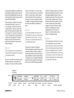
Creating Spot Colors
You create spot colors in Adobe InDesign
using the New Color Swatch dialog box.
Instead of choosing CMYK values, as you
would when you create a process color, you
choose Spot from the Color Type list, then
choose a spot color system from one of
15 systems in the Color Mode list. After you
choose a system, the related library of spot
colors loads into the New Swatch dialog
box allowing you to choose the spot color
you want. Figure 36 shows the PANTONE
solid coated color system.
Importing Graphics with
Spot Colors
When you create graphics in Adobe
Illustrator or Adobe Photoshop, you can
create and apply spot colors in those appli-
cations as well. For example, you can create
a logo in Adobe Illustrator and fill it with a
spot color.
Because InDesign, Illustrator, and
Photoshop are all made by Adobe,
InDesign recognizes the spot colors
applied to graphics created in those appli-
cations. In the above example, when you
place the graphic from Illustrator,
InDesign identifies the spot color that was
used and that spot color is added to the
InDesign Swatches palette. If you double-
click the swatch in the Swatches palette,
you will see that the swatch is automati-
cally formatted as a spot color.
FIGURE 36
Creating a spot color swatch
PANTONE solid
coated swatches list
Color Type: Defines
whether the color is
Process or Spot
Color Mode: Defines
which type of Spot color
system you want to use
INDESIGN 5-26 Working with Color
Create a spot color swatch
1. Click the Swatches palette list arrow, then
click New Color Swatch.
2. Click the Color Type list arrow, then
click Spot.
3. Click the Color Mode list arrow, then click
PANTONE solid coated.
4. Type 663 in the PANTONE text box, so that
your New Color Swatch dialog box resem-
bles Figure 37.
5. Click OK, then compare your Swatches
palette with Figure 38.
6. Change the fill of the pink frame to
PANTONE 663.
7. Change the fill of the “TWIST & SHOUT” text
to PANTONE 663, deselect the “TWIST &
SHOUT” text frame, then compare your doc-
ument to Figure 39.
You created a spot color swatch and then applied
it to elements in the layout.
FIGURE 37
Choosing a spot color
FIGURE 38
Identifying a spot color in the Swatches palette
FIGURE 39
Viewing the document with the spot color applied
Spot color
PANTONE 663
PANTONE 663
Lesson 3 Work with Spot Colors INDESIGN 5-27
Import graphics with spot
colors
1. Click the Imported Graphics layer in the
Layers palette to target it, click the Selection
Tool , then select the frame shown in
Figure 40.
TIP Clicking in the general area of the
selected frame shown in Figure 40 will select
the frame.
2. Click File on the menu bar, click Place, navi-
gate to the drive and folder where your Data
Files are stored, click Living Graphic.ai,
then click Open.
3. Click Object on the menu bar, point to
Fitting, then click Center Content.
The graphic that is placed in the frame was
created in Adobe Illustrator.
4. Compare your Swatches palette to Figure 41.
The PANTONE 159 C swatch was automati-
cally added to the Swatches palette when the
graphic was placed, since it was a color
used to create the graphic.
5. Deselect the graphics frame, double-click
PANTONE 159 C in the Swatches palette,
note that PANTONE 159 C was imported as a
spot color as indicated in the Color Type text
box, then click Cancel.
(continued)
FIGURE 40
Selecting a frame for a graphic
FIGURE 41
Identifying a new spot color in the Swatches palette
PANTONE swatch added
to the Swatches palette
when the Illustrator
graphic was imported