Adobe GoLive 6.0- P14 pot
Bạn đang xem bản rút gọn của tài liệu. Xem và tải ngay bản đầy đủ của tài liệu tại đây (1.47 MB, 30 trang )
405
ADOBE GOLIVE 6.0
Classroom in a Book
The Personal Information table you created was sized to fit perfectly in the designated cell
of the main table for the membership application. If you had not sized the Personal Infor-
mation table correctly, you could adjust the size of the Personal Information table in the
Table Inspector. Before you begin creating a form, however, it’s a good idea to carefully
plan its layout. You should always decide on the contents of the main table, paying special
attention to whether or not you will add nested tables to it. Careful planning will save you
from having to redesign your form’s layout during the creation process.
Adding an image that spans two columns
Now you’ll replace the words “Membership Application” by adding an image to the page.
First you’ll adjust the table columns so that the words “Membership Application” span
two columns.
1 Move your pointer over the bottom edge of the cell that contains the words
“Membership Application,” so that the pointer changes to an arrow. Then click to select
the cell.
The Inspector changes to the Table Inspector, with the Cell tab automatically selected.
2 In the Table Inspector, enter 2 for Column Span, and press Enter or Return.
Now you’ll replace the text with an image.
3 Triple-click in the text to select the words “Membership Application,” and press Delete.
You’ll add the image to the form using a file in the site window.
4 Choose File > Open, and open the forms.site file in Lessons/Lesson11/11Start/forms
folder/.
The site file contains a media folder, the index.html file, and the membership.html file. It
also contains the name_form.html file that you created earlier in this lesson; however,
before this file displays in the site window, you need to update the contents of the window.
If you had created the new page, name_form.html from the site window, the page would
have been visible right away.
5 Choose Site > Refresh View to update the contents of the site window.
LESSON 11
406
Creating Forms
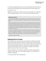
6 In the site window, expand the media folder. Then drag form_header.jpg from the
media folder in the site window to the empty table cell that previously contained the
words “Membership Application.” The image is added to the cell.
Dragging image file from site window to table cell
7 Click in the document window, and choose File > Save to save the page.
Adding radio buttons
The Payment Information section in the lower right corner of the form already
contains a nested table with one row and five columns that has been inserted into the
main table. You’ll add a group of radio buttons to this section so that viewers can select a
payment type.
If you created the Payment Type section from scratch, you would create it much in the
same way as the Personal Information section. You would create a table with one row and
five columns. Then you would type the text “Payment Type” in the first cell and insert
images of a MasterCard and VISA card into the third and fifth cells. You would then add
radio buttons to the second and fourth cells, as you are about to do now.
407
ADOBE GOLIVE 6.0
Classroom in a Book
1 Click the Forms button ( ) at the top of the Objects palette. Then drag the Radio
Button icon from the Forms set of the Objects palette to the empty table cell located to
the left of the MasterCard image in the document window.
Dragging Radio Button icon from the Forms set of the Objects palette to table cell
The Inspector changes to the Form Radio Button Inspector.
2 Click the radio button that you added to the page to select it.
3 In the Form Radio Button Inspector, enter paymentType for Group. This names the
group of radio buttons.
You’ll use the same group name for the second radio button that you’ll add to the page.
Using the same group name for the two radio buttons ensures that visitors can only select
one option from the group.
4 Enter mastercard for Value. This is the value that will be returned to the CGI script for
the form when a viewer chooses this option.
5 Check the Selected option. This makes MasterCard the preselected option.
Note: It’s not required that you preselect any of the radio buttons.
Now you will copy the radio button that you just created, paste it into the empty table cell
and then edit the properties of the copied radio button in the Radio Button Inspector.
LESSON 11
408
Creating Forms
6 Ctrl-drag (Windows) or Option-drag (Mac OS) the radio button to the empty table
cell next to the Visa image.
7 You’ll use the same group name for the second radio button in the document window,
so leave paymentType selected for Group in the Form Radio Button Inspector.
Remember, using the same group name for the two radio buttons ensures that visitors can
only select one option from the group.
8 Enter visa for Value, and uncheck the Selected option.
9 Choose File > Save to save the page.
Now you’ll preview the page to test the form fields that you’ve added to the page so far.
10 Click the Show in Browser button in the toolbar. The document appears in the Web
browser that you specified in the GoLive Preferences dialog box.
Previewing form fields that you’ve added to page
409
ADOBE GOLIVE 6.0
Classroom in a Book
11 Test the form fields that you’ve created by entering your name and address, choosing
a country, and selecting a payment type.
12 When you are finished previewing the form, close your browser and return to the
membership.html file in the Layout Editor.
Modifying a list box
A list box in the upper right of the form provides viewers with a list of workshops from
which they can choose. The list box was created much in the same way as the Country
pop-up menu earlier in the lesson. You’ll make several changes to the list box. First you’ll
specify that the list box display six items rather than five.
1 Click in the list box to select it. The Inspector changes to the Form List Box Inspector.
In the Form List Box Inspector, notice how the items for the list box have been entered in
the same way as the Country pop-up menu. Each item has a label and value.
2 Enter 6 for Rows, and press Enter or Return. This will increase the number of rows (or
items) visible in the list box to six.
You’ll add more items in a minute, but first you’ll make the list box into a multiselection
form field, so that users can select more than one workshop.
3 Select the Multiple Selection option.
Selecting list box Setting options in Form List Box
Inspector
Now you’ll add three more items to the list box.
LESSON 11
410
Creating Forms
4 Click the New Item button ( ) at the bottom of the Form List Box Inspector to create
a new item. In the left text box at the bottom of the Inspector, delete the text “item,” enter
History of Poetry, and press Tab. In the right text box, enter Workshops_History, and
press Enter or Return.
5 If necessary, scroll down the list box in the Form List Box Inspector to view the item
you just added. (You can also increase the size of the Inspector by dragging its lower right
corner.)
6 Click the New Item button to create a second new item, and enter European Poetry as
its label and Workshops_European as its value.
7 Click the New Item button to create a third new item, and enter African Poetry as its
label and Workshops_African as its value.
8 Choose File > Save to save the page.
Now you’ll preview the page in GoLive to verify that the list box works as it should. Notice
that only six workshops are displayed in the pop-up menu and that the user must use the
scroll bar to access the workshops that you added.
9 Click the Preview tab in the document window. To select more than one item in the list
box in the Preview mode, click the first item and then Ctrl-click (Windows) or
Command-click (Mac OS) to add additional items to your selection. You can also Shift-
click to select a contiguous range of items in the list.
10 Click the Layout tab in the document window to return to the Layout Editor.
411
ADOBE GOLIVE 6.0
Classroom in a Book
Adding a clickable image
Next you’ll add a clickable image to the form for submitting the application over the Web.
This feature is one of the ways you can enable viewers to submit a form. An alternative
way is to add a Submit button, which is discussed in “Adding a Reset button” on page 413.
1 If necessary, scroll down the membership.html window to display the bottom of the
form. The main table used to lay out the form has two empty cells in its last row.
2 Click below the MasterCard image to insert a cursor in the empty table cell on the left.
3 Drag a Form Input Image icon from the Forms set ( ) of the Objects palette to the
cursor in the document window. A Form Input Image placeholder is added to the table
cell, and the Inspector changes to the Form Input Image Inspector.
4 If necessary, rearrange your desktop so that the Form Input Image placeholder is visible
in the document window and the submit.jpg file is visible in the media folder in the site
window. Then click the Form Input Image placeholder in the document window to
reselect it.
LESSON 11
412
Creating Forms
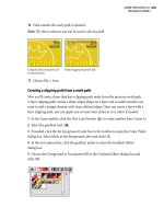
5 Drag from the Point and Shoot button ( ) in the Form Input Image Inspector to
submit.jpg in the media folder in the site window. The submit application image is added
to the table cell.
Connecting Form Input Image placeholder on page to image file in site window
6 In the Alt Text box, enter Submit Image as an alternative text message for the image.
7 Click the More tab of the Form Input Image Inspector. Enter submitImage for Name
next to the Is Form option. This names the clickable image.
8 Click the Basic tab of the Form Input Image Inspector. Select the Border option so it’s
checked and enter a value of 0, if necessary. This prevents a border from marring the
appearance of the image.
9 Choose File > Save to save the page.
413
ADOBE GOLIVE 6.0
Classroom in a Book
Adding a Reset button
You can add buttons to your form in at least two ways. The first method is to create an
image of a button and link it to one or more actions. The second method is to use the
Submit or Reset button in the Forms set of the Objects palette.
• The Submit button sends a visitor’s information to your database and closes the form.
• The Reset button deletes all of the visitor’s information and returns the form to its
default settings.
Now you’ll add a Reset button to the form.
1 Drag a Reset Button icon from the Forms set ( ) of the Objects palette to the empty
table cell to the right of the submit application image. The Inspector changes to the Input
Button Inspector.
Dragging Reset Button icon from the Forms set of the Objects palette to table cell
The necessary options for the Reset button are preset; however, you can change the button
name from Reset by checking the Label option in the Input Button Inspector and entering
a new name in the Label text box.
For more information about creating a Normal button, see “Creating buttons and
check boxes” in the Adobe GoLive 6.0 User Guide.
2 Choose File > Save to save the page.
LESSON 11
414
Creating Forms
Changing the main table’s border and cell spacing
Now that you have finished adding images and form fields to the form, you can remove
the border of the main table and the cell space of its table cells. (Both the border and cell
space are currently set at 2, which has made it easier for you to select the table and its cells
while modifying the form.)
1 In the document window, click the left or top edge of the main table (above the
Membership Application row) to select it. The Inspector changes to the Table Inspector,
with the Table tab automatically selected.
2 In the Table Inspector, enter 0 for Border, 0 for Cell Space, and press Enter or Return.
3 Choose File > Save to save the page.
4 Click the Preview tab in the document window, and check how the page appears in
Layout Preview.
5 Click the Layout tab in the document window to return to the Layout Editor.
Creating a tabbing chain
Now you’ll add a navigational aid to your form—a tabbing chain that allows viewers to
use the Tab key to move between form fields. To create a tabbing chain, you specify the
order in which the form fields are selected by the Tab key. Adding a tabbing chain should
be the last thing that you do to your form, after you are satisfied with its layout.
Note: Some Web browsers will automatically allow users to use the Tab key to move between
text fields. Some browsers only allow users to use the Tab key to move between text fields and
not other types of form fields. Also, be aware that the tabbing order that you create may or
may not be recognized, depending on the browser and which version the visitor is using.
You can start your tabbing chain with any form field. You’ll start the tabbing chain for this
form with the text field for entering a name.
1 Select the text field in the document window that contains the text “Enter name here.”
The Inspector changes to the Form Text Field Inspector.
415
ADOBE GOLIVE 6.0
Classroom in a Book
2 In the Form Text Field Inspector, select the Tab option. Enter 1 in the Tab text box. This
specifies the text field as the first form field in the tabbing chain.
Selecting text field Specifying text field as first in
tabbing chain
3 Click the Start/Stop Indexing button ( ). Yellow squares appear on each form field
that can be part of the tabbing chain. (The yellow squares also appear on the form labels,
although you can’t add labels to your tabbing chain.)
The yellow square in the text field for entering a name already has a 1 in it, indicating that
this field is the first in the tabbing chain.
Clicking Start/Stop Indexing Result
button
LESSON 11
416
Creating Forms
4 Click the text field for entering an e-mail address. A 2 appears in its yellow square.
5 Continue to create the tabbing chain by clicking on the yellow squares for the
remaining form fields. (Be sure to click on the yellow squares for the form fields, not
the labels.)
Note: If you want to change the order of your tabbing chain, first deselect the Start/Stop
Indexing button in the Form Text Field Inspector. Then select the form field for which you
want to change the tabbing order number in the document window, and enter the correct
tabbing order number in the Tab text box of the Inspector. Select the Start/Stop Indexing
button to see the result.
6 When you have finished creating the tabbing chain, click the Start/Stop Indexing
button in the Inspector. The tabbing chain has been created, and the yellow squares
disappear.
7 Choose File > Save to save the page.
8 Click the Show in Browser button in the toolbar. The document appears in the Web
browser that you specified in the GoLive Preferences dialog box. Place your cursor in the
text field for entering a name, and press Tab repeatedly to check that the tabbing chain
works as it should.
9 Close your browser.
10 Choose File > Close, and close both the membership.html file and the forms.site file.
In this lesson, you’ve learned how to lay out form fields using a table, and how to add a
variety of form fields to a form. Other form fields and functions that you can add to your
forms include check boxes, a file browser, a key generator, read-only and disabled form
fields, bounding boxes with legends to group form fields, and hidden form fields.
For complete information about creating forms in GoLive, see “Creating Forms” in
the Adobe GoLive 6.0 User Guide.
417
ADOBE GOLIVE 6.0
Classroom in a Book
Review questions
1 What are form fields?
2 Why do you need to add the Form icon to each form?
3 Why should you avoid creating forms using a layout grid?
4 How can you add a clickable image to a form?
5 How do you add an item to a list box?
6 How do you create a tabbing chain for your form?
Review answers
1 Form fields are elements that you can add to your forms, such as text fields, radio
buttons, or list boxes. Viewers can interact with form fields by entering information,
clicking items, or selecting items.
2 Dragging the Form icon from the Forms set of the Objects palette creates the container
for a form and allows the form to display and function properly in a browser.
3 A form created using a layout grid can vary according to a visitor’s browser and
screen resolution.
4 To add a clickable image to a form, you can do one of the following:
• Drag a Form Input Image icon from the Forms set of the Objects palette to the form,
and use the Point and Shoot button in the Form Input Image Inspector to connect the
placeholder to an image file.
• Drag a Form Input Image icon from the Forms set of the Objects palette to the form,
and use the Browse button in the Form Input Image Inspector to browse for an image file.
• Drag an image file directly to the Form Input Image placeholder in the form.
You should also make sure that the Is Form option is selected in the More tab of the Form
Input Image Inspector.
5 In the Form List Box Inspector, click the New Item button to create a new item. Then
enter a label and value for the item.
6 To create a tabbing chain, select any form field in your form, and click the Start/Stop
Indexing button in the Inspector. Click the yellow squares for the form fields (not the
labels) in the order in which you want viewers to be able to select the form fields using
the Tab key. Click the Start/Stop Indexing button in the Inspector to turn off the
tabbing chain.
12 Using Cascading Style Sheets
Using style sheets, you can easily update
the style of large amounts of text and
maintain consistency in typography and
formatting throughout a Web site. Good,
consistent design makes a site more invit-
ing to visitors and easier to explore
LESSON 12
422
Using Cascading Style Sheets
About this lesson
In this lesson, you’ll learn how to:
• Identify styles applied to a document.
• Create styles that apply to HTML elements in a document, in blocks of text, or in
selected text.
• Update styles and apply style changes globally.
• Duplicate and modify existing styles.
• Change the page color and margins using styles.
• Differentiate between internal and external style sheets.
• Link external style sheets to a document, and use them to update a document’s
formatting.
This lesson takes approximately 1 hour to complete.
If needed, copy the Lessons/Lesson12/ folder onto your hard drive. As you work on this
lesson you’ll overwrite the start files. If you need to restore the start files, copy them from
the Adobe GoLive 6.0 Classroom in a Book CD.
Note: Windows users need to unlock the lesson files before using them. For more information,
see “Copying the Classroom in a Book files” on page 3.
Getting started
To see what you’ll do in this lesson, first you’ll view the final lesson file in your browser.
1 Start your Web browser.
2 From your browser, open the index.html file in
Lessons/Lesson12/12End/poetrypond.com folder/poetrypond.com/.
3 Scroll through the page, and note its formatting.
4 Click the link “Benjamin Lucas.” All the formatting, including the formatting of links,
is controlled by a cascading style sheet.
Because this Web site is under construction, not all the links work and you may
sometimes need to use the Back button in your browser to retrace your steps.
5 When you have finished viewing the file, close your browser.
423
ADOBE GOLIVE 6.0
Classroom in a Book
About style sheets
HTML is a simple language intended to control the structure of information, not its
presentation. Style sheets let Web designers enhance HTML’s basic formatting by using
styles to position text precisely, control type, and format elements on the page.
Cascading style sheets (CSS for short) are a simple way to add style to HTML documents
and enhance the basic formatting of HTML elements. A style sheet is a set of stylistic rules
that describe how HTML documents should appear to viewers. In HTML code, a rule is
a statement about a stylistic aspect of one or more elements, in which a selector specifies
what elements a declaration—consisting of a property and its value—will affect. For
example, the style rule h1 { color : red } makes all head level 1s in a document appear red.
A. Rule B. Selector C. Property D. Value
In the past, designers had to understand these concepts in-depth so they could write
cascading style sheet code by hand in HTML. Now GoLive writes this code for you as you
apply simple formatting commands much as in familiar word-processing or page layout
applications. In addition styles are applied in a cascading fashion, from the most general
to the most specific.
GoLive supports Level 1 Cascading Style Sheets (CSS1), which are part of the HTML 4.0
specification. In general, Netscape Navigator 4.0 or later and Internet Explorer 3.0 or later
support many of the cascading style sheet properties that can be specified in GoLive.
(Microsoft and Netscape browsers differ in which CSS features they support.) Browsers
must have CSS1-support to be able to recognize and properly interpret style sheets.
A few considerations are key to using style sheets successfully:
• Be familiar with what style sheet properties are supported by current browsers. The
CSS specification is constantly evolving. Refer to
• Experiment with applying different properties to different HTML elements. It’s
important always to preview the results in the current browsers to test your style sheet’s
effectiveness.
A
CDBCD
LESSON 12
424
Using Cascading Style Sheets
Exploring the style sheet tools
The Adobe GoLive tools—the CSS Editor window and its buttons, and the CSS Style Inspector—let you
create and edit style sheets and link to external style sheets. This illustration shows the relationship between
these tools.
Both the internal and any linked
external style sheets appear in a CSS
Editor window.
The CSS Style Inspector
displays style properties.
To edit a style, select the style
name in the CSS Editor
window. Then click a button
on the CSS Inspector and edit
the properties.
Use the buttons at the bottom of the CSS Editor to create new styles for internal or
external style sheets. A. New Element Style B. New Class Style C. New ID Style
D. New Link to External CSS E. Remove Selected Item
A B C D E
To display the Style CSS Editor, click the
Open CSS Editor button in the
document window.
External style sheets are stand-
alone documents that can be
applied to any HTML page
by reference.
To create a new external style
sheet, choose File > New
Special > Cascading Style
Sheet. Create your styles and
save the style sheet with a .css
extension to your site folder. To
link the style sheet to a
document, drag it from the site
window to the CSS Editor.
425
ADOBE GOLIVE 6.0
Classroom in a Book
Exploring style sheets
GoLive supports two different kinds of style sheets: internal and external. Internal and
external style sheets differ in how they work with Web pages. Internal style sheets apply
only to the document in which they were created, although their styles can be exported
for use with other documents.
Far more flexible than internal style sheets, external style sheets can apply to a group of
documents, or to an entire Web site. Rather than defining an internal style sheet for each
and every page to which you want to apply some extra formatting, it’s easier to create a
stand-alone external style sheet document. You can then refer to this external style sheet
from any page and make its style options available.
Exploring an internal style sheet
You’ll start your work in the lesson by exploring a style sheet that was created with
a document.
1 Start Adobe GoLive.
By default, an introductory screen appears prompting you to create a new page, create a
new site, or open an existing file.
Note: You can set preferences for the introductory screen to not appear when you start GoLive.
If the introductory screen doesn’t appear, choose File > Open and go to step 3.
2 Click Open to open an existing file.
Creating internal and external style sheets
To create a style sheet, you must first determine whether the style sheet should be internal or external. An
internal style sheet resides in the head section of a Web page and is typically used if the styles aren’t used on
more than one page. An external style sheet exists as a separate file, which is useful if you want multiple pages
to share the same styles. For the greatest flexibility, GoLive lets you import the styles from an external style
sheet into an internal style sheet or export an internal style sheet to an external style sheet file. You can use
internal and external style sheets in a single Web page.
Note: Except for their title bars, the internal and external CSS Editors appear identical. The Internal CSS
Editor displays the “host” Web page’s name in the title bar. The External CSS Editor displays the external
style sheet’s file name with the .css file name extension in the title bar.
LESSON 12
426
Using Cascading Style Sheets
3 Open the poetrypond.com.site file in Lessons/Lesson12/12Start/poetrypond.com
folder/.
4 In the site window, double-click index.html to open the home page of the
poetrypond.com Web site.
The basic structure and simple formatting of this document was achieved by applying the
basic HTML elements such as h1, h2, and p to raw text. The finer styling such as the font
size and color, margin widths, and even the white background of the document have been
applied using a style sheet.
First you’ll view the document without the style sheet formatting. You can preview your
pages in one of several ways. You can choose a browser that doesn’t have CSS support; you
can turn off CSS support in your browser; or in the GoLive Web Settings, you can create
a new browser profile that does not support CSS.
In this part of the lesson you’ll create a browser profile that does not support CSS.
5 Choose Edit > Web Settings, and click the Browser Profiles tab.
427
ADOBE GOLIVE 6.0
Classroom in a Book
6 Click to select a browser profile (we used GoLive), and right-click (Windows) or
Control-click (Mac OS) the browser name to display the context menu. Choose
Duplicate.
Duplicating a browser profile
Notice that the lock icon changes to a pencil, indicating that this duplicate browser profile
can be edited.
7 Choose Window > Inspector to open the Inspector palette, or click the Inspector tab if
the Inspector is collapsed.
8 In the Basic tab of the Root Style Sheet Inspector, enter No CSS Support for the name
of the browser profile.
9 Click the Settings tab in the Inspector, and deselect the Can Handle Style Sheets option.
10 Click the document window to make it active.
11 Choose Window > View to open the View palette, or click the View tab if the palette
is collapsed.
LESSON 12
428
Using Cascading Style Sheets
12 In the View palette, choose No CSS Support from the Profile pop-up menu.
Choosing browser with no CSS
support in View palette
Because you are now using a browser profile that does not provide CSS support, you have
in effect turned off style sheets for the current document. In the document window,
notice how the document display changes when the style sheet isn’t used.
In this example, the headings lose their color properties and the fonts change to a larger
serif face.
Style sheet active Style sheet turned off
429
ADOBE GOLIVE 6.0
Classroom in a Book
You can see how the document got this basic HTML structure by checking the Format
menu on the toolbar.
13 In the document window, insert the text cursor in the “Live webcast of poetry
reading” heading or triple-click to select the entire heading, and then notice the Format
menu on the toolbar.
The Format menu displays the text’s current HTML formatting. Header 2 indicates that
the text is tagged as an HTML h2 element. Similarly the “Events” text is formatted as
Header 1, which translates to an HTML h1 element; the body paragraphs are formatted
as Paragraph, which translates to an HTML p element.
Format menu shows Header 2; corresponding text in document
LESSON 12
430
Using Cascading Style Sheets
14 If you’re new to HTML, click the Source tab ( ) in the document window to see how
GoLive has written the HTML code and tagged the various chunks of text.
Source view
15 Click the Layout tab ( ) to return to the Layout Editor.
Now you’ll take a look at the formatting that the style sheet controls.
431
ADOBE GOLIVE 6.0
Classroom in a Book
16 Choose Explorer 5 for your platform (Windows or Mac OS) from the Profile pop-up
menu in the View palette. The document window once again displays formatting with
styles.
Using the Profile menu in the View palette, you can choose any of the popular browsers
and see how the visual presentation changes. However, previewing with the View palette
only simulates how the pages will appear in a browser; it is not a substitute for previewing
pages in an actual browser.
17 To view the style sheet, click the Open CSS Editor button ( ) in the upper right
corner of the document window. This opens the index.html CSS Editor window.
LESSON 12
432
Using Cascading Style Sheets
The Internal folder in the CSS Editor window displays the different styles defined for this
document.
HTML Element styles let you reformat the visible part of an HTML document based on
its structure. The designer can define a style for any HTML element, and it is applied
automatically to all instances of the HTML element throughout a document. Element-
based styles are fully compatible with browsers that can’t read CSS1 information. So
viewers with older browsers that don’t support style sheets see the tag’s plain HTML
formatting, while viewers with newer browsers that support style sheets see the enhanced
formatting. HTML Element styles are also useful for ensuring that your documents will
be readable in alternative browsers or on nonstandard viewing devices, such as handheld
PDAs.
Class styles apply style formatting to specific instances of a text block, rather than all
instances that share a common HTML element. Unlike HTML Element styles, Class styles
are independent of the document’s structure; they are defined by the designer but must
be manually applied. Classes are useful for creating distinctive formatting like warning
notes or pull quotes that you want to stand out from the rest of your text, or for creating
special effects such as varying font sizes or colors within a word. However, don’t use
classes to structure a document visually; the formatting won’t stick if viewers have non-
CSS-compatible browsers. Instead use HTML Element styles to achieve as much styling
as you can, and reserve Class styles for special (but not imperative) styling, at least until
browser support for cascading style sheets improves and you are sure that most of your
viewers are using the latest browsers.
ID styles let you embed a specific style for a unique paragraph or range of text in your
document, and create unique type treatments. Applying an ID style in GoLive requires
that you edit HTML code.
GoLive floating boxes use ID styles to define their properties. If your document contains
floating boxes, the document’s CSS Editor lists an ID style for each floating box. You can use
the CSS Inspector to edit many floating box properties, such as border size and style, that are
not available through the Floating Box Inspector. Many of these properties are not available
in the Inspector because browsers do not consistently support them at this time.
18 Notice that the Internal folder in the index.html CSS Editor already lists some
common HTML elements.


