Photoshop Elements 3 Solutions: The Art of Digital Photography- P6 pptx
Bạn đang xem bản rút gọn của tài liệu. Xem và tải ngay bản đầy đủ của tài liệu tại đây (17.43 MB, 30 trang )
134
CHAPTER
5:
BETTER PRODUCT SHOTS
■
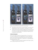
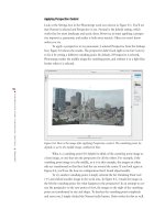
Figure 5.26: Just by applying Levels to the background, the image was improved (left).
Applying a Gaussian blur made the background less distracting (right).
3. This helped, but to give the picture more depth I applied a Gaussian blur to the
background (Filter
Blur Gaussian Blur). I set the Radius at 13.5 pixels.
4. The label still needs selective burning and dodging, and the reflections at the top
of the bottles are too harsh. I’ll fix the harsh reflections later in the chapter, but
as you can see on the right in Figure 5.26, simplifying the background already
has significantly improved this shot.
Creating New Backgrounds
After you have isolated a product from its background, there is no reason why you
can’t insert any background you want. Backgrounds can come from another photo-
graph or purely from selective Photoshop Elements’ effects and a little imagination.
Some of the most effective backgrounds are a combination of a real photograph and a
Photoshop Elements filter or effect.
In Figure 5.27, you’ll see an example of a background created using a combina-
tion of a gradient fill adjustment layer and an effect.
4363_ch05_p4.qxd 10/10/04 11:40 PM Page 134
135
■ IMPROVING THE BACKGROUND
Figure 5.27: This background was quickly created using a gradient fill and an effect.
Here’s what I did to create the new background:
1. Starting with the car that I worked on previously, I selected and removed the
previous background titled
Color Fill 1 (Layer Delete Layer) and made a new
gradient background by clicking the Create Adjustment Layer icon ( ) at the
top of the Layers palette and choosing Gradient from the pop-up menu. (You
can also select Layer
New Fill Layer Gradient from the menu bar.)
2. From the various Gradient options, I chose the settings you see on the left in
Figure 5.28. To find the Silver gradient, I started by clicking the drop-down
arrow adjacent to the word Gradient in the Gradient Fill dialog box. Then,
when another palette of options opened, I clicked the arrow pointing to the
right. This brought up a drop-down menu with various options. I selected the
one called Metals. This loaded several icons into the palette. I chose the one
named Silver (the third one from the left—the name appears only when the cur-
sor is placed on top of the icon).
Figure 5.28: I chose the Silver gradient with the settings you see in the dialog box (left).
The Layers palette (right).
4363_ch05_p4.qxd 10/10/04 11:40 PM Page 135
136
CHAPTER
5:
BETTER PRODUCT SHOTS
■
3. I clicked and dragged the gradient adjustment layer to the bottom of the Layers
palette.
4. Making sure that the Citroen layer was active, I applied Colorful Center from
the Styles and Effects palette (choose Effects and then Image Effects from the
pop-up menus). You can see on the right in Figure 5.28 that the Colorful Center
effect created a duplicate layer and left the
Citroen layer intact.
The great thing about creating backgrounds this way is that they are totally
changeable. I can go back at any time and adjust the gradient adjustment layer or
remove an effect (
“All about Layers” in the appendix). My original image remains
unchanged.
Figure 5.29 illustrates how easy it is to go back and change a background creat-
ed this way. I simply selected the first layer in Figure 5.28 called
Gradient Fill; then in
the Styles and Effects palette I selected Layer Styles from the pop-up menu and
Complex from the other pop-up menu. Next I clicked the layer style called
Rainbow.
The Layers palette for this new image is shown on the right in Figure 5.29.
Figure 5.29: It’s easy to change or add to a background if it is created with an adjustment
layer (left). This is the Layers palette for the image (right).
4363_ch05_p4.qxd 10/10/04 11:40 PM Page 136
137
■ IMPROVING THE BACKGROUND
Modifying an Existing Background
The image shown on the left in Figure 5.30 is a mistake. My digital camera fired unex-
pectedly. Instead of erasing the blurred image, I kept it and then used it later to create
the background shown on the right.
Figure 5.30: This was a mistake (left), but I thought the image might have potential, so I
saved it. Later, I used it as the basis for this background (right).
This is what I did to modify the image:
1. I opened the image shown on the left in Figure 5.30 and chose Enhance Auto
Levels.
2. I applied the Add Noise filter (Filters Noise Add Noise). I used the follow-
ing settings: Amount: 57, Distribution: Gaussian.
3. I applied the Radial Blur filter (Filters Blur Radial Blur) and used the fol-
lowing settings: Amount: 22, Blur Method: Zoom, Quality: Best. The results are
shown in Figure 5.31.
Figure 5.31: The image after applying the Add Noise and Radial Blur filters and with a
1368 × 1676 pixel selection.
4363_ch05_p4.qxd 10/10/04 11:40 PM Page 137
138
CHAPTER
5:
BETTER PRODUCT SHOTS
■
4. I opened a new image of a bag and noted its pixel dimensions, 1368 × 1676.
5. Now, with the Mistake image, I selected the Rectangular Marquee tool ( )
from the toolbox and in the options bar I changed Style from Normal to Fixed
Size. Then in the Width box I typed 1368 and in the Height box I typed 1676. I
then made a selection, placing the constrained Rectangular Marquee over the
area that I wanted. I made a copy of this selection (Ctrl+C / +C).
6. I pasted the Mistake selection into the bag image (Ctrl+V / +V). It fit perfect-
ly. I made sure that the
Mistake image layer was below the one containing the
bag. You can easily move layers into different positions (
“All about Layers”
in the appendix).
7. I added a drop shadow to the bag and I was done (
“Adding Depth,” next).
Shooting Digital: Are You Sure You Want to Delete?
One of the great features of digital cameras is the capability to erase shots you don’t like. A
word of caution: as you’ve seen throughout this book, there are many ways to use a digital
photo. Think before you erase an accidental shot of the pavement, because it could be used
as an interesting background. Think before you erase a picture that is inherently boring but
could conceivably be used in a collage. Think before you erase a bad photo of Uncle Jimmy,
because the good shot of Aunt Annie next to him could be used for something else. Instead
of always erasing, consider investing in more memory for both your camera and computer
and building a digital library of those potentially useful “throwaways.”
Adding Depth
After you’ve found a background, you need to give your image a sense of depth. An
easy way to do this is to make a clear distinction between the foreground object and
the background. Assuming you’ve isolated your object from the background, you can
do this by creating a drop shadow or other layer style.
Drop Shadows
Drop shadows are commonly used to create a sense of depth. Here’s what I did to
replace the background, rotate, and add a drop shadow to the image shown in
Figure 5.32.
4363_ch05_p4.qxd 10/10/04 11:40 PM Page 138
139
■ ADDING DEPTH
Figure 5.32: The original digital camera shot.
1. I selected and removed the background by using the Magic Eraser ( )
(
“Separating a Product from Its Background,” earlier in this chapter). I
rotated the image to the right (Image
Rotate 90° Right).
2. I created a new background by clicking the Create Adjustment Layer icon ( )
at the top of the Layers palette and choosing Solid Color from the pop-up
menu. I chose white. (Alternatively, you can choose Layer
New Fill Layer
Solid Color from the menu bar.)
3. With the layer called Bag selected, I chose a drop shadow from the Styles and
Effects palette (Layer Styles from the first pop-up menu and Drop Shadows
from second pop-up menu). I applied a drop shadow called Soft Edge by simply
clicking its icon. After the drop shadow was applied, an
f symbol appeared in
the
Bag layer in the Layers palette. I double-clicked the f, which opened the
Style Settings dialog box. (Choosing Layer
Layer Style Layer Settings also
brings up this dialog box.) From this box, I tweaked the drop shadow by using
the settings shown on the left in Figure 5.33. The Layers palette is shown on the
right. The final image is shown in Figure 5.34.
Figure 5.33: These are the settings I used for my drop shadow (left). The Layers palette
shows the new background and layer with the drop shadow layer style attached (right).
4363_ch05_p4.qxd 10/10/04 11:40 PM Page 139
140
CHAPTER
5:
BETTER PRODUCT SHOTS
■
Figure 5.34: The final image.
Outer Glow
You can use other layer styles such as Outer Glow to also make a distinction between
a product and its background, as you can see on the left in Figure 5.35.
Figure 5.35: Use Outer Glow styles to add depth to your image (left). These are settings I
used for my Simple Outer Glow (right).
To add depth with Outer Glow, I started with the previous example and then
did the following:
1. I changed the color of the background from white to black by clicking on the
layer thumbnail in the
Color Fill layer and choosing black from the Color Picker.
2. I deleted the drop shadow effect from the layer called Bag by selecting that layer
and then choosing Layer
Layer Style Clear Layer Style from the menu bar.
3. I applied an Outer Glow from the Styles and Effects palette to the layer called
Bag (choose Layer Styles from the first pop-up menu, then Outer Glows from
the second pop-up menu). I chose the Outer Glow called Simple. I used the set-
tings shown on the right in Figure 5.35.
4363_ch05_p4.qxd 10/10/04 11:40 PM Page 140
141
■ CREATING LIGHTING EFFECTS
Creating Lighting Effects
Effective lighting can give a product shot dimension and drama. If the interesting light-
ing isn’t there to begin with, you can use Photoshop Elements’ Lighting Effects filter to
create it. Figure 5.36 shows how lighting effects can alter an original shot.
Figure 5.36: The lighting is even but uninteresting (left). With the help of the Lighting
Effects filter, the image is more dramatic (right).
This is what I did to create the effective lighting:
1. I selected the Lighting Effects filter (Filter Render Lighting Effects).
2. I applied the settings shown in Figure 5.37 and clicked OK.
Figure 5.37: These are the settings I used for the Lighting Effects filter.
4363_ch05_p4.qxd 10/10/04 11:40 PM Page 141
142
CHAPTER
5:
BETTER PRODUCT SHOTS
■
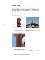
Softening Highlights and Glare
On the left in Figure 5.38 is a close-up of the wine bottles from a previous example
(
“Separating a Product from Its Background,” earlier in this chapter). You can tell
that the light source for the photograph was direct and harsh and not the soft, diffused
lighting often used by professional photographers. Fortunately, it is easy to fix this in
Photoshop Elements.
Figure 5.38: The reflections are harsh and need to be softened (left). With the help of the
Blur tool, the reflections are softer, more diffused (right).
All I did to get the results shown on the right in Figure 5.38 was select the Blur
tool ( ) from the toolbox and then click and drag it several times over the spots of
light. (The Blur tool shares the same spot on the toolbar as the Sharpen and Smudge
tools. Shift+R will cycle through the three tools.) I selected a soft-edged brush in the
options bar and left the Pressure set at 50 percent. The Mode was Normal.
4363_ch05_p4.qxd 10/10/04 11:40 PM Page 142
143
■ ADDING A NEW LABEL
Adding a New Label
Will Rutledge is a professional photographer and the manager of QVC Inc.’s photo
studio. QVC is an electronics retailer mostly known for its cable-shopping channel. As
you can imagine, Will shoots a lot of products. He mostly uses a high-end digital cam-
era and he often uses Photoshop to fix a photo because something isn’t quite right with
the product. Take, for example, the photo shown on the left in Figure 5.39. One of the
lipstick cases didn’t have a label. However, Will had another, similar shot of a different
lipstick case that did. He used Photoshop to copy and paste the label from one photo
to the other. Although he used Photoshop to do the job, everything he did can be done
in Photoshop Elements as well.
Figure 5.39: The vertical lipstick case didn’t have a label and it needed one (left). Will used
the Polygonal Lasso tool to select the label from an image of another case (right).
Here’s what Will did to fix the photo:
1. With both images open, Will used the Polygonal Lasso tool ( ) to select the
label from the image that had one. The right side of Figure 5.39 shows a close-
up of the lipstick case and Will’s selection.
Note: The Polygonal Lasso tool is similar to the Magnetic Lasso tool; however, you manu-
ally set endpoints for each straight segment (
“Selection Tools” in the appendix).
2. He then copied (Ctrl+C / +C) and pasted (Ctrl+V / +V) the selection onto
the second image. He used the Move tool ( ) from the toolbox to position the
label in place. (See Figure 5.40.)
3. Will then used the Eraser tool ( ) to erase parts of the pasted label so it blend-
ed nicely.
The final image is shown on the right in Figure 5.40.
4363_ch05_p4.qxd 10/10/04 11:40 PM Page 143
144
CHAPTER
5:
BETTER PRODUCT SHOTS
■
Figure 5.40: Will copied and pasted the label on this image (left) and then used the Move
tool to put it in place. The pasted label blended nicely after Will erased parts of it (right).
(Photo by Will Rutledge. Copyright 2000 QVC. Courtesy of Stacey Schiefflin of Models
Prefer Cosmetics.)
Making a Product Smile
Will Rutledge also took the product shot shown on the left in Figure 5.41, this time for
QVC’s annual report. He was given creative license to make the image fun, and that is
what Will did to make the image shown on the right.
Figure 5.41: A typical shot of an electrical outlet (left). A not-so-typical shot of an electrical
outlet, helped along by the 3D filter (right). (Photo by Will Rutledge. Copyright 2000 QVC.)
4363_ch05_p4.qxd 10/10/04 11:40 PM Page 144
145
■ MAKING A PRODUCT SMILE
1. Will used the Lasso tool ( ) to select one of the rectangular slots.
2. He copied and pasted his selection onto a separate layer. He rotated the slot
until it was horizontal by choosing Image
Transform Free Transform (see
Figure 5.42).
Figure 5.42: After copying and pasting the vertical slot, Will used a Transform command to
rotate it to a horizontal position (left). The 3D filter mapped Will’s selection to a sphere.
When he rotated the sphere, he got a smile (right).
3. With the layer containing the pasted, rotated slot selected, he opened the 3D fil-
ter (Filter
Render 3D Transform).
4. In the 3D Transform filter dialog box, Will selected the Sphere tool ( ) and
drew a circle tightly around the rectangular slot in the preview window. He
then clicked the Trackball tool ( ) and in the preview window rotated the ball
until he got a smile. Then he clicked OK. The result is shown on the right in
Figure 5.42.
5. Will used the Move tool ( ) from the toolbox to position his smile in place. He
then used the Eraser tool ( ) and Clone Stamp tool ( ) to make the smile
completely replace the old slot.
Who says life always has to be so serious?
4363_ch05_p4.qxd 10/10/04 11:40 PM Page 145
146
CHAPTER
5:
BETTER PRODUCT SHOTS
■
Simplifying a Product Shot
Converting a complex product shot into a simple line drawing can be useful for
brochures or instructional material. To simplify the shot shown on the left in Figure 5.43,
I applied the Photocopy filter with the foreground color set to black (Filter
Sketch
Photocopy). I also set the Detail at 14 and the Darkness at 33. The result is shown on
the right.
Figure 5.43: The original photo (left). A much simpler image after applying the Photocopy
filter (right). (Photo by Maurice Martell)
4363_ch05_p4.qxd 10/10/04 11:40 PM Page 146
147
■ SIMPLIFYING A PRODUCT SHOT
Shooting Digital: Creating Your Own Mini Photo Studio
It doesn’t take a lot of money or equipment to set up a mini photo studio in your office or
home. With the following setup, you’ll be able to shoot perfect photos of small objects such
as books, coins, jewelry, small appliances, or other objects that you want to place on an
online auction or prepare for a flyer or ad:
• A digital camera
• A white, seamless backdrop and a means to hold it
• Two diffused light sources
Look at the following diagram. The seamless paper is draped over a table. It’s important for it
to drape smoothly, or it will catch light and create unwanted shadows. Also notice how the
object to be photographed is set away from the edge of the paper. This also keeps shadows
at a minimum. Two diffused lights are enough for most situations. You can diffuse a light
source with a sheet of thick, translucent plastic or a window screen. Move the lights around
and try to make the light fall as evenly on the product as possible.
When you shoot, experiment with different angles. But remember to show as much of the
product as you can. The shot should be informative as well as interesting.
Where can you find the equipment for this mini studio? Professional photography supply
houses all carry the seamless paper, lights, and stands. Go to my website (
www.shooting-
digital.com
) for more resources.
Lights
Product
Bench
Seamless paper
with stands
Camera on tripod
4363_ch05_p4.qxd 10/10/04 11:40 PM Page 147
148
CHAPTER
6:
MAKING PHOTO
-
REALISTIC COMPOSITES
■
4363_ch06_p4.qxd 10/9/04 11:37 PM Page 148
149
■ MAKING PHOTO
-
REALISTIC COMPOSITES
6
Chapter Contents
Adding Yourself (or Anyone) to a
Group Shot
Combining Different Resolutions
Swapping Kids
Expanding Your Image
Seamlessly Pasting
Cloning Elements from Multiple
Images
Pre-visualizing a Scene
Making
Photo-Realistic
Composites
Composites are like tapestries woven together
from the fabric of more than one source. They
can be relatively simple to create (adding a
missing person to a group shot) or complex
(combining many images from many sources).
Creating a photo-realistic composite tests nearly
all of your Photoshop Elements skills, from
selecting to transforming, from cloning to man-
aging multiple layers. But when you’re finished,
you’ll have a single image visually richer than
the sum of its individual parts.
4363_ch06_p4.qxd 10/9/04 11:37 PM Page 149
150
CHAPTER
6:
MAKING PHOTO
-
REALISTIC COMPOSITES
■
Adding Yourself (or Anyone) to a Group Shot
I’m not in the shot shown on the left in Figure 6.1, but I wanted to be. It was one of
those typical situations when old friends gather and suddenly someone says, “Hey, let’s
get a group shot of everyone!”
Figure 6.1: I wanted to be in this shot (left), but someone had to take the picture. My wife
took this second shot with me in it (right).
I had my digital camera but no tripod and I couldn’t find anything high enough
to place the camera on for a self-timer shot. Instead, I took a shot of the group and
then my wife took a shot with me in it (shown on the right in Figure 6.1).
I left my spot open in the first shot so I could simply copy and paste myself
from one image into the other. Here’s how I did it:
1. I opened both digital images. Starting with the one that didn’t include me (I’ll
call this Image 1), I adjusted Levels to make the image look lighter, using
Enhance Adjust Lighting Levels.
2. I turned to the second shot, the one with me in it. I’ll call this Image 2. I wanted
the exact same Levels settings applied to Image 2 so the tonal values of my
upper body would match those of the other people in Image 1. I could have
noted my Input Levels settings in my Levels controls in Image 1, and with
Levels open for Image 2, typed them into the Levels Input boxes. Instead, I used
a neat shortcut that I learned from Will Rutledge at QVC, Inc. With Image 2
active, I pressed Ctrl+Alt+L / +Option+L. This shortcut automatically applied
the same adjusted Levels setting from Image 1 to Image 2, and I got exactly the
results I wanted. Cool. I could have continued applying Levels this way to an
entire batch of similar images, which would have been a real time-saver.
Another simple way to do this—suggested by my trusty assistant Ed Schwartz—
is to use an adjustment layer for Levels in Image 1 and then drag the adjustment
layer over to Image 2 to get the same adjustment (
“Adjustment and Fill
Layers” in the appendix).
3. OK, now on Image 2 I used the Lasso tool ( ) to make a loose selection, as
shown in Figure 6.2. At this point I wasn’t precise, and in fact, I purposely
included other areas of the image to help me position my pasted selection.
4363_ch06_p4.qxd 10/9/04 11:37 PM Page 150
151
■ ADDING YOURSELF
(
OR ANYONE
)
TO A GROUP SHOT
Figure 6.2: I made a loose selection with the Lasso tool and copied the selection.
4. I pasted my selection (Ctrl+V / +V) into Image 1, and Photoshop Elements
placed it automatically into its own layer. From the Layers palette, I set the
Opacity to 50 percent so I could see part of the underlying image. I then used the
Move tool ( ) to position the selection into place. I used part of my friend Joe’s
shoulder that I had included in my pasted selection as a reference (Figure 6.3).
Figure 6.3: I set my layer Opacity to 50 percent so I could see the underlying image.
Note: What is the difference between the Paste and Paste Into Selection commands found
on the main menu bar under Edit? Let’s say you select an expanse of sky by using the
Rectangular Marquee selection tool ( ) and then copy the selection. If you Paste this copy
into another layer or image, the entire rectangular selection will be pasted. In contrast, using
Paste Into Selection enables you to set different boundaries. Before you paste, say you make
a selection on the layer or image with, for example, the Elliptical Marquee selection tool ( ).
Then when you paste the rectangular selection from before by using the Paste Into Selection
command, the rectangular selection will appear bounded and defined by the selected circle.
You can use any of the selection tools and make any shape. Paste Into Selection will use that
selection as the parameteror mask, if you willfor your paste.
4363_ch06_p4.qxd 10/9/04 11:37 PM Page 151
152
CHAPTER
6:
MAKING PHOTO
-
REALISTIC COMPOSITES
■
5. Next came the tricky part. I reset my layer Opacity to 100 percent and used the
Eraser tool ( ) with a Hard Round 19 pixels brush to remove the superfluous
areas around my head and shoulders. Then I magnified my image from 100 per-
cent to 300 percent and used a Hard Round 9 pixels brush to erase any leftover
tidbits. At one point, when I was working on the area to my left, I momentarily
changed the layer Opacity back to 50 percent so I could tell where the face of
the man in front of me ended and my neck and shoulder started. I finished with
a Soft Round 13 pixels brush, brushing the edges of my pasted selection lightly
to make them blend into the background.
6. I didn’t bring my legs over from Image 1, so I just used the Clone Stamp tool
( ) to clone the shadow that was already there in Image 2. The final image is
shown in Figure 6.4.
Figure 6.4: Now the group is complete.
This composite was easy to make because Image 1 and Image 2 were so similar.
Creating a realistic composite is more difficult when you are working with shots taken
at different times, with different lighting, with different film, or at different pixel reso-
lutions. The next section shows you how to work with images of different resolutions.
Also, later in this chapter you’ll learn more about keeping composites in mind while
taking pictures (
“Shooting Digital: Creating Realistic-Looking Composites”).
Note: Copying, pasting, and other tasks associated with creating composites can take up
a lot of memory, and at some point the performance of Photoshop Elements could become
noticeably compromised. If this happens, you can free up more memory by using the Clear
command (Edit
Clear). You’ll have a choice of which item type or buffer you want to clear:
Undo History, Clipboard Contents, or All. If the item type or buffer is dimmed, it just means it
is already empty. You should use the Clear command only as a last resort because it can’t be
undone.
Combining Different Resolutions
Look at Figure 6.5. You can’t easily tell by looking at the printed page, but the image
on the left was taken with a 6 megapixel digital camera that produced an image with a
pixel resolution of 2000 × 3008. The image on the right has a pixel resolution of only
1000
× 1504. Figure 6.6 shows what happens when I select the girls from the larger
4363_ch06_p4.qxd 10/9/04 11:37 PM Page 152
153
■ COMBINING DIFFERENT RESOLUTIONS
file and paste them into the smaller one. The selection from the larger image
“swamps” the smaller target image.
Figure 6.5: The image on the left has a pixel resolution of 2000 × 3008, while the target
image on the right has a resolution of only 1000
× 1504.
Figure 6.6: This is what happens when a selection from the larger file is pasted on the
smaller one.
4363_ch06_p4.qxd 10/9/04 11:37 PM Page 153
154
CHAPTER
6:
MAKING PHOTO
-
REALISTIC COMPOSITES
■
How can I scale the selection to fit? Here are two ways:
A. Scale the entire larger image file down before selecting and pasting to the small-
er image.
B. Use the Resize command (Image Resize Scale) after selecting and pasting
part of the larger image into the smaller one.
I’ll get to option B in a minute. If you choose option A, here are the steps:
1. With both images open, select the smaller, target image by clicking anywhere on
the image window with your cursor.
2. Determine the pixel resolution of the smaller, target image. Do this by choosing
Image
Resize Image Size from the menu bar and noting the Width or
Height in the dialog box. Figure 6.7 shows the Image Size dialog box. (You
need only the width or the height, not both. And you don’t need to note the
number next to Resolution; this is relevant mostly when printing.) You can also
get the image size by right-clicking the top outside edge of the image window
(Windows) or by Option+clicking in the box next to the percentage readout, at
the bottom left of the image window (Mac). You can also get the image size by
going to the Info palette (Window
Info).
3. Select the larger image. Choose Image Resize Image Size from the menu
bar. Enter a Width or Height value as determined by the smaller image. If
Constrain Proportions is selected, Photoshop Elements will automatically calcu-
late the corresponding width or height. Make sure the Resample Image check
box is also selected in the Image Size palette. If you leave the sampling method
at its default Bicubic setting, you’ll get good results. You might get better results
if you select Bicubic Sharper from the pop-up menu. Bicubic Sharper preserves
crisp edge transitions and works best when you are resampling down. Bicubic
Smoother, another option, suppresses image noise and is a good choice when
you resample up to a larger pixel resolution.
4. Click OK in the Image Resize dialog.
Figure 6.7: The Image Size dialog box. Make note of the Width or Height dimensions.
When resizing, make sure the Resample Image check box is selected.
4363_ch06_p4.qxd 10/9/04 11:37 PM Page 154
155
■ COMBINING DIFFERENT RESOLUTIONS
Note: You can also use the Crop tool to resize one image to match the size of another.
With the target image open and selected, simply select the Crop tool from the toolbar ( ).
In the Crop tool options bar, click the Front Image button. Photoshop Elements will automati-
cally insert the dimensions of the selected image in the Width and Height boxes also located
in the options bar. Now click on another image. Apply the Crop tool. It will automatically
apply the values of the previously selected image to the one you are working on. Be sure to
select Clear from the options bar when you are finished. If you don’t, the next time you use
the Crop tool it will apply the same settings even if you don’t want it to.
After your larger image has been resampled to match the target image, you can
use any of the various selection tools to select the part of the image you want to copy
and paste. (I used the Lasso tool to select the two girls.) Next you can copy (Ctrl+C /
+C) and paste (Ctrl+V / +V) onto the target image. Alternatively, you can
Ctrl+click and hold ( +click and hold on Mac) and drag the copied selection to the
target image. Either way, a copy of the selection will appear on a layer of its own. You
can use the Move tool ( ) or arrow keys to precisely position the selection. If you
need to tweak the size of the selection to get it just right, use the method described
next (Image
Resize Scale). Just be sure the layer containing the pasted image is
selected. Figure 6.8 shows the final composite.
Figure 6.8: The final composite after matching resolutions.
A word of warning: don’t inadvertently close and save the resized image. You’ll
end up throwing away a lot useful image data.
4363_ch06_p4.qxd 10/9/04 11:37 PM Page 155
156
CHAPTER
6:
MAKING PHOTO
-
REALISTIC COMPOSITES
■
If you choose option B, use these steps:
1. On the larger image, select and copy (Ctrl+C / +C) the desired element(s).
2. Paste (Ctrl+V / +V) or Ctrl+click / +click, hold, and drag the copied selec-
tion to the target image. It’s likely, because of the discrepancy in image size, that
your pasted selection will block most or all of the target image, as it did in my
example in Figure 6.6.
3. Choose Image Resize Scale from the menu bar. Normally you could simply
point your cursor to one of the bounding boxes located at the corners of the
selection and click, hold, and drag the selection to a desired size. Because the
pasted selection is so large relative to the target image, the bounding boxes are
often not visible. Instead, go to the options bar (Figure 6.9). Point your cursor
to the space between the Width and Height boxes and click on the linked chain.
This will lock the width and height together, maintain a fixed aspect ratio, and
thereby prevent distortion. Now type in a percentage in either box. Start with
25 percent. Because you’ve locked the width and height together, you need to
type in only one box. You might need to type in a lower percentage depending
on the size of the pasted selection.
4. At some point, with enough reduction, the bounding boxes at the edges of the
selection will become visible. You can now point your cursor at one of the
boxes and click, hold, and drag the selection to the desired size. Hold the Shift
key when you drag to constrain the dimensions. You can also move the selection
into place by placing your cursor in the middle of the selection and then click-
ing, holding, and dragging. After you are finished, select the Commit button in
the options bar or hit the Enter/Return key.
Figure 6.9: The Scale options bar. Note the chained link between the Width and Height
boxes. Select this link to maintain a fixed aspect ratio and prevent distortion when you
enter percentage values.
4363_ch06_p4.qxd 10/9/04 11:37 PM Page 156
157
■ SWAPPING KIDS
Swapping Kids
Children will be children. Some children like to be tossed up in the air, and others
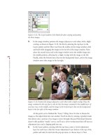
don’t. Photographer Maggie Hallahan couldn’t get the kid on the left in Figure 6.10 to
be thrown in the air, look at the camera, and smile all at once. What a surprise! But
everything else about the picture was fine, so Maggie tried another tack. She shot the
other photo shown in Figure 6.10, this time with an older child who smiled but wasn’t
keen on being thrown in the air. Maggie’s client was PJA, an advertising and marketing
agency in San Francisco.
Figure 6.10: Everything about this picture was fine, except for the kid (left), who was great
but didn’t like being thrown in the air. A second picture (right) provides a replacement child
for the composite. (Photos by Maggie Hallahan)
Back at the computer, PJA Photoshop pro Bretton Newsom went to work with
Photoshop, putting the best parts of Maggie’s two shots together. I talked with Bretton
before he finished the final composite, and he agreed to walk me through the steps
he’d taken so far on a low-resolution file. It should be noted that Bretton, like most
pros, works with the full version of Photoshop. However, just about everything he did
in this example can be duplicated in Photoshop Elements.
Here are the steps Bretton took to create the composite:
1. He used the Clone Stamp tool ( ) to remove the child in the first image (shown
on the left side of Figure 6.11).
4363_ch06_p4.qxd 10/9/04 11:37 PM Page 157
158
CHAPTER
6:
MAKING PHOTO
-
REALISTIC COMPOSITES
■
2. He went to the image of the smiling older kid and created a precise selection
around the child by using a Quick Mask—a function not available in Photoshop
Elements. Fortunately, the program has a roughly equivalent tool: the Selection
Brush tool ( ). For more on using the Selection Brush tool and other selection
tools, see the appendix. After the kid was selected, Bretton copied the selection
and pasted it into its own layer in the first image, as shown on the right in
Figure 6.11. He used the Move tool ( ) to position the pasted selection into
the outstretched arms of “mom.”
Figure 6.11: Bretton used the Clone Stamp tool to remove the first child (left). After select-
ing and copying the second child, Bretton pasted the smiling child into the outstretched
arms of “mom” (right).
3. As you can see in Figure 6.11, the woman’s arm is covered by the pasted image
of the child. So Bretton copied and pasted part of the woman’s arm and shoul-
der, as shown on the left in Figure 6.12. He placed the layer containing the arm
and shoulder above the layer containing the smiling child, which put the arm
and hand in the correct position relative to the child. You can see Bretton’s
Layers palette in Figure 6.12. (Alternatively, he could have selectively used the
Eraser tool on the child to reveal the woman’s left arm.)
4363_ch06_p4.qxd 10/9/04 11:37 PM Page 158