IELTS EXPERT WRITING TASK 1 (basic) - PINES INTERNATIONAL ACADEMY
Bạn đang xem bản rút gọn của tài liệu. Xem và tải ngay bản đầy đủ của tài liệu tại đây (2.99 MB, 111 trang )
PIA IELTS GUARANTEE COURSE
Writing Task 1 Academic
TABLE OF CONTENTS
INTRODUCTION ----------------------------------------------------------------------------------------
2
WRITING INTRODUCTION IN TASK 1 ----------------------------------------------------------
6
LINE GRAPH ----------------------------------------------------------------------------------------------
10
OVERVIEW -----------------------------------------------------------------------------------------------
11
PREPOSITIONS FOR GRAPHS ----------------------------------------------------------------------
14
BODY PARAGRAPH ------------------------------------------------------------------------------------
17
BAR CHART -----------------------------------------------------------------------------------------------
27
PIE CHART ------------------------------------------------------------------------------------------------
37
TABLE ------------------------------------------------------------------------------------------------------
48
DIAGRAM -------------------------------------------------------------------------------------------------
57
MAP ----------------------------------------------------------------------------------------------------------
70
MULTIPLE CHARTS -----------------------------------------------------------------------------------
80
APPENDIX
TASK 1 QUESTIONS -------------------------------------------------------------------------------
89
SAMPLE ----------------------------------------------------------------------------------------------- 100
REFERENCE ----------------------------------------------------------------------------------------------
109
1
INTRODUCTION
IELTS ACADEMIC WRITING TASK 1
The Writing Task 1 of the IELTS Academic test requires you to write a summary of at least
150 words in response to a particular graph, table, chart, or process (how something works,
how something is done). This task tests your ability to select and report the main features, to
describe and compare data, identify significance and trends in factual information, or
describe a process.
QUESTION TYPES
TYPE
2
PURPOSE
Line graph
Analyze movement
Bar chart
Compare size
Table
Analyze changes in different categories
Pie chart
Compare proportion
Diagram
Process / Procedure
Map
Compare changes / Compare options
Multiple charts
Same topic with different data
HOW TO PRESENT YOUR REPORT
The report should have three to four paragraphs. The paragraph should include an
introduction, an overview (a summary) of the information and two (body) paragraphs that
show details. There is no need for a conclusion.
BASIC STRUCTURE GUIDE
This is a skillful paraphrase of the question. Skillful means you
will need to substitute words with synonyms and restructure the
sentence.
INTRODUCTION
For example
Question: The diagram below shows the various stages involved
in the production of beer.
Paraphrase: The given flow chart describes the process of
brewing beer.
The overview is a two-sentence paragraph that identifies and
reports on the main features of the figure. It is very important as
it shows the examiner that you have understood the data
presented.
OVERVIEW
(very important)
Do not give any details of the data. Pick two of the most notable
aspects of the figure and write one sentence about each. These
should be topics of your body paragraphs.
An overview can be included in the introduction paragraph.
Starts with ‘In brief, ’
The body paragraphs are where you put the details of the
information.
Do not try to explain all the given data. You just need to include
the main details and group similar data together.
BODY PARAGRAPH
1&2
You have to identify and show major changes or differences, any
trend, and anything else that is interesting or unusual.
Make comparisons and contrasts where possible.
Use a variety of language and complex sentences.
Remember to use sequencing language when describing a
process.
In some cases, you can have three body paragraphs.
starts with ‘Turning to the detail, ’ or ‘Moving to the detail, ’
3
TIPS
1) You should spend no more than 20 minutes on writing task 1 and you should write at
least 150 words.
2) Look at the figure carefully and decide what information you will include.
3) Plan your answer briefly. It is okay to spend up to 5 minutes doing this, but no more.
4) Remember to have one paragraph dedicated for interpreting the graph/chart/diagram
(an overview).
5) Stick to what you can see on the graph. Do not give your opinion.
6) Use adverbs and adjectives to give life to your descriptions.
Ex) ‘the student population dropped over two years’ vs ‘the student population
dropped markedly over two years’.
7) Use synonyms and paraphrases where possible. Try not to repeat words.
8) Decide what tense to write in. (past/present/future)
9) Try to group smaller/less important numbers together and then describe them in that
group.
Ex) ‘Tidal, solar and wind energy all showed modest rises over the period, making up
about one tenth of Australia’s power production.
RECOMMENDED TIME FRAME FOR TASK 1
4
1. Look at resources
1min
2. Plan (identifying and grouping)
2mins
3. Paraphrase introduction
2mins
4. Overview
3mins
5. Body 1
5mins
6. Body 2
5mins
7. Grammar check
2mins
THE MARKING CRITERIA
Task Achievement
- This criterion assesses how appropriately, accurately and relevantly the response
fulfills the requirements set out in the task, using a minimum of 150 words
Coherence and Cohesion
- This is concerned with the overall clarity and fluency of the message: how the
response organizes and links information, ideas and language.
Coherence – refers to the linking of ideas through logical sequencing
Cohesion – refers to the varied and appropriate use of cohesive devices
Lexical Resource
- This refers to the range of vocabulary the candidate has used and the accuracy
and appropriacy of that use in terms of the specific task.
Grammatical Range and Accuracy
- This criterion refers to the range and accurate use of the candidate’s grammatical
resource
5
WRITING INTRODUCTION IN TASK 1
You need to begin with one or two sentences that state what the IELTS writing task 1 shows.
To do this, paraphrase the title of the graph, making sure you put in a time frame if there is
one.
Paraphrasing in Task 1
Being able to paraphrase sentences is an essential skill for gaining high scores in
IELTS exam. There are two methods of paraphrasing: using synonyms of key words
and altering grammatical structures. When you are just starting out just try to use
synonyms as this is the easiest method.
Be careful, though, that you use an appropriate synonym so you stay in context. As
you perfect the use of synonyms, start playing with grammatical structures by
swapping subjects and objects and also using relative clauses. Practice this skill as it
will definitely make task one easier.
Paraphrase example
Question
The chart below shows the number of hours studied per night by school students in
Australia based on age.
Paraphrase
The given graph illustrates the data about how long Australian school students, of varying
ages, study per night.
6
INTRODUCTORY EXPRESSIONS:
STARTING
PRESENTATION
VERB
DESCRIPTION
TYPE
The given
diagram / table
shows / represents / the comparison of..
supplied
/ figure / illustration
depicts / enumerates /
differences..
presented
/ graph / chart / flow
illustrates / presents /
changes..
shown
/ picture /information gives / provides /
describes / expresses /
/ presentation / data
outlines/ compares and
/ process
contrasts/ gives data on
provided
/ gives information on /
presents
about
/
information
shows
data
number of..
information on..
data on..
proportion of
amount of..
information on..
about / demonstrates /
data about..
outlines / summarizes
percentages of..
FOR DIAGRAM (shows process/steps)
-
The series of images highlight the stages of
-
The diagram highlights the process by which
7
Warm Up
Practice 1
The following chart describes the enthusiasm levels of students in filling in their vocabulary
books over the duration of a course.
______________________________________________
______________________________________________
______________________________________________
Practice 2
The graph below shows the unemployment rates in the US and Japan between March
1933 and March 1999.
______________________________________________
______________________________________________
______________________________________________
Practice 3
The graph below shows how many minutes US elementary school students spent walking
and bicycling each day in 1977, 1990 and 2001.
______________________________________________
______________________________________________
______________________________________________
8
Practice 4
The table below shows the number of museum patrons by age between 1997 and 2003.
______________________________________________
______________________________________________
______________________________________________
Practice 5
The chart below shows the literacy rates of three different continents between 1930 and
2000.
______________________________________________
______________________________________________
______________________________________________
Practice 6
The graph below shows the consumption of meat in Spain between 2001 and 2011.
______________________________________________
______________________________________________
______________________________________________
9
LINE GRAPH
Lexical Resources for Line Graph
Language of Change
MOVEMENT
INTENSITY
DIRECTION
↗
↘
ADJECTIVE
creep up
creep down
slight
slightly
upward
escalate
shrink
moderate
moderately
flattening
increase
decrease
relative
relatively
leveled off
rise
fall
considerable
considerably
fluctuate
incline
decline
significant
significantly
downward
ascend
descend
substantial
substantially
hike
recede
steady
steadily
surge
plunge
consistent
consistently
shoot up
drop
continuous
continuously
ADVERB
Can be used for different types of chart, graph, table and diagram.
Sample Phrases / Collocations
10
Sales crept up for two
years
Sales leveled off for the
next 10 years
upward tendency
Sales surged substantially
There was a significant
rise in 1990
constant decline
Sales shrank continuously
Sales decreased with
fluctuations
flattening trend
Sales fluctuated through to
the next 10 years
a slight increase
descending trend
OVERVIEW
The overview is a two sentence paragraph that identifies and reports on the main features
or trends of the figure. It is very important as it shows the examiner that you have
understood the data presented.
Example
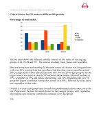
The line graph below shows changes in the amount and type of fast food consumed by
Australian teenagers from 1975 to 2000.
Consumption of fast food by Australian Teenagers
Number of times eaten per year
120
100
80
60
Pizza
40
Fish n Chips
Hamburger
20
0
1975
1980
1985
1990
1995
2000
YEAR
One thing that stands out in this graph is that one type of fast food fell over the period, whilst
the other two increased, so this would be a good overview.
Overview
In brief, the consumption of fish and chips declined over the period, whereas the amount of
pizza and hamburgers that were eaten increased.
This covers the main changes that took place over the whole period
11
Warm Up
Practice 1
The graph below shows the rate of smoking per 1000 people in Someland from 1960 to
2000.
Per 1,000 People
700
600
500
400
Men
300
Women
200
100
0
1960
1965
1970
1975
1980
1985
1990
1995
2000
Rates of smoking in Someland
Introduction
______________________________________________
______________________________________________
______________________________________________
Overview
______________________________________________
______________________________________________
______________________________________________
______________________________________________
12
Practice 2
The graph below shows flu rate for males and females in a large country town in June
1996.
Flu Rates for Males & Females, 1996
4000
No. of cases of flu
3500
3000
2500
2000
Males
1500
Females
1000
500
0
Feb
Mar
Apr
May
Jun
Jul
Aug
Sep
Oct
Nov
Dec
Introduction
______________________________________________
______________________________________________
______________________________________________
Overview
______________________________________________
______________________________________________
______________________________________________
______________________________________________
13
PREPOSITIONS FOR GRAPHS
1. It is very important that you know how to correctly use prepositions in the IELTS writing
task 1.
2. Certain prepositions go with certain words when you use the language of change.
3. If you put them in the wrong place or use the wrong preposition, you may confuse what
you are trying to say.
First, take a look at this graph model answer and notice how some of the prepositions
are used. They have been highlighted in bold.
14
Sample Task 1 Answer
The line graph compares the number of car thefts for every thousand vehicles in four
countries from 1990 to 1999. In brief, it can be seen that car thefts were far higher in Great
Britain than in the other three counties throughout the whole time frame.
To begin, car thefts in Sweden, France and Canada followed a fairly similar pattern over the
first five years, all remaining at between 5 and 10 per thousand. The general trend though
for France and Canada was a decline in the number of vehicles stolen over the period, with
both at around 6 in 1999. In contrast, Sweden experienced an upward trend, starting the
period at approximately 8, and finishing at just under 15.
Interestingly, car thefts in Great Britain started at 18 per thousand, which far exceeded that of
the other countries. It then fluctuated over the next nine years, reaching a peak of 20 thefts
per 1000 in 1996, and ending the period slightly lower than where it began, at approximately
17 per thousand.
15
Practice
Now, take a look at the sentences below. Decide which preposition from the box should go in
the gap and write it in.
with
at
in
by
at
to
between
from
to
of
1. In May, the price of gold rose slightly ________ $1,500.
2. Holidays to foreign destinations remained constant ________ about 85,000 per month for
the last two months of the year.
3. Profits increased ________ 4 million dollars to 6 million dollars last year.
4. From 2001 to 2010, the price of electricity has increased ________ 125%.
5. Bike sales reached a peak ________ 20,000 in September.
6. There is a sharp increase in traffic levels from 8am to 9am, ________ nearly 3000 cars
traveling on the road.
7. The last decade has seen a steep increase ________ the number of people diagnosed
with diabetes.
8. At the start of the year, the turnover of the company stood ________ £1.3 million.
9. During the summer, student numbers at the school fluctuated ________ 150 and 170 per
week.
10. Following this, the number then fell ________ a low of 20 per month.
16
BODY PARAGRAPHS
1. In body paragraphs, you can give more specific detail of the chart, graph or diagram.
2. When you give the detail in your body paragraphs, you must make reference to the data.
3. The key to organizing your body paragraphs for writing task 1 is to group data together
where there are patterns.
4. To do this you need to identify any similarities and differences.
Example
The line graph below shows changes in the amount and type of fast food consumed by
Australian teenagers from 1975 to 2000.
Consumption of fast food by Australian Teenagers
Number of times eaten per year
120
100
80
60
Pizza
40
Fish n Chips
Hamburger
20
0
1975
1980
1985
1990
1995
2000
YEAR
What things are similar and what things are different in the graph?
: As we have already identified in the overview that pizza and hamburgers were following
a similar pattern, but fish and chips were different. On this basis, you can use these as
your ‘groups’, and focus one paragraph on fish and Chip (body 1) and the other one on
pizza and hamburgers (body 2).
17
BODY 1
Fish and chips
1975: most popular fast food / 100 times
1980 – 1985: brief rise
1985 – 2000: gradually declined / under 40 in 2000
Here is an example of the first paragraph:
“Turning to the detail, in 1975, the most popular fast food with Australian teenagers was
fish and chips, being eaten 100 times a year. This was far higher than Pizza and
hamburgers, which were consumed approximately 5 times a year. However, apart from a
brief rise again from 1980 to 1985, the consumption of fish and chips gradually declined
over the 25 year timescale to finish at just under 40.”
As you can see, the focus is on fish and chips. This does not mean you should not
mention the other two foods, as you should still make comparisons of the data as the
question asks.
BODY 2
Pizza
1975 – 1995: increased gradually / overtook
the consumption of fish and chips in 1990
1995 – 2000: leveled off
Hamburger
1975 – 1990: increased sharply / exceeding
fish and chips in 1985
2000: finished at the same level that fish and
chips began / 100 times
The second body then focuses on the other foods:
“In sharp contrast to this, teenagers ate the other two fast foods at much higher levels.
Pizza consumption increased gradually until it overtook the consumption of fish and chips
in 1990. It then leveled off from 1995 to 2000. The biggest rise was seen in hamburgers as
the occasions they were eaten increased sharply throughout the 1970’s and 1980’s,
exceeding that of fish and chips in 1985. It finished at the same level that fish and chips
began, with consumption at 100 times a year.”
18
FULL MODEL ANSWER
This line graph illustrates the comparison data about the fast food consumption of teenagers
in Australia between 1975 and 2000, a period of 25 years. In brief, the consumption of fish
and chips declined over the period, whereas the amount of pizza and hamburgers that were
eaten increased.
Turning to the detail, in 1975, the most popular fast food with Australian teenagers was fish
and chips, being eaten 100 times a year. This was far higher than Pizza and hamburgers,
which were consumed approximately 5 times a year. However, apart from a brief rise again
from 1980 to 1985, the consumption of fish and chips gradually declined over the 25 year
timescale to finish at just under 40.
In sharp contrast to this, teenagers ate the other two fast foods at much higher levels. Pizza
consumption increased gradually until it overtook the consumption of fish and chips in 1990.
It then leveled off from 1995 to 2000. The biggest rise was seen in hamburgers as the
occasions they were eaten increased sharply throughout the 1970’s and 1980’s, exceeding
that of fish and chips in 1985. It finished at the same level that fish and chips began, with
consumption at 100 times a year.
(203 words)
19
COMPARING OR CONTRASTING
A. SIMILARITY
1. similarly
2. in the same way
3. both…and…
4. also
5. likewise
6. the same
7. as well as
8. just as x, y….
9. equally
10. in a similar way
11. not only.. but also..
12. like x, y..
B. CONTRAST
1. but
2. however
3. nevertheless
4. yet
5. on the other hand
6. unlike
7. while
8. whereas
9. although
10. even though
11. as opposed to
12. in contrast to
13. by contrast
14. instead of
20
DESCRIPTIVE WORDS
1. It is important to be able to describe changes on any chart, especially when given multiple
charts.
2. Cleverly worded change gives your description life and shows the examiner that you
understand the dynamic of the graph.
3. There is a range of describing words available to you: noun, verbs, adverbs and adjectives.
4. The effect of these words can make a big difference to your score as they are attributed to
your Lexical Resources, Grammatical Range and also Cohesion.
Let’s have a look at some bad and good examples.
Question:
The graph below shows the average student numbers of an elementary school from
the 1950’s to the 2000’s.
Average Number of Students
700
Student numbers
600
500
400
300
200
100
0
1950's
1960's
1970's
1980's
1990's
2000's
21
A poor answer
The line starts at about 650 then goes down to 600 in the 1960’s till the 1970’s. It then
goes down a long way through the 1970’s ending at 250 by the 1980’s. It then goes up
over the next two decades finishing at about 350 in the 2000’s.
The problem with this answer is that it is not particularly academic.
The words ‘up’ and ‘down’ are quite simple and do not accurately describe what is
happening.
The graph is also described quite literally by using the word ‘line’ rather than
relating it back to student numbers.
It is incredibly boring to read as there are very few descriptive words to give life to
the chart.
A better answer
As the graph shows, the school had its highest average of students in 1950 at around
650. This number then dropped slightly over the next decade to about 600 at which
point enrollments leveled off through to the 1970’s. From 1970’s until the 1980’s, the
amount of students plunged, bottoming out at close to 250. After that, however, the
student number rose steadily to roughly 350 by the 2000’s.
In this example, the use of adjectives and adverbs in combination with nouns and
verbs add life to the chart, making the report flow better, easier to understand and
more interesting to read.
Some examples are the use of: plunged, dropped slightly, bottoming out, rose
steadily, and leveled off.
22
Warm Up
Practice 1
The graph shows the rate of smoking in Someland.
Summarize the information by selecting and reporting the main features, and make
comparisons where relevant.
NOTE
23