Tài liệu Web Application Design Patterns- P5 pdf
Bạn đang xem bản rút gọn của tài liệu. Xem và tải ngay bản đầy đủ của tài liệu tại đây (2.31 MB, 30 trang )
CHAPTER 4 Application Main Page
106
requires effort on the users ’ part. Therefore, if it’s possible to infer their needs
and content can be personalized — for example, based on information provided
by them — consider complementing customization with PERSONALIZATION
approaches.
BLANK SLATE
Problem
Many web applications start out empty because they rely on users to pro-
vide data (e.g., a defect-tracking application, online calendar, to-do list, etc.).
Although the application pages will fi ll up eventually, the fi rst time users access
the application (or a new functionality within the application) they’ll see an
empty page — a “ blank slate. ” They may be confused as to what to do next and
may get an impression that the application is not working as desired when they
see a page without content.
Solution
On the blank-slate page, answer questions that fi rst-time users would have such
as how to get started, what to do next, and what will the page look like when
fi lled in with data (37signals, 2006). This can be accomplished by explaining
to users the best ways to get started via tutorials and help texts and/or show a
typical screenshot of the page fi lled with content ( Figure 4.32 ).
Why
Any guidance that can be offered to users during their initial interaction with a
web application makes them feel comfortable with the application and helps
them get started quickly. In addition, when faced with an empty page, users
may fi nd it diffi cult to determine scope and the extent of functionality offered
by the web application, thus limiting the degree to which they are able to inter-
act with the application.
Having a blank-slate page serves several purposes for users: it sets appropriate
expectations, encourages taking action, familiarizes them with what the page
will eventually look like, and creates a positive fi rst impression of the applica-
tion (Hoekman, 2008; 37signals, 2006).
How
An important design feature of an effective blank-slate page is one or more
prominently displayed action(s) that would remove the blank slate and get
users familiar with the application ( Figure 4.33 ).
The actions may be accompanied by messages informing users why they are
not seeing any content. For example, Basecamp uses messages such as “ Create
the fi rst writeboard for this project ” with “ fi rst ” implying that users have not
created a writeboard ( Figure 4.34 ).
107
OFFER USERS RELEVANT TUTORIALS OR DEMOS
Make users understand the steps involved in using a web application or a piece of
functionality by offering them tutorials or demos (see Figure 4.34 ). Make them
targeted and short in duration so that users can start using the application quickly.
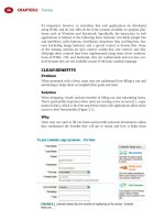
Blank Slate
FIGURE 4.32
Blinksale, an invoice management application, provides a brief explanation
of the dashboard and shows an example dashboard page demonstrating to users what the
dashboard will look like when fi lled in.
FIGURE 4.33
On its blank-slate page, Box.net offers users several options (e.g., create a new
folder, create a new collaboration folder) to get started. It also offers an option to “ Watch video
demo. ”
CHAPTER 4 Application Main Page
108
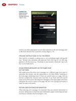
FIGURE 4.34
Basecamp shows the message “ Create the fi rst writeboard for this project ” to
indicate that users haven’t created any writeboards. It also shows what a writeboard looks like and
offers users a video demo (approximately 2 minutes) to learn more about writeboards.
FIGURE 4.35
Blinksale uses both the “ Example ” watermark and dims the screenshot on the
blank-slate page.
109
SHOW USERS AN EXAMPLE SCREENSHOT
Set clear expectations of what the page will look like when fi lled by showing a
screenshot with sample content. Make it clear to users that they are not seeing
real data by inserting watermarks, such as “ Sample data ” or “ Example, ” or dim
the screenshot to make it recede into the background ( Figure 4.35 ).
ASSIST USERS IN THE INITIAL SETUP
If there are certain tasks users must do before they can use the web application,
offer options to guide them through the initial setup process. For example, for
a fi nancial application, users can be offered to set up accounts ( Figure 4.36 ).
Related design patterns
BLANK SLATE offers necessary guidance to new users of the application so that
they can become productive with the application quickly. The need for assisting
users does not completely go away after they have interacted with the applica-
tion and fi lled it with data. It’s important to continue assisting users throughout
their interaction with the application using CONTEXTUAL HELP, FREQUENTLY
ASKED QUESTIONS, and APPLICATION HELP (see the Web Help Appendix
at www.elsevierdirect.com/9780123742650 and the INPUT HINTS/PROMPTS
pattern in Chapter 2).
Blank Slate
FIGURE 4.36
Mint offers users help with initial account setup. They show the page without
content dimmed with some sample data to give users a general idea of what the “ Account ”
page will eventually look like.
This page intentionally left blank
111
INTRODUCTION
Designing navigation is about establishing relationships between various applica-
tion parts (i.e., content and functionality) and conveying their importance and
hierarchy to effi ciently and effectively facilitate completion of user tasks. This
includes organization, labeling, and presentation of content and functionality.
This chapter focuses on patterns related to the types of navigation systems and
their presentation; to learn about the organization and labeling of navigation sys-
tems, see Morville and Rosenfeld (2006), Kalbach (2007), and Fleming (1998).
Most web applications are organized hierarchically and thus allow users access
to its content and functionality using levels of navigation. At the highest level,
PRIMARY NAVIGATION, or global navigation , shows top-level categories or
groupings that users can access from anywhere within the application. By mak-
ing it available throughout the application, it also helps orient users within the
application. SECONDARY NAVIGATION, or local navigation , shows users sec-
ond and subsequent levels of navigation options for the selected primary nav-
igation option. In addition to primary and secondary navigations, users also
need a quick way to access a few key functions (e.g., login, logout, language
selector, etc.) and content (e.g., help, cart, account, etc.). Like primary naviga-
tion, these key functions and content areas need to be made available through-
out the application (UTILITY NAVIGATION).
Although primary and secondary navigation are useful in supporting an appli-
cation’s hierarchical structure, content in many applications is multidimen-
sional and does not afford a unique hierarchical navigation scheme. FACETED
NAVIGATION has emerged as an effective approach to allow maximum fl ex-
ibility and support a variety of tasks by offering the ability to navigate using
multiple attributes and not restricting users to only one (e.g., a facet) with
which to start navigation.
In addition to the hierarchical navigation approaches, users also benefi t from
nonhierarchical ways to access information using indexes, related items lists, rec-
ommendations, and so forth (SUPPLEMENTAL NAVIGATION). Supplemental
Navigation
CHAPTER 5 CHAPTER 5
CHAPTER 5 Navigation
112
navigation systems are intended not only as alternative ways of accessing
content but also to encourage exploration. More recent applications, especially
those that rely on user-generated and user-contributed content, allow users
to discover new content by offering a navigation approach based on folkson-
omies — a structure derived from user-provided labels describing application
content (TAG CLOUDS).
Another important function of navigation is that of orienting users and letting
them know where they are within the application. Support for orientation is
usually provided by location trails, commonly referred to as BREADCRUMBS.
While most application navigation is intended to get users to their desired
content or function, there are instances where navigation is used to help users
accomplish tasks by guiding them one step at a time (WIZARDS). This is par-
ticularly the case for infrequent, yet important, multistep tasks that have depen-
dencies that users may be unfamiliar with.
PRIMARY NAVIGATION
Problem
The most common functionality and high-level categories (or objects) within
web applications need to be readily available and understood by users.
Additionally, users should be able to navigate quickly among major sections
from anywhere within the web application.
Solution
Offer users a consistent way to navigate to main application functions and place
them in a consistent and salient manner on all application pages ( Figure 5.1 ).
Why
For web applications, primary navigation plays a crucial role in facilitating
navigation and orientation. It serves as both a table of contents by exposing
high-level application functions and an orientation mechanism that lets
users know where they are within the application’s structure (see also the
BREADCRUMBS pattern later in this chapter).
FIGURE 5.1
LinkedIn uses a tab-based approach that allows users access to important
application features and functionalities.
113
How
Place primary navigation either horizontally at the top of the page or verti-
cally running down the page, either on the left or right side. Web applications
have typically favored placing primary navigation horizontally ( Figure 5.2 );
Adkisson (2002) found that 87 percent (65 of 73 sites) of e-commerce appli-
cations placed the primary navigation horizontally at the top of the page. This
is understandable, since placing primary navigation vertically reduces avail-
able horizontal space. For web applications presenting tabular data with many
columns, vertical placement of primary navigation could result in horizontal
scrolling or make tabular data appear cluttered.
Placing primary navigation horizontally, however, limits the number of naviga-
tion options it can offer users before requiring them to scroll horizontally. To
avoid horizontal scrolling, web applications often resort to having a “ more ”
option (usually depicted as an arrow icon) to allow users to see additional nav-
igation choices ( Figure 5.3 ); this is similar to toolbars in desktop applications
Primary Navigation
FIGURE 5.2
Rally places primary navigation horizontally to accommodate tabular data that has
several columns.
FIGURE 5.3
SalesForce uses an arrow tab that allows users access to additional primary
navigation options that could not be accommodated horizontally.
CHAPTER 5 Navigation
114
such as Microsoft Word, Firefox, and others. Table 5.1 summarizes the benefi ts
and limitations of horizontal and vertical placement of primary navigation.
Regardless of the placement of primary navigation, it is important that it be
positioned consistently and made available throughout the application.
MAKE PRIMARY NAVIGATION VISUALLY SALIENT
Because users rely on primary navigation to access the main functionality of
the web application, make it salient and clearly differentiated from the page
content ( Figure 5.4 ).
HIGHLIGHT THE SELECTED NAVIGATION OPTION
Highlight the selected navigation option to let users know where they are
within the application. This can be accomplished by visually distinguishing the
selected navigation option from others by varying its font, background, color,
and/or border ( Figure 5.5 ).
Table 5.1
Benefi ts and Limitations of Horizontal and Vertical
Placement of Primary Navigation
Horizontal Placement Vertical Placement
Benefi ts
Allows more horizontal space
for content. Benefi cial if the web
application requires showing
tabular data with several
columns.
Is easier to scale. Can easily
accommodate 10 – 15 menu
options without requiring
users to scroll on monitors
with 1024 ϫ 768 resolution.
Allows multiple levels of
navigation options as a
hierarchical structure.
Limitations
Diffi cult to scale. Cannot
typically accommodate more
than 8 – 10 navigation options
on monitors with 1024 ϫ 768
resolution.
If multiple navigation levels
are desired and shown as
cascading levels, horizontal
navigation breaks down beyond
two to three levels. Also, with
multiple cascading levels,
content gets pushed down.
Requires horizontal space
limiting the space available
for application content.
Table 5.1
115
REMOVE PRIMARY NAVIGATION FOR TASKS
WITH SELF-CONTAINED NAVIGATION
Typically, primary navigation should be placed in and made available con-
sistently throughout the application. However, for multistep tasks with their
self-contained navigation (e.g., wizard-based), to minimize distractions or to
prevent data loss (e.g., checkout, initial setup, or registration) primary naviga-
tion may be removed ( Figure 5.6 ). Because wizardlike tasks are often supported
by their own navigation, removing primary navigation also avoids potential
confusion among multiple navigation mechanisms (see the WIZARDS pattern
later in this chapter).
ESTABLISH A CORRECT INFORMATION “ SCENT ” THROUGH
EFFECTIVE LABELING
Primary navigation labels are very important for establishing a correct informa-
tion “ scent ” for the application. The notion of an information “ scent ” is based
on the information foraging theory , which explains mechanisms used by people
when searching for information (Chi et al., 2000; Pirolli and Card, 1999). This
Primary Navigation
FIGURE 5.4
Plaxo uses global navigation that is clearly distinguishable from the rest of the page.
FIGURE 5.5
Backpack makes the selected option appear like a tab to visually distinguish it
from other navigation options.
CHAPTER 5 Navigation
116
FIGURE 5.6
Gap removes all forms of navigation (other than that required for purchasing
items) as soon as users begin the checkout process. This site uses the accordion
1
approach to
navigate for sign in, shipping, payment, and so forth.
1
The accordion approach shows users content for only one navigation option at a time. Clicking
another navigation option expands the content within it and collapses other choices. The accor-
dion interface is similar to a tab-based navigation in that both the approaches show content
within only one navigation option at a time. The main difference is in the accordion menu ’ s
visual representation and the accompanying “ sliding ” animation effect for revealing content
within each navigation option.
TIP
The need to establish a correct information
“
scent ” applies to all types of navigation systems,
not just primary navigation.
theory suggests that, when faced with a variety of options, users choose the one
offering them the strongest indication or “ scent ” that will take them closer to
the desired information. When applied to primary navigation, if labels repre-
senting navigation options fail to provide a strong “ scent, ” not only will users
take longer to decide which option to choose, but they may also navigate down
the wrong paths, leading to ineffi cient interaction and a frustrating experience.
Simply stated, from navigation labels, users should be able to form correct
expectations of information they will be able to access and tasks they will be
able to accomplish by choosing a navigation option without actually selecting it.
117
Related design patterns
Most web applications support hierarchical navigation, requiring both primary
navigation and SECONDARY NAVIGATION. For deeper navigation hierarchies,
consider using BREADCRUMBS to orient users and show them where they are
in the application.
SECONDARY NAVIGATION
Problem
Users need a way to access navigation options in the application’s hierarchy at
levels below the primary navigation.
Solution
Show users secondary navigation that corresponds to the selected primary navi-
gation option. In addition, clearly show the hierarchical relationship between
the primary and each secondary level of navigation ( Figure 5.7 ).
Why
Navigation in most web applications is designed to support its hierarchical
structure,
2
which is typically two to three levels deep. Secondary navigation com-
plements primary navigation and makes it easy for users to navigate the appli-
cation’s structure at levels below the primary navigation. Although secondary
navigation options change based on the selected primary navigation, their place-
ment within the application should be consistent to encourage exploration.
How
Clearly indicate the primary navigation option to which the secondary (and
deeper) levels of navigation belong. When primary navigation is placed hori-
zontally, secondary navigation options are either placed horizontally nested
below the primary navigation (see Figure 5.6 ) or vertically as either left or right
navigation bars ( Figure 5.8 ).
Secondary Navigation
2
This doesn’t exclude other navigation approaches such as quick links to related items, alpha-
betical indexes, breadcrumbs, and so forth (see the SUPPLEMENTAL NAVIGATION pattern
later in this chapter). However, hierarchies are simpler to understand and offer a familiar way
to organize information. Therefore, they are the preferred approach for structuring information
(Morville and Rosenfeld, 2006).
FIGURE 5.7
Rally shows secondary navigation nested below the selected primary navigation
option. Although not common, Rally allows users to add their own secondary navigation option.


