Tài liệu Web Application Design Patterns- P4 doc
Bạn đang xem bản rút gọn của tài liệu. Xem và tải ngay bản đầy đủ của tài liệu tại đây (2.84 MB, 30 trang )
CHAPTER 3 User Authentication
76
instead of emailing the current password, assign users a temporary password
that they can change as soon as they log in. Alternatively, users may be emailed
a link to reset their password ( Figure 3.36 ).
CONFIRM USER IDENTITY WITH SECURITY QUESTIONS
If the web application stores sensitive information, additional layers of security
may be necessary to verify the identity of the user claiming to have lost log in
information. Additional identifi cation questions may include information that
only the account owner knows, such as the last four digits of his or her Social
Security number, account number, and so forth ( Figure 3.37 ). The identifi cation
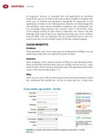
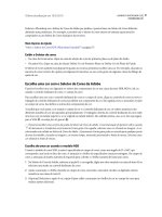
FIGURE 3.36
Agile Commons (hosted by HiveLive) emails the link to reset the password after
verifying the email address (a). Clicking the link displays the reset password page (b).
(a)
(b)
77
may also require users to answer one or more security questions set up during
registration.
Related design patterns
Users may realize that they have forgotten their username and/or password
when they are prompted to log in. Therefore, options to retrieve them should
be presented along with fi elds that are required to log in (LOG IN).
Fogot Username/Password
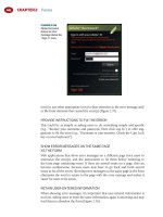
FIGURE 3.37
Advanta, a credit card company, asks for several identifi cation-related questions
before resetting user ID and password.
This page intentionally left blank
79
INTRODUCTION
An important decision for designers is what users should see or which page
they should be taken to after they log in to the application.
For web applications that allow access without logging in (e.g., consumer
e-commerce applications), users either remain on the same page or are taken to
the next page in the sequence. For example, if users decide to log in on a prod-
uct details page, they remain on the same page. However, if they log in dur-
ing the checkout process, they are taken to the next page in the sequence — the
shipping information page.
On the other hand, applications that require users to log in before accessing
their functionality may show one of the following, depending on the nature of
the application:
■
An INBOX, where users can see a list of items to view or act on.
■
A CONTROL PANEL, which serves as a launch page to access application
functionality.
■
A DASHBOARD, with an at-a-glance view of the most important perfor-
mance indicators.
■
A PORTAL, which aggregates information from several sources and serves
as a launching place for information and applications users may access.
PORTAL pages often incorporate some aspects of CONTROL PANEL and
DASHBOARD in order to enable users to quickly access functionality and
content supported by one or more applications.
Application main pages are typically personalized based on user profi les,
interests, and information needs with the intention of presenting the most
relevant content and fi ltering out the not-so-relevant information. However,
PERSONALIZATION driven by business rules or some form of social fi ltering
may not be able to accurately predict the information users may need. Thus,
applications often offer users CUSTOMIZATION options to allow them to
Application Main Page
CHAPTER 4 CHAPTER 4
CHAPTER 4 Application Main Page
80
tailor the application to their preferences and compensate for personalization
shortcomings. Customization is not limited to information and task-related
needs; it often extends to a choice of colors, logos, themes, fonts, and page
layouts.
An often-overlooked design aspect of many web applications is what fi rst-time
users will see (BLANK SLATE). This is particularly important for applications
that rely on users to fi ll in the application with appropriate data.
INBOX
Problem
It is essential that users know the items they need to work on or the activities
that have happened since they last logged in.
Solution
Show users a list of items they can act on or need to review. For example, for
email applications, show users a list of emails; for defect-tracking applications,
show users a list of defects; and so forth ( Figure 4.1 ).
Why
Applications focused on managing items of one type (e.g., emails, defects,
fi les, accounts, support calls, timesheets, etc.) benefi t from showing users items
that they can interact with as soon as they login. This does not mean that the
application does not allow users to manage other types of items or allow quick
FIGURE 4.1
NetResults tracker shows developers a list of bugs and enhancements assigned
to them when they log in.
81
Control Panel
access to other functionalities within the application — it’s just that they are sec-
ondary in nature. For example, email applications allow users to manage con-
tact lists even though managing contacts is not its primary purpose. Therefore,
when users log in, they are fi rst shown a list of emails, both past and new. The
term inbox is appropriate, since these are typically items that users need to
attend to when they log in to the application.
How
Show users a list of items for which the application was primarily designed —
emails, defects, fi les, accounts, to-dos, and so on — highlighting the items that
users need to immediately attend to or be reminded of, such as new emails,
new fi les, new defects, and so forth ( Figure 4.2 ).
ALLOW USERS TO SET UP REMINDERS
If the application is not going to be accessed frequently and if users prefer to be
reminded of changes in the state of one or more items (e.g., payment due or a
new to-do item), allow them to set up reminders ( Figure 4.3 ).
Related design patterns
The INBOX pattern typically uses lists, either TABULAR LISTS or IMAGE
GRIDS. In addition, like lists, they often need SORTING and FILTERING to
make it easy for users to fi nd relevant information (see Chapter 7 for further
discussion on lists).
CONTROL PANEL
Problem
After users have logged in, they may want to access different application func-
tions to perform a variety of tasks. However, which function they may want to
access cannot be reliably predicted.
FIGURE 4.2
Users see their email inbox after they have logged in to Gmail. New items in the
inbox are in bold.
CHAPTER 4 Application Main Page
82
Solution
Show users a page with all available application functions, any one of which
they can quickly access ( Figure 4.4 ).
Why
For many web applications, users need a place that serves as a launch pad
for accessing its functions (i.e., mini-applications) that are rather independent
of each other. Although users need access to all functions, they do not need
to navigate from one function to another. However, they need a place to
return to when they feel lost or disoriented (similar to a “ home page ” on
web sites).
How
Provide a “ launch ” page from which users can access all application functions
or mini-applications. Control panels are designed using a hub-and-spoke user-
interface approach (Baxley, 2003; Tidwell, 2006), where users can reach the
self-contained mini-applications (i.e., “ spokes ” ) from one central “ hub ” page
such that users can access a mini-application, accomplish desired tasks, and
return to the hub page to perform another task using another mini-application.
FIGURE 4.3
Remember The Milk offers users the option of setting reminders daily as well
as a preset number of minutes before the task is due. It also allows users to be reminded via
email, instant messengers, and mobile text messages.
83
Control panels have quite a few similarities with home pages on content-
oriented web sites:
■
They set an expectation of the application’s scope and provide quick
access to its most important features and functionality.
■
They establish an overall information design approach for pages within
the application in terms of its layout, placement of navigation, search
functionality, and so forth.
■
They inform users of new features and functions.
Control panels are also useful for account overview pages where users can access
all of their account-related functions in one place. For example, e-commerce
applications use account overview pages to allow users access to their orders,
shipping addresses, payment information, and so forth ( Figure 4.5 ).
HIGHLIGHT ITEMS THAT NEED ATTENTION
Like with the INBOX, a CONTROL PANEL is a place to inform users of, or
direct their attention to, changes in application functionality and content.
As soon as users have landed on the control panel page, it is important to
direct them to items that need their attention. Because users may not be expect-
ing them, it’s necessary that items serving as notifi cations or announcements
Control Panel
FIGURE 4.4
1 & 1, a web site hosting company, gives users the ability to access all functions
related to their account on their control panel page. Because there are a number of options, it
groups them into two separate areas, “ Administration ” and “ Account. ”
CHAPTER 4 Application Main Page
84
are made salient. A good notifi cation example is a message about a planned
application outage, although this should also be done on the login page. For
items that serve only an informational purpose (i.e., announcements) and do
not require any user action, offer users an option to dismiss them.
Related design patterns
Use the BLANK SLATE design pattern, especially on “ spoke pages, ” to avoid
showing users empty pages and to ensure that they are not confused as to
what to do after logging in for the fi rst time. This also helps them get com-
fortable using the application, especially for applications that rely on users to
provide data.
DASHBOARD
Problem
Information that helps users make decisions and monitor information about
the “ state of their world ” is available, but requires users to visit several different
application areas. In addition, available information is not presented in a for-
mat that helps users make decisions and/or determine their next steps.
Solution
Offer users a single-page “ dashboard ” view of information and metrics that
they need to track. In addition, allow users to “ drill ” down to detailed content
from the dashboard view ( Figure 4.6 ).
FIGURE 4.5
Dell’s “ My Account ” page provides a summary of account information and serves
as a launch page allowing access to user-specifi c information such as saved items, coupons,
shopping cart, order status, and so forth.
85
Dashboard
FIGURE 4.6
Yahoo!’s Election 08 Political Dashboard shows at-a-glance information about the
current status of each candidate at the national level (a). Additionally, it allows users to click on
candidates and get detailed information about the candidate including recent poll averages,
money raised, and so forth (b).
(a)
(b)
CHAPTER 4 Application Main Page
86
Why
Requiring users to navigate several application pages or run reports to monitor
items ’ status and determine actions to take is not only ineffi cient but also may
cause users to overlook important information. In addition, integrating infor-
mation sources from several places for every visit can become quite cumber-
some for users.
Dashboards, when properly designed, are “ presented in a way that allows
them [users] to monitor what’s going on in an instant ” (Few, 2006). By using
appropriate visualizations for important measures (often referred to as key
performance indicators or KPIs) along with exception conditions and alerts,
dashboards provide at-a-glance information about current status and facilitate
identifi cation of necessary corrective and preventive actions.
How
Dashboards typically serve three important functions for users:
1. They monitor and track important metrics.
2. They provide analysis to determine trends and exception conditions.
3. They report information to facilitate diagnosis and identify corrective
actions as necessary.
Pie Charts: Use pie charts to represent proportional
relationships for a few categories with potentially large value
differences. When there are many categories that have smaller
value differences, it may be difficult to discern the differences
in this format.
Bar Charts: Use bar charts for showing the relationship among
data elements within a series or multiple series. Because data
bars share a common measure, they can be easily compared
with one another. Bar charts may not be appropriate when a
data series has few values with a large outlier value, which
could compress the scale for the remaining data making
discrimination among the bars difficult.
Line Charts: Use line charts to see trends in one or more
metrics.
Tables and Lists: Use tables or lists for nonnumeric data or
when a graphical presentation of numeric data may not be
meaningful or easily understood by intended users. Tables
or lists may also serve as an alternate view for graphical data
(see also Chapter 7).
FIGURE 4.7
D a t a
display methods.
87
To help users understand data, relationships, trends, and diagnose problems,
report summarized and abstracted data on dashboards using approaches
such as pie charts, bar charts, line charts, tables or lists, and so forth. To ensure
that data are understood correctly, employ data visualization or charting meth-
ods that are suitable for the type of data and their intended use ( Figures 4.7
and 4.8 ).
MATCH EXCEPTION CONDITIONS TO USERS ’ TASKS
Match dashboard icons and indicators to users ’ monitoring tasks ( Figure 4.9 ).
For example, use indicators, such as alert or traffi c light icons, if users need to
know only the current state of a metric. However, if users need to also know
trends, use trend icons, such as up and down arrows, with appropriate colors
may be more appropriate; they may be supplemented with spark lines to show
a quick snapshot of the historical trend.
Dashboard
FIGURE 4.8
Google Analytics ’ dashboard uses a variety of charting methods to convey web
site performance metrics. It uses a trend chart to show “ Visitors Overview, ” numbers and spark
lines to show “ Site Usage, ” and tabular data to show “ Content Overview. ”