ielts writing task 1 academic module
Bạn đang xem bản rút gọn của tài liệu. Xem và tải ngay bản đầy đủ của tài liệu tại đây (3.29 MB, 104 trang )
Target
Band
7
+
IELTS
JOURNAL
Task 1 IELTS Writing
Academic Training Module by Adam Smith
First Published in 2015
IELTSJOURNAL
Contents
About the Writing Test
4
How to use your 20 minutes
4
Points to Apply in Task 1, Report Writing
5
What does a good report look like?
6
Using the right tense is important
6
Different types of visuals
7
Describing trends, Language of change
8
Connecting trends
10
Using the right prepositions
12
Describing numbers, percentages & fractions
16
Describing Quantities
17
Varying your language
18
Using Simple Comparisons
19
The language for comparing
20
Other Important Language for Comparisons
21
Adding an explanation
22
Writing an introduction
23
Writing the General Overview Paragraph
26
Selecting Main Points
27
Writing an 'overview' not a conclusion
29
Writing Body Paragraphs
30
Writing just six sentences to include the details
31
Selecting details and grouping them
33
Including approximation
35
IELTS JOURNAL
2
Having a Task 1 checklist is important
36
Avoid common mistakes
36
Describing more than one chart
37
Describing Processes
39
Describing a map
42
Effective ways to prepare for Task 1
46
Good Sample Answers Worth Reading
47
Keep in touch!
104
Use this book together with the instagram page @ieltsjournal
The instagram page contains lessons that show how to use the ideas from this
book. You can keep in touch with the author there and ask your questions.
IELTS JOURNAL
3
Academic Training Writing
About the Writing Test
The IELTS Academic Training Writing Test takes 60 minutes. You have to complete two
writing tasks.
Task 1
‚ You have about 20 minutes
‚ You must write a report of at least 150 words
‚ You are given a visual presentation which can be in form of a graph, diagram, bar
chart, table, map or a process. You must write a report explaining the main features
of the figure and make comparisons where relevant. You must not include any
personal opinion while you are explaining the figure. You just need to describe and
report what you are given.
How to use your 20 minutes
You have 20 minutes for task 1, so try spending 5 minutes on each paragraph. This might
help you to organise your time better.
First 5 minutes
Read the question, make sure you understand the chart, write your
introduction by paraphrasing the question.
Second 5 minutes
Look at the chart and try to find 2 general points. Don't look at specific details;
look for "the big picture". Write 2 sentences summarising the information.
Final 10 minutes
Describe specific details. Try to break this part into 2 paragraphs because it
looks better. You could spend 5 minutes on each paragraph.
IELTS JOURNAL
4
Points to Apply in Task 1, Report Writing
The IELTS writing Task 1 academic is an information transfer task which requires you to
write a fairly precise account of some information presented in graphic form such as a
graph, table or some form of pictorial representation of data. In order to complete the task
successfully, follow these suggestions.
‚ Introduction should describe the purpose of the report and say what the overall trends are.
For example, if the graph is climbing up or dropping down, you should mention the change
or the changes accurately and meaningfully. You need to remember that you are describing
a graph to someone who does not see it, so your words must draw the picture. Write what
the graph is about, its dates and location as well as the right kind of measurements used.
You must write in complete sentences. Notes are not acceptable.
‚ Do not copy whole sentences or long phrases from the question. The examiner will
recognize them, and they will not count towards the minimum number of words you must
write.
‚ The overall trend or the general over view should sum up the global or the general trends
shown in the figure and compare them if possible. Your personal opinion should not appear
anywhere in the report. You should not include other information that does not appear in
the figure or the chart since this kind of writing can and will probably be penalized.
‚ The body paragraphs should describe the most important features and trends, while all the
information is summarized to avoid unnecessary details. When you are given too much
information, you need to group them and select the most noticeable ones. For example, if
there is a graph that has 2 peaks, you should mention them and tell when those peaks
appeared and what the peak values are; however, if there are 5 similar trends, you need to
group the information in order to avoid over length writing, which can lead to a waste of
time.
‚ Notice how many distinctive features the diagram or the graph has and divide them into
paragraphs, one paragraph one set of features that is a group of similar trends. You should
also link the paragraphs by sentences that logically connect them to one another.
‚ You need to write about all the periods of time and all the subjects of the graph or the
figure. If it shows several years for example 1992, 1993, 1994 and 1995, write about all of
them. If it is about men and women, write about both genders. Remember that
summarizing does not mean throwing away information. The key here is to select what is
important, organize it and make comparisons, which is describing both the similarities and
the differences where relevant.
‚ You may write your plans on the question sheet if, for example, you want to underline key
words or to write notes and make comparisons. The examiner who marks your writing will
not see the question sheet.
IELTS JOURNAL
5
What does a good report look like?
When your Task 1 academic writing is graded by IELTS examiners, they look for this
structure:
‚ Introduction (including 1 or 2 sentences)
‚ Overall view (including at least two important general points in 2 or 3 sentences)
‚ Body paragraphs (including the details and the factual information presented in the
figure as well as relevant comparisons in 6 or 7 sentences)
Using the right tense is important
The figures you need to write a report about always have a time stamp on them. The time
stamp tells you whether the graph or the figure describes something that happened in the
past or happens in the present or will happen in the future.
Examples
‚ The rate of unemployment increased significantly between 2010 and 2012. (It
happened in the past)
‚ The figures for the electricity consumption show a rapid growth during the day
time. (It happens in the present, generally)
‚ It is predicted that the amount of air pollution will decrease by 5% within the next
two years. (It will happen in the future)
Note: When there is no time stamp that is a date or a time period as in some graphs or
in processes, the present tense must be used.
IELTS JOURNAL
6
Different types of visuals
1
2
3
4
5
6
7
1.
2.
3.
4.
5.
6.
7.
IELTS JOURNAL
7
Table
Bar chart
Line graph
Pie chart
Process
Map
Line graph & pie chart
(more than one graph)
Describing trends, Language of change
Below you can see a list of the most popular vocabulary used to describe trends. We use combinations of
verb/adverbs and adjective/nouns to refer to changes in graphs.
Noun
a rise
an increase
a growth
a climb
a boom
a peak
N/A
fall
decrease
reduce
decline
dip
go down
a fall
a decrease
a reduction
a decline
a dip
N/A
level out
not change
remain stable
a leveling out
no change
(a period of)
stability
N/A
N/A
N/A
remain steady
stay constant
maintain the
same level
stand steady
fluctuate
oscillate
be volatile
Degree and speed
Adverb
Adjective
dramatically
dramatic
sharply
sharp
enormously
enormous
steeply
steep
substantially
substantial
considerably
considerable
significantly
significant
rapidly
rapid
moderately
moderate
gradually
gradual
slightly
slight
minimally
minimal
Strong
Weak
Figure 1:
GM car sales
105
85
'000 dollars
Trends
Verb
rise
increase
grow
climb
boom
peak
go up
N/A
a fluctuation
an oscillation
a period of
volatility
65
45
25
5
1960 1970 1980 1990 2000 2010
Figure 1 example sentences:
X GM car sales increased significantly from $5,000 to $105,000 between 1960 and 2010.
X There was a significant increase of $100,000 in GM car sales, from $5,000 to $105,000, between
1960 and 2010.
X GM car sales saw a significant growth in GM car sales, from $5,000 to $105,000, between 1960 and
2010.
X GM car sales registered a significant rise between 1960 and 2010.
X GM car sales reached a peak at $105,000 in 2010.
X GM car sales had an enormous climb of $100,000 between 1960 and 2010.
Note: Why is a ‘past tense’ used in the examples above?
IELTS JOURNAL
8
Exercise 1: Look at the graphs below. Then describe the changes.
A (Car sales in ‘000)
B (Car sales)
C (Car sales)
105
105
105
85
85
85
65
65
65
45
45
45
25
25
25
5
5
5
D (Net users in ‘000)
E (Net users)
F (Net users)
105
105
105
85
85
85
65
65
65
45
45
45
25
25
25
5
5
5
G (Cases of polio in ‘000)
H (Cases of polio)
I (Cases of polio)
105
105
105
85
85
85
65
65
65
45
45
45
25
25
25
5
5
5
J (Radio listeners in ‘000)
K (Radio listeners)
L (Radio listeners)
105
105
105
85
85
85
65
65
65
45
45
45
25
25
25
5
5
5
Note: Use a ‘future tense’ to describe changes in items J, K and L above.
Example: It is predicted that the number of radio listeners will fall to 45,000 people in 2030.
IELTS JOURNAL
9
Connecting trends
Similar or different trends
Figure 1 (Addition)
Figure 2 (Contrast)
GM car sales
105
105
85
85
'000 Dollars
'000 Dollars
GM car sales
65
45
25
5
65
45
25
5
1960 1970 1980 1990 2000 2010
1960 1970 1980 1990 2000 2010
Figure 1 example:
X GM car sales increased gradually to $24,000 in 1980, and then it continued its upward trend in the
next four years to reach a peak at $105,000 in 2010.
Figure 2 example:
X There was a sharp increase in GM car sales between 1960 and 1990 until it reached a high of almost
$95,000; however, sales began to decrease swiftly to under $65,000 in 2010.
Exercise 2: Look at the graphs below. Then describe the changes trying to connect trends.
A (Net users in ‘000)
B (Net users)
C (Net users)
105
105
105
85
85
85
65
65
65
45
45
45
25
25
25
5
5
5
D (Birds population in ‘000)
E (Birds population)
F (Birds population)
105
105
105
85
85
85
65
65
65
45
45
45
25
25
25
5
5
5
IELTS JOURNAL
10
Exercise 3: First, label the graph using the words and phrases below. Then describe the changes and connect the
trends where relevant.
1.
2.
3.
4.
5.
6.
7.
8.
9.
10.
11.
12.
13.
14.
mild fluctuations
a peak
a period of instability
a significant increase
a partial growth
a record high
figures climbing back
a marked rise
a dramatic decrease
a period of slight volatility
a leveling out
a sharp decline
a plateau
figures remaining constant
The number of XYZ radio station listeners since 1940 with projections until 2030
105
Thousand s
85
65
45
25
5
1940
1950
1960
1970
1980
1990
2000
2010
2020
2030
Example (Numbers 1 & 5 above):
X There were mild fluctuations in the number of the XYZ radio station from 1980 to 2000, ranging
between 11 and 35 listeners; however, the figures saw a partial growth over the next two years,
reaching almost 25 thousand people.
IELTS JOURNAL
11
Using the right prepositions
It is important to use the right preposition when you are reporting the features and
describing the numbers, prepositions like to, by, with and at when describing numbers and
figures. Here are some examples to give you a basic idea of the differences:
1. Use to when describing what happened to the number:
In 2008, the rate of unemployment rose to 10%.
2. Use by when describing the amount of change between two numbers:
In 2009, the rate of unemployment fell by 2% (from 10% to 8%).
3. Use with to give the idea of 'having' the number:
He won the election with 52% of the vote.
4. Use at to add the number on the end of a sentence:
Unemployment reached its highest level in 2008, at 10%.
Exercise: Complete the sentences choosing the right preposition from the list below.
for
of
at on
to
up
down
in by
with
1.
2.
3.
4.
5.
from
between
and
during
……… 1990 ……… 2000, there was a drop ……… 15%.
GM car sales peaked ……… 2,000 in 1999.
The chart shows a decline ……… 35% ……… the bird population.
There has been a significant increase ……… the number of people aged over eighty.
There have been dramatic cuts ……… the level of spending on the elderly, reaching a
low …… 11%.
6. Profits rose ……… a low of 4.5 million to a high of 8 million in 2008.
7. Canada and Australia’s wheat exports fluctuated ……… 5 million and 6 million
respectively.
8. There were significant improvements ……… healthcare ……… 1980.
9. The statistics show a reduction ……… 20% ……… energy costs as a result ……… the
measures.
10.Profits fell ……… 10%, from 2,000 to 1,800 in 1970s.
11.The radio station experienced a fall ……… 36,000 listeners to a total audience ………
2.1 million.
IELTS JOURNAL
12
12.The number of students fell ……… a low of 1,500 in the second half of the year.
13.Cases of AIDS shot ……… from 2,400 in 1996 to 4,000 in 2004.
14.Demand reached a peak ……… 45,000 in early March.
15.The number of cars sold remained unchanged in 1999 ……… three million.
16.Students do between three ……… four hours homework a night.
17.The number of accidents ……… 1999 was slightly higher than that of 2000.
18.The figure rose steadily ……… the four years between 1997 ……… 2001.
19.Oil production rose dramatically at first but then leveled out ……… $70 a barrel.
20.There was an increase ……… 50,000 between 1990 and 1992.
21.……… 1994 ……… 1997, sales rose steadily ……… over 20,000.
22.DVD sales peaked ……… 60,000 ……… 1992 but then decreased ……… about 10,000
over the next two years.
23.In the year 2000, sales started ……… 10,000. In the first month, there was a rise ………
around 2,000.
24.After some fluctuations, sales in 2000 reached their peak ……… just over 15,000, a
rise ……… 5,000 since the beginning of the year. Sales increased ……… over 10,000
between 1994 and 1997, but then dropped ……… more than 10,000 …………… 1997
and 1999.
25.In 2008, the rate of unemployment rose …… 10%.
26.In 2008, the rate of unemployment rose …… 10%, from 2,000 to 2,200 cases.
27.There was a slight rise …… the number of men employed.
28.Experts expect there to be a fall …… approximately 30% over the next decade.
29.The introduction ……… DVDs led to a decline ……… 20% ……… video sales.
30.The figures show a drop ……… 5% ……… student numbers.
31.The health service program spent a total ……… $2.5 billion on staffing …… April 2002.
32.The survey hopes to track trends ……… consumer spending.
33.In 2009, the rate of unemployment fell ……… 2% (from 10% to 8%).
34.He won the election ……… 52% of the vote.
35.Unemployment reached its highest level ……… the year 2008 ……… 10%.
36.……… 2002, the cost of an average house in the UK was around £130,000. ……… 2007,
the average house price had risen ……… almost £190,000, but it fell back ……… just
under £150,000 ……… 2008.
37.Japan ……… two gold medals and a silver one stood ahead of the US ……… one gold
and one bronze medal ……… 1968.
IELTS JOURNAL
13
Now you can check your work with this key:
1.
2.
3.
4.
5.
From 1990 to 2000, there was a drop of 15%.
GM car sales peaked at 2,000 in 1999.
The chart shows a decline of 35% in the bird population.
There has been a significant increase in the number of people aged over eighty.
There have been dramatic cuts in the level of spending on the elderly, reaching a low
of 11%.
6. Profits rose from a low of 4.5 million to a high of 8 million in 2008.
7. Canada and Australia’s wheat exports fluctuated between 5 million and 6 million
respectively.
8. There were significant improvements in healthcare in 1980.
9. The statistics show a reduction of 20% in energy costs as a result of the measures.
10.Profits fell by 10%, from 2,000 to 1,800 in 1970s.
11.The radio station experienced a fall of 36,000 listeners to a total audience of 2.1
million.
12.The number of students fell to a low of 1,500 in the second half of the year.
13.Cases of AIDS shot up from 2,400 in 1996 to 4,000 in 2004.
14.Demand reached a peak of 45,000 in early March.
15.The number of cars sold remained unchanged in 1999 at three million.
16.Students do between three and four hours homework a night.
17.The number of accidents in 1999 was slightly higher than that of 2000.
18.The figure rose steadily in the four years between 1997 and 2001.
19.Oil production rose dramatically at first but then leveled out at $70 a barrel.
20.There was an increase of 50,000 between 1990 and 1992.
21.Between 1994 and 1997, sales rose steadily to over 20,000.
22.DVD sales peaked at 60,000 in 1992 but then decreased to about 10,000 over the
next two years.
23.In the year 2000, sales started at 10,000. In the first month, there was a rise of
around 2,000.
24.After some fluctuations, sales in 2000 reached their peak of just over 15,000, a rise of
5,000 since the beginning of the year. Sales increased to over 10,000 between 1994
and 1997, but then dropped to more than 10,000 between 1997 and 1999.
25.In 2008, the rate of unemployment rose to 10%.
26.In 2008, the rate of unemployment rose by 10%, from 2,000 to 2,200 cases.
27.There was a slight rise in the number of men employed.
28.Experts expect there to be a fall of approximately 30% over the next decade.
IELTS JOURNAL
14
29.The introduction of DVDs led to a decline of 20% in video sales.
30.The figures show a drop of 5% in student numbers.
31.The health service program spent a total of $2.5 billion on staffing in April 2002.
32.The survey hopes to track trends in consumer spending.
33.In 2009, the rate of unemployment fell by 2% (from 10% to 8%).
34.He won the election with 52% of the vote.
35.Unemployment reached its highest level in the year 2008 at 10%.
36.In 2002, the cost of an average house in the UK was around £130,000. In 2007, the
average house price had risen to almost £190,000, but it fell back to just under
£150,000 in 2008.
37.Japan with two gold medals and a silver one stood ahead of the US with one gold and
one bronze medal in 1968.
IELTS JOURNAL
15
Describing numbers, percentages & fractions
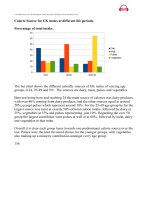
In some graphs, esp. tables, there are some especial numbers, fractions e.g. 1/3 (one third) and percentages e.g.
50%. Look at the following table which shows a number in different years, 1990-1995:
A. You could describe the table using numbers, fractions or percentages:
1990
1,200
Note:
1995
1,800
1. The number went up by 600 from 1,200 to 1,800. (Number)
2. The number went up by one third from 1,200 to 1,800. (Fraction)
3. The number went up by 50% from 1,200 to 1,800. (Percentage)
Look how we write
fractions in task 1
½ = a half
¼ = a quarter
BUT:
1/3 = one third
2/5 = two fifth
B. You could describe the table using the words double, treble, quadruple, -fold
and times:
1992
500
1.
2.
3.
4.
5.
6.
7.
8.
1994
1,000
1996
3,000
Note:
1998
12,000
See how –fold & times are
used in examples below:
The number doubled between 1992 and 1994.
The number trebled between 1994 and 1996.
The number quadrupled from 1996 to 1998.
There was a two-fold increase between 1992 and 1994.
The number went up six times between 1992 and 1996.
The figure in 1996 was six fold the 1992 figure.
The figure for 1996 was six times higher than that of 1992.
The figure for 1998 was four times greater than that of 1996.
“In the last 50 years,
there has been a 35-fold
increase in the amount of
pesticide in farming.”
“She earns five times
more than I do.”
C. You could describe the table using fractions:
1992
1,000
1994
800
1996
400
1998
100
1. Between 1992 and 1994, the figure fell by one fifth.
2. Between 1994 and 1996, the figure dropped by half.
3. The figure in 1998 was one tenth the 1992 total.
D. You could put the percentage either at the beginning of the sentence or at the end of the sentence:
Family Type
Single aged person
Aged couple
Proportion of people living in poverty
6%
4%
1. 6% of single aged people were living in poverty.
2. The level of poverty among single aged people stood at 6% .
E. You could also add a comparison:
1. 6% of single aged people were living in poverty, compared to only 4% of aged couples.
IELTS JOURNAL
16
Further explanation and examples
1. 'double' (verb)
‚ The number of unemployed people doubled between 2005 and 2009.
2. 'twice as...as/compared to', 'three times as...as/compared to'
‚ There were twice as many unemployed people in 2009 as in 2005.
‚ Twice as many people were unemployed in 2009 compared to 2005.
3. 'twofold', 'threefold' (adjective or adverb)
‚ There was a twofold increase in the number of unemployed people between
2005 and 2009. (adjective with the noun 'increase')
‚ The number of unemployed people increased twofold between 2005 and
2009. (adverb with the verb 'increase')
Try using these forms in your own sentences. Make sure you follow the patterns.
Describing Quantities
Look at the patterns below and the examples carefully so that you can describe different numbers and
amounts in your report correctly.
The number of + Plural Countable Noun + Singular Verb Form
‚ The number of people out of work fell by 99,000 to 2.39 million in the three months to
October.
The amount of + Singular Uncountable Noun + Singular Verb Form
‚ The amount of rainfall doubles between May and June.
The proportion of + Countable or Uncountable Nouns + Singular Verb Form
‚ The proportion of spending on furniture and equipment reached its peak in 2001, at 23%.
The percentage of + Countable or Uncountable Nouns + Singular Verb Form
‚ The percentage of people using their phones to access the Internet jumped to 41% in 2008.
The figures for Countable or Uncountable Nouns + Plural Verb Form
‚ The figures for imprisonment fluctuated sharply over the period shown.
IELTS JOURNAL
17
Varying your language
As with any task 1, this is important. You should not keep repeating the same structures.
The key language when you write about pie charts is proportions and percentages.
Common phrases to see are "the proportion of…" or "the percentage of…". However, you
can also use other words and fractions. These are some:
‚
‚
‚
‚
‚
‚
‚
‚
‚
‚
‚
‚
‚
‚
‚
‚
‚
‚
‚
‚
‚
‚
‚
A large number of people
over a quarter of people
a small minority
A significant number of people
less than a fifth
This table presents some examples
of how you can change percentages
to fractions or ratios:
Percentage Fraction
80% four-fifths
75% three-quarters
70% seven in ten
65% two-thirds
60%
55%
50%
45%
40%
35%
30%
25%
20%
15%
10%
5%
three-fifths
more than half
half
more than two fifths
two-fifths
more than a third
less than a third
a quarter
a fifth
less than a fifth
one in ten
one in twenty
If the percentages are not exact as above, then you can use qualifiers to make sure your
description remains accurate. Here are some examples:
‚
‚
‚
‚
‚
77%
77%
49%
49%
32%
‚ Percentage proportion / number /
amount / majority / minority
‚ 75% - 85% a very large majority
‚ 65% - 75% a significant proportion
‚ 10% - 15% a minority
‚ 5% a very small number
just over three quarters
approximately three quarters
just under a half
nearly a half
almost a third
The words above are interchangeable, though number is for countable nouns and amount
is for uncountable nouns.
Here are 3 useful techniques for describing percentages:
1. English speakers usually put the percentage at the start of the sentence.
2. Use while, whereas or compared to (after a comma) to add a comparison.
3. Use "the figure for" to add another comparison in the next sentence.
IELTS JOURNAL
18
Use these examples as models for your own sentences:
‚ In 1999, 35% of British people went abroad for their holidays, while only 28% of
Australians spent their holidays in a different country. The figure for the USA stood
at 31%.
‚ Around 40% of women in the UK had an undergraduate qualification in 1999,
compared to 37% of men. The figures for the year 2000 rose slightly to 42% and
38% respectively.
Using Simple Comparisons
You can use "compared to", "compared with", "in comparison to" and "in comparison with"
in the same way. For example:
‚ Prices in the UK are high compared to / with / in comparison with (prices in)
Canada and Australia.
‚ Compared to / with / in comparison with (prices in) Canada and Australia,
prices in the UK are high.
When writing about numbers or changes, I find it easier to use "while" or "whereas":
‚ There are 5 million smokers in the UK, while / whereas only 2 million
Canadians and 1 million Australians smoke.
‚ Between 1990 and 2000, the number of smokers in the UK decreased
dramatically, while / whereas the figures for Canada and Australia remained
the same.
Note:
‚ We don't say "comparing to".
‚ We say "2 million" not "2 millions".
Correct: 10 million people
Wrong: 10 millions people, 10 millions of people, 10 million of people
When there is no number, we do write "millions of".
e.g. Millions of people travel abroad each year.
IELTS JOURNAL
19
The language for comparing
Here are some good phrases for comparing. See if you can adapt them to other task 1
questions.
‚
‚
‚
‚
‚
‚
‚
‚
The chart compares... in terms of the number of...
...is by far the most... OR ...has by far the highest number of...
the figures for... tend to be fairly similar
In second place on the chart is...*
The number of... is slightly higher than...
Only four other countries have...
...all with similar proportions of...
...is the only country with a noticeably higher proportion of...
Note: Only use phrases like "in second place" if the chart shows some kind of competition.
Don't write "in first / second place" if the chart shows unemployment or health problems.
Comparative and Superlative Adjectives
Being able to compare and contrast data is an essential skill for IELTS writing, especially in
Task 1. Comparatives and superlatives are one common way to do this.
Comparatives are used to compare two things:
‚ Leopards are faster than tigers.
Superlatives are used to compare one thing against a group of others:
‚ The leopard is the largest of the four big cats.
Here are the basics of how they are formed:
Words with one syllable
Words with three syllables
or more
Example Word
Comparative
high
higher
more productive
productive
Words ending in –y
wealthy
Short words ending with a hot
consonant/vowel/consonant
Irregular
good
IELTS JOURNAL
20
Superlative
the highest
the most productive
less productive
wealthier
hotter
the least productive
the wealthiest
the hottest
better
the best
Other Important Language for Comparisons
Comparatives and superlatives are useful to compare and contrast, but they won't be
enough.
Here are some other useful words and structures:
Transitions
1. The Middle East produces high levels of oil; however, Japan produces none.
2. The USA produces large amounts of natural gas. In contrast, South Korea
produces none.
3. European countries make great use of solar power. On the other hand, most
Asian countries us this method of power generation very little.
Subordinating Conjunctions
1. The Middle East produces high levels of oil, whereas / while Japan produces
none.
2. Whereas / While the Middle East produces high levels of oil, Japan produces
none.
3. Although the Middle East produced 100 tons oil, Japan produced none.
Other Structures
1. Developing countries are more reliant on alternative energy production than
developed countries.
2. Solar power accounts for far less of the total energy production than gas or
coal does.
3. Hydropower is not as efficient as wind power.
4. Like Japan, South Korea does not produce any natural gas.
5. The Middle East produces twice as much oil as Europe.
6. Western countries consume three times more oil than the Middle East.
7. Russia consumes slightly more oil than Germany.
8. The UAE produced the same amount of oil as Saudi Arabia.
IELTS JOURNAL
21
Adding an explanation
In adding explanation, it is important to minimize the number of words which you intend to
use to make sure you stay within the word limit. Look at the examples below.
1. Both cities experienced a rise in the number of tourists coming in through their
airports, which reached a common level of 255,000 in July.
Reduced Form: Both cities experienced a rise in the number of tourists coming in
through their airports, reaching a common level of 255,000 in July.
2. Gold bar prices experienced a spectacular rise in November, which climbed to a new
peak of $625.
Reduced Form: Gold bar prices experienced a spectacular rise in November,
climbing to a new peak of $625.
3. In the first half of 2009, the attendance at the museum went into free fall, which
nose-dived to approximately 300,000 visitors.
Reduced Form: In the first half of 2009, the attendance at the museum went into
free fall, nose-diving to approximately 300,000 visitors.
4. Females also spend less time socializing and much less time than men on sport,
which allows them more time for studying.
Reduced Form: Females also spend less time socializing and much less time than
men on sport, allowing them more time for studying.
Exercise: Reduce the clauses in the sentences into phrases.
1. The figures then dropped sharply to well below 5000, which was the lowest in record for
2.
3.
4.
5.
6.
7.
8.
more than 40 years.
The largest number of visitors in total came from the United States, which rose from 345
to 609 thousand.
Rents shot up from 11% in 1993 to 21% in 2003, which doubled over the ten-year period.
From the end of 2001, consumption remained unchanged with two minor peaks at the end
of 2001 and 2002, which corresponded with two dips in the use of nuclear and fossil
energies.
Email and instant messenger are close thirds and fourths in popularity, which scored 17%
and 16% respectively for men, 21% and 18% for their counterparts.
The amount of money saved also dropped dramatically, which stepped down from 6% in
2003 to just 2% ten years later.
In the first two months of the year, the number of internet users reached nearly 1.5
million, which was double the estimate for the period.
The number of internet users soared once more during March and April, which outstripped
forecasts by a wide margin.
IELTS JOURNAL
22
Writing an introduction
The opening sentence for the first paragraph should define what the graph is about that is
the date, location and what is being described in the graph. The easiest way to start writing
is by paraphrasing the topic. Practice writing different introductions about one graph.
Example:
Writing Task 1
You should spend about 20 minutes on this task.
The table below shows the proportion of different categories of families living in
poverty in Australia in 1999.
Summerise the information by selecting and reporting the main features, and make
comparisons where relevant.
Write at least 150 words.
Family type
Single aged person
Aged couple
Single, no children
Couple, no children
Sole parent
Couple with children
All households
Proportion of people from each
household type living in poverty
6% (54,000)
4% (48,000)
19% (359,000)
7% (211,000)
21% (232,000)
12% (933,000)
11% (1,837,000)
Sample introductions:
Here are 3 introductions which paraphrase the question in different ways. Notice
that sometimes using the words from the table or the table can help you write
better.
1. The chart compares percentages of Australians from six different family
types who were classed as poor in 1999. (18 words)
2. The table gives information about poverty rates among six types of
households in Australia in the year 1999. (18 words)
3. The table compares different categories of Australian families in terms of the
proportion of people living below the poverty line in each one. (23 words)
IELTS JOURNAL
23
Further practice with paraphrasing in Task 1 introductions
Task 1 introductions should be fast and easy. Just paraphrase the question statement, i.e.
rewrite it in your own words. If you practice this technique, you will be able to start the
writing test with more confidence. Here are some useful introductory phrases in addition to
some simple changes you can make:
Useful introductory phrases:
‚
‚
‚
‚
‚
‚
‚
‚
‚
‚
The table shows changes in …
The table gives information about …
The bar chart compares …
The graph illustrates …
The chart shows data about …
The pie charts compare …
The diagram shows the process of …
The figure shows how … is produced
The line graph shows changes in …
The line graph compares …
Simple changes you can make:
‚ Graph/line graph/chart/bar chart
‚ Diagram/figure
‚ Shows/illustrates/compares
‚ proportion = percentage
‚ information = data
‚ the number of/the figure for/the
proportion of
‚ people in the UK/ the British
‚ from 1999 to 2009/between 1999 and
2009/over a period of 10 years
‚ in three countries = in the UK, France
and Spain (i.e. name the countries)
Example:
in thousands
The graph below shows the figures for imprisonment in five countries
between 1930 and 1980.
We can change 3 elements of this sentence:
1. graph shows = bar chart compares
2. figures for imprisonment = number of people in prison/prisoners
3. between ... and ... = over a period of … years
Sample paraphrased introduction:
The bar chart compares the number of people in prison in five different countries over a
period of 50 years, from 1930 to 1980. (24 words)
IELTS JOURNAL
24
Useful Phrases
You can use the words and the phrases below to start writing your introductory paragraph
more quickly with more confidence.
‚ The … gives information about …
‚ The … compare(s) …
‚ The … makes a comparison between … and …
‚ The … shows changes in …
‚ The … illustrates ….
‚ The … shows data about …
IELTS JOURNAL
25