css web sites with dreamweaver mx 2004 - Phần 5 potx
Bạn đang xem bản rút gọn của tài liệu. Xem và tải ngay bản đầy đủ của tài liệu tại đây (926.32 KB, 22 trang )
Figure 10 shows the floral style in Netscape 4 - not a great layout, perhaps, but the general
gist is there:
Figure 10 – Floral Style in Netscape 4
Now it's your turn! If you've been following along with this series, you should have lots of
ideas of how to style these pages. I've included all the relevant markup, CSS and graphics,
too, so download them and modify away!
88
89
7. Creating A Three-Column Layout
You see it everywhere—the three column layout. Whether it's achieved by table-based
design or CSS, three columns seems to be a very popular means of laying out pages.
Creating such a layout in CSS gives you a lot of flexibility because you really will only be
creating three actual columns, relying on margins, padding, and border styles to create
the white space and presentation you desire. Doing this in tables would require additional
cells and spacer GIFs, making the page far less accessible and far weightier.
By relying only on CSS for layout, our actual XHTML document is very lean and mean, as
well as extraordinarily bendable in the myriad ways you can re-style it quickly, easily, with
no muss, fuss, or need to buy stock in the pharmaceutical company that manufactures
the pain killer of your choice.
Defining the Site
The first thing you'll want to do is download the files for this chapter. Unpack them into a
location on your hard drive. Then, you'll define your site so all of your assets are to hand. To
define your site, follow these steps:
1. Select Site > New. The Site Definition Dialog appears.
2. Name the site "3 Column CSS" and click Next.
3. Select the "No, I don't want to use server technology" option, as you'll be working
with CSS and XHTML only for this example. You can always change this later if you
choose to develop the example beyond this chapter.
4. Select "Edit local copies on my machine, then upload to server when ready." Again,
you can always modify this later, but for now we'll just work locally in the folder you
created when unpacking the files. Click Next.
5. You'll be asked how you want to connect to your server. For now, select None. Click
Next.
6. Click Done. Your site is defined!
Linking and Importing the Site Style
I've created both the layout and presentation style sheets, which you'll be studying and
modifying as you proceed. First, let's link the presentation styles.
1. From the Site panel, double click on the 3column.html file to open. Select Code
View.
2. In the head portion of the document, below the meta element, click once.
3. From the Design panel, under the CSS Styles tab, click Edit Style Sheet. The Edit Style
Sheet dialog appears.
90
4. Click Link. From the Link External Style Sheet dialog, click browse. Highlight the
styles.css document and click OK. You'll be returned to the Link External Style Sheet
dialog. Be sure that the Link option is selected below the Add As option. Click OK.
5. You'll be returned to the Edit Style Sheet dialog. Click Done.
Examine the style sheet. In it, you'll see some basic styles for color, padding, headers,
paragraphs, fonts, and links. What you won't see are any positioning styles, which we'll
check out next.
body {
padding: 0px;
margin: 20px;
background-color: #99CCCC;
}
h1 {
margin:0px 0px 15px 0px;
padding:0px;
font-size:28px;
font-weight:900;
color:#993333;
border-bottom: #30302a 2px solid;
font-family: Georgia, "Times New Roman", Times, serif;
}
h2 {
font:bold 18px/14px Georgia, "Times New Roman", Times, serif;
margin:0px 0px 5px 0px;
padding:0px;
color: #CC9900;
}
p {
font:11px/20px verdana, arial, helvetica, sans-serif;
margin:0px 0px 16px 0px;
padding:0px;
}
/* begin link styles */
a {
color:#993333;
font-size:11px;
font-family:verdana, arial, helvetica, sans-serif;
font-weight:600;
text-decoration:none;
}
91
a:link {
color:#993333;
}
a:visited {
color:#CC9900;
}
a:hover {
color:#CC9900;
}
p {
padding: 0px;
margin: 0px 0px 16px 0px;
background: transparent;
}
.footer {
font-family: Georgia, "Times New Roman", Times, serif;
font-size: 10px;
text-align: center;
}
Go ahead and import the layout styles. If you recall from the last chapter, importing the
e
f course, a browser with no style support will not display either styles. So, you end up with
ut
rd
o import the layout style:
1. From the Design panel, under the CSS Styles tab, click Edit Style Sheet. The Edit Style
2. External Style Sheet dialog, make sure the Add As option is
3. nd find the file layout.css. Highlight it, and click OK.
're returned to
layout styles allows us to fashion our content for those browsers with limited style support
(such as Netscape 4.x) as those browsers don't understand the @import rule. As a result, th
layout styles aren't imported, but the presentation styles, which are linked, can be
interpreted.
O
a best-case-scenario in contemporary browsers: Full layout and style; a transitional
scenario for browsers with some style; and very plain vanilla results for browsers witho
style at all. Either way, the site visitor gets to your content. You'll see how this works towa
the end of the chapter.
T
Sheet dialog appears.
Click Link. From the Link
set to import.
Click Browse, a
4. Click OK again in the Link External Style Sheet dialog, and when you
the Edit Style Sheet dialog, click Done.
92
Your layout styles are now imported. Let's take a look.
#logo {
padding: 10px;
width: 128px;
position: absolute;
left: 10px;
top: 20px;
}
#content {
padding: 10px;
width: auto;
position: relative;
margin: 0px 210px 20px 170px;
border-left: 1px dotted #993333;
}
#nav {
padding: 10px;
width: 128px;
position: absolute;
left: 10px;
top: 130px;
}
/* begin navigation styles */
/* end navigation styles */
#right {
padding: 10px;
text-align: left;
width: 168px;
position: absolute;
right: 20px;
top: 20px;
}
#footer {
padding: 10px;
margin: 0px 210px 20px 170px;
width: auto;
min-width: 120px;
position: relative;
border: none;
93
}
You'll see a total of five IDs plus two comments in between which you'll be adding styles for
s
• #logo. This ID defines the area for the logo. It resides within the left navigation
• content. This is the primary content area. The style for this ID defines the center
• nav. The nav ID contains the styles for the left column, into which we'll place our
s.
• right. This ID defines the styles for the right column. Its position is also absolute.
• footer. This defines styles for a footer, which will be displayed below the content.
n
oth the styles.css and layout.css form the basis of the layout and presentational elements
Defining Your Divisions
s in place, it's time to work in the 3column.html file again. Go
ithin the body element, you'll manually add the divisions, along with their appropriate
your navigation. Note that each of the existing IDs have significance within the design
we're creating, but only three of them relate to the formation of columns. The IDs are a
follows:
column.
#
column. You'll notice its position is relative, and its width is set to auto. This allows the
content to remain fluid within the division.
#
navigation for this design. You'll notice that its position is absolute, so it never move
#
#
While we could have added our footer content to the content area itself, footer
information typically contains copyright, registration, privacy and other informatio
that is updated regularly. Separating it into its own division makes it easier to perform
site-wide search and replace functions to update that content with ease.
B
for the exercise. You can modify them at any time to suit your own design ideas.
With the majority of the style
ahead and open it in Code View.
W
IDs. You're going to position the logo first, the content second, the navigation area third
and the footer last.
<div id="logo">
</div>
<div id="content">
</div>
94
<div id="nav">
</div>
<div id="right">
</div>
<div id="footer">
</div>
Save your file to update the changes.
tent prior to the menu? This is because we want the
e
Adding Content
iew at first to flesh out our areas.
1. In the content area, type the words stylin' a three column layout.
1 from the Format
3. I've included some dummy text in the
xt
4. l paragraph, add the words "and here's more!"
ading 2 from the
Why are we ordering our logo and con
logo and content to be the first thing that gets seen in those particular browsers that do
not handle positioning. Browsers with positioning rely on the CSS, not the order of the
markup, to position your div elements. So for those good CSS browsers, the order of th
divisions simply doesn't matter, whereas for those without it, it does.
We'll work in Code V
2. Highlight the text, and from the Property Inspector, select Heading
drop-down menu.
Add text content in paragraph format below.
dummytext.html document. You can simply open that document and copy and
paste the dummy text into the content area. Of course you may add your own te
content, too.
Above the fina
5. Highlight the words, and from the Property Inspector, select He
Format drop-down menu.
95
Figure 1 shows your progress in Design View.
Figure 1
Adding the Logo
Adding the logo is very simple.
1. In the Site window, expand the images folder.
2. With the page open in Design View, click the file logo.gif and drag it into the logo
division. Be sure to drop it into the specific #logo section!
3. With the logo image selected, open the Property Inspector, and add descriptive
text into the Alt textbox.
4. Save your changes.
Adding Navigation
There are lots of ways to style navigation these days, but as you read in chapter 2, a very
popular way of styling navigation is to use lists and modify the lists with CSS. We'll tap into
the power of lists once again, this time adding some styles that will create a simple but
attractive menu.
96
Begin by adding the following unordered list with links to the #nav division in the
3column.html document.
<ul id="navlist">
<li><a href="link1.html" title="Go to Link One">Link One</a></li>
<li><a href="link2.html" title="Go to Link Two">Link Two</a></li>
<li><a href="link3.html" title="Go to Link Three">Link Three</a></li>
<li><a href="link4.html" title="Go to Link Four">Link Four</a></li>
<li><a href="link5.html" title="Go to Link Five">Link Five</a></li>
<li><a href="link6.html" title="Go to Link Six">Link Six</a></li>
<li><a href="link7.html" title="Go to Link Seven">Link Seven</a></li>
<li><a href="link8.html" title="Go to Link Eight">Link Eight</a></li>
<li><a href="link9.html" title="Go to Link Nine">Link Nine</a></li>
</ul>
You'll notice that I've added the ID navlist to the opening <ul> tag. This list can't be styled
until we add the navigation styles to the layout style sheet. Go ahead and open layout.css
(if it isn't already opened) and scroll to the line found between the navigation comments
pointed out earlier. Add the following CSS:
/* begin navigation styles */
#nav ul {
margin-left: 0;
padding-left: 0;
list-style-type: none;
}
#navlist {
padding-left: 0;
margin-left: 0;
border-bottom: 1px solid #993333;
width: 128px;
}
#navlist li {
margin: 0;
padding: 0.25em;
border-top: 1px solid #993333;
}
#navlist li a {
text-decoration: none;
}
/*end navigation styles */
97
Let's examine these IDs, because some of the selectors here might be unfamiliar to you.
• #nav ul. This is a special type of selector known as a descendant selector.
Specifically, it's a child selector, and means that any child ul of the #nav division will
be affected by the style declarations within this rule.
• #navlist. This is the ID that applies style to the entire list.
• #navlist li. Here you see another child selector, this time any child li of #navlist will be
affected by the style defined here.
• #navlist li a. Another descendent selector in operation, but specifically choosing any
anchor element within a li within the ID navlist to be styled by the style information
here.
You can now save your file and view 3column.html to see how the navigation looks (Figure
2).
Figure 2
98
Adding Content to the Right Column
You'll want to add content to the right column. This might be text, images, or a
combination of both. I've inserted a series of photographs, and included them in the site
for you to use as mockups. To add the photos, have the 3column.html file open. Select
Design view. From the Site panel, expand the images folder for your site.
1. Click on red-flowers.jpg and drag and drop it into the right column.
2. Select Enter (Return) to drop yourself down to the next line. Now, drag and drop
yellow-flower.jpg into the column.
3. Select Enter again, and drag and drop pink-flowers.jpg into the column.
4. Using the Property Inspector, add Alt text for each image.
Your resulting markup for this is as follows:
<div id="right">
<p><img src="images/red-flowers.jpg" width="150" height="113"
alt="photo of red flowers" /></p>
<p><img src="images/yellow-flower.jpg" width="150" height="113"
alt="photo of yellow flower" /></p>
<p><img src="images/pink-flowers.jpg" width="150" height="113"
alt="photo of pink flowers" /></p>
</div>
Easy enough! Save the file and view it in an external browser once to see the changes :
Figure 3
99
Adding the Footer
This one is even easier! Just type in the text you wish to appear in the footer and format it
as a paragraph. Add the class "footer" to achieve the text effects.
Your resulting markup for this division is as follows (with any modifications you yourself
made to the text):
<div id="footer">
<p class="footer">© 2003 Molly E. Holzschlag </p>
</div>
Cleaning Up and Testing Your Documents
In this section, you'll put your documents through a few housekeeping tasks. First, clean up
your XHTML. This helps get rid of unnecessary white space and corrects errors. To do this:
1. Have your 3column.html file saved and at the ready.
2. Select Commands > Clean Up XHTML. The Clean Up HTML / XHTML dialog appears.
You can leave everything at the default if you've followed the directions here
closely.
3. Click OK. Dreamweaver MX will clean up your XHTML and provide you with a Clean
Up Summary dialog. Click OK.
4. Save the file.
Now you're ready to validate the document. To do so:
1. Select File > Check Page. A submenu appears.
2. Select Validate Markup. The validator will now run.
3. When the validator is finished, it will open the Results Inspector. If all went well, you'll
have no errors. If you made any mistakes, the validator will tell you the line and a
description of the problem.
4. Repair any errors and check your page until no errors are found.
If you'd like to check your CSS, you can do so by using the CSS validator at the W3C. To do
so, follow these steps:
1. Point your browser to
2. Click the link "by upload". The validator will bring you to a new page.
3. Click the Browse button, and browse to layout.css.
4. Choose Submit. If you've followed the directions in this chapter without making any
errors, the file will validate. If you do find errors, go ahead and repair them, and run
the validator again.
100
5. Repeat the process for styles.css. Again, if you've followed the directions without
inadvertently introducing errors, the styles will be valid.
You're ready to rock! Figure 4 shows the final results in a Mozilla Firebird, a compliant CSS
Browser.
Figure 4
101
Figure 5 shows the results in the semi-compliant browser, Netscape 4.x. You'll notice the
logo and content up top, the navigation below. While not as pretty, it's all still readable
(the right column images appear below the footer).
Figure 5
102
And finally, Figure 6 shows the design in Mozilla with all styles turned off. Still readable, still
navigable, just not very stylish!
Modify Away
Of course, your own design skills probably far outweigh my simple approach, so go forth
and use the techniques here to create a 3 column design of your very own.
103
8. Creating a Weblog Layout, and using a horizontal
navigation list
Web logs or “blogs” have taken the Web by storm. Blogs can be profound, entertaining, or
poignant. They also tend to be where some of the most creative visual design occurs. This
is especially true in terms of the use of CSS. Maybe it’s the independent nature of Web logs
that have allowed them to come to the forefront of CSS design, because most avid
bloggers are bound to be using up-to-date browsers with ample CSS support. Or maybe
it’s because many popular Web log programs such as Blogger and Movable Type tend to
offer CSS options as part of their templates, enabling individuals less familiar with Web
design to use CSS without a lot of fuss n’ muss. Whatever the reasons, it’s certainly an
intriguing phenomenon to find so much progressive design among blogs, and as an
extension it’s something many designers want to tap into for personal as well as
professional reasons.
For this chapter, I’ll design a new Web log for myself using Dreamweaver MX. My intention
is to show you a very simple CSS layout that features some important techniques,
including:
• Using Dreamweaver MX to create a majority of the source CSS
• Using Dreamweaver to lay out the page
• Using hand-authoring techniques to improve performance
• Creating multiple style sheets to show instant different looks for the same layout
• Setting up horizontal navigation using an unordered list (if you’ve not learned this
trick, this chapter is worth the read just for learning this technique!)
While the design is very simple using only a single column it’s a great starting place for
those interested in working more with CSS to design sites and not just code them.
About the Design
I had several important goals when setting out to create this design. As mentioned, I
wanted to keep the example very simple. That means few graphics and very clean, well
structured mark-up. So, when I set out to create the design, I first made some simple
sketches to help guide the way. Then, I created a mockup in Photoshop and played with
ideas until I came up with a design that met my criteria.
I put together a collage that was relevant to my Web log topics something that showed
me along with scenes from my travels and personal life. I knew I wanted this to run
horizontal along the top of the page, offering visual interest. I wanted navigation so
people could get to other areas of my site, of course, and I needed an area for content.
104
Figure 1 shows my initial mockup in Photoshop.
Figure 1: Mocking up the page in Photoshop
Happy with the clean and bright results, I took down some notes on what I wanted for my
color palette so I could refer to it easily, and then generated two graphics from the
Photoshop file: The collage strip along the top, and the background design with
intersecting arcs. I saved the collage strip as a JPG to maintain the photographic quality
and color. Its total weight is 21KB. Then, I saved the background image as a GIF since it has
flat colors and very few colors at that. The total weight of the background is 5KB. So that’s
25KB for dependencies, which works out very well.
Once satisfied with the images, I fired up Dreamweaver MX and began to work on the
markup.
Creating the Markup
Knowing that I wasn’t going to use any presentational HTML or tables for layout, that my
media needs were very light, and that I wanted to tap into the power of DOCTYPE
Switching to better manage my CSS layouts, I chose to use XHTML Strict. So the first thing I
did in Dreamweaver MX was to select File > New, and checked the “Make Document
XHTML Compliant” checkbox. Then I saved my file immediately and used one of my
favorite extensions, Jerry Baker’s “Insert HTML DOCTYPES”, to replace the default
Dreamweaver MX XHTML Transitional DOCTYPE with the XHTML 1.0 Strict DOCTYPE.
105
Listing 1 shows the default Dreamweaver MX XHTML DOCTYPE:
<!DOCTYPE html PUBLIC "-//W3C//DTD XHTML 1.0 Transitional//EN"
"
Listing 1: XHTML Transitional DOCTYPE
While it would have been perfectly acceptable to use an XHTML 1.0 Transitional DOCTYPE,
I knew I wouldn’t want to be using any presentational elements or attributes, so using the
XHTML 1.0 Strict DOCTYPE ensures that I would catch any deviations from that goal when I
validated the document. Listing 2 shows the Strict DOCTYPE the extension replaced the
default with:
<!DOCTYPE html PUBLIC "-//W3C//DTD XHTML 1.0 Strict//EN"
"
Listing 2: XHTML Strict DOCTYPE
Note: For more information on DOCTYPEs, seethe chapter “
DOCTYPE Switching with MX”.
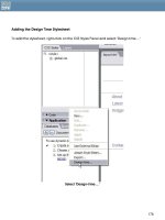
With my document type and basic structure in place, I then moved on to using
Dreamweaver MX’s Draw Layers feature to create the positioning of the elements. First, I
drew a layer along the top to contain the collage image. I named this layer “collage.”
Then, I continued using the Draw Layer feature to position the text header, the navigation,
and the content areas, naming them “header”, “nav”, and “content” respectively.
Tip: Name your Dreamweaver MX layers as you create them, using names that are
relevant and understandable to others who might be working on the site as well as
yourself.
Positioning the Visual Elements with CSS
It’s great using Dreamweaver for doing positioned layouts because it takes a lot of the
guesswork out of doing the CSS. Because Dreamweaver MX Draw Layers puts the CSS that
positions the boxes inline, my tendency is to use Dreamweaver for the positioning, then go
in and pull out the inline markup and put it in an external style sheet. This way, I not only
have all the positioning for a site in a single file, making it easier to manage, but I save a
little on the document weight as well as keeping the XHTML itself very clean.
106
Here’s the inline positioning that Dreamweaver created:
<!DOCTYPE html PUBLIC "-//W3C//DTD XHTML 1.0 Strict//EN"
"
<html xmlns="
<head>
<title>Molly.Com, Inc. Welcome</title>
<meta http-equiv="Content-Type" content="text/html; charset=iso-8859-1"
/>
<link href="molly.com.new.css" rel="stylesheet" type="text/css" />
</head>
<body>
<div id="collage" style="position:absolute; left:0px; top:4px;
width:800px; height:58px"><img src="top-main.jpg" width="800" height="58"
alt=”photographic collage” /></div>
<div id="header" style="position:absolute; left:0px; top:76px;
width:800px; height:35px">
<h1>molly.com</h1>
</div>
<div id="nav" style="position:absolute; left:204px; top:93px;
width:596px; height:32px; z-index:1">
<ul>
<li>Home</li>
<li>Books</li>
<li>Articles</li>
<li>Events</li>
<li>Courses</li>
<li>Consultation</li>
<li>About Molly</li>
<li>Fun Stuff</li>
</ul>
</div>
<div id="content" style="position:absolute; left:0px; top:154px;
width:600px; height:400px; z-index:2">
<p>©Copyright 2003 - 2004 Molly.Com, Inc.<br />Privacy - Credits</p>
107
</div>
</body>
</html>
Listing 3: Dreamweaver’s inline positioning.
As you can see, Dreamweaver MX has generated the inline CSS for my positioned areas.
As mentioned, I prefer to put this all into an external style sheet, where I can also make
modifications to the CSS that Dreamweaver has authored so as to gain further control and
get rid of any rules that are unnecessary.
First, I moved the collage style information from the main document into my external style
sheet. In my CSS document I created an ID selector, #collage, and then input the rules:
#collage {
position:absolute;
left:0px;
top:4px;
width:800px;
height:58px;
}
Listing 4: The CSS positioning for the collage image.
In this instance, I didn’t add or take away any CSS, nor did I for the ID selector I created,
#header:
#header {
position:absolute;
left:0px;
top:76px;
width:800px;
height:35px;
}
Listing 5: Positioning the text header.
I did make one modification to the CSS for the selector, #nav. I removed the Z-index that
Dreamweaver had input. A z-index is unnecessary in this particular design so, to save a few
bytes of the download time, I took it out:
#nav {
position:absolute;
left:204px;
top:93px;
width:596px;
height:32px;
}
108
Listing 6: Positioning the navigation
Next, I created a #content ID selector and moved the CSS from the main document to the
external style sheet. However, here I did make significant changes:
#content {
position: absolute;
width: 600px;
padding: 10px;
margin-top: 100px;
margin-bottom: 20px;
margin-right: 200px;
margin-left: 200px;
}
Listing 7: Here, I’ve made significant changes from the Dreamweaver CSS
The only thing I kept from the Dreamweaver MX styles for the content area is the position
and width. I removed everything else and added margins that were more effective for the
design, as well as adding a 10 pixel padding around the text itself. While I could have
made these modifications once the Draw Layer was created using Dreamweaver’s CSS
editing tools, I chose simply to use Code View and type the declarations directly into the
CSS document. It just was faster in this case.
Styling the Page
Now that everything is quite literally in position, I turned toward adding links and styling the
document: adding fonts, header styles, colors, link colors, background, and creating two
classes, .nav, which we’ll get to in the next section, and the .footer class. I did all of this
using Dreamweaver’s CSS tools, after which time I went into the external style sheet and
moved things around into a more logical order.
Everyone works differently of course, but I tend to be fairly strong-minded about keeping
things logical. So, I’ll make sure I start my CSS documents with the body selector, and then
any HTML selector I use from there down, then links, then ID selectors, then classes. I then
add comments into the CSS, denoting each section. The results of my CSS document
(except the .nav class as I will discuss that in the following section), are seen in Listing 8.
/* molly.com.new.css - global styles */
body {
font-family: Georgia, "Times New Roman", Times, serif;
font-size: 14px;
color: #666666;
background-attachment: fixed;
background-color: #FFFFFF;
background-image: url(molly.new.bak.gif);
background-repeat: no-repeat;
109


