GUIDELINES ON QUALITY CONTROL CIRCLES (QCC) IN THE PUBLIC SERVICE PHẦN 3 potx
Bạn đang xem bản rút gọn của tài liệu. Xem và tải ngay bản đầy đủ của tài liệu tại đây (201.03 KB, 10 trang )
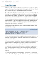
DIAGRAM 7: THE COMPLETED DIAGRAM ESTABLISHING THE SUB-CAUSES
Material Man
\ \
\ Shortage \ Lack of manpower
\ of printing \ No detailed checking
\ supplies \ Attitude
\ \ |
\ Poor quality \ Going on emergancy
\ of supplies \ leave too of often
\ \
\ \ No Training
\ \
\ \
Æ Reports Cannot Be
/ / Printed On Time
/ Disruption of /
/ electricity /
/ / Delay in receiving
/ Insufficent / back first proof
/ Machines /
/ / Delay in setting up
/ Machines / proof-reading division
/ break down /
/ frequently / Amendments while
/ / work is in progress
/ /
/ /
Machine Method
Step 4: Verify Actual Causes
This can be done through two ways, namely through the use of data or by allowing each
Circle member to vote on every cause, which they think, is important. If voting is used,
the votes should be recorded in the Cause and Effect Diagram. The actual causes (that is
those that receive the most number of votes) are circled. At this stage, the Cause and
Effect Diagram will appear as in Diagram 8.
Step 5: Prioritisation of Sub-Causes
Additional data on each sub-cause and each sub-sub-cause, which have been circled are
collected to choose one or more main cause. These causes are then arranged in order of
priority through a voting process. This is shown as in Diagram 9.
Points To Be Noted
In preparing the Cause and Effect Diagram, the following points should be given
attention:
(i) This technique is not suitable in cases where the problem is easy
to solve or its causes / solution are apparent.
(ii) During the brainstorming process to identity the causes of a
certain problem, the focus should be on the causes only and
not on the solutions.
(iii) Use the questioning technique when Circle members face
difficulties in completing the diagram by, using words such as
“what”, “why”, “where”, “when”, “who” and “how”, and
(iv) Use a separate Cause and Effect Diagram for each problem.
(c) Check-sheets
Check-sheets are used to record data in a more orderly and systematic
manner according to the frequency of occurrence of the problem or its
causes. The steps involved in preparing a check-sheet are as follows:
Step 1: Designing A Check-sheet For Data Collection
At this step, members will collect data related to the frequency of
occurrence of each sub-cause identified in a pre-determined format.
For example, the problem identified may be “Loss of Items From
Lodging Rooms” and the sub-causes leading to these problems have
been identified as in Table 2. Data on each of these sub-causes are
listed according to the week in which they occurred. An example is
shown in Table 2.
Step 2: Summarising The Data Collected
Data on each of the sub-causes can be collected for a specified
number of days, weeks or months using a check-sheet. In view of the
fact that many check-sheets will be used in data collection, all the data
gathered should be summarised into one check-sheet as shown in Table 3.
Step 3: Relative Frequency and Cumulative Frequency
The data presented in Table 3 can be rearranged in a descending
order. The relative as well as the cumulative frequency can also be
calculated as shown in Table 4.
The use of check-sheets is more effective if Circle members:
(i) Are clearly aware of the purpose of the data collection;
(ii) Collect data with care and accuracy;
(iii) Choose an appropriate type of check-sheet;
(iv) Design a suitable format as well as instructions on the use of the form;
(v) Identify the person responsible for recording the data for a specific time
period; and
(vi) Determine the sample size.
(d) Pareto Analysis
The Pareto Analysis is the most frequently used methodology for data
analysis by Circle members. The Pareto Diagram is a special kind of graph,
which shows data in the form of vertical or bars in a descending order
of length. This diagram shows the major causes of a problem. The tallest
indicates the most important cause followed by other main causes. With
this, attention can be given to overcoming the major causes of a problem.
The Pareto Diagram can also be used to confirm a certain decision, that
is by comparing diagrams based on information before and after corrective
action has been taken. The effectiveness of the corrective action can then
be established.
The Pareto Diagram is based on the Pareto principle, which is also
known as “80-20 Rule”. This principle shows that usually a small number
of activities can cause numerous problems, or produce the most results.
As an example, 80% of typing errors are caused by 20% of the typists
or 80% of sales of a company are made by 20% of the sales personnel.
This means that scarce resources should be directed towards the most
important areas or aspects.
The Pareto Diagram can be prepared based on the data collected as in
Table 4. The types of data is shown on the horizontal axis whereas the
frequency of occurrence is on the left vertical axis. The cumulative
frequency in the form of percentages is indicated on the right vertical axis.
A Pareto Diagram indicating the frequency of each item is
presented in Diagram 10.
The cumulative frequency curve is plotted as follows:
(i) Start at zero point and connect the line to the right-hand corner
of the first bar, that is at level 121, with a straight line;
(ii) Connect the print at level 121 and the point at level 195;
(ii) Connect the point at level 195 to the point at level 246 and
onwards to level 273 or 100% at the right-hand vertical axis.
A legend to the Pareto diagram should be prepared to indicate the
sources of data / information as shown in Table 5.
The purpose of the legend is to explain the data as well as the sources
from which the data / information was obtained. The data collected must
be accurate because inaccurate data can lead to incorrect or wrong
conclusions.
The Use of the Pareto Diagram
(i) The Pareto Diagram Is The First Step To Improve The Quality Of Work
The Pareto diagram is important because by examining the
diagram, the reader can be made aware of the main causes of a
certain problem. The tallest column indicates the main cause of a
certain problem.
(ii) To Confirm Decisions
By comparing Pareto diagrams before and after corrective
action, circle members will be able to confirm whether the
correct course of action has been taken. This is shown in
Diagram 11.
(e) Bar Charts
Bar charts can be used to indicate the importance of an event through
the frequency of occurrence of a problem. Diagram 12 is an example
of a Bar Chart which shows the number and type of complaints.
Methodology For Constructing Bar Charts
The vertical scale indicates quantity. If this begins at zero point, then
the highest scale should be given. For example, if the highest figure on
the scale is 978, then the maximum scale, which should be used, is 1000.
The bar chart need not be drawn to its full extent if big numbers are
involved. It is sufficient to use a partial chart as shown in Diagram 13.
(f) Pie Charts
Pie charts are used to compare one quantity with another quantity.
These charts are also convenient for comparing a particular data with
its total. The steps involved in preparing a pie chart are as follows:
Step 1
The data collected is converted to percentage form and the number
of degrees. This data is shown in Table 6 and is converted to a Pie
Chart as in Diagram 14.
.
Calculation of percentage and degrees.
Percentage:
Total number of units per
specific item
Total number of units
X 100
Item A = 35 /121 X 100 = 29%
The calculation using the above formula is made for other items namely
B, C and D.
Degrees : One full circle = 360 = 100%
Thus 1% = 360 /100 = 3.60 degrees
Thus 29% for item A = 29% x 3.60 = 104 degrees
This process is continued to calculate the number of degrees for the other
items namely B, C and D.
Step 2
Two concentric circles are drawn. The smaller circle indicates the
total number of units that is 121 as in Diagram 14.
Step 3
The circle should be divided into sectors that is from A to D
according to percentage as shown in Diagram 14.
Step 4
The sectors are arranged clock-wise starting from the 12 o'clock
position. The arrangement is from the biggest / most to the smaller/
lesser. This chart should also provide information such as its date,
purpose and other necessary information.
(g) Histograms
Histograms can be used to present data in an easy and effective manner.
These are used to indicate the frequency of occurrence of the identified
causes. The frequency is shown by the height of the columns in the
histograms.
For example there are complaints in a Government agency that some
of the workers come late to office. A histogram is prepared to depict this
problem. The method of preparation is as follows:
Step 1: Determine The Number of Classes Required
Classes can be different as the arrangement of the data collected according to
specific categories such as time or number of cases. Usually 5 to 20 classes can be
used depending on the number of observations planned and the degree of accuracy
required. In the above example, based on records from the punch-clock cards, it is
found that there is no case of any worker clocking in after 8.45 a.m. Here, an
arbitrary choice of 9 classes is made considering a range of 45 minutes.
Step 2: Establish Class Intervals
Class intervals are decided through comparison of the highest and the lowest
value in the distribution with the number of classes selected. As in the
example, anyone arriving in office after 8.00 am is late. The class interval
for this example is:
(8.45 - 8.00) /9 = 45/9 = 5 minutes
Step 3: Determine Class Boundaries
Class boundaries need to be determined starting with the lowest taking
into consideration the smallest value and building on subsequent classes.
Class boundaries should be selected to avoid situations where a certain
value can be included in a certain class.
In this example, the classes chosen are:
8.01 - 8.05 minutes
8.06 - 8.10 minutes
8.11 - 8.15 minutes
8.16 - 8.20 minutes
8.21 - 8.25 minutes
8.26 - 8.30 minutes
8.31 - 8.35 minutes
8.36 - 8.40 minutes
8.41 - 8.45 minutes
Step 4: Use A Check-sheet To Collect Data
Once the class boundaries have been established as in Step 3, data
can be collected according to the various classes using a check-sheet.
For the examples being used, data can be collected from punch-clock
cards for the past months. On the assumption that the Management has
decided that data be collected from punch-clock cards for one day only,
then the data collected using the check-sheet is as in Table 7.
Step 5: Transfer The Information From The Check-sheet To A
Frequency Table
The information from the check-sheet needs to be transferred to a
frequency table before a histogram can be prepared. The example of
the frequency table is as in Table 8.
Step 6: Preparing A. Histogram
Based on the Frequency table above, a histogram can be prepared
as in Diagram 15.
(i) The horizontal axis is a continuous scale showing the
selected classes;
(ii) For each class, a square vertical column is drawn starting
from the lower class limit to the upper class limit;
(iii) There is no space between the columns in a histogram; and
(iv) The vertical axis shows the frequency that is the number
of employees.
A Histogram can be used to draw conclusions and also to confirm
whether a complain is justified or not. In the above example, a total
of 187 employees were found to be late on the date concerned.
However, all 187 arrived before 8.45 am. This indicates that 37.4%
out of the total number of employees were late and therefore the
complaint is justified. From the histogram, it can also be seen that 65
out of the 187 employees who came late, were late by 10 minutes only.
One clear finding is that 25 employees were between 41- 45 minutes late.
(h) Process Analysis
Sometimes the source of a problem found in a division or at one stage
of a process could originate from other divisions or the preceding stage
of the process. In such a situation, a technique that can be used to trace
or identify the specific stage where the problem originates is the Process
Analysis Technique. Process Analysis can be undertaken through Work
Processes or Work Flow Charts.
A Work Process is a sequential chain of actions involved in carrying
out a certain activity.
A Work Process ensures quality of work by way of pre-determined
work standards. At the same time, a work process facilitates and
streamlines the daily office routine as well as maintaining the level of
efficiency and effectiveness of an employee’s work. By analysing a
Work Process, Circle members will be able to identify weaknesses or
problems arising as well as the officers involved in the process. This is
helpful to Circle members at the problem solving stage.
A Work Flow Chart should be prepared after the Work Process Chart
has been completed. A Work Flow Chart is a graphical depiction or a
diagram on all the actions involved in an activity or procedure. A Work
Flow Chart is useful because it shows clearly each step or action which
has to be taken in order of the correct sequence that is it shows in brief
the starting point as well as the finishing point. Flow charts also help the
staff to understand their respective duties and responsibilities better as
well as improving coordination between departments. Flow charts can
also pinpoint areas of delay or bottlenecks as well as repetitive work.
It also depicts the overall picture of the activity being undertaken.
Specific symbols that are used in the preparation of a Flow Chart are:
An Action (step) in the work process
|
\/ Flow
|
♦ Decision Making
| Simultaneous Action
| | |
∇ Storage or No Further Action
O Connector