The Practice & Science Of Drawing phần 7 pps
Bạn đang xem bản rút gọn của tài liệu. Xem và tải ngay bản đầy đủ của tài liệu tại đây (441.95 KB, 14 trang )
The Project Gutenberg eBook of The Practice & Science Of Drawing, by Harold Speed.
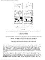
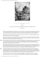
Diagram XIX.
SHOWING HOW LINES UNRELATED CAN BE BROUGHT INTO HARMONY BY THE INTRODUCTION OF OTHERS IN
SYMPATHY WITH THEM.
H. LINES DRAWN AT RANDOM.
I. LINES DRAWN AT RANDOM.
J. ADDITIONAL LINES DRAWN TO RELATE ORIGINAL LINES AND BRING THE WHOLE INTO HARMONY TAKING LINE 1-
2, AS DOMINANT.
K. ADDITIONAL LINES DRAWN TO RELATE ORIGINAL LINES TAKING 1-2 AS DOMINANT.
L. THE SAME AS J WITH ADDITION OF MASSES TO COVER CROSSING OF LINES.
M. THE SAME AS AT K WITH ADDITION OF MASSES TO COVER CROSSING LINES.
In H, I have introduced a straight line into our initial scribble, and this somewhat increases the difficulties of relating them. But by
drawing 7-8 and 9-10 radiating from 1-2, we have introduced this straight line to 5-6. For although 5-6 and 9-10 do not radiate
from the same point, they are obviously in sympathy. It is only a short part of the line at the end marked 5 that is out of sympathy,
and had 5-6 taken the course of the dotted line, it would have radiated from the same point as 9-10. We still have line 3-4 to
account for. But by drawing 11-12 we bring it into relationship with 5-6, and so by stages through 9-10 and 7-8 to the original
straight line 1-2. Line 13-14, by being related to 3-4, 11-12, and also 5-6, still further harmonises the group, and the remainder
echo 5-6 and increase the dominant swing. At L masses have been introduced, covering crossing lines, and we have a basis for a
composition.
In Diagram I lines have been drawn as before, at random, but two of them are straight and at right angles, the longer being across
the-centre of the panel. The first thing to do is to trick the eye out of knowing that this line is in the centre by drawing others
parallel to it, leading the eye downwards to line 9-10, which is now much more important than 1-2 and in better proportion with
the height of the panel. The vertical line 3-4 is rather stark and lonely, and so we' introduce two more verticals at 11-12 and 13-14,
which modify this, and with another two lines in sympathy with 5-6 and leading the eye back to the horizontal top of the panel,
176
(85 of 147)3/9/2006 11:03:42 PM
The Project Gutenberg eBook of The Practice & Science Of Drawing, by Harold Speed.
some sort of unity is set up, the introduction of some masses completing the scheme at M.
There is a quality of sympathy set up by certain line relationships about which it is important to say something. Ladies who have
the instinct for choosing a hat or doing their hair to suit their face instinctively know something of this; know that certain things in
their face are emphasised by certain forms in their hats or hair, and the care that has to be taken to see that the things thus drawn
attention to are their best and not their worst points.
The principle is more generally understood in relation to colour; everybody knows how the blueness of blue eyes is emphasised by
a sympathetic blue dress or touch of blue on a hat, &c. But the same principle applies to lines. The qualities of line in beautiful
eyes and eyebrows are emphasised by the long sympathetic curve of a picture hat, and the becoming effect of a necklace is partly
due to the same cause, the lines being in sympathy with the eyes or the oval of the face, according to how low or high they hang.
The influence of long lines is thus to "pick out" from among the lines of a face those with which they are in sympathy, and thus to
accentuate them.
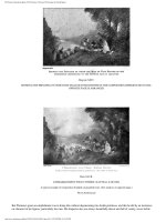
To illustrate this, on page 178 [Transcribers Note:
Plate XLII] is reproduced "The Portrait of the Artist's Daughter," by Sir Edward
Burne-Jones.
The two things that are brought out by the line arrangement in this portrait are the beauty of the eyes and the shape of the face.
Instead of the picture hat you have the mirror, the widening circles of which swing round in sympathy with the eyes and
concentrate the attention on them. That on the left (looking at the picture) being nearest the centre, has the greatest attention
concentrated upon it, the lines of the mirror being more in sympathy with this than the other eye, as it is nearer the centre. If you
care to take the trouble, cut a hole in a piece of opaque paper the size of the head and placing it over the illustration look at the face
without the influence of these outside lines; and note how much more equally divided the attention is between the two eyes
without the emphasis given to the one by the mirror. This helps the unity of impression, which with both eyes realised to so intense
a focus might have suffered. This mirror forms a sort of echo of the pupil of the eye with its reflection of the window in the left-
hand corner corresponding to the high light, greatly helping the spell these eyes hold.
Diagram XX.
INDICATING THE SYMPATHETIC FLOW OF LINES THAT GIVE UNITY TO THIS COMPOSITION.
177
179
(86 of 147)3/9/2006 11:03:42 PM
The Project Gutenberg eBook of The Practice & Science Of Drawing, by Harold Speed.
Plate XLII.
PORTRAIT OF THE ARTIST'S DAUGHTER SIR EDWARD BURNE-JONES, BART.
An example of sympathetic rhythm. (See diagram on opposite page.)
Photo Hollyer
The other form accentuated by the line arrangement is the oval of the face. There is the necklace the lines of which lead on to those
on the right in the reflection. It is no mere accident that this chain is so in sympathy with the line of the face: it would hardly have
remained where it is for long, and must have been put in this position by the artist with the intention (conscious or instinctive) of
accentuating the face line. The line of the reflection on the left and the lines of the mirror are also sympathetic. Others in the folds
of the dress, and those forming the mass of the hands and arms, echo still further this line of the face and bring the whole canvas
into intense sympathetic unity of expression.
The influence that different ways of doing the hair may have on a face is illustrated in the accompanying scribbles. The two
profiles are exactly alike—I took great trouble to make them so. It is quite remarkable the difference the two ways of doing the
hair make to the look of the faces. The upward swing of the lines in A sympathise with the line of the nose and the sharper
projections of the face generally (see dotted lines), while the full downward curves of B sympathise with the fuller curves of the
face and particularly emphasise the fullness under the chin so dreaded by beauty past its first youth (see dotted lines). It is only a
very sharply-cut face that can stand this low knot at the back of the head, in which case it is one of the simplest and most beautiful
ways of doing the hair. The hair dragged up high at the back sharpens the lines of the profile as the low knot blunts them.
180181182
(87 of 147)3/9/2006 11:03:42 PM
The Project Gutenberg eBook of The Practice & Science Of Drawing, by Harold Speed.
Diagram XXI.
ILLUSTRATING THE EFFECT ON THE FACE OF PUTTING THE HAIR UP AT THE BACK. HOW THE UPWARD FLOW OF
LINES ACCENTUATES THE SHARPNESSES OF THE FEATURES.
Diagram XXII.
ILLUSTRATING THE EFFECT ON THE SAME FACE AS DIAGRAM XXI, OF PUTTING THE HAIR LOW AT THE BACK. HOW
THE FULLER LINES THUS GIVEN ACCENTUATE THE FULLNESSES OF THE FEATURES.
The illustrations to this chapter have been drawn in diagrammatical form in order to try and show that the musical quality of lines
and the emotions they are capable of calling up are not dependent upon truth to natural forms but are inherent in abstract
183
(88 of 147)3/9/2006 11:03:42 PM
The Project Gutenberg eBook of The Practice & Science Of Drawing, by Harold Speed.
arrangements themselves. That is to say, whenever you get certain arrangements of lines, no matter what the objects in nature may
be that yield them, you will always get the particular emotional stimulus belonging to such arrangements. For instance, whenever
you get long uninterrupted horizontal lines running through a picture not opposed by any violent contrast, you will always get an
impression of intense quiet and repose; no matter whether the natural objects yielding these lines are a wide stretch of country with
long horizontal clouds in the sky, a pool with a gentle breeze making horizontal bars on its surface, or a pile of wood in a timber
yard. And whenever you get long vertical lines in a composition, no matter whether it be a cathedral interior, a pine forest, or a
row of scaffold poles, you will always have the particular feeling associated with rows of vertical lines in the abstract. And further,
whenever you get the swinging lines of the volute, an impression of energy will be conveyed, no matter whether it be a breaking
wave, rolling clouds, whirling dust, or only a mass of tangled hoop iron in a wheelwright's yard. As was said above, these effects
may be greatly increased, modified, or even destroyed by associations connected with the things represented. If in painting the
timber yard the artist is thinking more about making it look like a stack of real wood with its commercial associations and less
about using the artistic material its appearance presents for the making of a picture, he may miss the harmonic impression the long
lines of the stacks of wood present. If real wood is the first thing you are led to think of in looking at his work, he will obviously
have missed the expression of any artistic feeling the subject was capable of producing. And the same may be said of the scaffold
poles or the hoop iron in the wheelwright's yard.
This structure of abstract lines at the basis of a picture will be more or less overlaid with the truths of nature, and all the rich
variety of natural forms, according to the requirements of the subject. Thus, in large decorative work, where the painting has to
take its place as part of an architectural scheme, the severity of this skeleton will be necessary to unite the work to the architectural
forms around it, of which it has to form a part; and very little indulgence in the realisation of natural truth should be permitted to
obscure it. But in the painting of a small cabinet picture that exists for close inspection, the supporting power of this line basis is
not nearly so essential, and a full indulgence in all the rich variety of natural detail is permissible. And this is how it happens that
painters who have gloried in rich details have always painted small pictures, and painters who have preferred larger truths pictures
of bigger dimensions. It sounds rather paradoxical to say the smaller the picture the more detail it should contain, and the larger the
less, but it is nevertheless true. For although a large picture has not of necessity got to be part of an architectural scheme, it has to
be looked at from a distance at which small detail could not be seen, and where such detail would greatly weaken its expressive
power. And further, the small picture easily comes within the field of vision, and the whole impression can be readily grasped
without the main lines being, as it were, underlined. But in a big picture one of the greatest difficulties is to get it to read simply, to
strike the eye as one impression. Its size making it difficult for it to be got comfortably within the field of vision, every artifice has
to be used to give it "breadth of treatment," as it is called, and nothing interferes with this like detail.
XIII
VARIETY OF MASS
The masses that go to make up a picture have variety in their shape, their tone values, their edges, in texture or quality, and in
gradation. Quite a formidable list, but each of these particulars has some rhythmic quality of its own about which it will be
necessary to say a word.
As to variety of shape, many things that were said about lines apply equally to the spaces enclosed by them. It is impossible to
write of the rhythmic possibilities that the infinite variety of shapes possessed by natural objects contain, except to point out how
necessary the study of nature is for this. Variety of shape is one of the most difficult things to invent, and one of the commonest
things in nature. However imaginative your conception, and no matter how far you may carry your design, working from
imagination, there will come a time when studies from nature will be necessary if your work is to have the variety that will give
life and interest. Try and draw from imagination a row of elm trees of about the same height and distance apart, and get the variety
of nature into them; and you will see how difficult it is to invent. On examining your work you will probably discover two or three
pet forms repeated, or there may be only one. Or try and draw some cumulus clouds from imagination, several groups of them
across a sky, and you will find how often again you have repeated unconsciously the same forms. How tired one gets of the pet
cloud or tree of a painter who does not often consult nature in his pictures. Nature is the great storehouse of variety; even a piece
of coal will suggest more interesting rock-forms than you can invent. And it is fascinating to watch the infinite variety of graceful
forms assumed by the curling smoke from a cigarette, full of suggestions for beautiful line arrangements. If this variety of form in
your work is allowed to become excessive it will overpower the unity of your conception. It is in the larger unity of your
composition that the imaginative faculty will be wanted, and variety in your forms should always be subordinated to this idea.
Nature does not so readily suggest a scheme of unity, for the simple reason that the first condition of your picture, the four
bounding lines, does not exist in nature. You may get infinite suggestions for arrangements, and should always be on the look out
for them, but your imagination will have to relate them to the rigorous conditions of your four bounding lines, and nature does not
help you much here. But when variety in the forms is wanted, she is pre-eminent, and it is never advisable to waste inventive
power where it is so unnecessary.
184
185
Variety of Shape.
186
(89 of 147)3/9/2006 11:03:42 PM
The Project Gutenberg eBook of The Practice & Science Of Drawing, by Harold Speed.
But although nature does not readily suggest a design fitting the conditions of a panel her tendency is always towards unity of
arrangement. If you take a bunch of flowers or leaves and haphazard stuff them into a vase of water, you will probably get a very
chaotic arrangement. But if you leave it for some time and let nature have a chance you will find that the leaves and flowers have
arranged themselves much more harmoniously. And if you cut down one of a group of trees, what a harsh discordant gap is usually
left; but in time nature will, by throwing a bough here and filling up a gap there, as far as possible rectify matters and bring all into
unity again. I am prepared to be told this has nothing to do with beauty but is only the result of nature's attempts to seek for light
and air. But whatever be the physical cause, the fact is the same, that nature's laws tend to pictorial unity of arrangement.
It will be as well to try and explain what is meant by tone values. All the masses or tones (for the terms are often used
interchangeably) that go to the making of a visual impression can be considered in relation to an imagined scale from white, to
represent the lightest, to black, to represent the darkest tones. This scale of values does not refer to light and shade only, but light
and shade, colour, and the whole visual impression are considered as one mosaic of masses of different degrees of darkness or
lightness. A dark object in strong light may be lighter than a white object in shadow, or the reverse: it will depend on the amount
of reflected light. Colour only matters in so far as it affects the position of the mass in this imagined scale of black and white. The
correct observation of these tone values is a most important matter, and one of no little difficulty.
The word tone is used in two senses, in the first place when referring to the individual masses as to their relations in the scale of
"tone values"; and secondly when referring to the musical relationship of these values to a oneness of tone idea governing the
whole impression. In very much the same way you might refer to a single note in music as a tone, and also to the tone of the whole
orchestra. The word values always refers to the relationship of the individual masses or tones in our imagined scale from black to
white. We say a picture is out of value or out of tone when some of the values are darker or lighter than our sense of harmony feels
they should be, in the same way as we should say an instrument in an orchestra was out of tone or tune when it was higher or
lower than our sense of harmony allowed. Tone is so intimately associated with the colour of a picture that it is a little difficult to
treat of it apart, and it is often used in a sense to include colour in speaking of the general tone. We say it has a warm tone or a cold
tone.
There is a particular rhythmic beauty about a well-ordered arrangement of tone values that is a very important part of pictorial
design. This music of tone has been present in art in a rudimentary way since the earliest time, but has recently received a much
greater amount of attention, and much new light on the subject has been given by the impressionist movement and the study of the
art of China and Japan, which is nearly always very beautiful in this respect.
This quality of tone music is most dominant when the masses are large and simple, when the contemplation of them is not
disturbed by much variety, and they have little variation of texture and gradation. A slight mist will often improve the tone of a
landscape for this reason. It simplifies the tones, masses them together, obliterating many smaller varieties. I have even heard of
the tone of a picture being improved by such a mist scrambled or glazed over it.
Plate XLIII.
MONTE SOLARO CAPRI
Study on brown paper in charcoal and white chalk.
187
Variety of Tone Values
188
189
(90 of 147)3/9/2006 11:03:42 PM
The Project Gutenberg eBook of The Practice & Science Of Drawing, by Harold Speed.
The powder on a lady's face, when not over-done, is an improvement for the same reason. It simplifies the tones by destroying the
distressing shining lights that were cutting up the masses; and it also destroys a large amount of half tone, broadening the lights
almost up to the commencement of the shadows.
Tone relationships are most sympathetic when the middle values of your scale only are used, that is to say, when the lights
are low in tone and the darks high.
They are most dramatic and intense when the contrasts are great and the jumps from dark to light sudden.
The sympathetic charm of half-light effects is due largely to the tones being of this middle range only; whereas the striking
dramatic effect of a storm clearing, in which you may get a landscape brilliantly lit by the sudden appearance of the sun, seen
against the dark clouds of the retreating storm, owes much of its dramatic quality to contrast. The strong contrasts of tone values
coupled with the strong colour contrast between the warm sunlit land and the cold angry blue of the storm, gives such a scene
much dramatic effect and power.
The subject of values will be further treated in dealing with unity of tone.
Variety in quality and nature is almost too subtle to write about with any prospect of being understood. The play of different
qualities and textures in the masses that go to form a picture must be appreciated at first hand, and little can be written about it. Oil
paint is capable of almost unlimited variety in this way. But it is better to leave the study of such qualities until you have mastered
the medium in its more simple aspects.
The particular tone music of which we were speaking is not helped by any great use of this variety. A oneness of quality
throughout the work is best suited to exhibit it. Masters of tone, like Whistler, preserve this oneness of quality very carefully in
their work, relying chiefly on the grain of a rough canvas to give the necessary variety and prevent a deadness in the quality of the
tones.
But when more force and brilliancy are wanted, some use of your paint in a crumbling, broken manner is necessary, as it catches
more light, thus increasing the force of the impression. Claude Monet and his followers in their search for brilliancy used this
quality throughout many of their paintings, with new and striking results. But it is at the sacrifice of many beautiful qualities of
form, as this roughness of surface does not lend itself readily to any finesse of modelling. In the case of Claude Monet's work,
however, this does not matter, as form with all its subtleties is not a thing he made any attempt at exploiting. Nature is sufficiently
vast for beautiful work to be done in separate departments of vision, although one cannot place such work on the same plane with
successful pictures of wider scope. And the particular visual beauty of sparkling light and atmosphere, of which he was one of the
first to make a separate study, could hardly exist in a work that aimed also at the significance of beautiful form, the appeal of form,
as was explained in an earlier chapter, not being entirely due to a visual but to a mental perception, into which the sense of touch
enters by association. The scintillation and glitter of light destroys this touch idea, which is better preserved in quieter lightings.
There is another point in connection with the use of thick paint, that I don't think is sufficiently well known, and that is, its greater
readiness to be discoloured by the oil in its composition coming to the surface. Fifteen years ago I did what it would be advisable
for every student to do as soon as possible, namely, make a chart of the colours he is likely to use. Get a good white canvas, and
set upon it in columns the different colours, very much as you would do on your palette, writing the names in ink beside them.
Then take a palette-knife, an ivory one by preference, and drag it from the individual masses of paint so as to get a gradation of
different thicknesses, from the thinnest possible layer where your knife ends to the thick mass where it was squeezed out of the
tube. It is also advisable to have previously ruled some pencil lines with a hard point down the canvas in such a manner that the
strips of paint will cross the lines. This chart will be of the greatest value to you in noting the effect of time on paint. To make it
more complete, the colours of several makers should be put down, and at any rate the whites of several different makes should be
on it. As white enters so largely into your painting it is highly necessary to use one that does not change.
The two things that I have noticed are that the thin ends of the strips of white have invariably kept whiter than the thick end, and
that all the paints have become a little more transparent with time. The pencil lines here come in useful, as they can be seen
through the thinner portion, and show to what extent this transparency has occurred. But the point I wish to emphasise is that at the
thick end the larger body of oil in the paint, which always comes to the surface as it dries, has darkened and yellowed the surface
greatly; while the small amount of oil at the thin end has not darkened it to any extent.
Claude Monet evidently knew this, and got over the difficulty by painting on an absorbent canvas, which sucks the surplus oil out
from below and thus prevents its coming to the surface and discolouring the work in time. When this thick manner of painting is
adopted, an absorbent canvas should always be used. It also has the advantage of giving a dull dry surface of more brilliancy than a
shiny one.
Although not so much as with painting, varieties of texture enter into drawings done with any of the mediums that lend themselves
Variety in Quality and Texture
190
191
192
(91 of 147)3/9/2006 11:03:42 PM
The Project Gutenberg eBook of The Practice & Science Of Drawing, by Harold Speed.
to mass drawing; charcoal, conté crayon, lithographic chalk, and even red chalk and lead pencil are capable of giving a variety of
textures, governed largely by the surface of the paper used. But this is more the province of painting than of drawing proper, and
charcoal, which is more painting than drawing, is the only medium in which it can be used with much effect.
There is a very beautiful rhythmic quality in the play from softness to sharpness on the edges of masses. A monotonous sharpness
of edge is hard, stern, and unsympathetic. This is a useful quality at times, particularly in decorative work, where the more intimate
sympathetic qualities are not so much wanted, and where the harder forms go better with the architectural surroundings of which
your painted decoration should form a part. On the other hand, a monotonous softness of edge is very weak and feeble-looking,
and too entirely lacking in power to be desirable. If you find any successful work done with this quality of edge unrelieved by any
sharpnesses, it will depend on colour, and not form, for any qualities it may possess.
Some amount of softness makes for charm, and is extremely popular: "I do like that because it's so nice and soft" is a regular show-
day remark in the studio, and is always meant as a great compliment, but is seldom taken as such by the suffering painter. But a
balance of these two qualities playing about your contours produces the most delightful results, and the artist is always on the look
out for such variations. He seldom lets a sharpness of edge run far without losing it occasionally. It may be necessary for the hang
of the composition that some leading edges should be much insisted on. But even here a monotonous sharpness is too dead a thing,
and although a firmness of run will be allowed to be felt, subtle variations will be introduced to prevent deadness. The Venetians
from Giorgione's time were great masters of this music of edges. The structure of lines surrounding the masses on which their
compositions are built were fused in the most mysterious and delightful way. But although melting into the surrounding mass, they
are always firm and never soft and feeble. Study the edge in such a good example of the Venetian manner as the "Bacchus and
Ariadne" at the National Gallery, and note where they are hard and where lost.
There is one rather remarkable fact to be observed in this picture and many Venetian works, and this is that the most accented
edges are reserved for unessential parts, like the piece of white drapery on the lower arm of the girl with the cymbals, and the
little white flower on the boy's head in front. The edges on the flesh are everywhere fused and soft, the draperies being much
sharper. You may notice the same thing in many pictures of the later Venetian schools. The greatest accents on the edges are rarely
in the head, except it may be occasionally in the eyes. But they love to get some strongly-accented feature, such as a crisply-
painted shirt coming against the soft modelling of the neck, to balance the fused edges in the flesh. In the head of Philip IV in our
National Gallery the only place where Velazquez has allowed himself anything like a sharp edge is in the high lights on the chain
hanging round the neck. The softer edges of the principal features in these compositions lend a largeness and mystery to these
parts, and to restore the balance, sharpnesses are introduced in non-essential accessories.
In the figure with the white tunic from Velazquez's "Surrender of Breda," here reproduced, note the wonderful variety on the edges
of the white masses of the coat and the horse's nose, and also that the sharpest accents are reserved for such non-essentials as the
bows on the tunic and the loose hair on the horse's forehead. Velazquez's edges are wonderful, and cannot be too carefully studied.
He worked largely in flat tones or planes; but this richness and variety of his edges keeps his work from looking flat and dull, like
that of some of his followers. I am sorry to say this variety does not come out so well in the reproduction on page 194
[Transcribers Note:
Plate XLIV] as I could have wished, the half-tone process having a tendency to sharpen edges rather
monotonously.
This quality is everywhere to be found in nature. If you regard any scene pictorially, looking at it as a whole and not letting your
eye focus on individual objects wandering from one to another while being but dimly conscious of the whole, but regarding it as a
beautiful ensemble; you will find that the boundaries of the masses are not hard continuous edges but play continually along their
course, here melting imperceptibly into the surrounding mass, and there accentuated more sharply. Even a long continuous line,
like the horizon at sea, has some amount of this play, which you should always be on the look out for. But when the parts only of
nature are regarded and each is separately focussed, hard edges will be found to exist almost everywhere, unless there is a positive
mist enveloping the objects. And this is the usual way of looking at things. But a picture that is a catalogue of many little parts
separately focussed will not hang together as one visual impression.
Variety of Edges.
193
194
195
(92 of 147)3/9/2006 11:03:42 PM
The Project Gutenberg eBook of The Practice & Science Of Drawing, by Harold Speed.
Plate XLIV.
PART OF THE SURRENDER OF BREDA. BY VELAZQUEZ
Note the varied quantity of the edge in white mass of tunic. (The reproduction does not unfortunately show this as well as the original.)
Photo Anderson
In naturalistic work the necessity for painting to one focal impression is as great as the necessity of painting in true perspective.
What perspective has done for drawing, the impressionist system of painting to one all-embracing focus has done for tone. Before
perspective was introduced, each individual object in a picture was drawn with a separate centre of vision fixed on each object in
turn. What perspective did was to insist that all objects in a picture should be drawn in relation to one fixed centre of vision. And
whereas formerly each object was painted to a hard focus, whether it was in the foreground or the distance, impressionism teaches
that you cannot have the focus in a picture at the same time on the foreground and the distance.
Of course there are many manners of painting with more primitive conventions in which the consideration of focus does not enter.
But in all painting that aims at reproducing the impressions directly produced in us by natural appearances, this question of focus
and its influence on the quality of your edges is of great importance.
Something should be said about the serrated edges of masses, like those of trees seen against the sky. These are very difficult to
treat, and almost every landscape painter has a different formula. The hard, fussy, cut-out, photographic appearance of trees misses
all their beauty and sublimity.
There are three principal types of treatment that may serve as examples. In the first place there are the trees of the early Italian
painters, three examples of which are illustrated on page 197 [Transcribers Note:
Diagram XXIII]. A thin tree is always selected,
and a rhythmic pattern of leaves against the sky painted. This treatment of a dark pattern on a light ground is very useful as a
contrast to the softer tones of flesh. But the treatment is more often applied nowadays to a spray of foliage in the foreground, the
pattern of which gives a very rich effect. The poplar trees in Millais' "Vale of Rest" are painted in much the same manner as that
employed by the Italians, and are exceptional among modern tree paintings, the trees being treated as a pattern of leaves against
the sky. Millais has also got a raised quality of paint in his darks very similar to that of Bellini and many early painters.
Giorgione added another tree to landscape art: the rich, full, solidly-massed forms that occur in his "Concert Champêtre" of the
Louvre, reproduced on page 151 [Transcribers Note:
Plate XXXIII]. In this picture you may see both types of treatment. There are
196
197
(93 of 147)3/9/2006 11:03:42 PM
The Project Gutenberg eBook of The Practice & Science Of Drawing, by Harold Speed.
the patterns of leaves variety on the left and the solidly-massed treatment on the right.
Diagram XXIII.
EXAMPLES OF EARLY ITALIAN TREATMENT OF TREES
A. From pictures in Oratorio di S. Ansano. "Il trionfo dell' Amore," attributed to Botticelli.
B. From "L'Annunziazione," by Botticelli, Uffizi, Florence.
C. From "La Vergine," by Giovanni Bellini in the Accademia, Venice.
Corot in his later work developed a treatment that has been largely followed since. Looking at trees with a very wide focus, he
ignored individual leaves, and resolved them into masses of tone, here lost and here found more sharply against the sky. The
subordinate masses of foliage within these main boundaries are treated in the same way, resolved into masses of infinitely varying
edges. This play, this lost-and-foundness at his edges is one of the great distinguishing charms of Corot's trees. When they have
been painted from this mass point of view, a suggestion of a few leaves here and a bough there may be indicated, coming sharply
against the sky, but you will find this basis of tone music, this crescendo and diminuendo throughout all his later work (see
illustration, page 215 [Transcribers Note:
Diagram XXVI]).
These are three of the more extreme types of trees to be met with in art, but the variations on these types are very numerous.
Whatever treatment you adopt, the tree must be considered as a whole, and some rhythmic form related to this large impression
selected. And this applies to all forms with serrated edges: some large order must be found to which the fussiness of the edges
must conform.
The subject of edges generally is a very important one, and one much more worried over by a master than by the average student.
It is interesting to note how all the great painters have begun with a hard manner, with edges of little variety, from which they have
gradually developed a looser manner, learning to master the difficulties of design that hard contours insist on your facing, and only
when this is thoroughly mastered letting themselves develop freely this play on the edges, this looser handling.
For under the freest painting, if it be good, there will be found a bed-rock structure of well-constructed masses and lines. They
may never be insisted on, but their steadying influence will always be felt. So err in your student work on the side of hardness
rather than looseness, if you would discipline yourself to design your work well. Occasionally only let yourself go at a looser
handling.
Variety of gradation will naturally be governed largely by the form and light and shade of the objects in your composition. But
while studying the gradations of tone that express form and give the modelling, you should never neglect to keep the mind fixed
upon the relation the part you are painting bears to the whole picture. And nothing should be done that is out of harmony with this
large conception. It is one of the most difficult things to decide the amount of variety and emphasis allowable for the smaller parts
of a picture, so as to bring all in harmony with that oneness of impression that should dominate the whole; how much of your scale
198
199
Variety of Gradiation.
(94 of 147)3/9/2006 11:03:42 PM
The Project Gutenberg eBook of The Practice & Science Of Drawing, by Harold Speed.
of values it is permissible to use for the modelling of each individual part. In the best work the greatest economy is exercised in
this respect, so that as much power may be kept in reserve as possible. You have only the one scale from black to white to work
with, only one octave within the limits of which to compose your tone symphonies. There are no higher and lower octaves as in
music to extend your effect. So be very sparing with your tone values when modelling the different parts.
XIV
UNITY OF MASS
What has been said about unity of line applies obviously to the outlines bounding the masses, so that we need not say anything
further on that subject. The particular quality of which something should be said, is the unity that is given to a picture by means of
a well-arranged and rhythmically considered scheme of tone values.
The modifications in the relative tone values of objects seen under different aspects of light and atmosphere are infinite and ever
varying; and this is quite a special study in itself. Nature is the great teacher here, her tone arrangements always possessing unity.
How kind to the eye is her attempt to cover the ugliness of our great towns in an envelope of atmosphere, giving the most
wonderful tone symphonies; thus using man's desecration of her air by smoke to cover up his other desecration of her country-side,
a manufacturing town. This study of values is a distinguishing feature of modern art.
But schemes taken from nature are not the only harmonious ones. The older masters were content with one or two well-tried
arrangements of tone in their pictures, which were often not at all true to natural appearances but nevertheless harmonious. The
chief instance of this is the low-toned sky. The painting of flesh higher in tone than the sky was almost universal at many periods
of art, and in portraits is still often seen. Yet it is only in strong sunlight that this is ever so in nature, as you can easily see by
holding your hand up against a sky background. The possible exception to this rule is a dark storm-cloud, in which case your hand
would have to be strongly lit by some bright light in another part of the sky to appear light against it.
This high tone of the sky is a considerable difficulty when one wishes the interest centred on the figures. The eye instinctively
goes to the light masses in a picture, and if these masses are sky, the figures lose some importance. The fashion of lowering its
tone has much to be said for it on the score of the added interest it gives to the figures. But it is apt to bring a heavy stuffy look
into the atmosphere, and is only really admissible in frankly conventional treatment, in which one has not been led to expect
implicit truth to natural effect. If truth to natural appearances is carried far in the figures, the same truth will be expected in the
background; but if only certain truths are selected in the figures, and the treatment does not approach the naturalistic, much more
liberty can be taken with the background without loss of verisimilitude.
But there is a unity about nature's tone arrangements that it is very difficult to improve upon; and it is usually advisable, if you can,
to base the scheme of tone in your picture on a good study of values from nature.
Such effects as twilight, moonlight, or even sunlight were seldom attempted by the older painters, at any rate in their figure
subjects. All the lovely tone arrangements that nature presents in these more unusual aspects are a new study, and offer unlimited
new material to the artist. Many artists are content to use this simply for itself, the beauty of a rare tone effect being sufficient with
the simplest accessories to make a picture. But in figure composition, what new and wonderful things can be imagined in which
some rare aspect of nature's tone-music is combined with a fine figure design.
These values are not easily perceived with accuracy, although their influence may be felt by many. A true eye for the accurate
perception of subtle tone arrangements is a thing you should study very diligently to acquire. How then is this to be done? It is
very difficult, if not impossible, to teach anybody to see. Little more can be said than has already been written about this subject in
the chapter on variety in mass. Every mass has to be considered in relation to an imagined tone scale, taking black for your darkest
and white for your highest light as we have seen. A black glass, by reducing the light, enables you to observe these relationships
more accurately; the dazzling quality of strong light making it difficult to judge them. But this should only be used to correct one's
eye, and the comparison should be made between nature seen in the glass and your work seen also in the glass. To look in a black
glass and then compare what you saw with your work looked at direct is not a fair comparison, and will result in low-toned work
with little brilliancy.
Now, to represent this scale of tones in painting we have white paint as our highest and black paint as our lowest notes. It is never
advisable to play either of these extremes, although you may go very near to them. That is to say, there should never be pure white
or pure black masses in a picture. There is a kind of screaminess set up when one goes the whole gamut of tone, that gives a look
of unrestraint and weakness; somewhat like the feeling experienced when a vocalist sings his or her very highest or very lowest
note. In a good singer one always feels he could have gone still higher or still lower, as the case may be, and this gives an added
power to the impression of his singing. And in art, likewise, it is always advisable to keep something of this reserve power. Also,
the highest lights in nature are never without colour, and this will lower the tone; neither are the deepest darks colourless, and this
will raise their tone. But perhaps this is dogmatising, and it may be that beautiful work is to be done with all the extremes you can
200
201
202
203
(95 of 147)3/9/2006 11:03:42 PM
The Project Gutenberg eBook of The Practice & Science Of Drawing, by Harold Speed.
"clap on," though I think it very unlikely.
In all the quieter aspects of lighting this range from black to white paint is sufficient. But where strong, brilliantly lit effects are
wanted, something has to be sacrificed, if this look of brilliancy is to be made telling.
In order to increase the relationship between some of the tones others must be sacrificed. There are two ways of doing this. The
first, which was the method earliest adopted, is to begin from the light end of the scale, and, taking something very near pure white
as your highest light, to get the relationships between this and the next most brilliant tone, and to proceed thus, tone by tone, from
the lightest to the darkest. But working in this way you will find that you arrive at the greatest dark you can make in paint before
you have completed the scale of relationships as in nature, if the subject happens to be brilliantly lit. Another method is to put
down the highest light and the darkest dark, and then work your scale of tone relatively between them. But it will be found that
working in this way, unless the subject in nature is very quietly lit, you will not get anything like the forceful impression of tone
that nature gives.
The third way, and this is the more modern, is to begin from the dark end of the scale, getting the true relationship felt between the
greatest dark and the next darkest tone to it, and so on, proceeding towards the light. By this method you will arrive at your highest
light in paint before the highest light in nature has been reached. All variety of tone at the light end of the scale will have to be
modified in this case, instead of at the dark end as in the other case. In the painting of sunlight the latter method is much the more
effective, a look of great brilliancy and light being produced, whereas in the earlier method, the scale being commenced from the
light end, so much of the picture was dark that the impression of light and air was lost and a dark gloomy land took its place, a
gloom accentuated rather than dispelled by the streaks of lurid light where the sun struck.
Rembrandt is an example of beginning the tone relationships from the light side of the scale, and a large part of his canvas is in
consequence always dark.
Bastien Lepage is an example of the second method, that of fixing upon two extremes and working-relatively between them. And
it will be noticed that he confined himself chiefly to quiet grey day effects of lighting, the rendering of which was well within the
range of his palette. The method of beginning from the dark side, getting the true relations of tones on this side of the scale, and
letting the lights take care of themselves, was perhaps first used by Turner. But it is largely used now whenever a strong
impression of light is desired. The light masses instead of the dark masses dominate the pictures, which have great brilliancy.
These tone values are only to be perceived in their true relationship by the eye contemplating a wide field of vision. With the
ordinary habit of looking only at individual parts of nature, the general impression being but dimly felt, they are not observed. The
artist has to acquire the habit of generalising his visual attention over a wide field if he would perceive the true relation of the parts
to this scale of values. Half closing the eyes, which is the usual method of doing this, destroys the perception of a great deal of
colour. Another method of throwing the eyes out of focus and enabling one to judge of large relationships, is to dilate them widely.
This rather increases than diminishes the colour, but is not so safe a method of judging subtle tone relationships.
It is easier in approaching this study out of doors to begin with quiet effects of light. Some of those soft grey days in this country
are very beautiful in tone, and change so little that careful studies can be made. And with indoor work, place your subject rather
away from the direct light and avoid much light and shade; let the light come from behind you.
If very strong light effects, such as sunlight, or a dark interior lit by one brilliant window, are attempted, the values will be found
to be much simpler and more harsh, often resolving themselves into two masses, a brilliant light contrasted with a dark shadow.
This tone arrangement of strong light in contrast with dark shadow was a favourite formula with many schools of the past, since
Leonardo da Vinci first used it. Great breadth and splendour is given by it to design, and it is one of the most impressive of tone
arrangements. Leonardo da Vinci's "Our Lady of the Rocks," in the National Gallery, is an early example of this treatment. And
Correggio's "Venus, Mercury, and Cupid," here reproduced, is another particularly fine example. Reynolds and many of the
eighteenth-century men used this scheme in their work almost entirely. This strong light and shade, by eliminating to a large extent
the half tones, helps to preserve in highly complete work a simplicity and directness of statement that is very powerful. For certain
impressions it probably will never be bettered, but it is a very well-worn convention. Manet among the moderns has given new life
to this formula, although he did not derive his inspiration directly from Correggio but through the Spanish school. By working in a
strong, rather glaring, direct light, he eliminated still further the half tones, and got rid to a great extent of light and shade. Coming
at a time when the realistic and plain air movements were destroying simple directness, his work was of great value, bringing back,
as it did with its insistence on large, simple masses, a sense of frank design. His influence has been very great in recent years, as
artists have felt that it offered a new formula for design and colour. Light and shade and half tone are the great enemies of colour,
sullying, as they do, its purity; and to some extent to design also, destroying, as they do, the flatness of the picture. But with the
strong direct light, the masses are cut out as simply as possible, and their colour is little sullied by light and shade. The picture of
Manet's reproduced is a typical example of his manner. The aggressive shape of the pattern made by the light mass against the
dark background is typical of his revolutionary attitude towards all accepted canons of beauty. But even here it is interesting to
note that many principles of composition are conformed to. The design is united to its boundaries by the horizontal line of the
couch and the vertical line of the screen at the back, while the whole swing hangs on the diagonal from top left-hand corner to
right; lower corner, to which the strongly marked edge of the bed-clothes and pillow at the bottom of the picture is parallel.
204
205
206207
(96 of 147)3/9/2006 11:03:42 PM
The Project Gutenberg eBook of The Practice & Science Of Drawing, by Harold Speed.
Plate XLV.
CORREGGIO. VENUS. MERCURY, AND CUPID (NATIONAL GALLERY)
A fine example of one of the most effective tone arrangements; a brilliantly-lit, richly-modelled light mass on a dark background.
Photo Hanfstaengl
Large flat tones give a power and simplicity to a design, and a largeness and breadth of expression that are very valuable, besides
showing up every little variety in the values used for your modelling; and thus enabling you to model with the least expenditure of
tones. Whatever richness of variation you may ultimately desire to add to your values, see to it that in planning your picture you
get a good basic structure of simply designed, and as far as possible flat, tones.
In speaking of variety in mass we saw how the nearer these tones are in the scale of values, the more reserved and quiet the
impression created, and the further apart or greater the contrast, the more dramatic and intense the effect. And the
sentiment of tone in a picture, like the sentiment of line and colour, should be in harmony with the nature of your subject.
Generally speaking more variety of tone and shape in the masses of your composition is permissible when a smaller range of
values is used than when your subject demands strong contrasts. When strong contrasts of tone or what are called black and
white effects are desired, the masses must be very simply designed. Were this not so, and were the composition patterned all over
with smaller masses in strong contrast, the breadth and unity of the effect would be lost. While when the difference of relative
values between one tone and another is slight, the oneness of effect is not so much interfered with by there being a large number of
them. Effects of strong contrasts are therefore far the most difficult to manage, as it is not easy to reduce a composition of any
complexity to a simple expressive pattern of large masses.
This principle applies also in the matter of colour. Greater contrasts and variety of colour may be indulged in where the middle
range only of tones is used, and where there is little tone contrast, than where there is great contrast. In other words, you cannot
with much hope of success have strong contrasts of colour and strong contrasts of tone in the same picture: it is too violent.
208
(97 of 147)3/9/2006 11:03:42 PM
The Project Gutenberg eBook of The Practice & Science Of Drawing, by Harold Speed.
If you have strong contrasts of colour, the contrasts of tone between them must be small. The Japanese and Chinese often make the
most successful use of violent contrasts of colour by being careful that they shall be of the same tone value.
And again, where you have strong contrasts of tone, such as Rembrandt was fond of, you cannot successfully have strong contrasts
of colour as well. Reynolds, who was fond both of colour and strong tone contrast, had to compromise, as he tells us in his
lectures, by making the shadows all the same brown colour, to keep a harmony in his work.
Plate XLVI.
OLYMPIA. MANET (Louvre)
A further development of the composition formula illustrated by Correggio's "Venus". Added force is given by lighting with low direct
light elimination half-tones.
Photo Neurdein
There is some analogy between straight lines and flat tones, and curved lines and gradated tones. And a great deal that was said
about the rhythmic significance of these lines will apply equally well here. What was said about long vertical and horizontal lines
conveying a look of repose and touching the serious emotional notes, can be said of large flat tones. The feeling of infinity
suggested by a wide blue sky without a cloud, seen above a wide bare plain, is an obvious instance of this. And for the same
harmonic cause, a calm evening has so peaceful and infinite an expression. The waning light darkens the land and increases the
contrast between it and the sky, with the result that all the landscape towards the west is reduced to practically one dark tone,
cutting sharply against the wide light of the sky.
And the graceful charm of curved lines swinging in harmonious rhythm through a composition has its analogy in gradated tones.
Watteau and Gainsborough, those masters of charm, knew this, and in their most alluring compositions the tone-music is founded
on a principle of tone-gradations, swinging and interlacing with each other in harmonious rhythm throughout the composition.
Large, flat tones, with their more thoughtful associations are out of place here, and are seldom if ever used. In their work we see a
world where the saddening influences of profound thought and its expression are far away. No deeper notes are allowed to mar the
gaiety of this holiday world. Watteau created a dream country of his own, in which a tired humanity has delighted ever since, in
which all serious thoughts are far away and the mind takes refreshment in the contemplation of delightful things. And a great deal
of this charm is due to the pretty play from a crescendo to a diminuendo in the tone values on which his compositions are based—
so far removed from the simple structure of flat masses to which more primitive and austere art owes its power.
209
211
(98 of 147)3/9/2006 11:03:42 PM