Pro WPF in C# 2010 phần 3 doc
Bạn đang xem bản rút gọn của tài liệu. Xem và tải ngay bản đầy đủ của tài liệu tại đây (1.43 MB, 106 trang )
CHAPTER 6 ■ CONTROLS
163
BorderThickness takes the width of the border in device-independent units. You need to set both
properties before you’ll see the border.
■ Note Some controls don’t respect the BorderBrush and BorderThickness properties. The Button object ignores
them completely because it defines its background and border using the ButtonChrome decorator. However, you
can give a button a new face (with a border of your choosing) using templates, as described in Chapter 17.
Fonts
The Control class defines a small set of font-related properties that determine how text appears in a
control. These properties are outlined in Table 6-1.
Table 6-1.
Font-Related Properties of the Control Class
Name Description
FontFamily The name of the font you want to use.
FontSize The size of the font in device-independent units (each of which is 1/96 inch).
This is a bit of a change from tradition that’s designed to support WPF’s new
resolution-independent rendering model. Ordinary Windows applications
measure fonts using points, which are assumed to be 1/72 inch on a standard PC
monitor. If you want to turn a WPF font size into a more familiar point size, you
can use a handy trick—just multiply by 3/4. For example, a traditional 38-point
font is equivalent to 48 units in WPF.
FontStyle The angling of the text, as represented as a FontStyle object. You get the FontSyle
preset you need from the static properties of the FontStyles class, which includes
Normal, Italic, or Oblique lettering. (Oblique is an artificial way to create italic
text on a computer that doesn’t have the required italic font. Letters are taken
from the normal font and slanted using a transform. This usually creates a poor
result.)
FontWeight The heaviness of text, as represented as a FontWeight object. You get the
FontWeight preset you need from the static properties of the FontWeights class.
Bold is the most obvious of these, but some typefaces provide other variations,
such as Heavy, Light, ExtraBold, and so on.
FontStretch The amount that text is stretched or compressed, as represented by a FontStretch
object. You get the FontStretch preset you need from the static properties of the
FontStretches class. For example, UltraCondensed reduces fonts to 50% of their
normal width, while UltraExpanded expands them to 200%. Font stretching is an
OpenType feature that is not supported by many typefaces. (To experiment with
this property, try using the Rockwell font, which does support it.)
CHAPTER 6 ■ CONTROLS
164
■ Note The Control class doesn’t define any properties that use its font. While many controls include a property
such as Text, that isn’t defined as part of the base Control class. Obviously, the font properties don’t mean
anything unless they’re used by the derived class.
Font Family
A font family is a collection of related typefaces. For example, Arial Regular, Arial Bold, Arial Italic, and
Arial Bold Italic are all part of the Arial font family. Although the typographic rules and characters for
each variation are defined separately, the operating system realizes they are related. As a result, you can
configure an element to use Arial Regular, set the FontWeight property to Bold, and be confident that
WPF will switch over to the Arial Bold typeface.
When choosing a font, you must supply the full family name, as shown here:
<Button Name="cmd" FontFamily="Times New Roman" FontSize="18">A Button</Button>
It’s much the same in code:
cmd.FontFamily = "Times New Roman";
cmd.FontSize = "18";
When identifying a FontFamily, a shortened string is not enough. That means you can’t substitute
Times or Times New instead of the full name Times New Roman.
Optionally, you can use the full name of a typeface to get italic or bold, as shown here:
<Button F
FontFamily="Times New Roman Bold"
>A Button</Button>
However, it’s clearer and more flexible to use just the family name and set other properties (such as
FontStyle and FontWeight) to get the variant you want. For example, the following markup sets the
FontFamily to Times New Roman and sets the FontWeight to FontWeights.Bold:
<Button FontFamily="Times New Roman" FontWeight="Bold">A Button</Button>
Text Decorations and Typography
Some elements also support more advanced text manipulation through the TextDecorations and
Typography properties. These allow you to add embellishments to text. For example, you can set the
TextDecorations property using a static property from the TextDecorations class. It provides just four
decorations, each of which allows you to add some sort of line to your text. They include Baseline,
OverLine, Strikethrough, and Underline. The Typography property is more advanced—it lets you access
specialized typeface variants that only some fonts will provide. Examples include different number
alignments, ligatures (connections between adjacent letters), and small caps.
CHAPTER 6 ■ CONTROLS
165
For the most part, the TextDecorations and Typography features are found only in flow document
content—which you use to create rich, readable documents. (Chapter 28 describes documents in detail.)
However, the frills also turn up on the TextBox class. Additionally, they’re supported by the TextBlock,
which is a lighter-weight version of the Label that’s perfect for showing small amounts of wrappable text
content. Although you’re unlikely to use text decorations with the TextBox or change its typography, you
may want to use underlining in the TextBlock, as shown here:
<TextBlock TextDecorations="Underline">Underlined text</TextBlock>
If you’re planning to place a large amount of text content in a window and you want to format
individual portions (for example, underline important words), you should refer to Chapter 28, where
you’ll learn about many more flow elements. Although flow elements are designed for use with
documents, you can nest them directly inside a TextBlock.
Font Inheritance
When you set any of the font properties, the values flow through to nested objects. For example, if you
set the FontFamily property for the top-level window, every control in that window gets the same
FontFamily value (unless the control explicitly sets a different font). This feature is similar to the
Windows Forms concept of ambient properties, but the underlying plumbing is different. It works
because the font properties are dependency properties, and one of the features that dependency
properties can provide is property value inheritance—the magic that passes your font settings down to
nested controls.
It’s worth noting that property value inheritance can flow through elements that don’t even support
that property. For example, imagine you create a window that holds a StackPanel, inside of which are
three Label controls. You can set the FontSize property of the window because the Window class derives
from the Control class. You can’t set the FontSize property for the StackPanel because it isn’t a control.
However, if you set the FontSize property of the window, your property value is still able to flow through
the StackPanel to get to your labels inside and change their font sizes.
Along with the font settings, several other base properties use property value inheritance. In the
Control class, the Foreground property uses inheritance. The Background property does not. (However,
the default background is a null reference that’s rendered by most controls as a transparent background.
That means the parent’s background will still show through.) In the UIElement class, AllowDrop,
IsEnabled, and IsVisible use property inheritance. In the FrameworkElement, the CultureInfo and
FlowDirection properties do.
■ Note A dependency property supports inheritance only if the FrameworkPropertyMetadata.Inherits flag is set to
true, which is not the default. Chapter 4 discusses the FrameworkPropertyMetadata class and property registration
in detail.
Font Substitution
When you’re setting fonts, you need to be careful to choose a font that you know will be present on the
user’s computer. However, WPF does give you a little flexibility with a font fallback system. You can set
CHAPTER 6 ■ CONTROLS
166
FontFamily to a comma-separated list of font options. WPF will then move through the list in order,
trying to find one of the fonts you’ve indicated.
Here’s an example that attempts to use Technical Italic font but falls back to Comic Sans MS or Arial
if that isn’t available:
<Button FontFamily="Technical Italic, Comic Sans MS, Arial">A Button</Button>
If a font family really does contain a comma in its name, you’ll need to escape the comma by
including it twice in a row.
Incidentally, you can get a list of all the fonts that are installed on the current computer using the
static SystemFontFamilies collection of the System.Windows.Media.Fonts class. Here’s an example that
uses it to add fonts to a list box:
foreach (FontFamily fontFamily in Fonts.SystemFontFamilies)
{
lstFonts.Items.Add(fontFamily.Source);
}
The FontFamily object also allows you to examine other details, such as the line spacing and
associated typefaces.
■ Note One of the ingredients that WPF doesn’t include is a dialog box for choosing a font. The WPF Text team
has posted two much more attractive WPF font pickers, including a no-code version that uses data binding
(
and a more sophisticated version that
supports the optional typographic features that are found in some OpenType fonts (
text/archive/2006/11/01/sample-font-chooser.aspx
).
Font Embedding
Another option for dealing with unusual fonts is to embed them in your application. That way, your
application never has a problem finding the font you want to use.
The embedding process is simple. First, you add the font file (typically, a file with the extension .ttf)
to your application and set the Build Action to Resource. (You can do this in Visual Studio by selecting
the font file in the Solution Explorer and changing its Build Action in the Properties window.)
Next, when you use the font, you need to add the character sequence ./# before the font family
name, as shown here:
<Label FontFamily="./#Bayern" FontSize="20">This is an embedded font</Label>
The ./ characters are interpreted by WPF to mean “the current folder.” To understand what this
means, you need to know a little more about XAML’s packaging system.
As you learned in Chapter 2, you can run stand-alone (known as loose) XAML files directly in your
browser without compiling them. The only limitation is that your XAML file can’t use a code-behind file.
In this scenario, the current folder is exactly that, and WPF looks at the font files that are in the same
directory as the XAML file and makes them available to your application.
CHAPTER 6 ■ CONTROLS
167
More commonly, you’ll compile your WPF application to a .NET assembly before you run it. In this
case, the current folder is still the location of the XAML document, only now that document has been
compiled and embedded in your assembly. WPF refers to compiled resources using a specialized URI
syntax that’s discussed in Chapter 7. All application URIs start with pack://application. If you create a
project named ClassicControls and add a window named EmbeddedFont.xaml, the URI for that window
is this:
pack://application:,,,/ClassicControls/embeddedfont.xaml
This URI is made available in several places, including through the FontFamily.BaseUri property.
WPF uses this URI to base its font search. Thus, when you use the ./ syntax in a compiled WPF
application, WPF looks for fonts that are embedded as resources alongside your compiled XAML.
After the ./ character sequence, you can supply the file name, but you’ll usually just add the
number sign (#) and the font’s real family name. In the previous example, the embedded font is named
Bayern.
■ Note Setting up an embedded font can be a bit tricky. You need to make sure you get the font family name
exactly right, and you need to make sure you choose the correct build action for the font file. Furthermore, Visual
Studio doesn’t currently provide design support for embedded fonts (meaning your control text won’t appear in the
correct font until you run your application). To see an example of the correct setup, refer to the sample code for
this chapter.
Embedding fonts raises obvious licensing concerns. Unfortunately, most font vendors allow their
fonts to be embedded in documents (such as PDF files) but not applications (such as WPF assemblies),
even though an embedded WPF font isn’t directly accessible to the end user. WPF doesn’t make any
attempt to enforce font licensing, but you should make sure you’re on solid legal ground before you
redistribute a font.
You can check a font’s embedding permissions using Microsoft’s free font properties extension
utility, which is available at Once
you install this utility, right-click any font file, and choose Properties to see more detailed information
about it. In particular, check the Embedding tab for information about the allowed embedding for this
font. Fonts marked with Installed Embedding Allowed are suitable for WPF applications; fonts with
Editable Embedding Allowed may not be. Consult with the font vendor for licensing information
about a specific font.
Text Formatting Mode
The text rendering in WPF is significantly different from the rendering in older GDI-based applications.
A large part of the difference is due to WPF’s device-independent display system, but there are also
significant enhancements that allow text to appear clearer and crisper, particularly on LCD monitors.
However, WPF text rendering has one well-known shortcoming. At small text sizes, text can become
blurry and show undesirable artifacts (like color fringing around the edges). These problems don’t occur
with GDI text display, because GDI uses a number of tricks to optimize the clarity of small text. For
example, GDI can change the shapes of small letters, adjust their positions, and line up everything on
CHAPTER 6 ■ CONTROLS
168
pixel boundaries. These steps cause the typeface to lose its distinctive character, but they make for a
better on-screen reading experience when dealing with very small text.
So how can you fix WPF’s small-text display problem? The best solution is to scale up your text (on a
96-dpi monitor, the effect should disappear at a text size of about 15 device-independent units) or use a
high-dpi monitor that has enough resolution to show sharp text at any size. But because these options
often aren’t practical, WPF 4 introduces a new feature: the ability to selectively use GDI-like text
rendering.
To use GDI-style text rendering, you add the TextOptions.TextFormattingMode attached property
to a text-displaying element like the TextBlock or Label, and set it to Display (rather than the standard
value, Ideal). Here’s an example:
<TextBlock FontSize="12" Margin="5">
This is a Test. Ideal text is blurry at small sizes.
</TextBlock>
<TextBlock FontSize="12" Margin="5" T
TextOptions.TextFormattingMode="Display"
>
This is a Test. Display text is crisp at small sizes.
</TextBlock>
It’s important to remember that the TextFormattingMode property is a solution for small text only.
If you use it on larger text (text above 15 points), the text will not be as clear, the spacing will not be as
even, and the typeface will not be rendered as accurately. And if you use text in conjunction with a
transform (discussed in Chapter 12) that rotates, resizes, or otherwise changes its appearance, you
should always use WPF’s standard text display mode. That’s because the GDI-style optimization for
display text is applied before any transforms. Once a transform is applied, the result will no longer be
aligned on pixel boundaries, and the text will appear blurry.
Mouse Cursors
A common task in any application is to adjust the mouse cursor to show when the application is busy or
to indicate how different controls work. You can set the mouse pointer for any element using the Cursor
property, which is inherited from the FrameworkElement class.
Every cursor is represented by a System.Windows.Input.Cursor object. The easiest way to get a
Cursor object is to use the static properties of the Cursors class (from the System.Windows.Input
namespace). The cursors include all the standard Windows cursors, such as the hourglass, the hand,
resizing arrows, and so on. Here’s an example that sets the hourglass for the current window:
this.Cursor = Cursors.Wait;
Now when you move the mouse over the current window, the mouse pointer changes to the familiar
hourglass icon (in Windows XP) or the swirl (in Windows Vista and Windows 7).
■ Note The properties of the Cursors class draw on the cursors that are defined on the computer. If the user has
customized the set of standard cursors, the application you create will use those customized cursors.
CHAPTER 6 ■ CONTROLS
169
If you set the cursor in XAML, you don’t need to use the Cursors class directly. That’s because
the TypeConverter for the Cursor property is able to recognize the property names and retrieve the
corresponding Cursor object from the Cursors class. That means you can write markup like this to show
the help cursor (a combination of an arrow and a question mark) when the mouse is positioned over a
button:
<Button Cursor="Help">Help</Button>
It’s possible to have overlapping cursor settings. In this case, the most specific cursor wins. For
example, you could set a different cursor on a button and on the window that contains the button. The
button’s cursor will be shown when you move the mouse over the button, and the window’s cursor will
be used for every other region in the window.
However, there’s one exception. A parent can override the cursor settings of its children using the
ForceCursor property. When this property is set to true, the child’s Cursor property is ignored, and the
parent’s Cursor property applies everywhere inside.
If you want to apply a cursor setting to every element in every window of an application,
the FrameworkElement.Cursor property won’t help you. Instead, you need to use the static
Mouse.OverrideCursor property, which overrides the Cursor property of every element:
Mouse.OverrideCursor = Cursors.Wait;
To remove this application-wide cursor override, set the Mouse.OverrideCursor property to null.
Lastly, WPF supports custom cursors without any fuss. You can use both ordinary .cur cursor files
(which are essentially small bitmaps) and .ani animated cursor files. To use a custom cursor, you pass
the file name of your cursor file or a stream with the cursor data to the constructor of the Cursor object:
Cursor customCursor = new Cursor(Path.Combine(applicationDir, "stopwatch.ani");
this.Cursor = customCursor;
The Cursor object doesn’t directly support the URI resource syntax that allows other WPF elements
(such as the Image) to use files that are stored in your compiled assembly. However, it’s still quite easy to
add a cursor file to your application as a resource and then retrieve it as a stream that you can use to
construct a Cursor object. The trick is using the Application.GetResourceStream() method:
StreamResourceInfo sri = Application.GetResourceStream(
new Uri("stopwatch.ani", UriKind.Relative));
Cursor customCursor = new Cursor(sri.Stream);
this.Cursor = customCursor;
This code assumes that you’ve added a file named stopwatch.ani to your project and set its Build
Action to Resource. You’ll learn more about the GetResourceStream() method in Chapter 7.
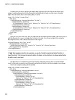
Content Controls
A content control is a still more specialized type of controls that is able to hold (and display) a piece of
content. Technically, a content control is a control that can contain a single nested element. The one-
child limit is what differentiates content controls from layout containers, which can hold as many nested
elements as you want.
CHAPTER 6 ■ CONTROLS
170
■ Tip Of course, you can still pack a lot of content in a single content control. The trick is to wrap everything in a
single container, such as a StackPanel or a Grid. For example, the Window class is itself a content control. Obviously,
windows often hold a great deal of content, but it’s all wrapped in one top-level container (typically a Grid).
As you learned in Chapter 3, all WPF layout containers derive from the abstract Panel class, which
gives the support for holding multiple elements. Similarly, all content controls derive from the abstract
ContentControl class. Figure 6-1 shows the class hierarchy.
DispatcherObject
DependencyObject
Visual
UIElement
FrameworkElement
Control
ContentControl
Label
ButtonBase
ToolTip
ScrollViewer
UserControl
Window
HeaderedContentControl
GroupBox
TabItem
Expander
Legend
Abstract Class
Concrete Class
F
Figure 6-1.
The hierarchy of content controls
CHAPTER 6 ■ CONTROLS
171
As Figure 6-1 shows, several common controls are actually content controls, including the Label and
the ToolTip. Additionally, all types of buttons are content controls, including the familiar Button, the
RadioButton, and the CheckBox. There are also a few more specialized content controls, such as
ScrollViewer (which allows you to create a scrollable panel) and UserControl class (which allows you to
reuse a custom grouping of controls). The Window class, which is used to represent each window in your
application, is itself a content control.
Finally, there is a subset of content controls that goes through one more level of inheritance by
deriving from the HeaderedContentControl class. These controls have both a content region and a
header region, which can be used to display some sort of title. They include the GroupBox, TabItem (a
page in a TabControl), and Expander controls.
■ Note Figure 6-1 leaves out just a few elements. It doesn’t show the Frame element, which is used for
navigation (discussed in Chapter 24), and it omits a few elements that are used inside other controls (such as list
box and status bar items).
The Content Property
Whereas the Panel class adds the Children collection to hold nested elements, the ContentControl class
adds a Content property, which accepts a single object. The Content property supports any type of
object, but it separates objects into two groups and gives each group different treatment:
x
Objects that don’t derive from UIElement.
The content control calls ToString()
to get the text for these controls and then displays that text.
x
Objects that derive from UIElement.
These objects (which include all the visual
elements that are a part of WPF) are displayed inside the content control using the
UIElement.OnRender() method.
■ Note Technically, the OnRender() method doesn’t draw the object immediately. It simply generates a graphical
representation, which WPF paints on the screen as needed.
To understand how this works, consider the humble button. So far, the examples that you’ve seen
that include buttons have simply supplied a string:
<Button Margin="3">Text content</Button>
This string is set as the button content and displayed on the button surface. However, you can get
more ambitious by placing other elements inside the button. For example, you can place an image
inside a button using the Image class:
<Button Margin="3">
<Image Source="happyface.jpg" Stretch="None" />
</Button>
CHAPTER 6 ■ CONTROLS
172
Or you could combine text and images by wrapping them all in a layout container like the
StackPanel:
<Button Margin="3">
<StackPanel>
<TextBlock Margin="3">Image and text button</TextBlock>
<Image Source="happyface.jpg" Stretch="None" />
<TextBlock Margin="3">Courtesy of the StackPanel</TextBlock>
</StackPanel>
</Button>
■ Note It’s acceptable to place text content inside a content control because the XAML parser converts that to a
string object and uses that to set the Content property. However, you can’t place string content directly in a layout
container. Instead, you need to wrap it in a class that derives from UIElement, such as TextBlock or Label.
If you wanted to create a truly exotic button, you could even place other content controls such as
text boxes and buttons inside the button (and still nest elements inside these). It’s doubtful that such an
interface would make much sense, but it’s possible. Figure 6-2 shows some sample buttons.
Figure 6-2.
Buttons with different types of nested content
CHAPTER 6 ■ CONTROLS
173
This is the same content model you saw with windows. Just like the Button class, the Window class
allows a single nested element, which can be a piece of text, an arbitrary object, or an element.
■ Note One of the few elements that is not allowed inside a content control is the Window. When you create a Window,
it checks to see if it’s the top-level container. If it’s placed inside another element, the Window throws an exception.
Aside from the Content property, the ContentControl class adds very little. It includes a HasContent
property that returns true if there is content in the control, and a ContentTemplate that allows you to
build a template telling the control how to display an otherwise unrecognized object. Using a
ContentTemplate, you can display non-UIElement-derived objects more intelligently. Instead of just
calling ToString() to get a string, you can take various property values and arrange them into more
complex markup. You’ll learn more about data templates in Chapter 20.
Aligning Content
In Chapter 3, you learned how to align different controls in a container using the HorizontalAlignment
and VerticalAlignment properties, which are defined in the base FrameworkElement class. However,
once a control contains content, you need to consider another level of organization. You need to decide
how the content inside your content control is aligned with its borders. This is accomplished using the
HorizontalContentAlignment and VerticalContentAlignment properties.
HorizontalContentAlignment and VerticalContentAlignment support the same values as
HorizontalAlignment and VerticalAlignment. That means you can line up content on the inside of any edge
(Top, Bottom, Left, or Right), you can center it (Center), or you can stretch it to fill the available space
(Stretch). These settings are applied directly to the nested content element, but you can use multiple levels
of nesting to create a sophisticated layout. For example, if you nest a StackPanel in a Label element, the
Label.HorizontalContentAlignment property determines where the StackPanel is placed, but the alignment
and sizing options of the StackPanel and its children will determine the rest of the layout.
In Chapter 3, you also learned about the Margin property, which allows you to add whitespace
between adjacent elements. Content controls use a complementary property named Padding, which
inserts space between the edges of the control and the edges of the content. To see the difference,
compare the following two buttons:
<Button>Absolutely No Padding</Button>
<Button Padding="3">Well Padded</Button>
The button that has no padding (the default) has its text crowded against the button edge. The
button that has a padding of 3 units on each side gets a more respectable amount of breathing space.
Figure 6-3 highlights the difference.
CHAPTER 6 ■ CONTROLS
174
Figure 6-3.
Padding the content of the button
■ Note The HorizontalContentAlignment, VerticalContentAlignment, and Padding properties are defined as part of
the Control class, not the more specific ContentControl class. That’s because there may be controls that aren’t
content controls but still have some sort of content. One example is the TextBox—its contained text (stored in the
Text property) is adjusted using the alignment and padding settings you’ve applied.
The WPF Content Philosophy
At this point, you might be wondering if the WPF content model is really worth all the trouble. After all,
you might choose to place an image inside a button, but you’re unlikely to embed other controls and
entire layout panels. However, there are a few important reasons driving the shift in perspective.
Consider the example shown in Figure 6-2, which includes a simple image button that places an
Image element inside the Button control. This approach is less than ideal, because bitmaps are not
resolution-independent. On a high-dpi display, the bitmap may appear blurry because WPF must add
more pixels by interpolation to make sure the image stays the correct size. More sophisticated WPF
interfaces avoid bitmaps and use a combination of vector shapes to create custom-drawn buttons and
other graphical frills (as you’ll see in Chapter 12).
This approach integrates nicely with the content control model. Because the Button class is a
content control, you are not limited to filling it with a fixed bitmap; instead, you can include other
content. For example, you can use the classes in the System.Windows.Shapes namespace to draw a
vector image inside a button. Here’s an example that creates a button with two diamond shapes (as
shown in Figure 6-4):
<Button Margin="3">
<Grid>
<Polygon Points="100,25 125,0 200,25 125,50"
Fill="LightSteelBlue" />
<Polygon Points="100,25 75,0 0,25 75,50"
Fill="White"/>
</Grid>
</Button>
CHAPTER 6 ■ CONTROLS
175
Figure 6-4.
A button with shape content
Clearly, in this case, the nested content model is simpler than adding extra properties to the Button
class to support the different types of content. Not only is the nested content model more flexible, but it
also allows the Button class to expose a simpler interface. And because all content controls support
content nesting in the same way, there’s no need to add different content properties to multiple classes.
(Windows Forms ran into this issue in .NET 2.0, while enhancing the Button and Label class to better
support images and mixed image and text content.)
In essence, the nested content model is a trade-off. It simplifies the class model for elements
because there’s no need to use additional layers of inheritance to add properties for different types of
content. However, you need to use a slightly more complex object model—elements that can be built
from other nested elements.
■ Note You can’t always get the effect you want by changing the content of a control. For example, even though
you can place any content in a button, a few details never change, such as the button’s shaded background, its
rounded border, and the mouse-over effect that makes it glow when you move the mouse pointer over it. However,
another way to change these built-in details is to apply a new control template. Chapter 17 shows how you can
change all aspects of a control’s look and feel using a control template.
Labels
The simplest of all content controls is the Label control. Like any other content control, it accepts any
single piece of content you want to place inside. But what distinguishes the Label control is its support
for mnemonics, which are essentially shortcut keys that set the focus to a linked control.
To support this functionality, the Label control adds a single property, named Target. To set the
Target property, you need to use a binding expression that points to another control. Here’s the syntax
you must use:
<Label Target="{Binding ElementName=txtA}">Choose _A</Label>
<TextBox Name="txtA"></TextBox>
<Label Target="{Binding ElementName=txtB}">Choose _B</Label>
<TextBox Name="txtB"></TextBox>
CHAPTER 6 ■ CONTROLS
176
The underscore in the label text indicates the shortcut key. (If you really do want an underscore to
appear in your label, you must add two underscores instead.) All mnemonics work with Alt and the
shortcut key you’ve identified. For example, if the user presses Alt+A in this example, the first label
transfers focus to the linked control, which is txtA. Similarly, Alt+B takes the user to txtB.
■ Note If you’ve programmed with Windows Forms, you’re probably used to using the ampersand (&) character
to identify a shortcut key. XAML uses the underscore instead because the ampersand character can’t be entered
directly in XML; instead, you need to use the clunkier character entity & in its place.
Usually, the shortcut letters are hidden until the user presses Alt, at which point they appear as
underlined letters (Figure 6-5). However, this behavior depends on system settings.
■ Tip If all you need to do is display content without support for mnemonics, you may prefer to use the more
lightweight TextBlock element. Unlike the Label, the TextBlock also supports wrapping through its TextWrapping
property.
Figure 6-5.
Shortcuts in a label
CHAPTER 6 ■ CONTROLS
177
Buttons
WPF recognizes three types of button controls: the familiar Button, the CheckBox, and the RadioButton.
All of these controls are content controls that derive from ButtonBase.
The ButtonBase class includes only a few members. It defines the Click event and adds support for
commands, which allow you to wire buttons to higher-level application tasks (a feat you’ll consider in
Chapter 9). Finally, the ButtonBase class adds a ClickMode property, which determines when a button
fires its Click event in response to mouse actions. The default value is ClickMode.Release, which means
the Click event fires when the mouse is clicked and released. However, you can also choose to fire the
Click event mouse when the mouse button is first pressed (ClickMode.Press) or, oddly enough,
whenever the mouse moves over the button and pauses there (ClickMode.Hover).
■ Note All button controls support access keys, which work similarly to mnemonics in the Label control. You add
the underscore character to identify the access key. If the user presses Alt and the access key, a button click is
triggered.
The Button
The Button class represents the ever-present Windows push button. It adds just two writeable
properties, IsCancel and IsDefault:
x
When IsCancel is true
, this button is designated as the cancel button for a
window. If you press the Escape key while positioned anywhere on the current
window, this button is triggered.
x
When IsDefault is true
, this button is designated as the default button (also
known as the accept button). Its behavior depends on your current location in
the window. If you’re positioned on a non-Button control (such as a TextBox,
RadioButton, CheckBox, and so on), the default button is given a blue shading,
almost as though it has focus. If you press Enter, this button is triggered. However,
if you’re positioned on another Button control, the current button gets the blue
shading, and pressing Enter triggers that button, not the default button.
Many users rely on these shortcuts (particularly the Escape key to close an unwanted dialog box), so
it makes sense to take the time to define these details in every window you create. It’s still up to you to
write the event handling code for the cancel and default buttons, because WPF won’t supply this
behavior.
In some cases, it may make sense for the same button to be the cancel button and the default
button for a window. One example is the OK button in an About box. However, there should be only a
single cancel button and a single default button in a window. If you designate more than one cancel
button, pressing Escape will simply move the focus to the next default button, but it won’t trigger that
button. If you have more than one default button, pressing Enter has a somewhat more confusing
behavior. If you’re on a non-Button control, pressing Enter moves you to the next default button. If
you’re on a Button control, pressing Enter triggers it.
CHAPTER 6 ■ CONTROLS
178
IsDefault and IsDefaulted
The Button class also includes the horribly confusing IsDefaulted property, which is read-only. IsDefaulted
returns true for a default button if another control has focus and that control doesn’t accept the Enter key.
In this situation, pressing the Enter key will trigger the button.
For example, a TextBox does not accept the Enter key, unless you’ve set TextBox.AcceptsReturn to true.
When a TextBox with an AcceptsReturn value of true has focus, IsDefaulted is false for the default button.
When a TextBox with an AcceptsReturns value of false has focus, the default button has IsDefaulted set to
true. If this isn’t confusing enough, the IsDefaulted property returns false when the button itself has focus,
even though hitting Enter at this point will trigger the button.
Although it’s unlikely that you’ll want to use the IsDefaulted property, this property does allow you to write
certain types of style triggers, as you’ll see in Chapter 11. If that doesn’t interest you, just add it to your list
of obscure WPF trivia, which you can use to puzzle your colleagues.
The ToggleButton and RepeatButton
Along with Button, three more classes derive from ButtonBase. These include the following:
x GridViewColumnHeader, which represents the clickable header of a column when
you use a grid-based ListView. The ListView is described in Chapter 22.
x RepeatButton, which fires Click events continuously, as long as the button is held
down. Ordinary buttons fire one Click event per user click.
x ToggleButton, which represents a button that has two states (pushed or
unpushed). When you click a ToggleButton, it stays in its pushed state until you
click it again to release it. This is sometimes described as sticky click behavior.
Both RepeatButton and ToggleButton are defined in the System.Windows.Controls.Primitives
namespace, which indicates they aren’t often used on their own. Instead, they’re used to build more
complex controls by composition, or extended with features through inheritance. For example, the
RepeatButton is used to build the higher-level ScrollBar control (which, ultimately, is a part of the even
higher-level ScrollViewer). The RepeatButton gives the arrow buttons at the ends of the scroll bar their
trademark behavior—scrolling continues as long as you hold it down. Similarly, the ToggleButton is used
to derive the more useful CheckBox and RadioButton classes described next.
However, neither the RepeatButton nor the ToggleButton is an abstract class, so you can use both of
them directly in your user interfaces. The ToggleButton is genuinely useful inside a ToolBar, which you’ll
use in Chapter 25.
The CheckBox
Both the CheckBox and the RadioButton are buttons of a different sort. They derive from ToggleButton,
which means they can be switched on or off by the user, hence their “toggle” behavior. In the case of the
CheckBox, switching the control on means placing a check mark in it.
CHAPTER 6 ■ CONTROLS
179
The CheckBox class doesn’t add any members, so the basic CheckBox interface is defined in the
ToggleButton class. Most important, ToggleButton adds an IsChecked property. IsChecked is a nullable
Boolean, which means it can be set to true, false, or null. Obviously, true represents a checked box, while
false represents an empty one. The null value is a little trickier—it represents an indeterminate state,
which is displayed as a shaded box. The indeterminate state is commonly used to represent values that
haven’t been set or areas where some discrepancy exists. For example, if you have a check box that
allows you to apply bold formatting in a text application and the current selection includes both bold
and regular text, you might set the check box to null to show an indeterminate state.
To assign a null value in WPF markup, you need to use the null markup extension, as shown here:
<CheckBox IsChecked="{x:Null}">A check box in indeterminate state</CheckBox>
Along with the IsChecked property, the ToggleButton class adds a property named IsThreeState,
which determines whether the user is able to place the check box into an indeterminate state. If
IsThreeState is false (the default), clicking the check box alternates its state between checked and
unchecked, and the only way to place it in an indeterminate state is through code. If IsThreeState is true,
clicking the check box cycles through all three possible states.
The ToggleButton class also defines three events that fire when the check box enters specific states:
Checked, Unchecked, and Indeterminate. In most cases, it’s easier to consolidate this logic into one
event handler by handling the Click event that’s inherited from ButtonBase. The Click event fires
whenever the button changes state.
The RadioButton
The RadioButton also derives from ToggleButton and uses the same IsChecked property and the same
Checked, Unchecked, and Indeterminate events. Along with these, the RadioButton adds a single
property named GroupName, which allows you to control how radio buttons are placed into groups.
Ordinarily, radio buttons are grouped by their container. That means if you place three RadioButton
controls in a single StackPanel, they form a group from which you can select just one of the three. On the
other hand, if you place a combination of radio buttons in two separate StackPanel controls, you have
two independent groups on your hands.
The GroupName property allows you to override this behavior. You can use it to create more than
one group in the same container or to create a single group that spans multiple containers. Either way,
the trick is simple—just give all the radio buttons that belong together the same group name.
Consider this example:
<StackPanel>
<GroupBox Margin="5">
<StackPanel>
<RadioButton>Group 1</RadioButton>
<RadioButton>Group 1</RadioButton>
<RadioButton>Group 1</RadioButton>
<RadioButton Margin="0,10,0,0" GroupName="Group2">Group 2</RadioButton>
</StackPanel>
</GroupBox>
<GroupBox Margin="5">
<StackPanel>
<RadioButton>Group 3</RadioButton>
<RadioButton>Group 3</RadioButton>
<RadioButton>Group 3</RadioButton>
<RadioButton Margin="0,10,0,0" GroupName="Group2">Group 2</RadioButton>
CHAPTER 6 ■ CONTROLS
180
</StackPanel>
</GroupBox>
</StackPanel>
Here, there are two containers holding radio buttons, but three groups. The final radio button at the
bottom of each group box is part of a third group. In this example, it makes for a confusing design, but
there may be some scenarios where you want to separate a specific radio button from the pack in a
subtle way without causing it to lose its group membership.
■ Tip You don’t need to use the GroupBox container to wrap your radio buttons, but it’s a common convention.
The GroupBox shows a border and gives you a caption that you can apply to your group of buttons.
Tooltips
WPF has a flexible model for tooltips (those infamous yellow boxes that pop up when you hover over
something interesting). Because tooltips in WPF are content controls, you can place virtually anything
inside a tooltip. You can also tweak various timing settings to control how quickly tooltips appear and
disappear.
The easiest way to show a tooltip doesn’t involve using the ToolTip class directly. Instead, you
simply set the ToolTip property of your element. The ToolTip property is defined in the
FrameworkElement class, so it’s available on anything you’ll place in a WPF window.
For example, here’s a button that has a basic tooltip:
<Button ToolTip="This is my tooltip">I have a tooltip</Button>
When you hover over this button, the text “This is my tooltip” appears in the familiar yellow box.
If you want to supply more ambitious tooltip content, such as a combination of nested elements,
you need to break the ToolTip property out into a separate element. Here’s an example that sets the
ToolTip property of a button using more complex nested content:
<Button>
<Button.ToolTip>
<StackPanel>
<TextBlock Margin="3" >Image and text</TextBlock>
<Image Source="happyface.jpg" Stretch="None" />
<TextBlock Margin="3" >Image and text</TextBlock>
</StackPanel>
</Button.ToolTip>
<Button.Content>I have a fancy tooltip</Button.Content>
</Button>
As in the previous example, WPF implicitly creates a ToolTip object. The difference is that, in this
case, the ToolTip object contains a StackPanel rather than a simple string. Figure 6-6 shows the result.
CHAPTER 6 ■ CONTROLS
181
Figure 6-6.
A fancy tooltip
If more than one tooltip overlaps, the most specific tooltip wins. For example, if you add a tooltip to
the StackPanel container in the previous example, this tooltip appears when you hover over an empty
part of the panel or a control that doesn’t have its own tooltip.
■ Note Don’t put user-interactive controls in a tooltip because the ToolTip window can’t accept focus. For
example, if you place a button in a ToolTip control, the button will appear, but it isn’t clickable. (If you attempt to
click it, your mouse click will just pass through to the window underneath.) If you want a tooltip-like window that
can hold other controls, consider using the Popup control instead, which is discussed shortly, in the section named
“The Popup.”
Setting ToolTip Properties
The previous example shows how you can customize the content of a tooltip, but what if you want to
configure other ToolTip-related settings? You actually have two options. The first technique you can use
is to explicitly define the ToolTip object. That gives you the chance to directly set a variety of ToolTip
properties.
The ToolTip is a content control, so you can adjust standard properties such as the Background (so
it isn’t a yellow box), Padding, and Font. You can also modify the members that are defined in the
ToolTip class (listed in Table 6-2). Most of these properties are designed to help you place the tooltip
exactly where you want it.
CHAPTER 6 ■ CONTROLS
182
Table 6-2.
ToolTip Properties
Name Description
HasDropShadow Determines whether the tooltip has a diffuse black drop shadow that
makes it stand out from the window underneath.
Placement Determines how the tooltip is positioned, using one of the values from the
PlacementMode enumeration. The default value is Mouse, which means
that the top-left corner of the tooltip is placed relative to the current mouse
position. (The actual position of the tooltip may be offset from this starting
point based on the HorizontalOffset and VerticalOffset properties.) Other
possibilities allow you to place the tooltip using absolute screen
coordinates or place it relative to some element (which you indicate using
the PlacementTarget property).
HorizontalOffset and
VerticalOffset
Allows you to nudge the tooltip into the exact position you want. You can
use positive or negative values.
PlacementTarget Allows you to place a tooltip relative to another element. In order to use
this property, the Placement property must be set to Left, Right, Top,
Bottom, or Center. (This is the edge of the element to which the tooltip is
aligned.)
PlacementRectangle Allows you to offset the position of the tooltip. This works in much the
same way as the HorizontalOffset and VerticalOffest properties. This
property doesn’t have an effect if Placement property is set to Mouse.
CustomPopupPlacement
Callback
Allows you to position a tooltip dynamically using code. If the Placement
property is set to Custom, this property identifies the method that will be
called by the ToolTip to get the position where the ToolTip should be
placed. Your callback method receives three pieces of information:
popupSize (the size of the ToolTip), targetSize (the size of the
PlacementTarget, if it’s used), and offset (a point that’s created based on
HorizontalOffset and VerticalOffset properties). The method returns a
CustomPopupPlacement object that tells WPF where to place the tooltip.
StaysOpen Has no effect in practice. The intended purpose of this property is to allow
you to create a tooltip that remains open until the user clicks somewhere
else. However, the ToolTipService.ShowDuration property overrides the
StaysOpen property. As a result, tooltips always disappear after a
configurable amount of time (usually about 5 seconds) or when the user
moves the mouse away. If you want to create a tooltip-like window that
stays open indefinitely, the easiest approach is to use the Popup control.
IsEnabled and IsOpen Allow you to control the tooltip in code. IsEnabled allows you to
temporarily disable a ToolTip. IsOpen allows you to programmatically
show or hide a tooltip (or just check whether the tooltip is open).
CHAPTER 6 ■ CONTROLS
183
Using the ToolTip properties, the following markup creates a tooltip that has no drop shadow but
uses a transparent red background, which lets the underlying window (and controls) show through:
<Button>
<Button.ToolTip>
<ToolTip Background="#60AA4030" Foreground="White"
HasDropShadow="False" >
<StackPanel>
<TextBlock Margin="3" >Image and text</TextBlock>
<Image Source="happyface.jpg" Stretch="None" />
<TextBlock Margin="3" >Image and text</TextBlock>
</StackPanel>
</ToolTip>
</Button.ToolTip>
<Button.Content>I have a fancy tooltip</Button.Content>
</Button>
In most cases, you’ll be happy enough to use the standard tooltip placement, which puts it at the
current mouse position. However, the various ToolTip properties give you many more options. Here are
some strategies you can use to place a tooltip:
x
Based on the current position of the mouse.
This is the standard behavior,
which relies on Placement being set to Mouse. The top-left corner of the tooltip
box is lined up with the bottom-left corner of the invisible bounding box around
the mouse pointer.
x
Based on the position of the moused-over element.
Set the Placement property
to Left, Right, Top, Bottom, or Center, depending on the edge of the element you
want to use. The top-left corner of the tooltip box will be lined up with that edge.
x
Based on the position of another element (or the window).
Set the Placement
property in the same way you would if you were lining up the tooltip with the
current element. (Use the value Left, Right, Top, Bottom, or Center.) Then choose
the element by setting the PlacementTarget property. Remember to use the
{Binding ElementName=Name} syntax to identify the element you want to use.
x
With an offset.
Use any of the strategies described previously, but set the
HorizontalOffset and VerticalOffset properties to add a little extra space.
x
Using absolute coordinates.
Set Placement to Absolute and use the
HorizontalOffset and VerticalOffset properties (or the PlacementRectangle) to set
some space between the tooltip and the top-left corner of the window.
x
Using a calculation at runtime.
Set Placement to Custom. Set the
CustomPopupPlacementCallback property to point to a method that you’ve
created.
Figure 6-7 shows how different placement properties stack up. Note that when lining up a tooltip
against an element along the tooltip’s bottom or right edge, you’ll end up with a bit of extra space. That’s
because of the way that the ToolTip measures its content.
CHAPTER 6 ■ CONTROLS
184
Button
Button
Tooltip
Tooltip
Tooltip
Tooltip
Tooltip
VerticalOffset
HorizontalOffset
Tooltip
Relative to
the mouse
Relative to an
Element Side
Relative to the
Element with an Offset
F
Figure 6-7.
Placing a tooltip explicitly
Setting ToolTipService Properties
There are some tooltip properties that can’t be configured using the properties of the ToolTip class. In
this case, you need to use a different class, which is named ToolTipService. ToolTipService allows you to
configure the time delays associated with the display of a tooltip. All the properties of the ToolTipService
class are attached properties, so you can set them directly in your control tag, as shown here:
<Button ToolTipService.InitialShowDelay="1">
</Button>
The ToolTipService class defines many of the same properties as ToolTip. This allows you to use a
simpler syntax when you’re dealing with text-only tooltips. Rather than adding a nested ToolTip
element, you can set everything you need using attributes:
<Button ToolTip="This tooltip is aligned with the bottom edge"
ToolTipService.Placement="Bottom">I have a tooltip</Button>
Table 6-3 lists the properties of the ToolTipService class. The ToolTipService class also provides two
routed events: ToolTipOpening and ToolTipClosing. You can react to these events to fill a tooltip with
just-in-time content or to override the way tooltips work. For example, if you set the handled flag in both
events, tooltips will no longer be shown or hidden automatically. Instead, you’ll need to show and hide
them manually by setting the IsOpen property.
■ Tip It makes little sense to duplicate the same tooltip settings for several controls. If you plan to adjust the
way tooltips are handled in your entire application, use styles so that your settings are applied automatically, as
described in Chapter 11. Unfortunately, the ToolTipService property values are not inherited, which means if you
set them at the window or container level, they don’t flow through to the nested elements.
CHAPTER 6 ■ CONTROLS
185
Table 6-3.
ToolTipService Properties
Name Description
InitialShowDelay Sets the delay (in milliseconds) before this tooltip is shown when the mouse
hovers over the element.
ShowDuration Sets the amount of time (in milliseconds) that this tooltip is shown before it
disappears, if the user does not move the mouse.
BetweenShowDelay Sets a time window (in milliseconds) during which the user can move between
tooltips without experiencing the InitialShowDelay. For example, if
BetweenShowDelay is 5000, the user has 5 seconds to move to another control
that has a tooltip. If the user moves to another control within that time period,
the new tooltip is shown immediately. If the user takes longer, the
BetweenShowDelay window expires, and the InitialShowDelay kicks into
action. In this case, the second tooltip isn’t shown until after the
InitialShowDelay period.
ToolTip Sets the content for the tooltip. Setting ToolTipService.ToolTip is equivalent to
setting the FrameworkElement.ToolTip property of an element.
HasDropShadow Determines whether the tooltip has a diffuse black drop shadow that makes it
stand out from the window underneath.
ShowOnDisabled Determines the tooltip behavior when the associated element is disabled. If
true, the tooltip will appear for disabled elements (elements that have their
IsEnabled property set to false). The default is false, in which case the tooltip
appears only if the associated element is enabled.
Placement,
PlacementTarget,
PlacementRectangle,
and VerticalOffset
Allows you to control the placement of the tooltip. These properties work in
the same way as the matching properties of the ToolTipHorizontalOffset class.
The Popup
The Popup control has a great deal in common with the ToolTip, although neither one derives from the
other.
Like the ToolTip, the Popup can hold a single piece of content, which can include any WPF element.
(This content is stored in the Popup.Child property, unlike the ToolTip content, which is stored in the
ToolTip.Content property.) Also, like the ToolTip, the content in the Popup can extend beyond the
bounds of the window. Lastly, the Popup can be placed using the same placement properties and shown
or hidden using the same IsOpen property.
CHAPTER 6 ■ CONTROLS
186
The differences between the Popup and ToolTip are more important. They include the
following:
x The Popup is never shown automatically. You must set the IsOpen property for it
to appear.
x By default, the Popup.StaysOpen property is set to true, and the Popup does not
disappear until you explicitly set its IsOpen property to false. If you set StaysOpen
to false, the Popup disappears when the user clicks somewhere else.
■ Note A popup that stays open can be a bit jarring because it behaves like a separate stand-alone window. If
you move the window underneath, the popup remains fixed in its original position. You won’t witness this behavior
with the ToolTip or with a Popup that sets StaysOpen to false, because as soon as you click to move the window,
the tooltip or popup window disappears.
x The Popup provides a PopupAnimation property that lets you control how it
comes into view when you set IsOpen to true. Your options include None (the
default), Fade (the opacity of the popup gradually increases), Scroll (the
popup slides in from the upper-left corner of the window, space permitting),
and Slide (the popup slides down into place, space permitting). In order for
any of these animations to work, you must also set the AllowsTransparency
property to true.
x The Popup can accept focus. Thus, you can place user-interactive controls in
it, such as a Button. This functionality is one of the key reasons to use the
Popup instead of the ToolTip.
x The Popup control is defined in the System.Windows.Controls.Primitives
namespace because it is most commonly used as a building block for more
complex controls. You’ll find that the Popup is not quite as polished as other
controls. Notably, you must set the Background property if you want to see
your content, because it won’t be inherited from your window and you need to
add the border yourself (the Border element works perfectly well for this
purpose).
Because the Popup must be shown manually, you may choose to create it entirely in code.
However, you can define it just as easily in XAML markup—just make sure to include the Name
property so you can manipulate it in code.
Figure 6-8 shows an example. Here, when the user moves the mouse over an underlined
word, a popup appears with more information and a link that opens an external web browser
window.
CHAPTER 6 ■ CONTROLS
187
Figure 6-8.
A popup with a hyperlink
To create this window, you need to include a TextBlock with the initial text and a Popup with the
additional content that you’ll show when the user moves the mouse into the correct place. Technically, it
doesn’t matter where you define the Popup tag, because it’s not associated with any particular control.
Instead, it’s up to you to set the placement properties to position the Popup in the correct spot. In this
example, the Popup appears at the current mouse position, which is the simplest option.
<TextBlock TextWrapping="Wrap">You can use a Popup to provide a link for a
specific <Run TextDecorations="Underline" MouseEnter="run_MouseEnter">term</Run>
of interest.</TextBlock>
<Popup Name="popLink" StaysOpen="False" Placement="Mouse" MaxWidth="200"
PopupAnimation="Slide" AllowsTransparency="True">
<Border BorderBrush="Beige" BorderThickness="2" Background="White">
<TextBlock Margin="10" TextWrapping="Wrap">
For more information, see
<Hyperlink NavigateUri="
Click="lnk_Click">Wikipedia</Hyperlink>
</TextBlock>
</Border>
</Popup>
This example presents two elements that you might not have seen before. The Run element
allows you to apply formatting to a specific part of a TextBlock—it’s a piece of flow content that
you’ll learn about in Chapter 28 when you consider documents. The Hyperlink allows you to
provide a clickable piece of text. You’ll take a closer look at it in Chapter 24, when you consider
page-based applications.


