Apress pro Silverlight 3 in C# phần 3 pps
Bạn đang xem bản rút gọn của tài liệu. Xem và tải ngay bản đầy đủ của tài liệu tại đây (1.65 MB, 68 trang )
CHAPTER 3 ■ LAYOUT
104
xmlns="
xmlns:x="
xmlns:toolkit=
"clr-namespace:System.Windows.Controls;assembly=System.Windows.Controls.Toolkit">
<! This container is required for rescaling. >
<toolkit:Viewbox>
<! This container is the layout root of your ordinary user interface.
Note that it uses a hard-coded size. >
<Grid Background="White" Width="200" Height="225" Margin="3,3,10,3">
<Grid.RowDefinitions>
</Grid.RowDefinitions>
<Grid.ColumnDefinitions>
<ColumnDefinition Width="*"></ColumnDefinition>
<ColumnDefinition Width="Auto"></ColumnDefinition>
</Grid.ColumnDefinitions>
<TextBox Grid.Row="0" Grid.Column="0" Margin="3"
Height="Auto" VerticalAlignment="Center" Text="Sample Text"></TextBox
>
<Button Grid.Row="0" Grid.Column="1" Margin="3" Padding="2"
Content="Browse"></Button>
</Grid>
</toolkit:Viewbox>
</UserControl>
In this example, the Viewbox preserves the aspect ratio of the resized content. In other
words, it sizes the content to fit the smallest dimension (height or width), rather than stretching
it out of proportion to fill all the available space. If you want to use a Viewbox that does stretch
its contents without regard for their proportions, simply set the Stretch property to Fill. This
isn’t terribly useful for page scaling, but it may make sense if you’re using the Viewbox for
another purpose–say, to size vector graphics in a button.
Finally, it’s worth noting that you can create some interesting effects by placing a
Viewbox in a ScrollViewer. For example, you can manually set the size of Viewbox to be larger
than the available space (using its Height and Width properties) and then scroll around inside
the magnified content. You could use this technique to create a zoomable user interface
increases the scale as the user drags a slider or turns the mouse wheel. You’ll see an example of
this technique with the mouse wheel in Chapter 4.
SILVERLIGHT SUPPORT FOR BROWSER ZOOMING
When accessed in some browsers and operating systems—currently, the most recent versions
of Firefox and Internet Explorer—Silverlight applications support a feature called autozoom. That
means the user can change the zoom percentage to shrink or enlarge a Silverlight application. (In
Internet Explorer, this can be accomplished using the browser status bar of the View ➤ Zoom
CHAPTER 3 ■ LAYOUT
105
menu.) For example, if the user chooses a zoom percentage of 110%, the entire Silverlight
application, including its text, images, and controls, will be scaled up 10 percent.
For the most part, this behavior makes sense—and it’s exactly what you want. However, if
you plan to create an application that provides its own zooming feature, the browser’s autozoom
might not be appropriate. In this situation, you can disable autozoom simply by adding the
enableAutoZoom parameter to the HTML entry page and setting it to false, as shown here:
<div id="silverlightControlHost">
<object data="data:application/x-silverlight-2,"
type="application/x-silverlight-2" width="100%" height="100%">
<param name="enableAutoZoom" value="false" />
</object>
<iframe style="visibility:hidden;height:0;width:0;border:0px"></iframe>
</div>
Full Screen
Silverlight applications also have the capability to enter a full-screen mode, which allows them
to break out of the browser window altogether. In full-screen mode, the Silverlight plug-in fills
the whole display area and is shown overtop of all other applications, including the browser.
Full-screen mode has some serious limitations:
• You can only switch into full-screen mode when responding to a user input event. In other
words, you can switch into full-screen mode when the user clicks a button or presses a
key. However, you can’t switch into full-screen mode as soon as your application loads
up. (If you attempt to do so, your code will simply be ignored.) This limitation is
designed to prevent a Silverlight application from fooling a user into thinking it’s
actually another local application or a system window.
• While in full-screen mode, keyboard access is limited. Your code will still respond to the
following keys: Tab, Enter, Home, End, Page Up, Page Down, Space, and the arrow keys.
All other keys are ignored. This means that you can build a simple full-screen arcade
game, but you can’t use text boxes or other input controls. This limitation is designed to
prevent password spoofing–for example, tricking the user into entering a password by
mimicking a Windows dialog box.
CHAPTER 3 ■ LAYOUT
106
■ Note Full-screen mode was primarily designed for showing video content in a large window. In Silverlight 1,
full-screen mode does not allow any keyboard input. In later versions, select keys are allowed—just enough to
build simple graphical applications (for example, a photo browser) and games. To handle key presses outside of
an input control, you simply handle the standard KeyPress event (for example, you can add a KeyPress event
handler to your root layout container to capture every key press that takes place). Chapter 4 has more
information about keyboard handling.
Here’s an event handler that responds to a button press by switching into full-screen
mode:
private void Button_Click(object sender, RoutedEventArgs e)
{
Application.Current.Host.Content.IsFullScreen = true;
}
When your application enters full-screen mode, it displays a message like the one
shown in Figure 3-20. This message includes the Web domain where the application is situated.
If you’re using an ASP.NET website and the built-in Visual Studio web server, you’ll see the
domain http://localhost. If you’re hosting your application with an HTML test page that’s
stored on your hard drive, you’ll see the domain file://. The message also informs users that
they can exit full-screen mode by pressing the Esc key. Alternatively, you can set the
IsFullScreen property to false to exit full-screen mode.
Figure 3-20. The full-screen mode message
In order for your application to take advantage of full-screen mode, your top-level user
control should not have a fixed Height or Width. That way, it can grow to fit the available space.
You can also use the scaling technique described in the previous section to scale the elements
in your application to larger sizes with a render transform when you enter full-screen mode.
The Last Word
In this chapter, you took a detailed tour of the new Silverlight layout model and learned how to
place elements in stacks, grids, and other arrangements. You built more complex layouts using
nested combinations of the layout containers, and you threw the GridSplitter into the mix to
make resizable split pages. You even considered how to build your own layout containers to get
custom effects. Finally, you saw how to take control of the top-level user control that hosts your
entire layout by resizing it, rescaling it, and making it fill the entire screen.
107
CHAPTER 4
■ ■ ■
Dependency Properties
and Routed Events
At this point, you’re probably itching to dive into a realistic, practical example of Silverlight
coding. But before you can get started, you need to understand a few more fundamentals. In
this chapter, you’ll get a whirlwind tour of two key Silverlight concepts: dependency properties
and routed events.
Both of these concepts first appeared in Silverlight’s big brother technology, WPF.
They came as quite a surprise to most developers–after all, few expected a user interface
technology to retool core parts of .NET’s object abstraction. However, WPF’s changes weren’t
designed to improve .NET but to support key WPF features. The new property model allowed
WPF elements to plug into services such as data binding, animation, and styles. The new event
model allowed WPF to adopt a layered content model (as described in the next chapter)
without horribly complicating the task of responding to user actions like mouse clicks and key
presses.
Silverlight borrows both concepts, albeit in a streamlined form. In this chapter, you’ll
see how they work.
■ What’s New Silverlight 3 dependency properties and routed events still work in exactly the same way.
However, there’s one new event in the base UIElement class—a MouseWheel event that allows you to respond
when the user turns the mouse wheel. Unfortunately, this event is limited to Windows-only, IE-only support. To
learn more, see the section “The Mouse Wheel.”
Dependency Properties
Essentially, a dependency property is a property that can be set directly (for example, by your
code) or by one of Silverlight’s services (such as data binding, styles, or animation). The key
feature of this system is the way that these different property providers are prioritized. For
example, an animation will take precedence over all other services while it’s running. These
overlapping factors make for a very flexible system. They also give dependency properties their
CHAPTER 4 ■ DEPENDENCY PROPERTIES AND ROUTED EVENTS
108
name–in essence, a dependency property depends on multiple property providers, each with
its own level of precedence.
Most of the properties that are exposed by Silverlight elements are dependency
properties. For example, the Text property of the TextBlock, the Content property of the Button,
and the Background property of the Grid–all of which you saw in the simple example in
Chapter 1–are all dependency properties. This hints at an important principle of Silverlight
dependency properties–they’re designed to be consumed in the same way as normal
properties. That’s because the dependency properties in the Silverlight libraries are always
wrapped by ordinary property definitions.
Although dependency features can be read and set in code like normal properties,
they’re implemented quite differently behind the scenes. The simple reason why is
performance. If the designers of Silverlight simply added extra features on top of the .NET
property system, they’d need to create a complex, bulky layer for your code to travel through.
Ordinary properties could not support all the features of dependency properties without this
extra overhead.
■ Tip As a general rule, you don’t need to know that a property is a dependency property in order to use it.
However, some Silverlight features are limited to dependency properties. Furthermore, you’ll need to understand
dependency properties in order to define them in your own classes.
Defining and Registering a Dependency Property
You’ll spend much more time using dependency properties than creating them. However, there
are still many reasons that you’ll need to create your own dependency properties. Obviously,
they’re a key ingredient if you’re designing a custom Silverlight element. They’re also required
in some cases if you want to add data binding, animation, or another Silverlight feature to a
portion of code that wouldn’t otherwise support it.
Creating a dependency property isn’t difficult, but the syntax takes a little getting used
to. It’s thoroughly different than creating an ordinary .NET property.
The first step is to define an object that represents your property. This is an instance of
the DependencyProperty class (which is found in the System.Windows namespace). The
information about your property needs to be available all the time. For that reason, your
DependencyProperty object must be defined as a static field in the associated class.
For example, consider the FrameworkElement class from which all Silverlight
elements inherit. FrameworkElement defines a Margin dependency property that all elements
share. It’s defined like this:
public class FrameworkElement: UIElement
{
public static readonly DependencyProperty MarginProperty;
}
By convention, the field that defines a dependency property has the name of the
ordinary property, plus the word Property at the end. That way, you can separate the
CHAPTER 4 ■ DEPENDENCY PROPERTIES AND ROUTED EVENTS
109
dependency property definition from the name of the actual property. The field is defined with
the readonly keyword, which means it can only be set in the static constructor for the
FrameworkElement.
■ Note Silverlight does not support WPF’s system of property sharing—in other words, defining a dependency
property in one class and reusing it in another. However, dependency properties follow the normal rules of
inheritance, which means that a dependency property like Margin that’s defined in the FrameworkElement class
applies to all Silverlight elements, because all Silverlight elements derive from FrameworkElement.
Defining the DependencyProperty object is just the first step. In order for it to become
usable, you need to register your dependency property with Silverlight. This step needs to be
completed before any code uses the property, so it must be performed in a static constructor for
the associated class.
Silverlight ensures that DependencyProperty objects can’t be instantiated directly,
because the DependencyProperty class has no public constructor. Instead, a
DependencyProperty instance can be created only using the static
DependencyProperty.Register() method. Silverlight also ensures that DependencyProperty
objects can’t be changed after they’re created, because all DependencyProperty members are
read-only. Instead, their values must be supplied as arguments to the Register() method.
The following code shows an example of how a DependencyProperty can be created.
Here, the FrameworkElement class uses a static constructor to initialize the MarginProperty:
static FrameworkElement()
{
MarginProperty = DependencyProperty.Register("Margin",
typeof(Thickness), typeof(FrameworkElement), null);
}
The DependencyProperty.Register() method accepts the following arguments:
• The property name (Margin in this example)
• The data type used by the property (the Thickness structure in this example)
• The type that owns this property (the FrameworkElement class in this example)
• A PropertyMetadata object that provides additional information. Currently, Silverlight
uses the PropertyMetadata to store just optional pieces of information: a default value
for the property and a callback that will be triggered when the property is changed. If
you don’t need to use either feature, supply a null value, as in this example.
■ Note To see a dependency property that uses the PropertyMetadata object to set a default value, refer to
the WrapBreakPanel example later in this chapter.
CHAPTER 4 ■ DEPENDENCY PROPERTIES AND ROUTED EVENTS
110
With these details in place, you’re able to register a new dependency property so that
it’s available for use. However, whereas typical property procedures retrieve or set the value of a
private field, the property procedures for a Silverlight property use the GetValue() and
SetValue() methods that are defined in the base DependencyObject class. Here’s an example:
public Thickness Margin
{
get
{
return (Thickness)GetValue(MarginProperty);
}
set
{
SetValue(MarginProperty, value);
}
}
When you create the property wrapper, you should include nothing more than a call to
SetValue() and a call to GetValue(), as in the previous example. You should not add any extra
code to validate values, raise events, and so on. That’s because other features in Silverlight may
bypass the property wrapper and call SetValue() and GetValue() directly. One example is when
the Silverlight parser reads your XAML markup and uses it to initialize your user interface.
You now have a fully functioning dependency property, which you can set just like any
other .NET property using the property wrapper:
myElement.Margin = new Thickness(5);
There’s one extra detail. Dependency properties follow strict rules of precedence to
determine their current value. Even if you don’t set a dependency property directly, it may
already have a value–perhaps one that’s applied by a binding or a style or one that’s inherited
through the element tree. (You’ll learn more about these rules of precedence in the next
section.) However, as soon as you set the value directly, it overrides these other influences.
At some point later, you may want to remove your local value setting and let the
property value be determined as though you never set it. Obviously, you can’t accomplish this
by setting a new value. Instead, you need to use another method that’s inherited from
DependencyObject: the ClearValue() method. Here’s how it works:
myElement.ClearValue(FrameworkElement.MarginProperty);
This method tells Silverlight to treat the value as though you never set it, thereby
returning it to its previous value. Usually, this will be the default value that’s set for the
property, but it could also be the value that’s set through property inheritance or by a style, as
described in the next section.
Dynamic Value Resolution
As you’ve already learned, dependency properties depend on multiple different services, called
property providers. To determine the current value of a property, Silverlight has to decide
which one takes precedence. This process is called dynamic value resolution.
When evaluating a property, Silverlight considers the following factors, arranged from
highest to lowest precedence:
CHAPTER 4 ■ DEPENDENCY PROPERTIES AND ROUTED EVENTS
111
1. Animations: If an animation is currently running, and that animation is changing the
property value, Silverlight uses the animated value.
2. Local value: If you’ve explicitly set a value in XAML or in code, Silverlight uses the local
value. Remember, you can set a value using the SetValue() method or the property
wrapper. If you set a property using a resource (Chapter 2) or data binding (Chapter 16),
it’s considered to be a locally set value.
3. Styles: Silverlight styles (Chapter 12) allow you to configure multiple controls with one
rule. If you’ve set a style that applies to this control, it comes into play now.
4. Property value inheritance.:Silverlight uses property value inheritance with a small set of
control properties, including Foreground, FontFamily, FontSize, FontStretch, FontStyle,
and FontWeight. That means if you set these properties in a higher level container (like a
Button or a ContentControl), they cascade down to the contained content elements (like
the TextBlock that actually holds the text inside).
■ Note The limitation with property value inheritance is that the container must provide the property you want
to use. For example, you might want to specify a standard font for an entire page by setting the FontFamily
property on the root Grid. However, this won’t work because the Grid doesn’t derive from Control, and so it
doesn’t provide the FontFamily property. One solution is to wrap your elements in a ContentControl, which
includes all the properties that use property value inheritance but has no built-in visual appearance.
5. Default value: If no other property setter is at work, the dependency property gets its
default value. The default value is set with the PropertyMetadata object when the
dependency property is first created, as explained in the previous section.
One of the advantages of this system is that it’s very economical. For example, if the
value of a property has not been set locally, Silverlight will retrieve its value from the template
or a style. In this case, no additional memory is required to store the value. Another advantage
is that different property providers may override one another, but they don’t overwrite each
other. For example, if you set a local value and then trigger an animation, the animation
temporarily takes control. However, your local value is retained and when the animation ends it
comes back into effect.
Attached Properties
Chapter 2 introduced a special type of dependency property called an attached property. An
attached property is a full-fledged dependency property and, like all dependency properties, it’s
managed by the Silverlight property system. The difference is that an attached property applies
to a class other than the one where it’s defined.
The most common example of attached properties is found in the layout containers
you saw in Chapter 3. For example, the Grid class defines the attached properties Row and
Column, which you set on the contained elements to indicate where they should be positioned.
CHAPTER 4 ■ DEPENDENCY PROPERTIES AND ROUTED EVENTS
112
Similarly, the Canvas defines the attached properties Left and Top that let you place elements
using absolute coordinates.
To define an attached property, you use the DependencyProperty.RegisterAttached()
method instead of Register(). Here’s the code from the Grid class that registers the attached
Grid.Row property:
RowProperty = DependencyProperty.RegisterAttached(
"Row", typeof(int), typeof(Grid), null);
The parameters are exactly the same for the RegisterAttached() method as they are for
the Register() method.
When creating an attached property, you don’t define the .NET property wrapper.
That’s because attached properties can be set on any dependency object. For example, the
Grid.Row property may be set on a Grid object (if you have one Grid nested inside another) or
on some other element. In fact, the Grid.Row property can be set on an element even if that
element isn’t in a Grid–and even if there isn’t a single Grid object in your element tree.
Instead of using a .NET property wrapper, attached properties require a pair of static
methods that can be called to set and get the property value. These methods use the familiar
SetValue() and GetValue() methods (inherited from the DependencyObject class). The static
methods should be named SetPropertyName() and GetPropertyName().
The SetPropertyName() method takes two arguments: the element on which you wish
to set the property, and the property value. Because the Grid.Row property is defined as an
integer, the second parameter of the SetRow() method must be an integer:
public static void SetRow(UIElement element, int value)
{
element.SetValue(Grid.RowProperty, value);
}
The GetPropertyName() method takes the element on which the property is set, and
returns the property value. Because the Grid.Row property is defined as an integer, the
GetRow() method must return an integer:
public static int GetRow(UIElement element)
{
return (int)element.GetValue(Grid.RowProperty);
}
And here’s an example that positions an element in the first row of a Grid using code:
Grid.SetRow(txtElement, 0);
This sets the Grid.Row property to 0 on the txtElement object, which is a TextBox.
Because Grid.Row is an attached property, Silverlight allows you to apply it to any other
element.
The WrapBreakPanel Example
Now that you understand the theory behind dependency properties, it’s time to ground your
knowledge in a realistic example.
In Chapter 3, you learned how to create custom panels that use different layout logic to
get exactly the effect you want. For example, you took a look at a custom UniformGrid panel
CHAPTER 4 ■ DEPENDENCY PROPERTIES AND ROUTED EVENTS
113
that organizes elements into an invisible grid of identically sized cells. The following example
considers part of a different custom layout panel, which is called the WrapBreakPanel. Here is
its class declaration:
public class WrapBreakPanel : System.Windows.Controls.Panel
{ }
Ordinarily, the WrapBreakPanel behaves like the WrapPanel (although it doesn’t
inherit directly from WrapPanel, and its layout logic is written from scratch). Like the
WrapPanel, the WrapBreakPanel lays out its children one after the other, moving to the next
line once the width in the current line is used up. However, the WrapBreakPanel adds a new
feature that the WrapPanel doesn’t offer–it allows you to force an immediate line break
wherever you want, simply by using an attached property.
■ Note The full code for the WrapBreakPanel is available with the downloadable samples for this chapter. The
only detail considered here is the properties that customize how it works.
Because the WrapBreakPanel is a Silverlight element, its properties should almost
always be dependency properties so you have the flexibility to use them with other Silverlight
features like data binding and animation. For example, it makes sense to give the
WrapBreakPanel an Orientation property like its relative, the basic WrapPanel. That way, you
could support displays that need to flow elements into multiple columns. Here’s the code you
need to add to the WrapBreakPanel class to define an Orientation property that uses the data
type System.Windows.Controls.Orientation:
public static readonly DependencyProperty OrientationProperty =
DependencyProperty.Register("Orientation", typeof(Orientation),
typeof(WrapBreakPanel), new PropertyMetadata(Orientation.Horizontal));
This code uses one minor time-saver. Rather than define the DependencyProperty and
register it with code in a static constructor, this definition takes care of the definition and
registration (and the compiled code doesn’t change). It also sets the default value to
Orientation.Horizontal.
Next, you need to add the property wrapper, which is perfectly straightforward:
CHAPTER 4 ■ DEPENDENCY PROPERTIES AND ROUTED EVENTS
114
public Orientation Orientation
{
get
{
return (Orientation)GetValue(OrientationProperty);
}
set
{
SetValue(OrientationProperty, value);
}
}
When using the WrapBreakPanel in a Silverlight page, you can set the Orientation
property as you set any other property:
<local:WrapBreakPanel Margin="5" Orientation="Vertical">
</local:WrapBreakPanel>
A more interesting experiment is to create a version of the WrapBreakPanel that uses
an attached property. As you’ve already learned, attached properties are particularly useful in
layout containers, because they allow children to pass along extra layout information (such as
row positioning in the Grid or coordinates and layering in the Canvas).
The WrapBreakPanel includes as attached property that allows any child element to
force a line break. By using this attached property, you can ensure that a specific element
begins on a new line, no matter what the current width of the WrapBreakPanel. The attached
property is named LineBreakBefore, and the WrapBreakPanel defines it like this:
public static DependencyProperty LineBreakBeforeProperty =
DependencyProperty.RegisterAttached("LineBreakBefore", typeof(bool),
typeof(WrapBreakPanel), null);
To implement the LineBreakBefore property, you need to create the static get and set
methods that call GetValue() and SetValue() on the element:
public static bool GetLineBreakBefore(UIElement element)
{
return (bool)element.GetValue(LineBreakBeforeProperty);
}
public static void SetLineBreakBefore(UIElement element, bool value)
{
element.SetValue(LineBreakBeforeProperty, value);
}
You can then modify the MeasureOverride() and ArrangeOverride() methods to check
for forced breaks, as shown here:
// Check if the element fits in the line, or if a line break was requested.
if ((currentLineSize.Width + desiredSize.Width > constraint.Width) ||
(WrapBreakPanel.GetLineBreakBefore(element)))
{ }
CHAPTER 4 ■ DEPENDENCY PROPERTIES AND ROUTED EVENTS
115
To use this functionality, you simply need to add the LineBreakBefore property to an
element, as shown here:
<local:WrapBreakPanel Margin="5" Background="LawnGreen">
<Button Width="50" Content="Button"></Button>
<Button Width="150" Content="Wide Button"></Button>
<Button Width="50" Content="Button"></Button>
<Button Width="150" Content="Button with a Break"
local:WrapBreakPanel.LineBreakBefore="True" FontWeight="Bold"></Button>
<Button Width="150" Content="Wide Button"></Button>
<Button Width="50" Content="Button"></Button>
</local:WrapBreakPanel>
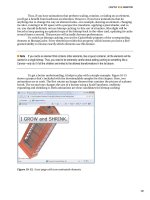
Figure 4-1 shows the result.
Figure 4-1. A WrapBreakPanel that supports forced line breaks
Routed Events
Every .NET developer is familiar with the idea of events–messages that are sent by an object
(such as a Silverlight element) to notify your code when something significant occurs. WPF
enhanced the .NET event model with a new concept of event routing, which allows an event to
originate in one element but be raised by another one. For example, event routing allows a click
that begins in a shape to rise up to that shape’s container and then to the containing page
before it’s handled by your code.
Silverlight borrows some of WPF’s routed event model, but in a dramatically simplified
form. While WPF supports several types of routed events, Silverlight only allows one: bubbled
events that rise up the containment hierarchy from deeply nested elements to their containers.
Furthermore, Silverlight’s event bubbling is linked to a few keyboard and mouse input events
(like MouseMove and KeyDown) and it’s supported by just a few low-level elements. As you’ll
CHAPTER 4 ■ DEPENDENCY PROPERTIES AND ROUTED EVENTS
116
see, Silverlight doesn’t use event bubbling for higher-level control events (like Click), and you
can’t use event routing with the events in your own custom controls.
The Core Element Events
Elements inherit their basic set of events from two core classes: UIElement and
FrameworkElement. As Figure 4-2 shows, all Silverlight elements derive from these classes.
Figure 4-2. The hierarchy of Silverlight elements
The UIElement class defines the most important events for handling user input and
the only events that use event bubbling. Table 4-1 provides a list of all the UIElement events.
You’ll see how to use these events through the rest of this chapter.
Table 4-1. The UIElement Events
Event Bubbles Description
KeyDown Yes Occurs when a key is pressed.
KeyUp Yes Occurs when a key is released.
GotFocus Yes Occurs when the focus changes to this element (when the
user clicks it or tabs to it). The element that has focus is
the control that will receive keyboard events first.
LostFocus Yes Occurs when the focus leaves this element.
CHAPTER 4 ■ DEPENDENCY PROPERTIES AND ROUTED EVENTS
117
Event Bubbles Description
MouseLeftButtonDown Yes Occurs when the left mouse button is pressed while the
mouse pointer is positioned over the element. Silverlight
does not provide an event for right-button clicking.
Instead, when the right mouse button is clicked over the
Silverlight window, a Silverlight system menu pops up
with configuration options.
MouseLeftButtonUp Yes Occurs when a mouse button is released.
MouseEnter No Occurs when the mouse pointer first moves onto an
element. This event doesn’t bubble, but if you have
several nested elements, they’ll all fire MouseEnter events
as you move to the most deeply nested element, passing
over the bounding line that delineates the others.
MouseLeave No Occurs when the mouse pointer moves off of an element.
This event doesn’t bubble, but if you have several nested
elements, they’ll all fire MouseEnter events as you move
the mouse away (in the reverse order that the
MouseEnter events occurred).
MouseMove Yes Occurs when the mouse moves while over an element.
The MouseMove event is fired frequently–for example, if
the user slowly moves the mouse pointer across the face
of a button, you’ll quickly receive hundreds of
MouseMove events. For that reason, you shouldn’t
perform time-consuming tasks when reacting to this
event.
MouseWheel Yes Occurs when the user turns the mouse wheel while over
an element (or while that element has focus).
Unfortunately, the MouseWheel event only fires if the
client is running Internet Explorer on Windows.
LostMouseCapture No Occurs when an element loses its mouse capture. Mouse
capturing is a technique that an element can use to
receive mouse events even when the mouse pointer
moves away, off its surface.
In some cases, higher-level events may effectively replace some of the UIElement
events. For example, the Button class provides a Click event that’s triggered when the user
presses and releases the mouse button or when the button has focus and the user presses the
space bar. Thus, when handling button clicks, you should always respond to the Click event,
not MouseLeftButtonDown or MouseLeftButtonUp (which it suppresses). Similarly, the
TextBox provides a TextChanged event which fires when the text is changed by any mechanism
in addition to the basic KeyDown and KeyUp events.
CHAPTER 4 ■ DEPENDENCY PROPERTIES AND ROUTED EVENTS
118
The FrameworkElement class adds just a few more events to this model, as detailed in
Table 4-2. None of these events use event bubbling.
Table 4-2. The FrameworkElement Events
Event Description
Loaded Occurs after an element has been created and added to the object
tree (the hierarchy of elements in the window). After this point, you
may want to perform additional customization to the element in
code.
SizeChanged Occurs after the size of an element changes. As you saw in Chapter 3,
you can react to this event to implement scaling.
LayoutUpdated Occurs after the layout inside an element changes. For example, if
you create a page that’s uses no fixed size (and so fits the browser
window), and you resize the browser window, the controls will be
rearranged to fit the new dimensions, and the LayoutUpdated event
will fire for your top-level layout container.
BindingValidationError Occurs if a bound data object throws an exception when the user
attempts to change a property. You’ll learn how to use the
BindingValidationError event to implement validation in Chapter 16.
Event Bubbling
Bubbling events are events that travel up the containment hierarchy. For example,
MouseLeftButtonDown is a bubbling event. It’s raised first by the element that is clicked. Next,
it’s raised by that element’s parent, and then by that element’s parent, and so on, until
Silverlight reaches the top of the element tree.
Event bubbling is designed to support composition–in other words, to let you build
more complex controls out of simpler ingredients. One example is Silverlight’s content controls,
which are controls that have the ability to hold a single nested element as content. These
controls are usually identified by the fact that they provide a property named Content. For
example, the button is a content control. Rather than displaying a line of text, you can fill it with
a StackPanel that contains a whole group of elements, like this:
<Button BorderBrush="Black" BorderThickness="1" Click="cmd_Click">
<StackPanel>
<TextBlock Margin="3" Text="Image and text label"></TextBlock>
<Image Source="happyface.jpg" Stretch="None"></Image>
<TextBlock Margin="3" Text="Courtesy of the StackPanel"></TextBlock>
</StackPanel>
</Button>
Here, the content element is a StackPanel that holds two pieces of text and an image.
Figure 4-3 shows the fancy button that this markup creates.
CHAPTER 4 ■ DEPENDENCY PROPERTIES AND ROUTED EVENTS
119
Figure 4-3. A button with contained elements
In this situation, it’s important that the button reacts to the mouse events of its
contained elements. In other words, the Button.Click event should fire when the user clicks the
image, some of the text, or part of the blank space inside the button border. In every case, you’d
like to respond with the same code.
Of course, you could wire up the same event handler to the MouseLeftButtonDown or
MouseLeftButtonUp event of each element inside the button, but that would result in a
significant amount of clutter and it would make your markup more difficult to maintain. Event
bubbling provides a better solution.
When the happy face is clicked, the MouseLeftButtonDown event fires first for the
Image, then for the StackPanel, and then for the containing button. The button then reacts to
the MouseLeftButtonDown by firing its own Click event, to which your code responds (with its
cmd_Click event handler).
■ Note The Button.Click event does not use event bubbling. This is a dramatic difference from WPF. In the
world of Silverlight, only a small set of basic infrastructure events support event bubbling. Higher-level control
events cannot use event bubbling. However, the button uses the bubbling nature of the MouseLeftButtonDown
event to make sure it captures clicks on any contained elements.
Handled (Suppressed) Events
When the button in Figure 4-3 receives the MouseLeftButtonDown event, it takes an extra step
and marks the event as handled. This prevents the event from bubbling up the control
hierarchy any further. Most Silverlight controls use this handling technique to suppress
MouseLeftButtonDown and MouseLeftButtonUp so they can replace them with more useful,
higher-level events like Click.
However, there are a few elements that don’t handle MouseLeftButtonDown and
MouseLeftButtonUp:
CHAPTER 4 ■ DEPENDENCY PROPERTIES AND ROUTED EVENTS
120
• The Image class used to display bitmaps
• The TextBlock class used to show text
• The MediaElement class used to display video
• The shape classes used for 2-D drawing (Line, Rectangle, Ellipse, Polygon, Polyline,
Path)
• The layout containers used for arranging elements (Canvas, StackPanel, and Grid) and
the Border class
These exceptions allow you to use these elements in content controls like the button
without any limitations. For example, if you place a TextBlock in a button, when you click the
TextBlock, the MouseLeftButtonUp event will bubble up to the button, which will then fire its
Click event. However, if you take a control that isn’t in the preceding list and place it inside the
button–say, a list box, check box, or another button–you’ll get different behavior. When you
click that nested element, the MouseLeftButtonUp event won’t bubble to the containing
button, and the button won’t register a click.
■ Note MouseLeftButtonDown and MouseLeftButtonUp are the only events that controls suppress. The
bubbling key events (KeyUp, KeyDown, LostFocus, and GotFocus) aren’t suppressed by any controls.
An Event Bubbling Example
To understand event bubbling and handled events, it helps to create a simple example, like the
one shown in Figure 4-4. Here, as in the example you saw previously, the
MouseLeftButtonDown event starts in a TextBlock or Image, and travels through the element
hierarchy.
CHAPTER 4 ■ DEPENDENCY PROPERTIES AND ROUTED EVENTS
121
Figure 4-4. A bubbled image click
In this example, you can watch the MouseLeftButtonDown event bubble by attaching
event handlers to multiple elements. As the event is intercepted at different levels, the event
sequence is displayed in a list box. Figure 4-4 shows the display immediately after clicking the
happy face image in the button. As you can see, the MouseLeftButtownDown event fires in the
image and then in the containing StackPanel and is finally intercepted by the button, which
handles it. The button does not fire the MouseLeftButtonDown event, and therefore the
MouseLeftButtonDown event does not bubble up to the Grid that holds the button.
To create this test page, the image and every element above it in the element hierarchy
are wired up to the same event handler–a method named SomethingClicked(). Here’s the
XAML that does it:
<UserControl x:Class="RoutedEvents.EventBubbling"
xmlns="
xmlns:x="
<Grid Margin="3" MouseLeftButtonDown="SomethingClicked">
<Grid.RowDefinitions>
<RowDefinition Height="Auto"></RowDefinition>
<RowDefinition Height="*"></RowDefinition>
<RowDefinition Height="Auto"></RowDefinition>
<RowDefinition Height="Auto"></RowDefinition>
</Grid.RowDefinitions>
CHAPTER 4 ■ DEPENDENCY PROPERTIES AND ROUTED EVENTS
122
<Button Margin="5" Grid.Row="0" MouseLeftButtonDown="SomethingClicked">
<StackPanel MouseLeftButtonDown="SomethingClicked">
<TextBlock Margin="3" MouseLeftButtonDown="SomethingClicked"
HorizontalAlignment="Center" Text="Image and text label"></TextBlock>
<Image Source="happyface.jpg" Stretch="None"
MouseLeftButtonDown="SomethingClicked"></Image>
<TextBlock Margin="3" HorizontalAlignment="Center"
MouseLeftButtonDown="SomethingClicked"
Text="Courtesy of the StackPanel"></TextBlock>
</StackPanel>
</Button>
<ListBox Grid.Row="1" Margin="5" x:Name="lstMessages"></ListBox
>
<Button Grid.Row="3" Margin="5" Padding="3" x:Name="cmdClear"
Click="cmdClear_Click" Content="Clear List"></Button>
</Grid>
</UserControl>
The SomethingClicked() method simply examines the properties of the
RoutedEventArgs object and adds a message to the list box:
protected int eventCounter = 0;
private void SomethingClicked(object sender, MouseButtonEventArgs e)
{
eventCounter++;
string message = "#" + eventCounter.ToString() + ":\r\n" +
" Sender: " + sender.ToString() + "\r\n";
lstMessages.Items.Add(message);
}
private void cmdClear_Click(object sender, RoutedEventArgs e)
{
lstMessages.Items.Clear();
}
When dealing with a bubbled event like MouseLeftButtonDown, the sender parameter
that’s passed to your event handler always provides a reference to the last link in the chain. For
example, if an event bubbles up from an image to a StackPanel before you handle it, the sender
parameter references the StackPanel object.
In some cases, you’ll want to determine where the event originally took place. The
event arguments object for a bubbled event provides a Source property that tells you the
specific element that originally raised the event. In the case of a keyboard event, this is the
control that had focus when the event occurred (for example, when the key was pressed). In the
case of a mouse event, this is the topmost element under the mouse pointer when the event
occurred (for example, when a mouse button was clicked). However, the Source property can
get a bit more detailed than you want–for example, if you click the blank space that forms the
background of a button, the Source property will provide a reference to the Shape or Path
object that actually draws the part of background you clicked.
Along with Source, the event arguments object for a bubbled event also provides a
Boolean property named Handled, which allows you to suppress the event. For example, if you
CHAPTER 4 ■ DEPENDENCY PROPERTIES AND ROUTED EVENTS
123
handle the MouseLeftButtonDown event in the StackPanel and set Handled to true, the
StackPanel will not fire the MouseLeftButtonDown event. As a result, when you click the
StackPanel (or one of the elements inside), the MouseLeftButtonDown event will not reach the
button, and the Click event will never fire. You can use this technique when building custom
controls if you’ve taken care of a user action like a button click, and you don’t want higher-level
elements to get involved,
■ Note WPF provides a back door that allows code to receive events that are marked handled (and would
ordinarily be ignored). Silverlight does not provide this capability.
Mouse Movements
Along with the obvious mouse clicking events (MouseLeftButtonDown and
MouseLeftButtonUp), Silverlight also provides mouse events that fire when the mouse pointer
is moved. These events include MouseEnter (which fires when the mouse pointer moves over
the element), MouseLeave (which fires when the mouse pointer moves away), and MouseMove
(which fires at every point in between).
All of these events provide your code with the same information: a MouseEventArgs
object. The MouseEventArgs object includes one important ingredient: a GetPosition() method
that tells you the coordinates of the mouse in relation to an element of your choosing. Here’s an
example that displays the position of the mouse pointer:
private void MouseMoved(object sender, MouseEventArgs e)
{
Point pt = e.GetPosition(this);
lblInfo.Text =
String.Format("You are at ({0},{1}) in page coordinates",
pt.X, pt.Y);
}
In this case, the coordinates are measured from the top-left corner of the page area
(just below the title bar of the browser).
■ Tip In order to receive mouse events in a layout container, the Background property must be set to a non-
null value—for example, a solid white fill.
The Mouse Wheel
These days, a large proportion of computer users have a mouse with a scroll wheel. You can use
that fact to your advantage, by responding to with an appropriate action when the user turns
the mouse wheel. The only rule of thumb is to make sure mouse wheel support is a useful extra,
not an essential part of your application’s behavior. After all, there are still a large proportion of
users who don’t have mouse wheels (for example, laptop users) or don’t think to use them.
CHAPTER 4 ■ DEPENDENCY PROPERTIES AND ROUTED EVENTS
124
Silverlight’s mouse wheel support also has a significant catch. Currently, Siverlight
only fires the MouseWheel event for clients who are running Internet Explorer on the Windows
operating system. (Out-of-browser applications on Windows also work, because they are using
IE behind the scenes.) Firefox users and Mac users are out of luck. If you need to provide mouse
wheel support for all platforms and browsers, you’ll need to use some sort of JavaScript hack.
The basic idea is to right a JavaScript event handler in the HTML test page that listens for the
mouse wheel. When it occurs, that event handler can call into your code to notify you. To learn
how to enable this sort of interaction between JavaScript code and your Silverlight application,
see Chapter 14.
The MouseWheel event passes some basic information about the amount the wheel
has turned since the last MouseWheel event, using the MouseWheelEventArgs.Delta property.
Typically, each notch in the mouse wheel has a value of 120, so a single nudge of the mouse
wheel will pass a Delta value of 120 to your application. The Delta value is positive if the mouse
wheel was rotated away from the user, and negative if it was rotated toward the user.
To get a better grip on this situation, consider the example of the interface shown in
Figure 4-5. Here, the user can zoom into or out of a Grid of content just by turning the mouse
wheel.
Figure 4-5. Zooming with the mouse wheel
To create the example, you need two controls you first considered in Chapter 3–the
ScrollViewer and Viewbox. The Viewbox powers the magnification, while the ScrollViewer
simply allows the user to scroll over the whole surface of the Viewbox when it’s too big to fit in
the browser window.
<UserControl x:Class="RoutedEvents.MouseWheelZoom"
xmlns="
xmlns:x="
xmlns:toolkit=
"clr-namespace:System.Windows.Controls;assembly=System.Windows.Controls.Toolkit"
CHAPTER 4 ■ DEPENDENCY PROPERTIES AND ROUTED EVENTS
125
MouseWheel="Page_MouseWheel">
<ScrollViewer VerticalScrollBarVisibility="Auto"
HorizontalScrollBarVisibility="Auto">
<toolkit:Viewbox x:Name="viewbox" Height="250" Width="350">
<Grid Background="White" Height="250" Width="350">
</Grid>
</toolkit:Viewbox>
</ScrollViewer>
</UserControl>
Notice that initially the Viewbox is given exactly the same hard-coded size as the Grid
inside. This ensures that the Viewbox doesn’t need to perform any initial scaling–instead, the
Grid is at its natural size when the application first starts.
When the user turns the mouse wheel, a MouseWheel event handler checks the delta
and simply adjusts the Width and Height properties of the Viewbox proportionately. This
expands or shrinks the Viewbox, and rescales everything inside:
private void Page_MouseWheel(object sender, MouseWheelEventArgs e)
{
// The Delta is in units of 120, so dividing by 120 gives
// a scale factor of 1.09 (120/110). In other words, one
// mouse wheel notch expands or shrinks the Viewbox by about 9%.
double scalingFactor = (double)e.Delta / 110;
// Check which way the wheel was turned.
if (scalingFactor > 0)
{
// Expand the viewbox.
viewbox.Width *= scalingFactor;
viewbox.Height *= scalingFactor;
}
else
{
// Shrink the viewbox.
viewbox.Width /= -scalingFactor;
viewbox.Height /= -scalingFactor;
}
}
Capturing the Mouse
Ordinarily, every time an element receives a mouse button down event, it will receive a
corresponding mouse button up event shortly thereafter. However, this isn’t always the case.
For example, if you click an element, hold down the mouse, and then move the mouse pointer
off the element, the element won’t receive the mouse up event.
In some situations, you may want to have a notification of mouse up events, even if
they occur after the mouse has moved off your element. To do so, you need to capture the
mouse by calling the MouseCapture() method of the appropriate element (MouseCapture() is
CHAPTER 4 ■ DEPENDENCY PROPERTIES AND ROUTED EVENTS
126
defined by the base UIElement class, so it’s supported by all Silverlight elements). From that
point on, your element will receive the MouseLeftButtonDown and MouseLeftButtonUp event
until it loses the mouse capture. There are two ways to lose the mouse capture. First, you can
give it up willingly by calling Mouse.Capture() again and passing in a null reference. Second, the
user can click outside of your application–on another program, on the browser menu, on
HTML content on the same web page. When an element loses mouse capture, it fires the
LostMouseCapture event.
While the mouse has been captured by an element, other elements won’t receive
mouse events. That means the user won’t be able to click buttons elsewhere in the page, click
inside text boxes, and so on. Mouse capturing is sometimes used to implement draggable and
resizable elements.
A Mouse Event Example
You can put all these mouse input concepts together (and learn a bit about dynamic control
creation) by reviewing a simple example.
Figure 4-6 shows a Silverlight application that allows you to draw small circles on a
Canvas and move them around. Every time you click the Canvas, a red circle appears. To move
a circle, you simply click and drag it to a new position. When you click a circle, it changes color
from red to green. Finally, when you release your circle, it changes color to orange. There’s no
limit to how many circles you can add or how many times you can move them around your
drawing surface.
Figure 4-6. Dragging shapes
Each circle is an instance of the Ellipse element, which is simply a colored shape that’s
a basic ingredient in 2-D drawing. Obviously, you can’t define all the ellipses you need in your
CHAPTER 4 ■ DEPENDENCY PROPERTIES AND ROUTED EVENTS
127
XAML markup. Instead, you need a way to generate the Ellipse objects dynamically each time
the user clicks the Canvas.
Creating an Ellipse object isn’t terribly difficult–after all, you can instantiate it like any
other .NET object, set its properties, and attach event handlers. You can even use the SetValue()
method to set attached properties to place it in the correct location in the Canvas. However,
there’s one more detail to take care of–you need a way to place the Ellipse in the Canvas. This
is easy enough, as the Canvas class exposes a Children collection that holds all the child
elements. Once you’ve added an element to this collection, it will appear in the Canvas.
The XAML page for this example uses a single event handler for the
Canvas.MouseLeftButtonDown event. The Canvas.Background property is also set, because a
Canvas with the default transparent background can’t capture mouse events. No other
elements are defined.
<Canvas x:Name="parentCanvas" MouseLeftButtonDown="canvas_Click" Background="White">
</Canvas>
In the code-behind class, you need two member variables to keep track of whether or
not an ellipse-dragging operation is currently taking place:
// Keep track of when an ellipse is being dragged.
private bool isDragging = false;
// When an ellipse is clicked, record the exact position
// where the click is made.
private Point mouseOffset;
Here’s the event-handling code that creates an ellipse when the Canvas is clicked:
private void canvas_Click(object sender, MouseButtonEventArgs e)
{
// Create an ellipse (unless the user is in the process
// of dragging another one).
if (!isDragging)
{
// Give the ellipse a 50-pixel diameter and a red fill.
Ellipse ellipse = new Ellipse();
ellipse.Fill = new SolidColorBrush(Colors.Red);
ellipse.Width = 50;
ellipse.Height = 50;
// Use the current mouse position for the center of
// the ellipse.
Point point = e.GetPosition(this);
ellipse.SetValue(Canvas.TopProperty, point.Y - ellipse.Height/2);
ellipse.SetValue(Canvas.LeftProperty, point.X - ellipse.Width/2);
// Watch for left-button clicks.
ellipse.MouseLeftButtonDown += ellipse_MouseDown;
// Add the ellipse to the Canvas.
parentCanvas.Children.Add(ellipse);
}
}
CHAPTER 4 ■ DEPENDENCY PROPERTIES AND ROUTED EVENTS
128
Not only does this code create the ellipse, it also connects an event handler that
responds when the ellipse is clicked. This event handler changes the ellipse color and initiates
the ellipse-dragging operation:
private void ellipse_MouseDown(object sender, MouseButtonEventArgs e)
{
// Dragging mode begins.
isDragging = true;
Ellipse ellipse = (Ellipse)sender;
// Get the position of the click relative to the ellipse
// so the top-left corner of the ellipse is (0,0).
mouseOffset = e.GetPosition(ellipse);
// Change the ellipse color.
ellipse.Fill = new SolidColorBrush(Colors.Green);
// Watch this ellipse for more mouse events.
ellipse.MouseMove += ellipse_MouseMove;
ellipse.MouseLeftButtonUp += ellipse_MouseUp;
// Capture the mouse. This way you'll keep receiving
// the MouseMove event even if the user jerks the mouse
// off the ellipse.
ellipse.CaptureMouse();
}
The ellipse isn’t actually moved until the MouseMove event occurs. At this point, the
Canvas.Left and Canvas.Top attached properties are set on the ellipse to move it to its new
position. The coordinates are set based on the current position of the mouse, taking into
account the point where the user initially clicked. This ellipse then moves seamlessly with the
mouse, until the left mouse button is released.
private void ellipse_MouseMove(object sender, MouseEventArgs e)
{
if (isDragging)
{
Ellipse ellipse = (Ellipse)sender;
// Get the position of the ellipse relative to the Canvas.
Point point = e.GetPosition(parentCanvas);
// Move the ellipse.
ellipse.SetValue(Canvas.TopProperty, point.Y - mouseOffset.Y);
ellipse.SetValue(Canvas.LeftProperty, point.X - mouseOffset.X);
}
}
When the left mouse button is released, the code changes the color of the ellipse,
releases the mouse capture, and stops listening for the MouseMove and MouseUp events. The
user can click the ellipse again to start the whole process over.

