HTML cơ bản - p 26 doc
Bạn đang xem bản rút gọn của tài liệu. Xem và tải ngay bản đầy đủ của tài liệu tại đây (803.45 KB, 10 trang )
ptg
234 Chapter 5: Building Websites
Example 5.4: Using jQuery to toggle a hidden menu
<!DOCTYPE html>
<html>
<head>
<title>Example 5.4</title>
<script src=" /><style type="text/css">
#state-choice {
position: relative; /* to contain the drop element */
}
#state-choice h4:hover {
cursor: pointer; /* change the pointer on mouseover */
}
#states {
display: none; /* initial state is hidden */
position: absolute;
top: 1.2em; /* move the links below the heading */
padding: .5em;
background-color: white; /* need to cover of other content */
border: thin solid;
}
#states a {
display: block; /* we don't get any breaks around here */
padding-top: .25em;
font-size: small;
}
</style>
</head>
<body>
<div id="state-choice">
<h4 onclick="$('#states').toggle('slow');">Choose your state</h4>
<div id="states">
<a href="award.html">Excited</a>
<a href="help.html">Confused</a>
<a href="restart.html">Disappointed</a>
<a href="loser.html">Angry</a>
</div>
From the Library of Wow! eBook
ptg
Organization and Navigation 235
<p>To help us serve you better.</p>
</div>
</body>
</html>
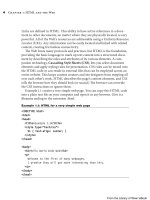
Figure 5.4 shows how this code appears in a browser before and aer the
level-four heading is clicked. e key to making it work is in the jQuery
expression assigned to the onclick attribute of the h4 element:
$('#states').toggle('slow');
e dollar sign ($) beginning the expression is an alias for the jQuery func-
tion. e expression instructs the browser to select the element with the id
attribute of states. e browser applies a toggle to the element so that, if it
is currently hidden, it is displayed, and if it is visible, it disappears when the
heading is clicked again. e toggle method takes an optional speed param-
eter. e strings
'fast' and 'slow' can be used, as well as a number indicating
the eect’s duration in milliseconds.
Figure 5.4: A jQuery drop menu
IMAGEMAPS
Every once in a while, the best way to solve a particular navigation problem is
graphically. at’s why the imagemap exists. If the website’s conceptual layout
can best be presented as a two-dimensional image, with dierent areas of the
image linked to dierent pages and resources, an imagemap is appropriate. An
internal company website might use a oor plan this way, placing the image-
map on the home page, with possibly a smaller version in a sidebar common
to all pages. Imagemaps are also useful when a photograph is featured on a
page and parts of the photograph cry out for hyperlinks to external sources of
information such as Wikipedia articles or Google search results.
From the Library of Wow! eBook
ptg
236 Chapter 5: Building Websites
To create an imagemap, use a map element containing one or more area ele-
ments. For example:
<map name="east-wall">
<area shape="rect" coords="80,120,200,280"
href=" /> alt="Starry Night, Vincent Van Gogh"/>
<area shape="rect" coords="240,120,400,300"
href=" /> alt="Water Lilies, Claude Monet"/>
<area shape="rect" coords="450,120,574,280"
href=" /> alt="The Bathers, Paul Cézanne"/>
</map>
e map element can be placed anywhere in the body of the page. It has
no displayable content and eectively exists outside the content ow. e
coords attributes dene the x- and y-coordinates, in pixels, of the top-le and
bottom-right corners of each subarea with respect to the top-le corner of the
image. Area coordinates can overlap, in which case the rst area element that
includes the user’s click (or nger tap) is the one taken. To use the map, add a
usemap attribute to the image element with the map’s name:
<img src="images/art-museum-wall.jpg"
alt="Pictures at an exhibition"
usemap="#east-wall"/>
Imagemaps were very popular when rst introduced, because they let
designers create graphically interesting navigation controls. ey fell out of
use as designers switched to text styled with CSS, but they may see increasing
use again as more location-aware mobile applications are deployed for touch-
sensitive devices. Imagemaps do have a few disadvantages:
.
ey are dicult to manage. Both the image and its map must be edited
in tandem, usually with dierent tools.
.
ey provide less information to robots that can’t discern the context in
which the links appear.
.
Area shapes other than rectangles do not have good cross-browser
support.
From the Library of Wow! eBook
ptg
Organization and Navigation 237
TOGGLES AND ACCORDIONS
jQuery methods such as toggle, hide, and show are useful organizational tools
for placing hidden content in a page that a visitor can bring into view with
a mouse click or nger tap. is keeps pages uncluttered while reducing the
number of page loads a visitor must endure to nd a specic piece of informa-
tion. Search engine robots, however, see and index all such hidden content on
a page. ese techniques are particularly useful for pages with information
such as frequently asked questions (FAQ) lists, where the questions are always
short text strings and the answers can be anything.
Example 5.5 shows how easy it is to construct a FAQ page with toggled
content. e questions and answers are marked up as a denition list, with
the questions as the list’s terms and the comments as the denition parts. e
answers are initially hidden by setting their
display property to none. Click-
ing a question causes the answer to ow in under the question, pushing the
remaining content down the page to make room. In Example 5.5, the answer
text has been shortened for brevity, but it can include pages’ worth of marked-
up content, including links and even other toggled content.
Example 5.5: Toggled content using jQuery
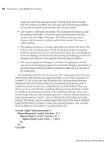
<!DOCTYPE html>
<html>
<head>
<title>Example 5.5</title>
<style type="text/css">
#faqs dt { color: #060; font: italic 1.2em sans-serif; margin: 0; }
#faqs dt:hover { cursor: pointer; color: blue; }
#faqs dt:before { content: 'Q: '; }
#faqs dt:first-letter { font-size: 150%; }
#faqs dd { display: none; margin: .25em auto 1em 2em; }
p.note { font: small sans-serif; }
</style>
<script src=" /><script type="text/javascript">
function faqShowHide(that) {
continues
From the Library of Wow! eBook
ptg
238 Chapter 5: Building Websites
$(that).toggle('slow');
}
</script>
</head>
<body style="padding: 18px;">
<h2>Frequently Asked Questions</h2>
<p class="note">Click on a Question to see the answer.
Click again to hide the answer.</p>
<dl id="faqs">
<dt onclick="faqShowHide('#a1')">
Why are they always doing road construction work at night?
</dt>
<dd id="a1">
<p>The volume of traffic during the day </p>
</dd>
<dt onclick="faqShowHide('#a2')">
Who decides to resurface a particular street?
</dt>
<dd id="a2">
<p>Anyone can request that a particular </p>
</dd>
<dt onclick="faqShowHide('#a3')">
How can I find out when construction work will be completed?
</dt>
<dd id="a3">
<p>In order to better inform the public </p>
</dd>
</dl>
</body>
</html>
Example 5.5: Toggled content using jQuery (continued)
From the Library of Wow! eBook
ptg
Organization and Navigation 239
An onclick attribute in each question term calls a simple function,
faqShowHide, with an argument consisting of an id selector for the correspond-
ing answer term. e function consists of a single jQuery expression:
$(that).toggle('slow');
Passing the 'slow' argument to the toggle method animates the eect.
“Slow” is not very slow, lasting only about a second. But it is just enough to
provide a visual sense of information revealed without wasting the visitor’s
time. Unfortunately, this eect cannot be illustrated on paper, so Figure 5.5
shows how the code in Example 5.5 appears with one of the questions toggled
open. e text is from the New York City Department of Transportation’s
website.
Source: The City of New York, 2010
Figure 5.5: a FaQ list using toggled content
e questions in Example 5.5 are styled with a few CSS statements to make
it clearer to the site visitor that they are clickable links. Using CSS to prepend a
large Q to each question gives it a nice professional nish.
An accordion list is similar to a toggled list in the same sense that a set of
radio buttons is similar to a set of checkboxes—only one content section is
open at a time. When a dierent trigger element is clicked, any open element
is hidden, and the selected one is revealed. If it is expected that the visitor
From the Library of Wow! eBook
ptg
240 Chapter 5: Building Websites
would close a toggled element before opening another, an accordion saves him
that eort. However, if the content elements are related, such that the visitor
might want to have more than one revealed at a time, an accordion might be
annoying.
To make the FAQ list of Example 5.5 into an accordion list, replace the sin-
gle expression in the
faqShowHide function with the following two expressions:
$('#faqs dd').slideUp();
$(that).slideDown('slow');
is code hides all open dd elements before revealing the selected one. e
jQuery methods slideUp and slideDown are variations of the hide and show
methods, with slightly dierent animations. e show method creates a box
whose width and height both increase until it accommodates the content.
e slideDown method creates a box initially at its full width; only the height
expands until the box is big enough.
As a nal step, with either the toggle or accordion version, you should pro-
vide CSS styles for printed media that will allow the site visitor to print all the
questions and answers together. For example:
<style type="text/css" media="print">
#faqs dd { display: block } /* show all of the answers */
p.note { visibility: hidden; } /* hide the instructions */
</style>
taBBeD Content SeCtionS
Tabbed content refers to multiple sections of content all occupying the same
place on a page, with only one of the sections visible at any time. Labels along
the top border (tabs) of the common content area promote the corresponding
content section when clicked. In this sense, tabs are not a navigation item but
an organizational tool that replaces navigation to distinct pages in a manner
that saves the site visitor time. Using tabs provides more content for robots,
which can “see” all the sections when they visit the page.
Building a tabbed content section involves HTML, CSS, and JavaScript. In
Examples 5.6a, 5.6b, and 5.6c, a tabbed content section is developed without
the use of any background images for the tab labels. Figure 5.6, shown in a
moment, shows how the tabbed section looks in a browser aer the second tab
label is clicked. e full listing is rather long, so we will start with the HTML
From the Library of Wow! eBook
ptg
Organization and Navigation 241
code in Example 5.6a and then move on to the CSS and JavaScript. Not all of
the text content is shown in the examples.
Example 5.6a: HTML markup for tabbed content
<body>
<h3>The Southern Cook Islands</h3>
<! Linked labels for tabbed content >
<div id="tabs">
<a href="javascript:void(0);"
onclick="setTab(this); showTab('#tab1');">Raratonga</a>
<a href="javascript:void(0);"
onclick="setTab(this); showTab('#tab2');">Aitutaki</a>
<a href="javascript:void(0);"
onclick="setTab(this); showTab('#tab3');">Mangaia</a>
</div>
<! tabbed content section >
<section id="tabbed">
<! First tabbed division >
<div id="tab1" class="tabbed-content">
<img src="images/raratonga.jpg" class="left-float"/>
Raratonga is the capital and largest of the Cook <br/>
<a href="cook-islands/raratonga.html">Read More</a>
</div>
<! Second tabbed division >
<div id="tab2" class="tabbed-content">
<img src="images/aitutaki.jpg" class="left-float"/>
Aitutaki is almost an atoll. The barrier reef that <br/>
<a href="cook-islands/aitutaki.html">Read More</a>
</div>
<! Third tabbed division >
<div id="tab3" class="tabbed-content">
<img src="images/mangaia.jpg" class="left-float"/>
continues
From the Library of Wow! eBook
ptg
242 Chapter 5: Building Websites
Mangaia is considered the oldest island in the Pacific <br/>
<a href="cook-islands/mangaia.html">Read More</a>
</div>
</section>
</body>
A division with the ID tabs, containing the three tab labels, is followed by
the section tabbed, with three divisions corresponding to each of the labels.
Each label is an anchor element with an href and onclick attribute. e href
attribute of each link contains a JavaScript expression (void(0)) that does
nothing. Essentially, it is a link with a null URL. Everything interesting is in
the onclick attribute, which calls two JavaScript functions: setTab, to set the
active tab, and showTab, to show just the selected tab’s content while hiding the
other content divisions. Now let’s look at the CSS statements in Example 5.6b.
Example 5.6b: CSS layouts and styles for tabbed content
<style type="text/css">
#tabs a { /* styles for the tab labels */
text-decoration: none;
background-color: #eef;
padding: 4px 8px;
border: thin solid; /* round the top corners */
-moz-border-radius: 7px 7px 0 0; /* Mozilla: Firefox, Flock */
-webkit-border-radius: 7px 7px 0 0; /* WebKit: Chrome, Safari */
-khtml-border-radius: 7px 7px 0 0; /* Opera */
border-radius: 7px 7px 0 0;
}
#tabbed { /* set the tabs' containing element */
display: block;
position: relative;
top: auto; left: auto;
}
Example 5.6a: HTML markup for tabbed content (continued)
From the Library of Wow! eBook
ptg
Organization and Navigation 243
#tab1, #tab2, #tab3 { /* layout of the tab divisions */
display: none;
position: absolute;
margin-top: 2px; /* tweak to overlay and align the tab */
width: 85%;
z-index: -1;
}
div.tabbed-content { /* styles for the tab divisions */
background-color: #eef;
padding: 1em .5em;
border: thin solid;
}
</style>
e CSS for the tab labels is nothing new. e only quirk is in the setting of
rounded corners on the tops of the tabs but not the bottoms. ese rules:
-moz-border-radius: 7px 7px 0 0; /* Mozilla: Firefox, Flock */
-webkit-border-radius: 7px 7px 0 0; /* WebKit: Chrome, Safari */
-khtml-border-radius: 7px 7px 0 0; /* Opera */
are for older browser versions that do not yet support the CSS3 border-radius
property. Microso’s Internet Explorer browser versions earlier than IE9 do
not support rounded corners. e rest of the code will still work, but the tabs
will be square in IE.
e two rules for the “tabbed”
section element dene it as a relatively
positioned block element. A section element must be declared as block in
order to work properly in older browsers that do not fully support HTML5.
It must be given relative positioning to dene it as the containing element for
the absolutely positioned child elements (see the section “CSS Positioning” in
Chapter 3). Although relatively positioned, the section’s location on the page is
the same as it would otherwise be, since the oset properties are set to “auto.”
Without the relative positioning rule, the three content divisions would appear
in the top-le corner of the browser’s window, covering the level-three head-
ing, instead of within the page content, where we want them to be.
e CSS for the tabbed divisions is in two statements. e rst addresses
the three divisions by their
id attributes to dene the layout requirements.
e second statement addresses them by their common class attribute and
From the Library of Wow! eBook

