Tự học HTML và CSS trong 1 giờ - part 60 doc
Bạn đang xem bản rút gọn của tài liệu. Xem và tải ngay bản đầy đủ của tài liệu tại đây (630.57 KB, 10 trang )
ptg
Exercises
1. Try your hand at reworking the example shown in Figure 18.5. Organize the infor-
mation into a definition list or a table. Make it easy for the visitor to scan for the
important points on the page.
2. Try the same with the example shown in Figure 18.7. How can you arrange the
information so that it’s easier to find the important points and links on the page?
566
LESSON 18: Writing Good Web Pages: Do’s and Don’ts
Download from www.wowebook.com
ptg
LESSON 19
Designing for the Real
World
In previous lessons, you learned about what you should and shouldn’t do
when you plan your website and design your pages. You also learned
about what makes a good or bad website. There’s another important fac-
tor that you should take into consideration, and that’s how to design your
pages for the real world.
You’ve already learned that the real world consists of many different
users with many different computer systems who use many different
browsers. Some of the things we haven’t yet addressed, however, are the
many different preferences and experience levels that the visitors to your
site will have. By anticipating these real-world needs, you can better judge
how you should design your pages. I also explain how you can make sure
that your websites are usable for people who are disabled and must use
accessibility technologies to browse the Web.
In this lesson, you’ll learn some ways that you can anticipate these
needs, as well as the following:
n
Things to consider when you’re trying to determine the prefer-
ences of your audience
n
Various ways of helping users find their way around your site
n
HTML code that displays the same web page in each of the
XHTML 1.0 specifications (Transitional, Frameset, and Strict)
n
What accessibility is, and how to design accessible sites
n
Using an accessibility validator
Download from www.wowebook.com
ptg
What Is the Real World, Anyway?
You’re probably most familiar with surfing the Internet on a computer that runs a specific
operating system, such as Windows, Mac OS X, or something similar. You might think
you have a pretty good idea of what web pages look like to everyone.
Throughout this book, you’ve learned that the view you typically see on the Web isn’t
the view that everyone else sees. The real world includes many different computers with
many different operating systems. Even if you try to design your pages for the most com-
mon operating system and the most common browsers, there’s another factor that you
can’t anticipate: user preference. Consider the following family, for example:
n
Bill is a top-level executive at a Fortune 100 company that has its own intranet.
The company IT department requires everyone to use the same operating system
and the same browser. Bill is mainly interested in getting news online, and doesn’t
bother with multimedia. He’s also addicted to his smartphone, constantly checking
his email and using it to get news on the Web when he’s not at his desk.
n
Bill’s wife, Susan, uses her computer mainly for email. She follows links that she
gets from other people, but she’s not comfortable “surfing” the Web. She’s a
genealogist by hobby and has learned that the Internet has many resources in that
field. She also wants to publish her family history on the Web. When she and her
husband got their cable modem hooked up, she was thrilled. But soon she was ask-
ing questions such as, “Can we fit more on the screen? Those letters are a bit too
small…can we make them larger? Where are the pictures? How come you have the
music turned off? It says that there’s sound on this page!” She already wanted to
see the Internet much differently than what her husband was used to seeing.
n
Bill and Susan have a son, Tom, who’s in high school. He’s an avid gamer and
spends a lot of time watching videos on YouTube! He pumps up the volume as
loud as he can and pushes the capacities of their new computer to the max. He also
thinks “Browser X” is better than “Browser Y” because it supports lots of cutting-
edge features. He wants to start a blog that provides hints, tips, and tricks for one
of his favorite online games.
n
Tom’s older sister, Jill, is an art major in college, studying to be a commercial
artist. She has a keen interest in sculpture and photography. She plans to use her
new computer for homework assignments, so she’ll be looking at the Web with a
keen visual interest. She also uses Facebook and Twitter to stay in touch with her
friends from school.
n
Then there are the senior members of the family, Susan’s aging parents, who have
recently moved in with the family after years of living in a rural town. Their
568
LESSON 19: Designing for the Real World
Download from www.wowebook.com
ptg
experience with computers is minimal—they don’t even have their own email
addresses. They’re interested in learning so that they can view family photos online
and exchange email with out-of-town relatives, but Dad’s eyes aren’t quite as sharp
as they used to be. He needs a special browser so that he can hear the text as well
as see it.
All these people are using the same computer and operating system to view the Web. In
all cases but one (young Tom), they’re also using the same browser. This example illus-
trates one of the other things that you need to think about when you design your website:
the needs of the users themselves. Some of these needs are easier to accommodate than
others. The following section describes some of the considerations you saw in the previ-
ous example.
Considering User Experience Level
There are varied levels of experience in our fictitious family. Although everyone is
keenly interested in the Web, some of them have barely used a web browser. When you
design your site, consider that the people who visit it might have varying levels of expe-
rience and browsing requirements.
Will the topics that you discuss on your site be of interest to people with different levels
of experience? If so, you might want to build in some features that help them find their
way around more easily. The key, of course, is to make your navigation as intuitive as
possible. By keeping your navigation scheme consistent from page to page throughout
the site, you’ll do a favor for users of all experience levels. There are a number of fea-
tures you can add to your site that will improve its usability for everyone.
Add a Search Engine
Many users go straight to the search engine when they want to find something on a site.
No matter how much time and effort you put into building a clear, obvious navigation
scheme, someone looking for information about Frisbees is going to look for a box on
your page where they can type in the word Frisbee and get back a list of the pages where
you talk about them.
Unfortunately, locating a good search engine package and setting it up can be an awful
lot of work, and difficult to maintain. On the other hand, there are some alternatives.
Some search engines enable you to search a specific site for information. You can add a
link to them from your site. Some search engines even allow you to set things up so that
you can add their search engine to your site, such as Google:
/>Considering User Experience Level
569
19
Download from www.wowebook.com
ptg
By signing up, you can add a search box to your site that enables your users to search
only pages on your own site for information. For a list of other ways to add search func-
tionality to your site, see the following page in the Open Directory Project:
Use Frames Wisely
One failing of some Hypertext Markup Language (HTML) books is that they tell you
about all the different techniques you can use to create web pages, but they don’t offer
any comparative information that explains when and how these techniques ought to be
used. For example, I’ve devoted a number of pages to discussing frames, but they should
really be used only when nothing else will work. For example, putting all of your naviga-
tion in one frame and your content in another just because you can is generally a poor
idea.
Frames have a couple of specific disadvantages that make them unsuitable for use in
many cases. The first is that they make it hard for users to bookmark inner pages on
sites. If your entire site is a frameset, the URL in the user’s location bar never changes as
the user navigates within the site. When the user gets to your inner page that has a won-
derful recipe for chocolate chip cookies that your grandmother gave you, he’ll have a
hard time bookmarking it because his browser wants to bookmark the top-level frameset
itself. When he returns on future visits, he’ll be taken back to your home page.
The second issue that’s common with framesets is that they can interfere with search
engines. Again, if your entire site is inside a frameset, when a search engine fetches your
home page, it’s probably going to get a page with no real content to speak of. Then, it
will download, say, the navigation frame, which lacks context, the content frame, which
may lack header and footer information, and on and on. If you want people to find your
site using search engines, frames can get in your way.
There are also other issues people have had with framesets in the past, like problems
printing and problems with the back button. Browsers mostly compensate for these
issues today, but even so, frames can confuse your users. In some cases, there’s just no
other good way to attack a problem, but you should always make sure that there’s not a
better way before going the frames route.
Use Concise, Sensible URLs
One common mistake made by web designers is not considering how users share URLs.
If your site is interesting at all, people are going to email the URL to their friends, paste
it into instant messaging conversations, and talk about it around the water cooler. Making
your URLs short and easy to remember makes them that much easier for people to share.
There’s a reason why people have paid huge sums for domain names like business.com
and computers.com in the past. They’re easy to remember and you don’t have to spell
them out when you tell them to people.
570
LESSON 19: Designing for the Real World
Download from www.wowebook.com
ptg
You may not have any control over your domain name, but you can exercise control over
the rest of your URLs. Say that you have a section of your site called “Products and
Services.” All the pages in that section are stored in their own directory. You could call it
any one of the following:
/ps
/prdsvcs
/products
/products_services
/products_and_services
There are plenty of other options, too (you could call it /massapequa if you wanted to),
but the preceding list seems like a reasonable group of options. Of the list, a few stand
out to me as being poor choices. /products_service and /products_and_services just
seem too verbose. If the pages under those directories have long names, you’re suddenly
in long URL territory, which isn’t conducive to sharing. On the other hand /prdsvcs
may be short, but it’s also difficult to remember and almost certainly has to be spelled
out if you tell it to anyone. It’s probably no good. That leaves two remaining choices:
/ps and /products. The first, /ps, is nice and short, and probably easy to remember.
Using it would be fine. However, there’s one other principle of URLs that I want to talk
about: guessability.
Chances are that most of the people who visit your website have been using the Web for
awhile. There’s some chance that they might just assume that they know where to go on
your site based on experience. If they want to read about your products, they may
guess—based on their experience with other sites they’ve visited—that your products
will be listed at Any time you can put your con-
tent where your users will assume it to be, you’re doing them a favor. Using standard
directory names such as /about, /contact, and /products can make things ever so
slightly easier for your users at no cost to you.
My final bit of advice on URLs is to make sure that they reflect the structure of your site.
One time I worked on a site that consisted of hundreds of files, all in a single directory.
The site itself had structure, but the files were not organized based on that structure.
Whether the user was on the home page or five levels deep within the site, the URL was
still just a filename tagged onto the hostname of the server. Not only did this make the
site hard to work on, but it also kept some useful information away from users. Suppose
you have a site about cars. What’s more useful to your users?
/>or
/>Considering User Experience Level
571
19
Download from www.wowebook.com
ptg
The second URL provides a lot more information to the user than the first one does. As
an added bonus, you can set up your site so that the user can take camry.html off the end
and get a list of all Toyota models for 2009, or take toyota/2009/camry.html off the
end and get a list of all car makes discussed on the site. Veteran web users are accus-
tomed to dealing with URLs; you should help them out as much as you can by using
URLs responsibly.
Navigation Provides Context
The key purpose of navigation is obviously to enable your users to get from one place to
another within your site. However, its secondary purpose is to let your users know where
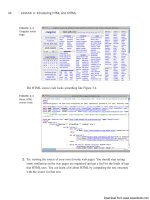
they are within the site. This was the stroke of genius behind Yahoo!’s introduction of
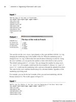
“breadcrumb” navigation in its directory. Take a look at the screenshot from Yahoo!’s
directory in Figure 19.1.
572
LESSON 19: Designing for the Real World
FIGURE 19.1
A page from
Yahoo!’s directory.
Near the top, you can see a list of links that start at the top of the directory and lead
down to the page that I’m actually on. The first thing it does is give me the ability to go
back to any level of the directory between the home page and the Cascading Style Sheets
page that I’m actually on. The second thing it does is let me know that I’m six levels into
the directory, and that the page I’m on is part of the Arts category of the directory, and
all the subcategories between that category and the page that I’m on. That’s a lot of util-
ity packed into a small feature.
Download from www.wowebook.com
ptg
Not all sites have as large and complex a structure as Yahoo!, but you can still provide
context for your users through your navigation scheme. By altering your navigational
elements based on the page that the user is on, you can indicate to them not only where
she can go but also where she is. This is also particularly helpful to users who arrive at
your site not via the home page, but from an external link. Enabling users to immediately
deduce where they are in the larger scheme of things makes it more likely that they’ll
take in more of your site.
Are Your Users Tourists or Regulars?
When you’re designing a site, especially one that uses forms, one of the key questions
you have to ask yourself is whether your users are tourists or regulars. If your users are
tourists, which means that they don’t use your site very often, or will probably only ever
use it one time, you should design your site so that the first-timer can easily figure out
what he should be doing and where he needs to go. This may annoy regular users who
already know where they’re going, but in some cases you have to cater to tourists.
On the other hand, if your site is normally used by the same existing group of users who
come back once a day or once a week, your emphasis should be on providing shortcuts
and conveniences that enable them to use your site as efficiently as possible. It’s okay if
it takes a bit of work to learn about the conveniences, because it’s worth your users’
time.
Clearly, the secret is to strike a balance here. The holy grail is a site that’s obvious and
clear to new users but also provides the features that repeat users crave. However, under-
standing what sort of audience you have can help you determine how to assign your
resources.
All of this is doubly true with forms. The forms that are part of a discussion board used
by the same people day after day will be designed much differently from those that are
part of a request-more-information form on a product page. When you design a form,
always think about the type of user who’ll be using it.
Determining User Preference
In addition to the various levels of experience that visitors have, everyone has his own
preferences for how he wants to view your web pages. How do you please them all? The
truth is, you can’t. But you can give it your best shot. Part of good web design is antici-
pating what visitors want to see on your site. This becomes more difficult if the topics
you discuss on your site are of interest to a wider audience.
Determining User Preference
573
19
Download from www.wowebook.com
ptg
You’ll notice that each person in our fictitious family needs to see the Web differently.
Sometimes this is due to his or her interests, but other times it’s because of special needs.
Therein lies the key to anticipating what you’ll need on your web pages.
A topic such as “Timing the Sparkplugs on Your 300cc Motorcycle Engine” is of interest
to a more select audience. It will attract only those who are interested in motorcycles—
more specifically, those who want to repair their own motorcycles. It should be relatively
easy to anticipate the types of things these visitors would like to see on your site. Step-
by-step instructions can guide them through each process, while images or multimedia
can display techniques that are difficult to describe using text alone.
“The Seven Wonders of the Ancient World,” on the other hand, will attract students of all
ages as well as their teachers. Archaeologists, historians, and others with an interest in
ancient history also might visit the site. Now you have a wider audience, a wider age
range, and a wider range of educational levels. It won’t be quite as easy to build a site
that will please them all.
In cases such as this, it might help to narrow your focus a bit. One way is to design your
site for a specific user group, such as the following:
n
Elementary school students and their teachers—This site requires a basic navi-
gation system that’s easy to follow. Content should be basic and easy to read.
Bright, colorful images and animations can help keep the attention of young visitors.
n
High school students and their teachers—You can use a slightly more advanced
navigation system. Multimedia and the latest in web technology will keep these
students coming back for more.
n
College students and their professors—A higher level of content is necessary,
whereas multimedia may be less important. Properly citing the sources for your
information will be important.
n
Professional researchers and historians—This type of site probably requires
pages that are heavier in text content than multimedia.
It’s not always possible to define user groups for your website, so you’ll need to start
with your own preferences. Survey other sites that include similar content. As you
browse through them, ask yourself what you hope to see there. Is the information dis-
played well? Is there enough help on the site? Does the site have too much or too little
multimedia? If you can get a friend or two to do the survey along with you, it helps you
get additional feedback before you start your own site. Take notes and incorporate those
ideas into your own web pages.
574
LESSON 19: Designing for the Real World
Download from www.wowebook.com
ptg
After you design some initial pages, ask your friends, family members, and associates to
browse through your site and pick it apart. Keep in mind that when you ask others for
constructive criticism, you might hear some things that you don’t want to hear. However,
this process is important because you’ll often get many new ideas on how to improve
your site even more.
Migrating to HTML5
One big question facing web developers right now is whether to start using HTML5 or to
stick with XHTML 1.0 (or even HTML 4.01). HTML5 is the path forward for HTML,
but it has not quite arrived. Work on it started in 2004, and as of February 2010, it was in
last call status with the WHATWG, the group that is drafting the specification. After the
specification is finalized, browsers will need to add support for the new features in the
specification.
Benefits of HTML5
Why are browser makers and interested publishers spending years coming up with a new
version of HTML? In the earlier days of the Web, new features were added to HTML
regularly without much regard for the standards process. Frames were created because
Netscape thought it would be a good idea to add a feature that allowed publishers to put
ads on the page that would move out of sight when users scrolled down the page.
Microsoft added the basefont tag to HTML so that authors could specify the font for a
page in one location before support for CSS was added to browsers. Furthermore,
browser makers added support for the same tags in different ways, so HTML looked dif-
ferent depending on the user’s browser. HTML5 will contain only features that the mak-
ers of all the major browsers have agreed to support, so it allows HTML to move forward
without the browser wars that were one of the worst things about the early Web. Having
said that, browsers will probably implement the new features in HTML5 on different
schedules. Mobile Safari, the browser on Apple’s iPhone, already supports a number of
the new features in HTML5. Google Chrome, Apple Safari, and Firefox all support
HTML5, as does Internet Explorer 9.
HTML5 introduces a number of new tags that more accurately reflect the way pages are
built now. Most designers build pages using lots of <div> tags with classes and IDs that
describe the purpose of those elements. HTML5 adds tags like <article>, <header>,
<footer>, <nav>, and <section>. Browser support for the new elements is limited, but
they will be supported eventually.
Migrating to HTML5
575
19
Download from www.wowebook.com