Tự học HTML và CSS trong 1 giờ - part 59 ppt
Bạn đang xem bản rút gọn của tài liệu. Xem và tải ngay bản đầy đủ của tài liệu tại đây (573.58 KB, 10 trang )
ptg
n
If you’re using a background image, make sure that it doesn’t interfere with
the text—Some images may look interesting on their own but can make text diffi-
cult to read when you put it on top of them. Keep in mind that backgrounds are
supposed to be in the background. Subtle patterns are always better than wild pat-
terns. Your visitors are visiting your pages for their content, not to marvel at your
ability to create faux marble in your favorite image editor.
When in doubt, try asking a friend to look at your pages. Because you’re already familiar
with the content, you may not realize how hard your pages are to read. Someone who
hasn’t read them before will tell you that your text colors are too close to your back-
ground color, or that the background image is interfering with the text. Of course, you’ll
have to find a friend who will be honest with you.
Making the Most of CSS and JavaScript
Web design these days is about minimal markup, styled using CSS. Sticking with the fol-
lowing rules of thumb will make sure that your sites load quickly and efficiently.
Put Your CSS and JavaScript in External Files
Nearly all browsers maintain a cache of recently loaded content, the more content on
your site that can be cached, the more quickly pages on your site after the first one will
load. You should put your styles in external style sheets and your JavaScript in linked
scripts whenever you can. Linked files will be cached when users visit the first page on
your site and then will be retrieved from the cache on subsequent page views.
There are also advantages to this approach in terms of saving you time, too. If the styles
for each page on your site live in <style> tags on those pages, you have to update every
page when you decide to make a change. It’s much easier to make those changes in an
external style sheet.
You can even include styles for specific pages in a single external style sheet if you use
the class and id attributes cleverly. The <body> tag for a page can have a class or id, just
like any other element. So if you want to the pages in the news section of your site to
have one background color and the pages in the “about us” section to have another, you
could use this <body> tag for “about us”:
<body class=”aboutus”>
For news, you’d use this one:
<body class=”news”>
556
LESSON 18: Writing Good Web Pages: Do’s and Don’ts
Download from www.wowebook.com
ptg
And then in your style sheet, you include the following styles:
body.aboutus { background-color: black; }
body.news { background-color: grey; }
The same rule applies to JavaScript, too. If you use unobtrusive JavaScript, discussed in
Lesson 15, “Using JavaScript in Your Pages,” you can often put all the JavaScript for a
site in a single file.
Making the Most of CSS and JavaScript
557
18
If possible, you will want to keep the size of your external CSS and
JavaScript files under 25k. Apple’s iPhone does not cache files
larger than 25k, so it’s better to split external files up as neces-
sary if they are larger than that.
Location Matters
HTML 4, XHTML 1.0, and HTML5 all require links to external style sheets and the
<style> tag to reside within the <head> element. You should be sure to follow this rule,
because placing style sheets elsewhere in your document can cause your pages to take
longer to display. By the same token, whenever possible, it’s best to put <script> tags at
the bottom of your document. When browsers are downloading an external script file,
they don’t try to download any other page elements. This can slow down overall page
loading time. Putting the scripts last on the page enables it to download everything else
on the page in parallel before it gets to the scripts. It can make your pages load a bit
more quickly.
Shrink Your CSS and JavaScript
When you finish with your CSS and JavaScript, it’s a good idea to compress them so that
they download more quickly. Yahoo! has created a tool called the YUI Compressor that
shrinks JavaScript and CSS to the smallest size possible. The resulting files aren’t read-
able by humans, but browsers understand them just fine. You’ll work on your files in the
human-readable form, but shrink them before putting them on the server. Shrinking these
files can save on download time. This shrinking is sometimes referred to as minifying.
If you use third-party libraries like jQuery, be sure to deploy the minified versions.
Your JavaScript files and style sheets might not be big, but these libraries can be quite
large. For example, the regular version of jQuery 1.4.2 is 160k, and the minified version
is 70.5k. Most JavaScript libraries can be downloaded in either the regular or minified
form.
TIP
Download from www.wowebook.com
ptg
You can download the YUI Compressor from />Google hosts versions of the popular AJAX libraries (like jQuery, Dojo, and YUI) so that
you don’t have to host them on your own server. This provides a number of advantages.
The first is that you don’t have to keep your own copy around. The second is that Google’s
infrastructure speeds up the delivery of these files. And third, if one of your users has
already visited a site that is using the Google-hosted version of the file you’re using, it’s
probably already cached so that the browser won’t have to download it at all. You can find
out how to use Google’s copies of the files at />Other Good Habits and Hints
In this section, I’ve gathered several other miscellaneous hints and advice about working
with groups of web pages. This includes notes on how big to make each page and how to
sign your pages.
Link Back to Home
Consider linking back to the top level or home page on every page of your site. This link
will give visitors a quick escape from the depths of your site. Using a home link is much
easier than trying to navigate backward through a hierarchy or repeatedly clicking the back
button. This is especially important because visitors to most sites are directed there by
search engines. If a search engine leads users to an internal page on your site, you’ll want to
give them a way to find their way to the top.
Don’t Split Topics Across Pages
Each web page works best if it covers a single topic in its entirety. Don’t split topics across
pages; even if you link between them, the transition can be confusing. It will be even more
confusing if someone jumps in on the second or third page and wonders what’s going on.
If you think that one topic is becoming too large for a single page, consider reorganizing
the page so that you can break up the topic into subtopics. This tip works especially well in
hierarchical organizations. It enables you to determine the exact level of detail that each
level of the hierarchy should go and exactly how big and complete each page should be.
Don’t Create Too Many or Too Few Pages
There are no rules for how many pages your website must have, nor for how large each
page should be. You can have one page or several thousand, depending on the amount of
content you have and how you’ve organized it.
558
LESSON 18: Writing Good Web Pages: Do’s and Don’ts
Download from www.wowebook.com
ptg
With this point in mind, you might decide to go to one extreme or another. Each one has
advantages and disadvantages. For example, let’s say that you put all your content on one
big page and create links to sections within that page, as illustrated in Figure 18.24.
Other Good Habits and Hints
559
18
FIGURE 18.24
One big page.
Table of Contents
Section One
Section Two
Section Three
XXXXXXX
XXXXXXX
XXXXXXX
XXXXXXX
XXXXXXX
XXXXXXX
XXXXXXX
Advantages:
n
One file is easier to maintain, and links within that file won’t ever break if you
move elements around or rename files.
n
This file mirrors real-world document structure. If you’re distributing documents
both online and in hard copy, having a single document for both makes producing
them easier.
Disadvantages:
n
A large file can take a long time to download, particularly if the visitor has a slow
network connection and the page includes a large number of images.
n
Visitors must scroll a lot to find what they want, and accessing particular bits of
information can become tedious. Navigating anywhere other than at the top or bot-
tom becomes close to impossible.
Download from www.wowebook.com
ptg
n
The structure is overly rigid. A single page is inherently linear. Although visitors
can skip around within the page, the structure still mirrors that of the printed page
and doesn’t take advantage of the flexibility of smaller pages linked in a nonlinear
fashion.
At the other extreme, you could create a whole bunch of little pages with links between
them, as illustrated in Figure 18.25.
560
LESSON 18: Writing Good Web Pages: Do’s and Don’ts
FIGURE 18.25
Many little pages.
Home
Advantages:
n
Smaller pages load very quickly.
n
You can often fit the entire page on one screen, so the information can be scanned
very easily.
Disadvantages:
n
Maintaining all those links will be a nightmare. Just adding some sort of naviga-
tional structure to that many pages may create thousands of links.
n
If you have too many links between pages, the links may seem jarring. Continuity
is difficult when your visitors spend more time moving from page to page than
actually reading.
Download from www.wowebook.com
ptg
What’s the solution? The content you’re describing will often determine the size and
number of pages you need, especially if you follow the one-topic-per-page suggestion.
Testing your web pages on a variety of platforms at different network speeds will tell you
whether a single page is too large. If you spend a lot of time scrolling around in your
page, or if it takes more time to load than you expected, it may be too large.
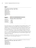
Sign Your Pages
Each page should contain some sort of information at the bottom to act as the signature. I
mentioned this tip briefly in Lesson 7, “Formatting Text with HTML and CSS,” as part
of the description of the <address> tag. That particular tag was intended for just this pur-
pose.
Consider putting the following useful information in the <address> tag on each page:
n
Contact information for the person who created this web page or who is responsi-
ble for it, colloquially known as the webmaster. This information should include
the person’s name and an email address, at the least.
n
The status of the page. Is it complete? Is it a work in progress? Is it intentionally
left blank?
n
The date this page was most recently revised. This information is particularly
important for pages that change often. Include a date on each page so that people
know how old it is.
n
Copyright or trademark information, if it applies.
Figure 18.26 shows a nice example of an address block.
Other Good Habits and Hints
561
18
FIGURE 18.26
A sample address.
Download from www.wowebook.com
ptg
Another nice touch is to link a Mailto URL to the text containing the email address of
the webmaster, as in the following:
<address>
Laura Lemay <a href=“mailto:”></a>
</address>
This way, the visitors who have browsers that support the Mailto URL can simply select
the link and send mail to the person responsible for the page without having to retype the
address into their mail programs.
562
LESSON 18: Writing Good Web Pages: Do’s and Don’ts
One downside of putting your email address on your web page is
that there are programs that search websites for email addresses
and add them to lists that are sold to spammers. You’ll want to
consider that risk before posting your email address on a public
web page.
Finally, if you don’t want to clutter each page with a lot of personal contact information
or boilerplate copyright info, a simple solution is to create a separate page for the extra
information and then link the signature to that page. Here’s an example:
<address>
<a href=“copyright.html”>Copyright</a> and
<a href=“webmaster.html”>contact</a> information is available.
</address>
Summary
The main do’s and don’ts for web page design are as follows:
n
Do understand the differences between the HTML standards. Decide which design
strategy to follow while using them.
n
Do provide alternatives if at all possible if you use nonstandard HTML tags.
n
Do test your pages in multiple browsers.
n
Do write your pages clearly and concisely.
n
Do organize the text of your page so that your visitors can scan for important
information.
NOTE
Download from www.wowebook.com
ptg
n
Do spell check and proofread your pages.
n
Do group related information both semantically (through the organization of the
content) and visually (by using headings or separating sections with rule lines).
n
Do use a consistent layout across all your pages.
n
Do use link menus to organize your links for quick scanning, and do use descrip-
tive links.
n
Do have good reasons for using links.
n
Do keep your layout simple.
n
Do provide alternatives to images for text-only browsers.
n
Do try to keep your images small so that they load faster over the network.
n
Do be careful with backgrounds and colored text to avoid making your pages
flashy but unreadable.
n
Do use external CSS and JavaScript files whenever possible.
n
Do always provide a link back to your home page.
n
Do match topics with pages.
n
Do provide a signature block or link to contact information at the bottom of each
page.
n
Do write context-independent pages.
n
Don’t link to irrelevant material.
n
Don’t write web pages that are dependent on pages before or after them in the
structure.
n
Don’t overuse emphasis (such as boldface, italic, all caps, link text, blink, or
marquees).
n
Don’t use terminology that’s specific to any one browser (“click here,” “use the
Back button,” and so on).
n
Don’t use heading tags to provide emphasis.
n
Don’t fall victim to the “here” syndrome with your links.
n
Don’t link repeatedly to the same site on the same page.
n
Don’t clutter the page with a large number of pretty but unnecessary images.
n
Don’t split individual topics across pages.
Summary
563
18
Download from www.wowebook.com
ptg
Workshop
Put on your thinking cap again because it’s time for another review. These questions,
quizzes, and exercises will remind you about the items that you should (or should not)
include on your pages.
Q&A
Q I’ve been creating pages and they work when I test them in the browser. Is it
really important to validate them?
A The number of browser is increasing, not decreasing. Popular desktop browsers
include Microsoft Internet Explorer, Firefox, Google Chrome, and Apple Safari.
Mobile devices with real web browsers are becoming increasingly popular. It’s
difficult to test your web pages in all the browsers people are using, and making
sure that they validate provides a baseline level of assurance that your pages are
built correctly and that they’ll work in browsers that you haven’t personally tested
them with.
Q I’m converting existing documents into web pages. These documents are text
heavy and are intended to be read from start to finish instead of being
scanned quickly. I can’t restructure or redesign the content to better follow
the guidelines you’ve suggested—that’s not my job. What can I do?
A All is not lost. You can still improve the overall presentation of these documents by
providing reasonable indexes to the content (summaries, tables of contents pages,
subject indexes, and so on) and including standard navigation links. In other words,
you can create an easily navigable framework around the documents themselves.
This can go a long way toward improving content that’s otherwise difficult to read
online.
Q I have a standard signature block that contains my name and email address,
revision information for the page, and a couple of lines of copyright informa-
tion that my company’s lawyers insisted on. It’s a little imposing, particularly
on small pages. Sometimes the signature is bigger than the page itself! How do
I integrate it into my site so that it isn’t so obtrusive?
A If your company’s lawyers agree, consider putting all your contact and copyright
information on a separate page and then linking to it on every page rather than
duplicating it every time. This way, your pages won’t be overwhelmed by the legal
stuff. Also, if the signature changes, you won’t have to change it on every single
page. Failing that, you can always just reduce the font size for that block and per-
haps change the font color to something with less contrast to the background of the
page. This indicates to users that they’re looking at fine print.
564
LESSON 18: Writing Good Web Pages: Do’s and Don’ts
Download from www.wowebook.com
ptg
Quiz
1. What are the three flavors of XHTML 1.0, and which of these three accommodates
the widest range of markup?
2. What are some ways you can organize your pages so that visitors can scan them
more easily?
3. True or false: Headings are useful when you want information to stand out because
they make the text large and bold.
4. True or false: You can reduce the download time of an image by using the width
and height attributes of the <img> tag to scale down the image.
5. Why does it improve performance to put your CSS in a linked style sheet rather
than including it on the page?
6. What are the advantages and disadvantages of creating one big web page versus
several smaller ones?
Quiz Answers
1. The three flavors of XHTML 1.0 are Transitional (designed for the widest range of
markup, including tags that are deprecated in the standard), Frameset (which
includes all tags in the Transitional specification, plus those for framesets), and
Strict (for those who want to stick to pure XHTML 1.0 tags and attributes).
2. You can use headings to summarize topics, lists to organize and display informa-
tion, and link menus for navigation, and you can separate long paragraphs with
important information into shorter paragraphs.
3. False. You should use headings as headings and nothing else. You can emphasize
text in other ways, or use a graphic to draw attention to an important point.
4. False. When you use the width and height attributes to make a large image appear
smaller on your page, it may reduce the dimensions of the file, but it won’t
decrease the download time. The visitor still downloads the same image, but the
browser just fits it into a smaller space.
5. Putting your CSS in an external file enables the browser to cache the file so that it
doesn’t have to download the same information as the user moves from one page
on the site to another.
6. The advantages of creating one large page are that one file is easier to maintain, the
links don’t break, and it mirrors real-world document structure. The disadvantages
are that it has a longer download time, visitors have to scroll a lot, and the structure
is rigid and too linear.
Workshop
565
18
Download from www.wowebook.com