Tự học HTML và CSS trong 1 giờ - part 57 ppt
Bạn đang xem bản rút gọn của tài liệu. Xem và tải ngay bản đầy đủ của tài liệu tại đây (1.4 MB, 10 trang )
ptg
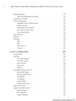
If you look closely at the screenshot, you can see that at the time I validated this page, it
came out with 42 errors, all of which are violations of the XHTML 1.0 Transitional rec-
ommendation. The page looks fine in the popular browsers, but it’s not in sync with the
recommendation. The errors generally fall into two categories: missing closing tags (usu-
ally for the <img> tag) and missing required attributes (mainly the alt attribute for <img>
tags). This page also includes some invalid attributes for tags. One common error that
appears on this page refers to an entity with no system identifier, and a longer set of
errors related to the same bit of markup. The problem here is that the validator expects
the character & to be the beginning of an entity, but on this page, it is part of the URL for
a link. To avoid these errors, the ampersands in links need to be encoded as &.
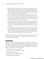
You can see this entity-related error in Figure 18.2.
536
LESSON 18: Writing Good Web Pages: Do’s and Don’ts
FIGURE 18.1
The W3 Validator.
Download from www.wowebook.com
ptg
Standards Compliance and Web Browsers
537
18
FIGURE 18.2
Error messages
produced by the
W3 Validator.
In the screenshot, you’ll see that each error is accompanied by the subset of the page’s
source where the error appears along with an explanation for the error. After you’ve fixed
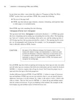
all the errors on your page, you’ll be privileged enough to see the message indicating that
your page is valid, as shown in Figure 18.3.
FIGURE 18.3
The W3 Validator
acknowledges a
job well done.
Download from www.wowebook.com
ptg
HTML Tidy
If you have some existing pages and you’re not up for the challenge of turning them into
valid HTML, there’s a program that will not only validate your pages, but also correct
them as best as it can. This program, HTML Tidy, was originally written by a staffer at
the W3C named David Raggett and has since been handed over to the community for
maintenance. You can obtain it at />Tidy accepts a number of command-line options that enable you to indicate how you
want your page to be validated and modified. For example, if you want to convert your
pages to XHTML, you can call it like this:
tidy -asxhtml myfile.html
Tidy will strip out all the deprecated <font> tags in your document, along with other
tags that can be replaced by CSS properties if you pass it the -clean option, like this:
tidy -clean myfile.html
After you’ve run Tidy on your files, they may still need some cleaning up, but Tidy will
fix all the obvious errors.
You might also want to look for support for HTML Tidy in your text editor if it has
HTML-specific features. Tidy is also available as a library that can be incorporated into
other tools, and many offer the ability to clean up your files as you edit them.
Writing for Online Publication
Writing on the Web is no different from writing in the real world. Although it’s not com-
mitted to hard copy, it’s still published and is still a reflection of you and your work.
Because your writing is online and your visitors have many other options when it comes
to finding something to read, you’ll have to follow the rules of good writing that much
more closely.
Because of the vast quantities of information available on the Web, your visitors aren’t
going to have much patience if your web page is poorly organized or full of spelling
errors. They’re likely to give up after the first couple of sentences and move on to some-
one else’s page. After all, there are several million pages out there. No one has time to
waste on bad pages.
I don’t mean that you have to go out and become a professional writer to create a
good web page, but I give you a few hints for making your web page easier to read and
understand.
538
LESSON 18: Writing Good Web Pages: Do’s and Don’ts
Download from www.wowebook.com
ptg
Write Clearly and Be Brief
Unless you’re writing the Great American Web Novel, your visitors aren’t going to linger
lovingly over your words. You should write as clearly and concisely as you possibly can,
present your points, and then stop. Obscuring what you want to say with extra words just
makes figuring out your point more difficult.
If you don’t have a copy of Strunk and White’s The Elements of Style, put down this
book right now and go buy that book. Read it, reread it, memorize it, inhale it, sleep with
it under your pillow, show it to all your friends, quote it at parties, and make it your life.
You’ll find no better guide to the art of good, clear writing than The Elements of Style.
Organize Your Pages for Quick Scanning
Even if you write the clearest, briefest, most scintillating prose ever seen on the Web,
chances are good that your visitors won’t start at the top of your web page and carefully
read every word down to the bottom.
In this context, scanning is the first quick look your visitors give to each page to get the
general gist of the content. Depending on what your users want out of your pages, they
may scan the parts that jump out at them (headings, links, other emphasized words), per-
haps read a few contextual paragraphs, and then move on. By writing and organizing
your pages for easy “scannability,” you can help your visitors get the information they
need as quickly as possible.
To improve the scannability of your web pages, follow these guidelines:
n
Use headings to summarize topics—Note that this book has headings and sub-
headings. You can flip through quickly and find the parts that interest you. The
same concept applies to web pages.
n
Use lists—Lists are wonderful for summarizing related items. Every time you find
yourself saying something like “each widget has four elements” or “use the follow-
ing steps to do this,” the content after that phrase should be in an ordered or
unordered list.
n
Don’t forget link menus—As a type of list, the link menu has all the same advan-
tages of lists for scannability, and it doubles as an excellent navigation tool.
n
Don’t bury important information in text—If you have a point to make, make it
close to the top of the page or at the beginning of a paragraph. Forcing readers to
sift through a lot of information before they get to what’s important means that
many of them won’t see the important stuff at all.
n
Write short, clear paragraphs—Long paragraphs are harder to read and make
gleaning the information more difficult. The further into the paragraph you put
your point, the less likely it is that anybody will read it.
Writing for Online Publication
539
18
Download from www.wowebook.com
ptg
Figure 18.4 shows the sort of writing technique that you should avoid.
540
LESSON 18: Writing Good Web Pages: Do’s and Don’ts
FIGURE 18.4
DON’T: A web
page that is
difficult to scan.
FIGURE 18.5
DO: An improve-
ment to the
difficult-to-scan
web page.
Because all the information on this page is in paragraph form, your visitors have to read
both paragraphs to find out what they want and where they want to go next.
How would you improve the example shown in Figure 18.4? Try rewriting this section so
that visitors can better find the main points from the text. Consider the following:
n
These two paragraphs actually contain three discrete topics.
n
The ways to plan the garden would make an excellent nested list.
Figure 18.5 shows what an improvement might look like.
Download from www.wowebook.com
ptg
Make Each Page Stand on Its Own
As you write, keep in mind that your visitors could jump to any of your web pages from
anywhere. For example, you can structure a page so that section four distinctly follows
section three and has no other links to it. Then someone you don’t even know might cre-
ate a link to the page starting at section four. From then on, visitors could find them-
selves at section four without even knowing that section three exists.
Be careful to write each page so that it stands on its own. The following guidelines will
help:
n
Use descriptive titles—The title should provide not only the direct subject of this
page, but also its relationship to the rest of the pages on the site.
n
Provide a navigational link—If a page depends on the one before it, provide a
navigational link back to that page (and also a link up to the top level, preferably).
n
Avoid initial sentences such as the following—”You can get around these prob-
lems by…,” “After you’re done with that, do this…,” and “The advantages to this
method are….” The information referred to by these, that, and this are off on some
other page. If these sentences are the first words your visitors see, they’re going to
be confused.
Be Careful with Emphasis
Use emphasis sparingly in your text. Paragraphs with a whole lot of words in boldface
or italics or ALL CAPS are hard to read, whether you use them several times in a para-
graph or to emphasize long strings of text. The best emphasis is used only with small
words such as and, this, or but.
Link text also is a form of emphasis. Use single words or short phrases for link text. Do
not use entire passages or paragraphs. Figure 18.6 illustrates a particularly bad example
of too much emphasis obscuring the rest of the text.
By removing some of the boldface and using less text for your links, you can consider-
ably reduce the amount of clutter in the paragraph, as you can see in Figure 18.7.
Be especially careful of emphasis that moves or changes, such as marquees, blinking
text, or animation. Unless the animation is the primary focus of the page, use movement
and sound sparingly.
Writing for Online Publication
541
18
Download from www.wowebook.com
ptg
542
LESSON 18: Writing Good Web Pages: Do’s and Don’ts
FIGURE 18.6
DON’T: Too much
emphasis.
FIGURE 18.7
DO: Less
emphasis.
Don’t Use Browser-Specific Terminology
Avoid references in your text to specific features of specific browsers. For example, don’t
use the following wording:
n
“Click here”—What if your visitors are surfing without a mouse? Users of mobile
phones with touch screens “tap” on links. A more generic phrase is “Follow this
link.” (Of course, you should avoid the “here” syndrome in the first place, which
neatly gets around this problem, too.)
n
“To save this page, pull down the File menu and select Save”—Each browser
has a different set of menus and different ways of accomplishing the same actions.
If at all possible, do not refer to specifics of browser operation in your web pages.
n
“Use the Back button to return to the previous page”—Each browser has a dif-
ferent set of buttons and different methods for going back. If you want your visi-
tors to go back to a previous page or to any specific page, link those pages.
Download from www.wowebook.com
ptg
Spell Check and Proofread Your Pages
Spell checking and proofreading may seem like obvious suggestions, but they bear men-
tioning given the number of pages I’ve seen on the Web that obviously haven’t had
either.
The process of designing a set of web pages and making them available on the Web is
like publishing a book, producing a magazine, or releasing a product. Publishing web
pages is considerably easier than publishing books, magazines, or other products, of
course, but just because the task is easy doesn’t mean your product should be sloppy.
Thousands of people may be reading and exploring the content you provide. Spelling
errors and bad grammar reflect badly on you, on your work, and on the content you’re
describing. It may be irritating enough that your visitors won’t bother to delve any
deeper than your home page, even if the subject you’re writing about is fascinating.
Proofread and spell check each of your web pages. If possible, have someone else read
them. Often other people can pick up errors that you, the writer, can’t see. Even a simple
edit can greatly improve many pages and make them easier to read and navigate.
Design and Page Layout
With the introduction of technologies such as style sheets and Dynamic HTML (DHTML)
, people without a sense of design have even more opportunities to create a site that
looks simply awful.
Probably the best rule of web design to follow at all times is this: Keep the design of
each page as simple as possible. Reduce the number of elements (images, headings, and
rule lines) and make sure that visitors’ eyes are drawn to the most important parts of the
page first.
Keep this cardinal rule in mind as you read the next sections, which offer some other
suggestions for basic design and layout of web pages.
Use Headings as Headings
Headings tend to be rendered in larger or bolder fonts in graphical browsers. Therefore,
using a heading tag to provide some sort of warning, note, or emphasis in regular text
can be tempting (see Figure 18.8).
Design and Page Layout
543
18
Download from www.wowebook.com
ptg
Headings stand out from the text and signal the start of new topics, so they should be
used only as headings. If you want to emphasize a particular section of text, consider
using a small image, a rule line, or some other method of emphasis instead. Remember
that you can use CSS to change the color, background color, font size, font face, and
border for a block of text. Figure 18.9 shows an example of the text from Figure 18.8
with a different kind of visual emphasis.
544
LESSON 18: Writing Good Web Pages: Do’s and Don’ts
FIGURE 18.8
DON’T: The wrong
way to use head-
ings.
FIGURE 18.9
DO: The right way
to use headings.
Group Related Information Visually
Grouping related information within a page is a task for both writing and design. As I
suggested in the “Writing for Online Publication” section, grouping related information
under headings improves the scannability of that information. Visually separating each
section from the others helps to make it distinct and emphasizes the relatedness of the
information.
If a web page contains several sections, find a way to separate those sections visually—
for example, with a heading, a rule line, or tables, as shown in Figure 18.10.
Download from www.wowebook.com
ptg
Use a Consistent Layout
When you’re reading a book, each page or section usually has the same layout. The page
numbers are placed where you expect them, and the first word on each page starts in the
same place.
The same sort of consistent layout works equally well on web pages. Having a single
look and feel for each page on your website is comforting to your visitors. After two or
three pages, they’ll know what the elements of each page are and where to find them. If
you create a consistent design, your visitors can find the information they need and navi-
gate through your pages without having to stop at every page and try to find where cer-
tain elements are located.
Consistent layout can include the following:
n
Consistent page elements—If you use second-level headings (<h2>) on one page
to indicate major topics, use second-level headings for major topics on all your
pages. If you have a heading and a rule line at the top of your page, use that same
layout on all your pages.
n
Consistent forms of navigation—Put your navigation menus in the same place on
every page (usually the top or the bottom of the page, or even both), and use the
same number of them. If you’re going to use navigation icons, make sure that you
use the same icons in the same order for every page.
n
The use of external style sheets—You should create a master style sheet that
defines background properties, text and link colors, font selections and sizes, mar-
gins, and more. The appearance of your pages maintains consistency throughout
your site.
Design and Page Layout
545
18
FIGURE 18.10
Do: Separate
sections visually.
Download from www.wowebook.com

