Tự học HTML và CSS trong 1 giờ - part 37 ppsx
Bạn đang xem bản rút gọn của tài liệu. Xem và tải ngay bản đầy đủ của tài liệu tại đây (619.1 KB, 10 trang )
ptg
Looking at the style sheet, you should get some idea of how the form will be laid out.
Each field will be in its own <div> and I’ve added a margin to the bottom of each of
them. Just as I did in the login form example earlier, I’ve added a left margin for the
Submit button so that it lines up with the other fields. Most of the styling has to do with
the labels.
In this form, I am using labels in two ways—first to create a left column of labels for the
form, and second to add clickable labels to the radio buttons and check boxes. To distin-
guish between them, I’m using a class called field, which I apply to the field-level
labels. I’ve also got a class called required that will be used with labels on required
fields.
Now that you’ve seen the styles, let’s look at the body of the page. After some introduc-
tory text, we open the form like this:
<form action=“/register” method=“post”
enctype=“multipart/form-data”>
Because this form contains a file upload field, we have to use the post method and the
multipart/form-data enctype in the <form> tag. The action attribute points to a CGI
script that lives on my server. Next, we start adding form inputs. Here’s the name input:
<div>
<label class=”required field” for=”name”>Name</label>
<input name=”name” />
</div>
All the inputs will follow this basic pattern. The input and its label are nested within a
<div>. In this case, the label has the classes field and required. The only attribute
included in the input tag is the field name because the default values for the rest of the
attributes are fine. Next is the gender field, which uses two radio buttons:
<div>
<label class=”required field”>Gender</label>
<label><input type=”radio” name=”gender” value=”male” />
male</label>
<label><input type=”radio” name=”gender” value=”female” />
female</label>
</div>
As you can see, the radio button group includes two controls (both with the same name,
establishing the group). Because we didn’t include line breaks between the two fields,
they appear side by side in the form. Here’s an instance where I used the <label> tag
two different ways. In the first case, I used it to label the field as a whole, and then I used
336
LESSON 10: Designing Forms
, ,
Download from www.wowebook.com
ptg
individual labels for each button. The individual labels allow you to select the radio but-
tons by clicking their labels. As you can see, I used the approach of putting the <input>
tags inside the <label> tags to associate them.
The next field is a select list that enables the user to indicate which operating system he
runs on his computer:
<div>
<label class=”required field”>Operating System</label>
<select name=”os”>
<option value=”windows”>Windows</option>
<option value=”macos”>Mac OS</option>
<option value=”linux”>Linux</option>
<option value=”other”>Other </option>
</select>
</div>
This select list is a single-line, single-select field with four options. Instead of using the
display values as the values that will be sent back to the server, we opt to set them
specifically using the value attribute of the <option> tag. The next form field is a check
box group:
<div>
<label class=”field”>Toys</label>
<label><input type=”checkbox” name=”toy” value=”digicam” /> Digital
Camera</label>
<label><input type=”checkbox” name=”toy” value=”mp3” /> MP3
Player</label>
<label><input type=”checkbox” name=”toy” value=”wlan” /> Wireless
LAN</label>
</div>
As you can see, we use labels for each of the individual check boxes here, too. The next
field is a file upload field:
<div>
<label class=”field”>Portrait</label>
<input type=”file” name=”portrait” />
</div>
The last input field on the form is a text area intended for the user’s bio.
<div>
<label class=”field”>Mini Biography</label>
<textarea name=”bio” rows=”6” cols=”40”></textarea>
</div>
Using Other Form Controls
337
11
, ,
Download from www.wowebook.com
ptg
After the text area, there’s just the Submit button for the form. After that, it’s all closing
tags for the <form> tag, <body> tag, and the <html> tag. The full source code for the
page follows, along with a screenshot of the form, as shown earlier in Figure 11.16.
Input ▼
<!DOCTYPE html>
<html>
<head>
<title>Registration Form</title>
<style type=”text/css” media=”screen”>
form div {
margin-bottom: 1em;
}
div.submit input {
margin-left: 165px;
}
label.field {
display: block;
float: left;
margin-right: 15px;
width: 150px;
text-align: right;
}
label.required {
font-weight: bold;
}
</style>
</head>
<body>
<h1>Registration Form</h1>
<p>Please fill out the form below to register for our site. Fields
with bold labels are required.</p>
<form action=”/register” method=”post” enctype=”multipart/form-data”>
<div>
<label class=”required field” for=”name”>Name</label>
<input name=”name” />
</div>
<div>
<label class=”required field”>Gender</label>
<label><input type=”radio” name=”gender” value=”male” />
338
LESSON 10: Designing Forms
, ,
Download from www.wowebook.com
ptg
male</label>
<label><input type=”radio” name=”gender” value=”female” />
female</label>
</div>
<div>
<label class=”required field”>Operating System</label>
<select name=”os”>
<option value=”windows”>Windows</option>
<option value=”macos”>Mac OS</option>
<option value=”linux”>Linux</option>
<option value=”other”>Other </option>
</select>
</div>
<div>
<label class=”field”>Toys</label>
<label><input type=”checkbox” name=”toy” value=”digicam” />
Digital Camera</label>
<label><input type=”checkbox” name=”toy” value=”mp3” /> MP3
Player</label>
<label><input type=”checkbox” name=”toy” value=”wlan” />
Wireless LAN</label>
</div>
<div>
<label class=”field”>Portrait</label>
<input type=”file” name=”portrait” />
</div>
<div>
<label class=”field”>Mini Biography</label>
<textarea name=”bio” rows=”6” cols=”40”></textarea>
</div>
<div class=”submit”>
<input type=”submit” value=”register” />
</div>
</form>
</body>
</html>
Using Other Form Controls
339
11
,
▲
Download from www.wowebook.com
ptg
Grouping Controls with fieldset and
legend
The fieldset element organizes form controls into groupings that appear in the web
browser. The legend element displays a caption for the fieldset. To create a fieldset
element, start with the opening fieldset tag, followed by the legend element.
Next, enter your form controls and finish things off with the closing fieldset tag:
Input ▼
<fieldset>
<legend>Oatmeal Varieties</legend>
<label><input type=“radio” name=“applecinnamon” /> Apple Cinnamon</label>
<label><input type=“radio” name=“nuttycrunch” /> Nutty Crunch
</label>
<label><input type=“radio” name=“brownsugar” /> Brown Sugar</label>
</fieldset>
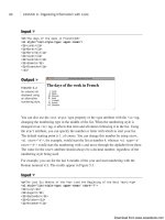
Figure 11.17 shows the result.
340
LESSON 10: Designing Forms
Output .
FIGURE 11.17
The fieldset and
legend elements
enable you to
organize your
forms.
The presentation of the fieldset in Figure 11.17 is the default, but you can use CSS to
style fieldset elements in any way that you like. A fieldset is a standard block level
element, so you can turn off the borders using the style border: none and use them as
you would <div> tags to group inputs in your forms.
One thing to watch out for with the <legend> tag is that it’s a little less flexible than the
<label> tag in terms of how you’re allowed to style it. It’s also not handled consistently
between browsers. If you want to apply a caption to a set of form fields, use <legend>
but be aware that complex styles may have surprising results. Figure 11.18 shows the
markup from Figure 11.17 with some the following styles applied:
Download from www.wowebook.com
ptg
Input ▼
<style type=”text/css” media=”screen”>
fieldset {
border: none;
background-color: #aaa;
width: 400px;
}
legend {
text-align: right;
}
</style>
Grouping Controls with fieldset and legend
341
11
Output .
FIGURE 11.18
A fieldset and leg-
end with styles
applied.
As you can see, I’ve changed the background color of the field set and assigned a spe-
cific width. I’ve also aligned the legend to the right. Because of the default browser posi-
tioning of the legend, the background color splits the legend text. This is an example of
how browsers treat legends uniquely. To set a background for the field set that includes
the full legend, I’d have to wrap the field set in another block level element (like a div),
and apply the background color to that.
Changing the Default Form Navigation
In most browsers, you can use the Tab key to step through the form fields and links on a
page. When filling out long forms, it’s often much easier to use the Tab key to move
from one field to the next than to use the mouse to change fields. If you have a mix of
form fields and links on your page, setting things up so that using Tab skips past the
links and moves directly from one form field to the next can improve the usability of
your applications greatly. To set the tab order for your page, use the tabindex attribute.
You should number your form fields sequentially to set the order that the browser will
use when the user tabs through them. Here’s an example:
<p><label>Enter your <a href=”/”>name</a> <input type=”text” name=”username”
tabindex=”1” /></label></p>
<p><label>Enter your <a href=”/”>age</a> <input type=”text” name=”age”
tabindex=”2” /></label></p>
<p><input type=”submit” tabindex=”3” /></p>
Download from www.wowebook.com
ptg
When you tab through this page, the browser will skip past the links and move directly to
the form fields.
Using Access Keys
Access keys also make your forms easier to navigate. They assign a character to an ele-
ment that moves the focus to that element when the user presses a key. To add an access
key to a check box, use the following code:
<p>What are your interests?</p>
<label>Sports <input type=”checkbox” name=”sports” accesskey=”S” /></label>
<label>Music <input type=””checkbox” name=”music” accesskey=”M” /></label>
<label>Television <input type=””checkbox” name=”tv” accesskey=”T” /></label>
Most browsers require you to hold down a modifier key and the key specified using
accesskey to select the field. On Windows, both Firefox and Internet Explorer require
you to use the Alt key along with the access key to select a field. Access keys are mostly
useful for forms that will be used frequently by the same users. A user who is going to
use a form only once won’t bother to learn the access keys, but if you’ve written a form
for data entry, the people who use it hundreds of times a day might really appreciate the
shortcuts.
Creating disabled and readonly Controls
Sometimes you might want to display a form control without enabling your visitors to
use the control or enter new information. To disable a control, add the disabled attribute
to the form control:
<label for=”question42”>What is the meaning of life?</label>
<textarea name=“question42” disabled=“disabled”>
Enter your answer here.
</textarea>
When displayed in a web browser, the control will be dimmed (a light shade of gray) to
indicate that it’s unavailable.
To create a read-only control, use the readonly attribute:
Input ▼
<label>This month</label> <input type=“text” name=“month” value=“September”
readonly=“readonly” />
342
LESSON 10: Designing Forms
Download from www.wowebook.com
ptg
The read-only control is not distinguished in any way from a normal form control.
However, when visitors attempt to enter new information (or, in the case of buttons or
check boxes, select them), they’ll find that they cannot change the value. Figure 11.19
shows both a disabled control and a read-only control. You’ll generally find disabled to
be more useful because it’s less confusing to your users.
Applying Cascading Style Sheet Properties to Form Elements
343
11
Output .
FIGURE 11.19
Disabled controls
are dimmed. Read-
only controls
appear normally—
they just can’t be
changed.
Form Security
It’s important to remember that regardless of what you do with your form controls,
what gets sent back to the server when the form is submitted is really up to your
user. There’s nothing to stop her from copying the source to your form, creating a
similar page on her own, and submitting that to your server. If the form uses the
get
method, the user can just edit the URL when the form has been submitted.
The point here is that there is no form security. In Lesson 15, “Using JavaScript in
Your Pages,” you’ll learn how to validate your forms with JavaScript. Even in that
case, you can’t guarantee that users will supply the input that you intend. What this
means is that you must always validate the data entered by your users on the
server before you use it.
Applying Cascading Style Sheet
Properties to Form Elements
In this lesson, I’ve already showed you some approaches you can take to managing the
layout of your forms with CSS. Now I explain how to alter the appearance of form input
fields themselves using style properties. As you can see from the screenshots so far, reg-
ular form controls might not blend in too well with your pages. The default look and feel
of form controls can be altered in just about any way using CSS. For example, in many
browsers, by default, text input fields use Courier as their font, have white backgrounds,
Download from www.wowebook.com
ptg
and beveled borders. As you know, border, font, and background-color are all proper-
ties that you can modify using CSS. In fact, the following example uses all those proper-
ties:
Input ▼
<!DOCTYPE html>
<html>
<head>
<title>Style Sheet Example</title>
<style type=”text/css”>
input.styled
{
border: 2px solid #000;
background-color: #aaa;
font: bold 18px Verdana;
padding: 4px;
}
</style>
</head>
<body>
<form>
<p><label>Default</label> <input value=”value” /></p>
<p><label>Styled</label> <input value=”value” class=”styled” /></p>
</form>
</body>
</html>
The page contains two text input fields: one with the default look and feel, and another
that’s modified using CSS. The page containing the form appears in Figure 11.20.
344
LESSON 10: Designing Forms
Output .
FIGURE 11.20
A regular text input
field and a styled
text input field.
As you can see, the field that we applied styles to is radically different from the one that
uses the default decoration. You can do anything to regular form fields that you can do to
other block-level elements. In fact, you can make form fields look just like the rest of
your page, with no borders and the same fonts as your page text if you like. Of course,
Download from www.wowebook.com
ptg
Applying Cascading Style Sheet Properties to Form Elements
345
11
▼
that will make your forms extremely confusing to use, so you probably don’t want to do
it, but you could.
It’s also fairly common to modify the buttons on your pages. Normally, Submit buttons
on forms are gray with beveled edges, or they have the look and feel provided by the
user’s operating system. By applying styles to your buttons, you can better integrate them
into your designs. This is especially useful if you need to make your buttons smaller than
they are by default. I provide more examples of style usage in forms in Exercise 11.3.
Bear in mind that some browsers support CSS more fully than others. So some users
won’t see the styles that you’ve applied. The nice thing about CSS, though, is that they’ll
still see the form fields with the browser’s default appearance.
Task: Exercise 11.3: Applying Styles to a Form
Let’s take another look at the form from Exercise 11.2. The form can easily be further
spruced up by tweaking its appearance using CSS. The main objectives are to make the
appearance of the controls more consistent, and to make it clear to users which form
fields are required and which are not. In the original version of the form, the labels for
the required fields were bold. We keep with that convention here and also change the
border appearance of the fields to indicate which fields are required and which aren’t.
Let’s look at the style sheet. This style sheet is similar to the one in Exercise 11.2, but I
have made some changes. First, three styles that I copied directly from the previous exer-
cise:
form div {
margin-bottom: 1em;
}
div.submit input {
margin-left: 165px;
}
label.field {
display: block;
float: left;
margin-right: 15px;
width: 150px;
text-align: right;
}
,
Download from www.wowebook.com

