Professional ASP.NET 3.5 in C# and Visual Basic Part 41 doc
Bạn đang xem bản rút gọn của tài liệu. Xem và tải ngay bản đầy đủ của tài liệu tại đây (290.91 KB, 10 trang )
Evjen c07.tex V2 - 01/28/2008 2:01pm Page 355
Chapter 7: Data Binding in ASP.NET 3.5
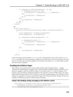
Template Name Description
ItemTemplate Provides a User Interface for each data item in the control
AlternatingItemTemplate Provides a unique UI for alternating data items in the control
SelectedItemTemplate Provides a unique UI for the currently selected data item
InsertItemTemplate Provides a UI for inserting a new data item into the control
EditItemTemplate Provides a UI for editing an existing data item in the control
EmptyItemTemplate Provides a unique UI for rows created when there is no more data to
display in the last group of the current page
EmptyDataTemplate The template shown when the bound data object contains no data
items
LayoutTemplate The template that serves as the root container for the ListView
control and is used to control the overall layout of the data items
GroupSeparatorTemplate Used to provide a separator UI between groups
GroupTemplate Used to provide a unique UI for grouped content
ItemSeperatorTemplate Used to provide a separator UI between each data item
The use of templates allows the ListView control to retain a very basic level of information about the
markup sections and states which can comprise the ListView, while still being able to give you almost
total control over the UI of the ListView.
ListView Data Item Rendering
While the ListView is generally very flexible, allowing you almost complete control over the way it
displays its bound data, it does have some basic structure which defines how the templates described
in the previous section are related to one another. As described previously, at a minimum, the control
requires you to define two templates, the LayoutTemplate and ItemTemplate. The LayoutTemplate is the
root control template and therefore where you should define the overall layout for the collection of data
items in the ListView.
For example, if you examine the template markup generated by the Grid layout, you can see the Lay-
outTemplate includes a
<
table
> element definition, a single table row (<
tr
>) definition, and a <
td.
>
element defined for each column header.
The ItemTemplate, on t he other hand, is where you define the layout for an individual data item. If you
again look at the markup generated for the Grid layout, its ItemTemplate is a single table row (
<
tr
>)
element followed by a series of table cell (
<
td
>) elements that contain the actual data.
When the ListView renders itself, it knows that the ItemTemplate should be rendered within the Layout-
Template, but what is needed is a mechanism to tell the control exactly where within the LayoutTemplate
to place the ItemTemplate. The ListView control does this b y looking within the LayoutTemplate for an
355
Evjen c07.tex V2 - 01/28/2008 2:01pm Page 356
Chapter 7: Data Binding in ASP.NET 3.5
Item Container. The Item Container is an HTML container element with the
runat = "server"
attribute
set and an
id
attribute whose value is
itemContainer
. The element can be any valid HTML container
element, although if you examine the default Grid LayoutTemplate you will see that it uses the
<
tbody
>
element.
<
tbody id="itemContainer"
>
<
/tbody
>
Adding to the overall flexibility of the control, even the specific Item Container element
id
that ListView
looks for can be configured. While by default the control will attempt to locate an element whose
id
attribute is set to
itemContainer
, you can change the
id
value the control will look for by changing the
control’s
ItemContainerID
property.
If the control fails to locate an appropriate HTML element designated as the Item Container, it will throw
an exception.
The ListView uses the element identified as the
itemContainer
to position not only the ItemTemplate, but
any item-level template, such as the AlternativeItemTemplate, EditItemTemplate, EmptyItemTemplate,
InsertItemTemplate, ItemSeperatorTemplate, and SelectedItemTemplate. During rendering, it simply
places the appropriate item template into the Item Container, depending on the state of the data item
(selected, editing, or alternate) for each data item it is bound to.
ListView Group Rendering
In addition to the Item Container, the ListView also supports another container type, the Group Con-
tainer. The Group Container works in conjunction with the GroupTemplate to allow you to divide a
large group of data items into smaller sets. The number of items in each group is set by the control’s
GroupItemCount
property. This is useful is w hen you want to output some additional HTML after some
number of item templates have been rendered. When using the GroupTemplate, the same problem
exists as was discussed in the prior section. In this case, however, rather than having two templates
to relate, introducing the GroupTemplate means you have three templates to relate: the ItemTemplate to
the GroupTemplate, and the GroupTemplate to the LayoutTemplate.
When the ListView renders itself, it looks to see if a GroupTemplate has been defined. If the control finds
a GroupTemplate, then it checks to see if a Group Container is provided in the LayoutTemplate. If you
have defined the GroupTemplate, then the control requires that you define a Group Container; otherwise
it throws an exception. The Group Container works the same way as the Item Container described in the
previous section, except that the container element’s
id
value should be
groupContainer
, rather than
itemContainer
. As with Item Container, the specific
id
value the control looks for can be changed by
altering the
GroupContainerID
property of the control.
You can see an example of the Group Container being used by looking at the markup generated by the
ListViews T iled layout. The LayoutTemplate of this layout shows a table serving as the Group Container,
shown here:
<
table id="groupContainer" runat="server" border="0" style=""
>
<
/table
>
Once a GroupContainer is defined, you need to define an Item Container, but rather than doing this in
the LayoutTemplate, you need to do this in the GroupTemplate. Again, looking at the Tiled layout, you
can see that within its GroupTemplate, it defined a table row which serves as the Item Container.
356
Evjen c07.tex V2 - 01/28/2008 2:01pm Page 357
Chapter 7: Data Binding in ASP.NET 3.5
<
tr id="itemContainer" runat="server"
>
<
/tr
>
When rendering, the ListView will output its LayoutTemplate first, and then output the GroupTemplate.
The ItemTemplate is then output the number of times defined by the
GroupItemCount
property. Once the
group item count has been reached, the ListView outputs the GroupTemplate, then ItemTemplate again,
repeating this process for each data item it is bound to.
Using the EmptyItemTemplate
When using the GroupTemplate, it is also important to keep in mind that the number of data items bound
to the ListView control may not be perfectly divisible by the GroupItemCount value. This is especially
important to keep in mind if you have created a ListView layout that is dependent on HTML tables for
its data item arrangement because there is a chance that the last row may end up defining fewer table
cells than previous table rows, making the HTML output by the control invalid, and possibly causing
rendering problems. To solve this, the ListView control includes the EmptyItemTemplate. This template
is rendered if you are using the GroupTemplate, and there are not enough data items remaining to
reach the
GroupItemCount
value. Figure 7-34 shows an example of when the EmptyItemTemplate would
be used.
Figure 7-34
In this scenario, the data source bound to the ListView control contains four data ite ms, but the
GroupItemCount
for the control is set to
3
, meaning there will be three ItemTemplates rendered in
each group. You can see that this means for the second group rendered, there will only be a single data
item remaining to render; therefore, the control will use the EmptyItemTemplate, if defined, to fill the
remaining items.
You can also see another example of the use of the EmptyItemTemplate in the ListView’s Tiled layout.
ListView Data Binding and Commands
Because the ListView does not generate any layout markup at runtime and does not include any of the
auto field generation logic as you may be used to in the GridView, each template uses the standard
ASP.NET inline data-binding syntax to position the values of each data item in the defined layout.
357
Evjen c07.tex V2 - 01/28/2008 2:01pm Page 358
Chapter 7: Data Binding in ASP.NET 3.5
ASP.NET’s inline data-binding syntax is covered in detail later in this chapter.
You can see this by examining the ItemTemplate of the default Grid layout created by the control. In
this template, each column of the bound data source is displayed using an ASP.NET label whose text
property is set to a data-binding evaluation expression:
<
asp:Label ID="ProductNameLabel" runat="server"
Text=’
<
%# Eval("ProductName") %
>
’/
>
Because the control uses this flexible model to display the bound data, you can leverage it to place the
data wherever you would like within the template, and even use the features of ASP.NET data binding
to manipulate the bound data before it is displayed.
Every ListView template that displays bound data uses the same ASP.NET binding syntax, and simply
provides a different template around it. For example, if you enable editing in the Grid layout you will see
that the EditItemTemplate simply replaces the ASP.NET Label used by the ItemTemplate with a TextBox
or Checkbox depending o n the underlying data type.
<
asp:TextBox ID="ProductNameTextBox" runat="server"
Text=’
<
%# Bind("ProductName") %
>
’/
>
Again, this flexibility allows you to choose exactly how you want to allow your end user to edit the data
(if you want it to be editable). Instead of a standard ASP.NET TextBox, you could easily replace this with
a DropDownList, or even a third-party editing control.
To get the ListView to show the EditItemTemplate for a data item, the control uses the same commands
concept found in the GridView control. The ItemTemplate provides three commands you can use to
change the state of a data item.
Command Name Description
Edit
Places the specific data item into edit mode and shows the EditTemplate for the
data item
Delete
Deletes the specific data item from the underlying data source
Select
Sets the ListView controls Selected index to the index of the specific data item
These commands are used in conjunction with the ASP.NET Button control’s
CommandName
property. You
can see these commands used in ItemTemplate of the ListViews default Grid layout by e nabling
Editing and Deleting using the ListView configuration dialog. Doing this generates a new column with
an Edit and Delete button, each of which specified the
CommandName
property set to Edit and Delete
respectively.
<
asp:Button ID="DeleteButton" runat="server"
CommandName="Delete" Text="Delete" /
>
<
asp:Button ID="EditButton" runat="server"
CommandName="Edit" Text="Edit" /
>
358
Evjen c07.tex V2 - 01/28/2008 2:01pm Page 359
Chapter 7: Data Binding in ASP.NET 3.5
Other templates in the ListView offer other commands, as shown in the table that follows.
Template
Command
Name Description
EditItemTemplate Update Updates the data in the ListViews data source and
returns the data item to the ItemTemplate display
EditItemTemplate Cancel Cancels the edit and returns the data item to the
ItemTemplate
InsertItemTemplate Insert Inserts the data into the ListViews at a source
InsertItemTemplate Cancel Cancels the insert and resets the InsertTemplate controls
binding values
ListView Paging and the Pager Control
ASP.NET 3.5 introduced another new control called the DataPager control that the ListView uses to
provide paging capabilities for itself. The DataPager control is designed to display the navigation for
paging to the end user and to coordinate data paging with any data bound control that implements the
IPagableItemContainer
interface, which in ASP.NET 3.5 is the ListView control. In fact, you will notice
that if you enable paging on the ListView control by checking the Paging check box in the ListView
configuration dialog, the control simply inserts a new DataPager control into its LayoutTemplate. The
default paging markup generated by the ListView for the Grid layout is shown here:
<
asp:datapager ID="DataPager1" runat="server"
>
<
Fields
>
<
asp:nextpreviouspagerfield ButtonType="Button" FirstPageText="First"
LastPageText="Last" NextPageText="Next" PreviousPageText="Previous"
ShowFirstPageButton="True" ShowLastPageButton="True" /
>
<
/Fields
>
<
/asp:datapager
>
The markup for the control shows that within the DataPager, a
Fields
collection has been created, which
contains a
NextPreviousPagerField
object. As its name implies, using the
NextPreviousPager
object
results in the DataPager rendering Next and Previous buttons as its user interface. The DataPager con-
trol includes three types of
Field
objects: the
NextPreviousPagerField
,the
NumericPagerField
object,
which generates a simple numeric page list, and the
TemplatePagerField
, which allows you to specify
your own custom paging user interface. Each of these different
Field
types includes a variety of prop-
erties that you can use to control exactly how the DataPager displays the user interface. Additionally,
because the DataPager exposes a
Fields
collection rather than a simple
Field
property, you can actually
display several different
Field
objects within a single DataPager control.
The TemplatePagerField is a unique type of
Field
object that contains no User Interface itself, but simply
exposes a template that you can use to completely customize the pagers user interface. Listing 7-56
demonstrates the use of the TemplatePagerField.
359
Evjen c07.tex V2 - 01/28/2008 2:01pm Page 360
Chapter 7: Data Binding in ASP.NET 3.5
Listing 7-56: Creating a custom DataPager user interface
<
asp:DataPager ID="DataPager1" runat="server"
>
<
Fields
>
<
asp:TemplatePagerField
>
<
PagerTemplate
>
Page
<
asp:Label runat="server"
Text="
<
%# (Container.StartRowIndex/Container.PageSize)+1%
>
"/
>
of
<
asp:Label runat="server"
Text="
<
%# Container.TotalRowCount/Container.PageSize%
>
"/
>
<
/PagerTemplate
>
<
/asp:TemplatePagerField
>
<
/Fields
>
<
/asp:DataPager
>
Notice that the sample uses ASP.NET data binding to provide the total page count, page size and the row
that the page should start on; these are values exposed by the DataPager control.
If you want to use custom navigation controls in the PagerTemplate, such as a Button control to change
the currently display Page, you w ould create standard Click an event handler for the Button. Within that
event handler you can access the DataPagers StartRowIndex, TotalRowCount and PageSize properties to
calculate the new StartRowIndex the ListView should use when it renders.
Unlike the paging provided by the GridView, the DataPager control, because it is a separate control,
gives you total freedom over where to place it on your webpage. The samples you have seem so far have
all looked at the DataPager control when it is placed directly in a ListView, but the control can be placed
anywhere on the webform.
Listing 7-57: Placing the DataPager control outside of the L istView
<
asp:DataPager ID="DataPager1" runat="server" PagedControlID="ListView1"
>
<
Fields
>
<
asp:NumericPagerField /
>
<
/Fields
>
<
/asp:DataPager
>
In Listing 7-57, the only significant change you should notice is the the use of the PagedControlID prop-
erty. This property allows you to specify explicitly which control this pager should work with.
FormView
The FormView control, introduced in the ASP.NET 2.0 toolbox, functions like the DetailsView control
in that it displays a single data item from a bound data source control and allows adding, e diting, and
deleting data. What makes it unique is that it displays the data in custom templates, which gives you
much greater control over how the data is displayed and edited. Figure 7-35 shows a FormView control
ItemTemplate being edited in Visual Studio. You can see that you have complete control over how your
360
Evjen c07.tex V2 - 01/28/2008 2:01pm Page 361
Chapter 7: Data Binding in ASP.NET 3.5
data is displayed. The FormView control also contains an EditItemTemplate and InsertItemTemplate that
allows you to determine how the control displays when entering edit or insert mode.
Figure 7-35
While Figure 7-35 shows the FormView control in action in Visual Studio, Figure 7-36 shows the control
displaying its ItemTemplate, reflecting the custom layout that was designed in Visual Studio.
In Figure 7-37, you see the control in edit mode, showing the standard EditItemTemplate layout.
Listing 7-58 shows the code that Visual Studio generates when designing the FormView control’s
customized ItemTemplate.
361
Evjen c07.tex V2 - 01/28/2008 2:01pm Page 362
Chapter 7: Data Binding in ASP.NET 3.5
Figure 7-36
Figure 7-37
362
Evjen c07.tex V2 - 01/28/2008 2:01pm Page 363
Chapter 7: Data Binding in ASP.NET 3.5
Listing 7-58: Using a FormView control to display and edit data
<
%@ Page Language="C#" %
>
<
html xmlns=" />>
<
head runat="server"
>
<
title
>
Using the FormView control
<
/title
>
<
/head
>
<
body
>
<
form id="form1" runat="server"
>
<
div
>
<
asp:FormView ID="FormView1" Runat="server" DataSourceID="SqlDataSource1"
DataKeyNames="CustomerID" AllowPaging="True"
>
<
EditItemTemplate
>
CustomerID:
<
asp:Label Text=’
<
%# Eval("CustomerID") %
>
’ Runat="server"
ID="CustomerIDLabel1"
>
<
/asp:Label
><
br /
>
CompanyName:
<
asp:TextBox Text=’
<
%# Bind("CompanyName") %
>
’ Runat="server"
ID="CompanyNameTextBox"
><
/asp:TextBox
><
br /
>
ContactName:
<
asp:TextBox Text=’
<
%# Bind("ContactName") %
>
’ Runat="server"
ID="ContactNameTextBox"
><
/asp:TextBox
><
br /
>
ContactTitle:
<
asp:TextBox Text=’
<
%# Bind("ContactTitle") %
>
’ Runat="server"
ID="ContactTitleTextBox"
><
/asp:TextBox
><
br /
>
Address:
<
asp:TextBox Text=’
<
%# Bind("Address") %
>
’ Runat="server"
ID="AddressTextBox"
><
/asp:TextBox
><
br /
>
City:
<
asp:TextBox Text=’
<
%# Bind("City") %
>
’ Runat="server"
ID="CityTextBox"
><
/asp:TextBox
><
br /
>
Region:
<
asp:TextBox Text=’
<
%# Bind("Region") %
>
’ Runat="server"
ID="RegionTextBox"
><
/asp:TextBox
><
br /
>
PostalCode:
<
asp:TextBox Text=’
<
%# Bind("PostalCode") %
>
’ Runat="server"
ID="PostalCodeTextBox"
><
/asp:TextBox
><
br /
>
Country:
<
asp:TextBox Text=’
<
%# Bind("Country") %
>
’ Runat="server"
ID="CountryTextBox"
><
/asp:TextBox
><
br /
>
Phone:
<
asp:TextBox Text=’
<
%# Bind("Phone") %
>
’ Runat="server"
ID="PhoneTextBox"
><
/asp:TextBox
><
br /
>
Fax:
<
asp:TextBox Text=’
<
%# Bind("Fax") %
>
’ Runat="server"
ID="FaxTextBox"
><
/asp:TextBox
><
br /
>
<
br /
>
<
asp:Button ID="Button2" Runat="server" Text="Button"
CommandName="update" /
>
<
asp:Button ID="Button3" Runat="server" Text="Button"
CommandName="cancel" /
>
Continued
363
Evjen c07.tex V2 - 01/28/2008 2:01pm Page 364
Chapter 7: Data Binding in ASP.NET 3.5
<
/EditItemTemplate
>
<
ItemTemplate
>
<
table width="100%"
>
<
tr
>
<
td style="width: 439px"
>
<
b
>
<
span style="font-size: 14pt"
>
Customer Information
<
/span
>
<
/b
>
<
/td
>
<
td style="width: 439px" align="right"
>
CustomerID:
<
asp:Label ID="CustomerIDLabel" Runat="server"
Text=’
<
%# Bind("CustomerID") %
>
’
>
<
/asp:Label
><
/td
>
<
/tr
>
<
tr
>
<
td colspan="2"
>
CompanyName:
<
asp:Label ID="CompanyNameLabel" Runat="server"
Text=’
<
%# Bind("CompanyName") %
>
’
>
<
/asp:Label
><
br /
>
ContactName:
<
asp:Label ID="ContactNameLabel" Runat="server"
Text=’
<
%# Bind("ContactName") %
>
’
>
<
/asp:Label
><
br /
>
ContactTitle:
<
asp:Label ID="ContactTitleLabel" Runat="server"
Text=’
<
%# Bind("ContactTitle") %
>
’
>
<
/asp:Label
><
br /
>
<
br /
>
<
table width="100%"
><
tr
>
<
td colspan="3"
>
<
asp:Label ID="AddressLabel" Runat="server"
Text=’
<
%# Bind("Address") %
>
’
>
<
/asp:Label
><
/td
>
<
/tr
>
<
tr
>
<
td style="width: 100px"
>
<
asp:Label ID="CityLabel" Runat="server"
Text=’
<
%# Bind("City") %
>
’
>
<
/asp:Label
><
/td
>
<
td style="width: 100px"
>
<
asp:Label ID="RegionLabel" Runat="server"
Text=’
<
%# Bind("Region") %
>
’
>
<
/asp:Label
><
/td
>
<
td style="width: 100px"
>
<
asp:Label ID="PostalCodeLabel"
Runat="server"
Text=’
<
%# Bind("PostalCode") %
>
’
>
<
/asp:Label
>
<
/td
>
<
/tr
>
<
tr
>
<
td style="width: 100px" valign="top"
>
Continued
364


