How to Display Data- P21 ppsx
Bạn đang xem bản rút gọn của tài liệu. Xem và tải ngay bản đầy đủ của tài liệu tại đây (164.54 KB, 5 trang )
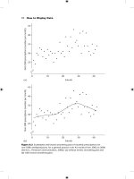
92 How to Display Data
Figure 8.2 Scatterplot and lowess smoothing plot of monthly prescriptions for
non-SSRIs antidepressants, for a general practice over 42 months from 2002 to 2006
(Senior J., Personal Communication, 2006): (a) without lowess smoothing plot and
(b) with lowess smoothing plot.
45
40
35
30
25
Non-SSRI prescriptions (number per month)
0102030
Month(a)
40
45
40
35
30
25
Non-SSRI prescriptions (number per month)
0102030
Month(b)
40
Time series plots and survival curves 93
8.4 Survival
The major outcome variable in many clinical trials is the time from ran-
domisation and start of treatment to a specifi ed critical event. The length of
time from entry to the study to when the critical event occurs is called the
survival time. Examples include patient survival time (time from diagnosis
to death), length of time that an indwelling cannula remains in situ, or the
time a serious burn takes to heal. Even when the fi nal outcome is not an
actual survival time, the techniques employed with such time-to-event data
are conventionally termed ‘survival’ analysis methods. An important feature
of such data is the censored observation, which relates to people who have
not suffered an event. Censored observations can happen before the last
known follow-up time, if people are lost to follow-up, or they are removed
from the ‘at risk’ dataset for some other reason. Alternatively, they can occur
if at the last known follow-up time a number of subjects remain who have
not had an event. More details are given in Chapter 10 of Campbell et al.
3
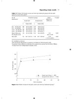
The conventional plot for survival data is the Kaplan–Meier survival plot.
This plots the proportion of a group surviving, on the Y-axis, against time, on
the X-axis, and allows for censored observations. Figure 8.3 shows a typical
Figure 8.3 Kaplan–Meier survival plot of 25-year follow-up of slate workers (n ϭ 726)
and controls (n ϭ 529).
4
0
0.0
0.2
0.4
0.6
Survival probability
0.8
Controls
Slate workers
1.0
510
Survival time (years)
15 20 25
94 How to Display Data
plot, which displays the survival of 726 slate workers from 1975 to the present
day, compared to the survival of 529 controls who were matched by age and
smoking habit.
4
Interestingly, the slate workers appear to have better survival
than the controls.
However, there are a number of problems with this type of plot. If mor-
tality is low, as it is here, much of the graph is occupied by white space.
There is no information about the numbers in each group at particular time
points as people die and are censored, the number of people who are at risk
at any one time point (number of observations that make up the curves) is
reduced. Finally, there is no indication about whether the differences could
have arisen by chance.
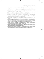
Particularly when survival is high it is often better to plot mortality (plots
going up) rather than survival (plots going down).
5
Though this is not the
Kaplan–Meier curve of convention, when mortality is low this can reduce
the amount of paper that is blank. Thus Figure 8.4 redraws the earlier data,
using the method highlighted by Pocock et al. and addresses the other issues
mentioned above. The numbers at risk are included along the horizontal
axis and the hazard ratio, together with its corresponding P-value has been
added to the plot.
Figure 8.4 Informative survival plot of slate workers mortality.
4
0
0.0
0.1
0.2
0.3
0.4
0.5
0.6
5
Probability of not surviving
10
Survival time (years)
Number at risk:
Controls 529 479 429 376 333
Slate workers 726 626 545 474 395
Slate workers
Controls
Hazard ratio 1.30 (95% CI: 1.19–1.41), P ϭ 0.002 (log rank)
15 20 25
Time series plots and survival curves 95
For some outcomes, where the result is a positive or favourable event, such
as a wound or burn healing then it is defi nitely preferable to have the plots
going up, that is, plot the proportion healed. Figure 8.5 gives an example,
from the leg ulcer study data used in earlier chapters.
6
All patients began the
study with a leg ulcer which was treated either in a specialist clinic or by a
district nurse at home. One of the principal outcomes was the time to com-
plete leg ulcer healing. In this example, the vertical axis records the cumulative
proportion of patients whose initial leg ulcers healed during the 12-month
follow-up period. Figure 8.5 also indicates the censored times as crosses (ϩ)
on the lines. This is a useful convention when the amount of data is not too
large. Note how the survival curves do not change at these points.
Another important problem with conventional survival curves is a ten-
dency to over-interpret the right-hand side of the fi gure. At this point the
curves are based upon fewer and fewer observations because a large propor-
tion of the subjects have already suffered an event, or are censored before
that time point. If the longest survival time in each group is associated with
a death, then if there are a number of censored data the graph can show an
abrupt change. For example the lines in Figure 8.3 would show a sudden
Figure 8.5 Healing times of initial leg ulcers by study group.
6
0
0.0
0.2
0.4
0.6
0.8
1.0
10 20 30
Home
Clinic
40 50 60
Initial leg ulcer healing time (weeks)
Cumulative proportion healed
Number at risk:
Clinic 120 84 55 38 30 27
Home 113 89 65 53 48 39
Hazard ratio 0.69 (95% CI: 0.49–0.96), P ϭ 0.027 (log rank)
96 How to Display Data
drop to zero at the right-hand side if the last person observed had died. It
may be sensible only to plot the data until a small percentage (say 10%) of
the subjects remain.
Some authors advocate plotting standard errors or confi dence intervals
on these graphs, but this is not to be recommended, since what is of interest
is the contrast between the curves and this is best summarised by a hazard
ratio and confi dence interval and P-value.
Summary
Time series plots:
• Observations should be on the vertical axis and time should be on the
horizontal axis.
• Adjacent points should be joined by straight lines.
• Lowess plots can be useful for exploring non-linear trends in time series
data.
Survival curves:
• Plot one minus probability of survival on the vertical axis and time on the
horizontal axis.
• Clearly label the scales on vertical and horizontal axes.
• Put ticks on the curves at the points where data are censored.
• Show the numbers at risk at suitable time points along the X-axis.
• Give some measure of the contrast between curves, such as a hazard ratio
and confi dence interval or a P-value.
• Do not put confi dence intervals on individual survival curves.
• Be cautious in interpreting the shape of survival curves. The problems
include fewer patients and so poorer estimation at the right-hand end;
lack of any pre-specifi ed hypothesis; and lack of power to explore subtle-
ties of curve differences.
References
1 Campbell MJ. Time series regression for counts: an investigation into the rela-
tionship between sudden infant death syndrome and environmental temperature.
Journal of the Royal Statistical Society, Series A 1994;157:191–208.
2 Cleveland WS. Robust locally weighted regression and smoothing scatterplots.
Journal of the American Statistical Association 1979;74:829–36.
3 Campbell MJ, Machin D, Walters SJ. Medical statistics: a textbook for the health sci-
ences, 4th ed. Chichester: Wiley; 2007.
4 Campbell MJ, Hodges NG, Thomas HF, Paul A, Williams JG. A 24-year cohort
study of mortality in slate workers in North Wales. Journal of Occupational Medicine
2005;55:448–53.