Taking Your Talent to the Web: A Guide for the Transitioning Designer- P4 pdf
Bạn đang xem bản rút gọn của tài liệu. Xem và tải ngay bản đầy đủ của tài liệu tại đây (497.89 KB, 20 trang )
IT’S THE BANDWIDTH,STUPID
Aside from corporate users and a few lucky folks with Digital Subscriber
Line (DSL) or cable modem access, most people view the Web through dial-
up connections, which are not exactly peppy. In every multimedia format,
digital compression is used to compensate for the narrowness of the user’s
“pipe”—the limitations of her bandwidth. As mentioned earlier, bandwidth
represents the rate at which web content may be downloaded to the end-
user’s computer. Remember David Siegel’s cry of “Clarity, Brevity, Band-
width?” Bandwidth is arguably the most important component of this
trinity. Web users will spend more time with mediocre sites that load fast
than they will waiting for beauty that takes forever to show up on
their screens. (Q. What’s the most popular button on the Web? A. The Back
button.)
Dialup modems top out at 56K. That’s 56 kilobits, or 6 kilobytes, per
second. (Actually, it’s even less than that: The FCC mandates a top speed
of 53K. Read the fine print on your modem.) Due to modem overheads
ranging from 1% to 15%, phone line noise, server traffic levels, Internet
congestion, and the alignment of the planets, modems rarely if ever actu-
ally achieve their top speed. 33.6 modems can do no better than 4.2K per
second and frequently do less. 28.8 modems typically deliver 3 to 3.5K per
second.
In ideal conditions, under a blue moon, on the Twelfth of Never, a home
user is downloading less than 6K per second. So a 600K movie will take at
least 100 seconds to download to the user’s computer. The greater a for-
mat’s compression ratio, the fewer kilobytes (or megabytes) your visitors
have to download and the sooner they can start enjoying what you have
to offer.
Flash, RealPlayer, QuickTime, and Windows Media Player all stream their
content (begin playing the file soon after downloading begins). But even
streaming formats are limited by the bandwidth constrictions of the end-
user’s modem. Streaming or not, no multimedia format can pour its data
faster than the user’s modem can drink it.
41
Taking Your Talent to the Web
04 0732 CH02 4/24/01 11:15 AM Page 41
As you might expect, the format that compresses best uses the least band-
width and is therefore the most popular. The RealPlayer (www.real.com) is
the “best-selling” free video player on the market because it compresses
video and audio down to sizes that work well even over dialup modems
(though 56K modems are strongly recommended). QuickTime files tend to
be larger than Real files and have higher quality; again, as common sense
would lead you to expect, QuickTime is not quite as popular as RealVideo.
Windows Media Player is currently the third most popular streaming for-
mat. Though it’s native to the Windows Operating System, an oddly named
“Windows Media Player for Macintosh” is available also, and seems to work
well enough.
When appropriate, these players and plug-ins enable designers to bring
rich multimedia (and in the case of Flash, interactivity) to the Web. And of
course, when used unwisely, they make the medium a virtual hell of ugly
spinning logos, unwanted soundtracks, and other detritus that adds insult
to injury by taking forever to download.
WEB PAGES HAVE NO SECRETS
Web pages are immodest. You can see what’s under their clothes. You can’t
learn the design secrets of a print layout by looking, touching, or clicking;
but you can easily do this on the Web.
To begin with, every browser since Mosaic, released in 1993, has a menu
item called View Source. As you’d expect, this allows you to view the source
code of any web page. How the heck did the designer pull off that intricate
web layout? View the source and find out. How did they make the image
change when you dragged your mouse across it? Click View Source and
study their JavaScript code. It is, of course, possible to obfuscate JavaScript
source code, making it difficult for source snoops to understand what is
going on. It’s also possible to write extremely ugly code, but that’s usually
not intentional. For an example of the former, use View Source and com-
pare: versus http://
dhtml-guis.com/game/poetry.html.
42
WHY: Designing for the Medium: Web Pages Have No Secrets
04 0732 CH02 4/24/01 11:15 AM Page 42
Naturally, you need to know enough about HTML or scripting languages to
understand the code you’re looking at. Conversely, the more source code
you view, the more you’ll learn about the code that makes web pages work.
Most web designers learn their trade this way. In fact it’s fair to say that
for every HTML book sold, there are a thousand web pages whose source
code has been studied for free. Well, perhaps it’s not fair to say, but we’ve
gone ahead and said it anyway, and since we get paid by the word, we’re
adding yet another irrelevant clause to the mess.
The ability to view source code is there for a reason: to teach HTML and
other markup and scripting languages by example. Even sharp operators
who know all the angles are constantly learning new tricks and techniques
by studying their peers’ sources.
Make a mental note never to steal someone else’s source code outright. All
you want to do is learn from it. This is an ethical and professional issue, not
a legal one. Unlike text, artwork, and photography, HTML markup is not
protected by copyright, even though some web designers claim otherwise.
Unscrupulous designers do steal each other’s code, but this is a bad prac-
tice. If the moral issues do not concern you, imagine your embarrassment—
and possible business difficulties—should your client receive an angry letter
from a designer whose code you swiped. It’s not worth the risk.
In Chapter 8, “HTML, the Building Blocks of Life Itself,” we’ll teach you how
to View Source in your HTML editor of choice rather than inside the
browser. Because many designers won’t bother reading that chapter, we’ll
pad it out with poignant childhood reminiscences and jokes involving
creamed corn.
In addition to View Source, Netscape Navigator’s menu bar offers an option
to View Document (or Page) Info. Choose it, and the entire page will be
deconstructed for you in a new window, image by image. Beside each
image’s name you’ll find its complete URL (its address on the Web), its file
size, how many colors it contains, and whether or not it uses transparency.
Click the link beside each image, and the image will load in the bottom of
the window. By viewing page info, you may discover that a large image is
43
Taking Your Talent to the Web
04 0732 CH02 4/24/01 11:15 AM Page 43
actually composed of smaller pieces stuck together with a borderless HTML
table or that what looks like one image is actually two: a transparent fore-
ground GIF image file floating atop a separate background image. Or you’ll
discover invisible (transparent) images, used to control the spacing of ele-
ments on old-fashioned web pages. (Today, designers use CSS to accom-
plish the same thing without subverting the structural purpose of HTML.
Throw out those old web design books. The tricks they teach are outdated
and considered harmful to the future of the Web.)
Microsoft’s Internet Explorer does not let you view page info the way
Netscape’s browser does. But both browsers are free, and as a designer you
will be using both anyway. In fact, you’ll regularly be checking your work
in at least two generations of Netscape and Microsoft’s browsers and then
double-checking it in WebTV, Opera, iCab, and Lynx.
In all likelihood, even when all browsers fully support common standards,
you will still have to check your work in multiple browsers to avoid browser
bugs—and of course you will have to view your work on multiple platforms.
Or at least ask people on web design mailing lists to check it for you.
The Web Is for Everyone!
The last version of HTML—HTML 4—goes out of its way to make sure that
everyone can use the Web, from Palm Pilot owners to the blind and from
English speakers to, uh, nonEnglish speakers. HTML 4 contains improved
accessibility features that enable web designers to accommodate all
potential users, thus better fulfilling the medium’s mandate. Throughout
this book we’ll be talking about ways to make your content accessible to
everyone.
Web design is different because websites must be compatible with many
browsers, operating systems, and access speeds. The following sections dis-
cuss some of the challenges that make all the difference between design-
ing and designing for the medium.
It’s Still the Bandwidth, Stupid
In the preceding section on multimedia, we defined bandwidth in terms of
bits and bytes per second. The key to bandwidth is realizing that there is
never enough of it. Design with a few small files, and you remove the band-
44
WHY: Designing for the Medium: Web Pages Have No Secrets
04 0732 CH02 4/24/01 11:15 AM Page 44
width obstacle for most of your potential audience. Design with large files,
and your audience shrinks to a chosen few who enjoy fast access at all
times. Design with many large files per page, and your audience shrinks to
you and you alone.
Bandwidth issues are complicated by the amount of traffic clogging the
network. A corporate T1 line is very fast—until 500 employees log on over
their lunch hour. Then it can be as dreary as the slowest home dialup
modem.
Similarly, 10 early adopters share a super-fast cable modem line. They brag
to their friends who quickly subscribe to the service and tell their buddies
about it. Soon 1,000 people are connected to the same cable modem line,
and it is no longer reliably fast because the available upstream bandwidth
has shrunk. The cable modem is still offering the same peppy connectivity,
but the bandwidth is now shared across multiple users.
Likewise, an Internet Service Provider (ISP) brags in its advertising that it
offers multiple, redundant T3 connectivity (very, very fast). The advertising
campaign is so successful that a million new users subscribe to the serv-
ice, and suddenly the bandwidth available to any given subscriber is low.
ISPs are like airlines. Airlines overbook flights, causing you to miss con-
nections. ISPs underestimate needed capacity, slowing down connections.
Bandwidth never exceeds the speed of the weakest link. Your corporate T1
line does you little good if the site is being served from a home machine
connected to the Internet via the owner’s Integrated Digital Services Net-
work (IDSN) line. Or the server may be fast and powerful, but if a connect-
ing router goes down in Chicago, bandwidth will slow to a trickle.
Differences in national phone service contribute to the problem. Sites
served from Japan, Australia, and France are almost always slow to reach
the U.S. no matter how powerful the server and no matter how fast the
connection on your end.
Bandwidth also may be negatively impacted if the server is overloaded due
to temporary traffic at one of the sites it serves. In 1999, when Internet
Channel (www.inch.com) in New York City hosted a live webcast by Steve
Jobs of Apple Computer, demand for Jobs’s address ran so high that all sites
on that server ran slower than normal—even though those other sites were
unaffiliated with the Apple broadcast.
45
Taking Your Talent to the Web
04 0732 CH02 4/24/01 11:15 AM Page 45
So let us repeat: There is never enough bandwidth. Therefore, the best web
design is that which conserves bandwidth.
Good web designers are constantly performing digital sleight of hand to
conserve bandwidth. By contrast, beginning web slingers with a back-
ground in design will typically create a comp in Adobe Photoshop, cut it
apart in Adobe ImageReady, and use Macromedia Dreamweaver or Adobe
GoLive to put it together again as a working web page. The page may look
divine, but it’s almost guaranteed to hog bandwidth.
So how do we conserve bandwidth?
Swap text and code for images
For one thing, we conserve bandwidth by using HTML text instead of typo-
graphic images wherever we can. As mentioned earlier, images must be
downloaded, decoded, and expanded in the browser —and that takes time.
Text may be downloaded in a fraction of the time. HTML is text-based and
is thus a bandwidth-friendly technology. ImageReady is a great tool, but
don’t expect it to make all your decisions for you. If you use ImageReady
or Macromedia Fireworks to generate the pieces of a web page, be prepared
to replace some of those pieces with bandwidth-friendly HTML.
Trim those image files
We also conserve bandwidth by reducing the file size of our images when
exporting them (saving them in web-friendly formats) from Photoshop. All
designers know that file sizes diminish as resolution decreases. A 1200ppi
(pixels-per-inch) image takes up more megabytes than the same image at
72ppi. On the Web, all images are rendered at 72ppi, but that is only the
beginning. Later in this chapter, we’ll discuss techniques for squeezing high
quality out of small image files, and (again) replacing images with HTML
even when you use a tool like ImageReady to automate part of the process.
Do more with less
Slicing a large image into a dozen pieces may reduce the bandwidth
required by each piece, but there is a trade-off. As the server responds to
one image request after another, the cumulative bandwidth used might be
higher than needed to serve a smaller number of larger images. Each design
requires you to experiment with these trade-offs.
46
WHY: Designing for the Medium: Web Pages Have No Secrets
04 0732 CH02 4/24/01 11:15 AM Page 46
Prune redundancy
Another technique to conserve bandwidth is to remove redundancy from
HTML code. If you’re unfamiliar with HTML, you can scan Chapter 8 for a
quick overview. But even if you don’t, the following example will probably
make sense to you. If not, just nod along and come back later.
In traditional web design, we use HTML tables to position text and images
on the page. HTML tables are just like tables in a spreadsheet, except that
the borders are usually turned off (border=”0”) to hide the underlying tech-
nology from viewers. By default, elements in a table cell are left-aligned
unless the programmer has specified otherwise by typing something like
<td align=”center”> or <td align=”right”>. Therefore, in an HTML layout, it
is unnecessary to type:
<td align=”left”>
In our code, when:
<td>
Will suffice. Now, <align=”left”> does not eat much bandwidth on its own,
but multiplied thousands of times throughout a site, that kind of unneces-
sary markup adds up to a significant waste of bandwidth per visitor. If the
site wastes 10K of bandwidth on each visitor, and one million visitors
access the site each week, the waste of bandwidth is multiplied to an
astounding 10 gigabytes per week, and visitors may experience a decline
in the overall responsiveness of the web server.
Strange as it seems, we can even conserve bandwidth by minimizing white
space in our HTML documents. Users never see these documents unless
they are utilizing View Source, and technically, the amount of white space
makes no difference in the rendering of the site. For example, this HTML
snippet:
<div align=”Center”>
<form>
<input
type=”button” style=”font-size: 12px; font-family: geneva, arial, sans-serif; background-
color: #ff6600; color: #ffffff;”
value=”Previous Reports”
47
Taking Your Talent to the Web
04 0732 CH02 4/24/01 11:15 AM Page 47
onClick=”window.location=’com0800a.html’;”
onMouseOver=”window.status=’More of same.’; return true;”
onMouseOut=”window.status=’’;return true;”>
</form>
</div>
<p>
<br>
</p>
Is functionally identical to this HTML snippet:
<div align=”Center”><form><input type=”button” style=”font-size: 12px; font-family:
geneva, arial, sans-serif; background-color: #ff6600; color: #ffffff;” value=”Previous
Reports” onClick=”window.location=’com0800a.html’;” onMouseOver=”window.status
=’More of same.’; return true;” onMouseOut=”window.status=’’;return true;”></form>
</div><p> <br></p>
Note that this technique cannot be applied to the entire web page. If you
mess with the white space and line breaks in JavaScript, you can generate
scripting errors that cause pages to fail. It is only safe to delete the extra
white space in the HTML portion of each document. HTML does not care
whether the white space is there or not. But extra white space adds to the
character count, which in turn, beefs up the document’s overall weight. An
HTML document with plenty of white space can weigh in at 11K, while an
identical document without white space may be as little as 9K. Certainly,
2K is a negligible amount of bandwidth, but multiplied by a million users
a week as per the previous example, it once again becomes significant.
Before you rush off and start deleting all the white space from your HTML
files, bear in mind that white space helps the eye make sense of the code.
Because a site that never changes is a site that soon loses its traffic, you
will frequently find yourself reopening documents you created months
before to update the content and design. Just as often, a coworker will have
to open and revise a document you created, or you’ll be editing one of
theirs. Moreover, web design is becoming more and more collaborative,
which means more and more documents change hands throughout the
process. For this reason, most web designers leave plenty of white space in
their documents—along with a trail of comments which help the designer
or her successors make sense of the markup.
48
WHY: Designing for the Medium: Web Pages Have No Secrets
04 0732 CH02 4/24/01 11:15 AM Page 48
Typical Comments in HTML
<! Begin the menu bar here. >
<! This script is used to preload images. >
<! Another pathetic hack. >
Bandwidth is key but not at the price of sanity. Nevertheless, some web
shops routinely save bandwidth by removing the white space from their
HTML documents. To protect themselves from suicidal despair, these shops
first save a legible copy of each document and preserve it offline. When a
particular HTML document needs to be updated, the designer or producer
opens the original document, not the one from which white space has been
removed.
Because it can be problematic and because it requires keeping duplicate
files, most shops don’t bother with this level of bandwidth conservation.
Okay, we’re sorry we mentioned the whole thing.
CACHE AS CACHE CAN
One of the best ways to minimize bandwidth is to employ the caching
mechanism built into all web browsers. The caching mechanism, which
lives on the end-user’s hard drive, is like a warehouse where files that have
already been downloaded are stored in case the user needs them again. For
instance, if a visitor returns to a previously viewed web page, the images
on that page are loaded from her cache instead of having to be downloaded
from the Web a second time. Because the files are already sitting on the
hard drive, they load almost instantly.
That’s all well and good for the web user, but how does it apply to the web
designer’s job?
The answer is simple: The more we reuse graphic elements, the less strain
we put on our visitors’ bandwidth. If we reuse the same graphic menu bar
elements from page to page, these elements only have to be downloaded
once. From then on, whenever the visitor hits a new page, the familiar
menu bar graphics are reloaded from the cache on her hard drive. By con-
trast, if we change the design of the menu bar on each page, the visitor
must download new graphics with every page, thus slowing the site expe-
rience (and adding to the toll on the server).
49
Taking Your Talent to the Web
04 0732 CH02 4/24/01 11:15 AM Page 49
Much Ado About 5k
The need to conserve bandwidth is so essential that in 2000, Stewart But-
terfield created a “5k Contest” challenging web designers to create some
of the smallest sites in the world: complete websites that would weigh in
at under 5 kilobytes. (To put this in perspective, 5K equals about seven or
eight short paragraphs of plain text.)
To Butterfield’s astonishment, thousands of web designers responded to
the challenge. You can see the results at www.the5k.org. As you marvel at
some of these creative solutions, bear in mind that the average web page
is 32K (over 6 times as large as the 5k winners). (The average corporate web
page is often much larger than that.) The 5k Contest proves that our pages
do not have to be nearly so bloated. As a web design professional, you will
always be seeking new ways to minimize bandwidth.
Repetitive elements help visitors make sense of the site; ever-changing
elements confuse and disorient visitors. (Ever-changing elements don’t
help reinforce branding, either.) The need to minimize bandwidth, reinforce
branding, and present the user with a comprehensible and intuitive navi-
gational system all point to the same moral here: Keep using the same stuff
over and over, relying on the user’s cache to serve as much of the site as
possible.
50
WHY: Designing for the Medium: Cache as Cache Can
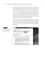
Figure 2.7
The title says it all:
“a5kRobustScalableInterne
tOnlineEcommerceFurnishi
ngsOutlet,” the winning
entry in the 5k Contest,
is both a spoof and a
functioning e-commerce
site, created in less than
5K of bandwidth
(www.the5k.org/). For
those brand-new to the
field, e-commerce was the
Holy Grail of web design
in 1999.
04 0732 CH02 4/24/01 11:15 AM Page 50
51
Taking Your Talent to the Web
SCREENING ROOM
Luxuriating in your monitor’s 21” screen, you design a site that looks sen-
sational. How will it look on a 14” screen? Will it even fit? That is the chal-
lenge of screen resolution.
Screens range from 14” to 21” (and higher), with 15” and 17” currently the
most popular. By the time this book is printed, 17” screens will dominate
the home market, and ladies named Mistress Beatrice will dominate every-
where else. Laptops will continue to offer 14” and 15” screens along with
the coveted 17-incher. Not only do screens vary, resolutions vary. Some
folks view the web at 640 x 480; others at 1600 x 1200 (or even higher).
This wild fluctuation in monitor size and screen resolution has a critical
effect on page layout.
Are we saying that your site must be able to fit inside a 640 x 480 envi-
ronment? No, you don’t always have that much space. Consider that
browsers do not make full use of the screen. In Windows, room is left at
the bottom for the task bar, while the top of the screen is taken up with
browser chrome (the buttons and text entry fields that allow users to nav-
igate the Web). In Mac OS, the right-hand side of the screen is reserved for
that little trail of icons representing the user’s hard drive, saved files, and
other work-related shortcuts, and the top of the screen is again given over
to browser chrome.
Accounting for OS interface elements and browser chrome, the usable
space may be less than 580 x 380. But if you design precisely to fit that
small space as if it were a fixed newspaper ad size, your site may look for-
lorn or even ludicrous on a larger monitor running at 1600 x 1200. What’s
a mother to do?
Liquid Design
The solution is to embrace the fluid nature of the medium and, whenever
possible, design in a resolution-independent manner. Glenn Davis, web
critic and former Chief Technology Officer of Projectcool.com, uses the
phrase Liquid Design to describe an approach to web design in which the
content reflows as it is “poured” into any monitor size.
04 0732 CH02 4/24/01 11:15 AM Page 51
Narrow your browser window to 640 pixels or thereabouts, and visit
www.jazzradio.net (see Figure 2.8). Now stretch your window as wide as it
will go (Figure 2.9). Notice how the entire layout reflows to fill the screen.
See also www.alistapart.com for another example of Liquid Design.
52
WHY: Designing for the Medium: Screening Room
Figure 2.8
The original site design for
jazzradio.net works well if
the visitor’s monitor is
small…
Figure 2.9
…and equally well if the
monitor is large. Liquid
Design makes users of
any size monitor feel
equally at home
(www.jazzradio.net).
04 0732 CH02 4/24/01 11:15 AM Page 52
There are limits to how wide a web layout may be stretched before it begins
to look ludicrous, but the goal is not to provide hours of “squash and
stretch” fun for web users. (They’re not going to perform this exercise any-
way.) The goal is to provide a site that seems to naturally fit each visitor’s
monitor. This makes the visitor feel right at home, thereby encouraging her
to spend more time on the site and drink milk right out of the carton when
she thinks you’re not looking.
By contrast, with a more rigid approach to web layout, your site might
appear to be “shoved into the corner” of a user’s large monitor. Or it might
be too wide for the user’s small monitor, forcing her to scroll left and right
(or more probably, encouraging her to leave and never come back).
A great majority of websites are designed at 800 x 600 fixed resolution in
the belief that most users have screens wide enough to accommodate this
width and height. True, “most” users can accommodate it, but why not
build something that fits every user like a glove?
With Liquid Design, you can do just that.
By contrast, Banana Republic (www.bananarepublic.com) (see Figure 2.10)
and Three.oh (www.threeoh.com) offer fixed web layouts using absolute
heights and widths. Banana Republic’s site does this to fit inside small
monitors. It certainly does that, but its attractiveness is marred on large
monitors—where most of the screen lies empty and yearning.
53
Taking Your Talent to the Web
Figure 2.10
Fixed web layouts can be
attractive, but on larger
monitors the design can
suffer from that “shoved
into the corner” feeling
(www.bananarepublic.com).
Sites must be designed to
work on small monitors but
need not be designed to
look ludicrous on large
ones. Liquid Design can
solve this problem.
04 0732 CH02 4/24/01 11:15 AM Page 53
Where bananarepublic.com chooses a fixed layout approach to accommo-
date dinky screens, Three.oh’s large, fixed layout requires the visitor to own
a monitor big enough to take in the entire design at a glance. Three.oh is
elegantly designed and serves an audience of graphic artists. Thus, the
assumption that site visitors possess a large enough monitor to see the
whole thing is reasonable enough. But by adhering to a print-like model of
site design, using absolute widths and font sizes, Three.oh rules out visitors
saddled with small monitors as well as the visually impaired. The site’s
designers no doubt feel justified in doing this because nondesigners and
visually impaired folks could not possibly be interested in what the site has
to offer. Most sites cannot make assumptions like this.
Liquid Design is accomplished through HTML tables that are built with per-
centages (rather than absolute widths), framesets that use percentages
(rather than absolute widths), or CCS. Because 4.0 browsers are still in use
at the time of this writing and will be for at least the next year, and because
CSS support is less than perfect in 4.0 browsers, most designers choose
tables or framesets to get the job done. We’ve created a simplified HTML
example to show how Liquid Design differs from print-like, fixed design.
Peek ahead to Chapter 8 if the markup confuses you.
Traditional versus Liquid Design
Here is a traditional, print-like approach to web design that uses table cells
with absolute widths. All extraneous code has been deleted from this radically
simplified example to focus on the points of difference between print-like and
Liquid Design.
<html>
<table width=”600”>
<tr>
<td width=”400”>
<p>Content goes here.</p>
</td>
<td width=”200”>
<p>Navigation goes here. This column is half as wide as the content column.</p>
</td>
</tr>
</table>
</html>
54
WHY: Designing for the Medium: Screening Room
04 0732 CH02 4/24/01 11:15 AM Page 54
Next, a similar web page, but this time it’s liquid. Specifying percentages
rather than absolute widths enables the page to fit any screen while pre-
serving the relative proportions of the original layout.
<html>
<table width=”100%”>
<tr>
<td width=”66%”>
<p>Content goes here.</p>
</td>
<td width=”34%”><p>Navigation goes here. As in the previous example, this column is
half as wide as the content column. However, this table will stretch or squash to fit any
monitor comfortably.</p>
</td>
</tr>
</table>
</html>
The liquid approach handles our horizontal problem, but what about the
vertical? Simple: Remember that the first 380 pixels of vertical space is the
only area that all your visitors are certain to see without scrolling. Make
sure that your navigational menu (if any), logo (if any), headlines (if any),
and other important content fits comfortably within that vertical area. Less
important information can fall below the fold, and no harm done. Your
client’s advertisers will be clamoring for placement at the top of the screen
for this very reason. Alas, if they get their wish, those with small monitors
will see browser chrome, ad banners, and task bars to the exclusion of
almost everything else. No wonder some people hate the Web the first time
they see it.
COLOR MY WEB
As with the wide variety in screen resolutions, computers are far from uni-
form in their ability to display color. Designers work with machines that
support millions of colors (24 or 32 bits). But many computer users are lim-
ited to thousands of colors (16 bits), and a significant minority is stuck with
256 colors (8 bits) or less.
55
Taking Your Talent to the Web
04 0732 CH02 4/24/01 11:15 AM Page 55
Monitors that are limited to 256 colors face an additional problem in that
up to 40 of these colors are “used up” in advance by the operating system
itself. For instance, Windows reserves 40 Windows system colors for its
own display purposes in lower-end color environments. That leaves exactly
216 colors at your disposal.
In 1994, the makers of Netscape Navigator mathematically subdivided the
color spectrum into 216 web-safe colors, which are equidistant from each
other along the color wheel. You will hear this mathematical arrangement
of web-safe colors variously referred to as the Netscape Color Cube, the
web-safe palette, and variations thereof, many of them unprintable in a
family publication.
The Color Cube is the bane of many web designers’ existence, but it need
not be. Paper stocks have limitations; so do type families, and so does the
Web. This is one of those limitations you can master upon accepting it as
part of the discipline the medium imposes.
Know the Code
Photoshop 5 (and higher) includes a web-safe color palette, and the included
VisiBone color palette is even more useful because it arranges the colors in
ways with which designers can understand and work. But how can you tell in
code alone if your colors are web-safe? Easy. Know the code. In HTML, all col-
ors are indicated in three pairs (six digits) of hexadecimal code.
This, for instance, is red: #ff0000.
And this is a darker red: #cc0000.
What are these little characters? They are hexadecimal code for the Red,
Green, and Blue channels of an RGB monitor. The first two digits indicate the
amount of light pouring from the monitor’s Red channel; the second pair tells
how much Green appears; and the third tells how much Blue.
With #ff0000, the Red channel is going full blast (#ff is the highest possible
two-digit value in hexadecimal), and the other two channels are “turned off”
(#00). (Most of the time, you will be working with subtler color values.)
Web-safe colors are composed only of the following hexadecimal pairs:
00 33 66
99 cc ff
Thus, #3399ff is a web-safe color, while #07ba42 is not.
56
WHY: Designing for the Medium: Color My Web
04 0732 CH02 4/24/01 11:15 AM Page 56
Only the 216 web-safe colors (colors that can be described with the hexa-
decimal pairs indicated in the previous sidebar) are guaranteed to display
correctly in both Windows and Mac OS in the 8-bit environment. Any other
color will dither (be broken into dots) on a 256-color monitor and will shift
(change to an unintended and subtly mismatched color) on a system with
thousands of colors.
Thousands Weep
As of this writing, 56% of computer owners now have 16-bit color (thou-
sands of colors), and this probably makes them happy because it makes the
daily bikini models’ flesh tones look more realistic. But for web designers,
16-bit color is a nightmare.
Sure, the dithering in 8-bit (256-color) systems is downright ugly and can
make a web page unreadable, but you can avoid it by sticking to the web-
safe Color Cube, which thus ends the problem. By contrast, the unavoid-
able color shifting that occurs on 16-bit systems springs from the dripping
maws of Hell.
57
Taking Your Talent to the Web
Figure 2.11
For reasons only a soft-
ware company could
explain, browsers and
image editors round off
16-bit color calculations
differently. As a result,
for users of 16-bit color,
image backgrounds and
HTML (or CSS), back-
grounds will never match
(www.alistapart.com/
stories/beyond/).
Say your web page has a web-safe, light brown background color. Say your
client’s product shot is supposed to sit on the page. Say the background
color in that product shot is subtly “off” from the background of your web
page. Say you’re in big trouble, cowboy.
04 0732 CH02 4/24/01 11:15 AM Page 57
Due to differences between the way browsers calculate 16-bit color and
the way image editors like Adobe Photoshop do it, in the 16-bit color space,
browsers are off differently from the way GIF images are off. In other
words, the background color of the image absolutely, mathematically can-
not match the background color of the web page. All the web designer’s
careful illusions are revealed. There is nothing you can do about this except
wait for 24-bit color to become cheaper so that more consumers will
adopt it.
Some web designers work around this problem by using transparent back-
grounds. This is fine as long as the image does not serve also as a link. (Most
images these days do.) Why are links problematic? Today most web pages
use the CSS hover property to make links light up (meaning change colors)
when the visitor drags her mouse over them. As you’ll see in Chapter 3, this
kind of visual interactivity is helpful because it lets the user know that this
particular set of words can take her somewhere else with a click of her
mouse. When images serve as links and when links use the CSS hover prop-
erty, the background color of a transparent image will change in response
to the actions of the visitor’s mouse. Freddie Kreuger has nothing on this
unintentional visual effect. Web designers who wish to avoid this horror
will either create incredibly complex style sheets or simply use solid, web-
safe background colors in their images. And of course, these solid colors
will be subtly mismatched on the screens of all 16-bit users. Welcome to
the Web. Meantime, at least you can protect your 8-bit, 24-bit, and 32-bit
using friends by sticking to the web-safe color palette as often as possible,
particularly for large color fields, typography, and background colors.
At this point many designers scream: “These colors are ugly! This is not
what I want.” You will find, after you work with these colors, that it is pos-
sible to create pleasing combinations with them, and you will develop your
own techniques for doing so. We promise.
When saving images, you do not need to worry about intermediate colors.
If your type is web-safe orange, and your background is web-safe blue, the
edges of the type will be filled in with intermediately shaded pixels that are
probably not web-safe. They do not have to be. As long as the large areas
of color are web-safe, a little dithering around the edges of type and
images goes unnoticed by most users.
58
WHY: Designing for the Medium: Color My Web
04 0732 CH02 4/24/01 11:15 AM Page 58
While GIFs are an appropriate format for logos, typography, and illustra-
tions, the JPEG format is usually preferred for photography. It is impossi-
ble to shift colors to the web-safe palette in a JPEG. Again, this limitation
of the medium is accepted or ignored by most users. But GIF images should
generally be shifted as closely as possible toward the Color Cube. In the
next sections, we will talk about ways of doing that.
Gamma Gamma Hey!
Gamma is a measurement of light, and different platforms come with dif-
ferent standard gamma settings. The Macintosh has a System Gamma set-
ting of 1.8. Put simply, it looks bright and has a wide range of light-to-dark
variance unless Mac users adjust their display to some other setting. Sili-
con Graphics Machines (SGI) have a System Gamma setting of 2.4. Their
default output is darker than that of Mac OS.
The Windows, Linux, and Sun operating systems run on PCs. PCs and their
components are built by a wide variety of manufacturers. While this keeps
end-user costs down, it also means that PCs have no standard hardware
gamma correction. Typically, their System Gamma is estimated at 2.4—
darker than Macintosh. In practice, PC gamma can be all over the place,
but it is always darker than that of Mac OS.
What does this mean to web designers? It means that if you do not com-
pensate for this cross-platform gamma variance, the subtle “study in earth
tones” that looks so moody and mysterious on your Mac will probably look
like a “study in mud” on most PCs. Because PCs are used by at least 90%
of your audience, a study in mud is not what you want.
In the late 1990s, Microsoft and Hewlett-Packard (www.w3.org/
Graphics/Color/sRGB.html) came up with a gamma standard called
standard RGB (sRGB) that gives Windows machines a common gamma set-
ting of around 2.2—at least in theory. Of course, it doesn’t work if users
don’t select it. And if they haven’t calibrated their monitors, it still won’t
really work. But at least it gives us something to aim for. Windows-based
web designers should calibrate their monitors, set their machines to sRGB,
and find something else to worry about.
59
Taking Your Talent to the Web
04 0732 CH02 4/24/01 11:15 AM Page 59
There are three ways for Mac-based web designers to compensate for
gamma issues.
The simplest is to download and install GammaToggle FKEY (www.acts.org/
roland/thanks/), a $5.00 shareware control panel created by Roland
Gustafsson in the mid-1990s. After it's downloaded and installed in the
System folder, this simple control panel allows you to toggle between your
Mac gamma setting and a representative PC gamma setting at the touch
of a command key. The software works flawlessly, the $5.00 shareware fee
is optional (but how could you not pay the man?), and this tool has proved
sufficient for hundreds of thousands of web designers since the earliest
days of professional design on the Web. Another advantage to Gamma-
Toggle FKEY is that it is software-independent. In other words, you can tog-
gle from Mac to PC gamma whether you’re working in Photoshop, using a
browser, or simply have the kooky urge to push a Command key in the mid-
dle of a slow day.
The second solution is to download the Furbo Filters Webmaster pack
(www.furbo-filters.com), created by Iconfactory’s brilliant Craig Hocken-
berry with kibitzing from your humble author. Unveiled in 1997, the Furbo
Webmaster pack is a constellation of Photoshop plug-ins that (among
other things) allows web designers to switch between Mac gamma and
three kinds of PC gamma. The software also lets you preview the effects of
various types of GIF and JPEG compression, and an included Web Scrubber
(based on the pioneering efforts of user interface guru Todd Fahrner) lets
you selectively shift your images toward the Color Cube. The shareware
costs $40, and may be downloaded and used indefinitely for free. A nag
screen helps your conscience decide when it’s time to pay for the software.
In 1998, Adobe got wise to this whole cross-platform gamma issue (and
related web design issues) and came out with ImageReady, a Photoshop-
like application for creating and exporting web graphics. Like Furbo Filters,
ImageReady lets you preview the effects of gamma differences and com-
pression settings on your images, and it also lets you shift your colors closer
to or further from the Color Cube.
60
WHY: Designing for the Medium: Color My Web
04 0732 CH02 4/24/01 11:15 AM Page 60


