Adobe GoLive 6.0- P19 ppt
Bạn đang xem bản rút gọn của tài liệu. Xem và tải ngay bản đầy đủ của tài liệu tại đây (953.09 KB, 24 trang )
LESSON 15
566
Creating Design Diagrams
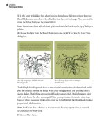
Next you’ll add a pending link from the Main page to the map.swf object. Pending links
are useful for mapping out the flow of a site. In the design diagram you can add pending
links between pages, sections, and custom objects; change the type of link (parent, child,
hyperlink, next and previous links); and change the deflection of the arrow and its
appearance. Additional properties for the appearance of links can be set in the Link Type
panel of the Design Diagram.site Settings dialog box (choose Site > Settings to open the
dialog box). After the design is submitted, you can use the Pending Links palette to resolve
links from HTML pages.
6 Select the Main page, and drag from its Point and Shoot button (located below the
Main page) to the SWF object to create a link.
Creating a pending link
7 In the Link tab of the Link Inspector, check the style of link defined. For this lesson
you’ll use the default settings. You can experiment with other styles if you wish.
8 Choose File > Save to save your work.
567
ADOBE GOLIVE 6.0
Classroom in a Book
Aligning and distributing objects
Now that you’ve added a number of pages and objects to the design diagram, you’ll use
the Align palette to organize objects more precisely.
1 Click to select the one of the three child pages of the Travel section, Cruises, Tours, and
Adventures, and Ctrl-click (Windows) or Shift-click (Mac OS) to add the other two to the
selection.
2 Choose Window > Align to open the Align palette, or click the tab if the palette is
collapsed.
3 In the Align Objects section of the Align palette, click the Align to Top button () to
align the tops of all pages.
Adding custom objects
You can create custom objects that represent items that you might add or link to a site and add these objects
to the Diagram set of the Objects palette. The Diagrams set of the Objects palette contains a number of pre-
defined custom objects representing items such as forms, elements, databases, applets, and scripts. You can
edit or delete these objects as needed.
Custom objects are images in GIF format, located in the Modules/Diagram Objects folder in the GoLive
application folder. When you add a custom object to a diagram, you can specify whether to create a file for
the object when it is submitted, and the type of file to be created. You must create the file from a template,
stationery, or sample file. For example, you can add a movie to a site by creating a custom object that uses
the movie file as a sample file. When the diagram is submitted, a new movie file is created from the sample
file. All non-HTML files created from custom objects become scratch items.
–From the Adobe GoLive 6.0 online Help.
LESSON 15
568
Creating Design Diagrams
4 Select the Use Spacing option and enter 16 in the text box. (A square on the grid is 16
pixels by default.) Click the Distribute Spacing button to add one space between the
objects.
You can align the siblings of the Customer Service section and any other objects in the
design diagram in the same way.
5 Click to select one of the three child pages of the Customer Service section, and Ctrl-
click (Windows) or Shift-click (Mac OS) to add the other two pages to the selection. Then
align the pages using the Align palette.
6 Reposition any other objects in the design diagram based on your preferences or the
example given in the 15End folder.
7 Close the Align palette when you are finished.
8 With the design diagram active, choose File > Save to save your work.
569
ADOBE GOLIVE 6.0
Classroom in a Book
Adding annotations
The design diagram is a presentation tool, so you’ll probably want to add annotations or
comments to the layout for discussion with the members of your team. Annotations are
text comments that can be displayed or closed. Both the subject and text of annotations
are summarized in the Annotations tab of the design diagram window.
Note: If you want comments created for presentation purposes to appear on each page of a
diagram, you can add them as master items on the Master tab of the diagram window.
You’ll add a note explaining to reviewers of the site design that you have moved the About
Us page to the Customer Service section.
1 Drag an Annotation icon from the Diagram set ( ) of the Object palette to an area
close to the Main page.
2 In the Annotations tab of the Annotation Inspector, enter New Layout 02 for Subject
and enter We have combined the About Us with the Customer Service section. Please
comment. -jh in the Text box.
LESSON 15
570
Creating Design Diagrams
3 Select the Display Subject and Display Text options to make the subject and text of
annotations visible in the design diagram.
The Annotations tab of the Annotation Inspector offers options for formatting and
displaying text. Select whether the subject and text are displayed to the right, left, above,
or below the annotation icon from the pop-up menu. The Graphics tab allows you to
personalize the font size and color for your comments.
4 Drop a second Annotation icon in the Order Group. In the Annotation tab of the
Inspector, enter Programmer as the Subject, and enter Get database set up for ordering.
–dm as the text. Select the Display Subject and Display Text options, and select Left of
Icon from the Position pop-up menu. Annotations in groups will move with the group.
If you drag an Annotation icon to an object, such as a page, you’ll see a gravity field or
halo around the object. Drop the icon when you see this gravity field and the icon will always
stay with that object.
5 In the Graphics tab, change the Fill Color and the Header Fill Color to the color labeled
about us #9933FF in the Color palette. Use the sliders to set the intensity of the color.
6 Both the text and subject of your icon are now visible in the design diagram. Before you
save your work, deselect the Display Subject and Display Text options to hide the content
of the annotation.
7 Choose File > Save.
571
ADOBE GOLIVE 6.0
Classroom in a Book
Annotations can also be dropped on Link lines to describe the nature of the link. The
annotation will stick to the line even if you move the line or change its deflection. You can
try this by dropping an annotation on the link from the Main page to the SWF object, and
then moving the SWF object. The annotation will move with the link. Restore the SWF
object to its original position if you try this experiment.
Adding items to every page
If you have items that you want to add to every page of your design diagram, such as logos
or copyright information, you can add them as master items. In this part of the lesson
you’ll add a client logo to the design diagram, and then you’ll add a box to contain the
design firm’s logo and text.
1 In the design diagram window, select the Master tab.
2 Position the site window so you can see both the Files tab of the site window and the
design diagram window.
3 From the Files tab of the site window, drag the client_logo.gif file from the media folder
to the top left corner of the grid in the Master view. If you drop the image in the wrong
place, you can simply drag it to a preferred location.
LESSON 15
572
Creating Design Diagrams
Now you’ll add a box to contain text and the designer’s logo. Boxes are graphical
containers that can hold objects, including text, graphics, and other boxes. All contents
within a box are contained in the box boundaries and move with the box. You can use
boxes to provide captions or to contain text or graphics that represent items in a site.
4 Scroll to the bottom of the design diagram window so you can see the bottom left
corner of the diagram.
5 From the Diagram set ( ) in the Objects palette, drag a Box icon to the bottom left
corner of the Master view.
6 Select one of the box handles, and resize the box to the right allowing room for the logo
and text.
7 With the box selected, in the Text area of the Box tab of the Inspector, enter the
following text:
2nd Draft by Comet Studios
Confidential
www.GaiaQuest.net
© 2002
You can also type directly in the box if you click to create an insertion point.
8 If necessary, drag one of the corners of the box to resize it so that all the text is visible.
9 In the Box Inspector, click the button to align the text to the right ( ).
10 To add the design company logo, drag the cometstudios_logo.jpg file from the media
folder in Files tab of the site window to the left side of the box. You may need to adjust the
size of the box again to accommodate the logo and the text. Use the arrow keys to adjust
the position of the logo.
11 Click the Design tab to return to the design diagram.
573
ADOBE GOLIVE 6.0
Classroom in a Book
12 Click the arrow at the bottom of the design diagram window to open the magnifi-
cation pop-up menu, and select Fit in Window to check your layout to date. When you
are finished reviewing the page, use the magnification pop-up menu to return to your
preferred magnification.
13 Drag a Box icon from the Diagram set of the Objects palette to the top of the page.
14 In the Text area of the Box tab of the Box Inspector, enter Design Diagram Second
Draft. Select center text button ( ) to center the text.
LESSON 15
574
Creating Design Diagrams
15 In the Graphics tab of the Box Inspector, change the Fill Color to the color labeled
banner #000000 and the Text color to the color labeled customer profile #FFCC00. Enter
12 for the Font Size.
Note: If you want the left edge of the box you just added to line up with the right edge of the
GaiaQuest logo so that the look is one seamless box, you’ll need to temporarily deselect the
Collision Avoidance option and the Horizontal Snap and Vertical Snap options in the Grid
tab of the View palette. You can then use the arrow keys to align the two boxes. To move an
object in one-pixel increments, press Ctrl+arrow key (Windows) or Option+arrow key
(Mac OS). Remember to reselect the Collision Avoidance and the Snap options when you are
finished. You can also select one of the box handles, and resize the box to the right allowing
the text to place on a single line if you wish.
16 Choose File > Save.
575
ADOBE GOLIVE 6.0
Classroom in a Book
Labeling the diagram levels
Now that your design is almost finished, you’ll add Level objects—brackets with optional
text labels—that you can use to indicate the hierarchy of objects in your design diagram.
You can place a bracket anywhere in the design diagram, and you can resize the bracket
to include all the objects at a particular level.
1 Drag a Level icon from the Diagram set ( ) of the Objects palette to the design
diagram. Position the bracket by dragging it to the left of the Main Page, and resize the
bracket by dragging any of its handles. You may find it easier to position the level labels if
you change the view of the page using the magnification menu.
2 In the Level tab of the Level Inspector, enter Level 1 in the text box. Click the Align in
the Center of the Bracket button, and click the Right Align Text button.
You’ll add four more level brackets to the design diagram, positioning the brackets to
correspond to each of the next four levels of the site hierarchy.
Note: Because you selected the Collision Avoidance option in the Grid tab of the View palette,
the Level bracket adjusts objects on the page to make room where needed. As a result, you may
need to realign objects on your page.
LESSON 15
576
Creating Design Diagrams
3 Add a Level 2 bracket for the row of Travel and Customer Service pages. Add a Level 3
bracket for the row of Tours, Cruise, Adventures, Ordering, FAQs, and About Us pages.
Add a Level 4 bracket for the Profile and Press Release pages directly below. Add a Level 5
bracket for the Secure Order, Jan 02, and Feb 02 Press Releases. If you need guidance on
the positioning of the level brackets, refer to the GaiaQuest_design_01 file in the Design
tab of the site window.
4 To align the Level brackets, click to select one and Ctrl-click (Windows) or Shift-click
(Mac OS) to add the others to the selection.
5 Choose Window > Align to open the Align palette, and then click the Align Left button
under Align to Parent to align the brackets to the left. Choose Window > Align to close
the Align palette when you are finished.
You have one more note to add at Level 4. Because this is a note about missing material
rather than a comment for review, you’ll add it in a box so that it is visible all the time.
6 From the Diagram set of the Objects palette, drag a Box icon to the right of the Level 4
bracket.
577
ADOBE GOLIVE 6.0
Classroom in a Book
7 Click in the box to create an insertion point, and enter the following text directly in the
box:
Need to add templates for content from database for Tours, Cruises, and Adventures .
-dm
8 Select the box and resize it by dragging one of the handles.
You can also enter text in the Text box of the Box Inspector.
9 Choose File > Save.
Your design diagram is finished. Now you need to present it for review.
Printing and exporting a design diagram
You can print a design diagram in paper format, or you can export the diagram to Adobe
PDF or SVG format for an online presentation. An exported diagram can contain live
links and annotations.
Note: You can open both SVG files and PDF files in Illustrator and further brand the diagram
with your company style as necessary. You can also edit the objects and individual lines as well
as enhance the presentation. You can further enhance your exported files in Illustrator by
replacing bitmaps (thumbnails, corporate logos, etc.) with higher-resolution versions (EPS,
Illustrator files, etc.) of the same images; or choose different fonts and font sizes to replace the
default fonts in the exported diagrams.
LESSON 15
578
Creating Design Diagrams
1 To export your design diagram as a PDF file, choose File > Export >Design Diagram.
In the Export Options dialog box, select PDF from the Export Diagram As pop-up menu.
2 Select the Make Annotations Live option so that the annotations can be opened in the
PDF file.
If you know the URL to which you’ll upload your files, you can select the Make Diagram
Objects Into Links option and enter the complete path where the site will be located.
You’ll not use this option in this lesson.
3 Click OK, and save the PDF file as “gq_diagram_02.pdf ” in the
Lessons/Lesson15/15Start/ folder on your hard drive.
4 Open the gq_diagram_02.pdf file. Notice that you can open annotations in the PDF
file.
5 Close the PDF file, and save the design diagram.
Anchoring a design diagram
After your design diagram is complete and approved, you can submit it—that is, you can
convert pages in the diagram to real pages in the site. Before you submit a design diagram,
however, you must anchor it to a page in the site’s navigation hierarchy.
For this design diagram, you’ll anchor the index.html page to the Main page. The
index.html pages will function as a splash page or introductory page that automatically
takes a visitor to the Main page depending on the type of browser being used.
First you’ll drag a live page from your site window to the design diagram window. This
live page becomes the anchor page, representing a location in the existing site. Later you’ll
check and submit the design.
1 Drag the index.html page from the Files tab of the site window to the design diagram
window and drop the page above the Main page without creating a hierarchy—that is,
without associating it as a parent page of the Main page.
579
ADOBE GOLIVE 6.0
Classroom in a Book
2 Drag the Main page over the bottom of the anchor page so that it becomes the child of
the anchor page. A black bar appears below the “No Name” anchor page when the main
page is a child of the anchor page.
Anchoring a site
3 Select the new anchor page, and in the Page tab of the Section Inspector, name the page
Home Page.
4 In the Graphics tab of the Inspector, leave the Fill Color as white (#FFFFFF). Change
the Header Fill Color to the color labeled main #99CC00 in the Color palette, and drag
the slider to the right.
Note: If the design shifts when you add an anchor page, you can realign the pages for
presentation.
5 Choose File > Save.
LESSON 15
580
Creating Design Diagrams
Submitting a design diagram
When you have completed the design diagram and anchored the diagram with a page
from the Files tab in the site window, you can submit your diagram, converting it into an
active site and make it live. Submitting a design diagram converts the pages and sections
to real, editable HTML pages that can be uploaded to the Web. The pages move from the
Diagrams tab of the site window to the Files tab and from the Design Pages and Objects
folders to the Live Pages and Live Objects folders in the Staging tab.
Before submitting (or converting) a design diagram, you should check the staging view
and correct any errors. The staging view lets you see how your design diagram relates to
the live site. It also displays error and warning icons when you check your site.
Note: Errors are often found in file and folder names (such as multiple files in the same
directory having the same name or wrong folders specified in a directory). Checking your
design alerts you to any changes you need to make before submitting the design.
1 To check the staging of the design, click the Staging tab of the design diagram window.
2 Choose Diagram > Staging > Check Staging.
A check mark in the Check column opposite a page or object means that no errors were
detected. Other icons in the column indicate problems or potential problems. For
example, the Stage in Scratch icon indicates that a page is not linked directly or indirectly
to an anchor page. Unless you want such a page to be treated as a scratch page when the
diagram is submitted, you need to anchor it by dragging an anchor page from the
navigation view to a page in the design diagram or linking the page to an anchored page
in the diagram to create a family link.
3 Choose Diagram > Staging > Submit All to submit the design diagram and convert its
pages and sections to real, editable HTML pages. Or click the Submit All button ( ) on
the toolbar.
4 Click the Design tab in the design diagram window.
Notice that all pages (but not necessarily the objects, such as the database) have a symbol
( ) in the right corner indicating that the design is anchored and currently submitted.
581
ADOBE GOLIVE 6.0
Classroom in a Book
In the Files tab of the site window, notice the newly created pages, folders (travel and
services), and their generic symbols. Also notice that none of the custom objects are
represented except for the Secure object. For predefined custom objects—forms,
elements, databases, applets, PDF files, and scripts—to be present in the site window, you
must create the file from a template, stationery, or sample file for it to become a real file.
The Secure object was created from stationery, which is why it is present in the Files tab
of the site window. The PDF files are not yet linked to a stationery or template. The press
release database has not been created and is not based on a real file.
5 Save and close both your design diagram and your site window.
After you make a design diagram live, you can recall it. You can then modify the design
diagram and resubmit it any time. For example, you might submit a diagram in progress
to examine it in context and then recall it for further design development. Or you might
submit one of two alternative diagrams, and then recall the submitted diagram so that
you can submit the other and choose between them. Submitted diagrams can be
uploaded to the Web.
Review questions
1 What are some of the reasons for using design diagrams?
2 How do you create a design diagram?
3 How do you add pages and elements to a design diagram?
4 What is the purpose of the Master tab in the design diagram window?
5 Why should you check the staging of a design diagram?
6 When would you submit a design diagram?
Review answers
1 A design diagram lets you lay out the structure of a site before you create pages and
helps you manage the site creation process. You can use multiple prototype diagrams as
you build and revise a site, creating and testing designs for review. You can present design
diagrams in print or online in Adobe PDF or SVG format. When you are ready to work
with real pages, you submit a diagram, converting its pages to actual pages in the Web site.
2 In the site window, select the Diagrams tab. Then choose Diagram > New Design
Diagram from the GoLive command bar to create a new design diagram.
3 There are several ways to add pages and elements to a design diagram. You can drag
page and element icons from the Diagram set of the Object palette. After you add one
page, you can also add pages and objects using the context menu. Right-click (Windows)
or Control-click (Mac OS) on a page or object in the design diagram, and choose from
the Insert Object menu or the New menu.
4 The Master view allows you to add items that will appear on every page of your design
diagram if you have a multipage diagram. This is useful when you want to brand pages
with a client logo or design team logo, for example, or when you want to add a legend.
5 Checking the staging of a design diagram lets you determine whether all of a site’s pages
are connected by links to an anchor page and whether there are folder or filename
problems. Checking the staging gives you the opportunity to correct errors before
submitting the design.
6 You submit a design diagram when you are ready to convert the design diagram’s pages
and sections to real, editable HTML pages. GoLive moves the pages from the Extras tab
of the site window to the Files tab, indicating that they exist as files within the site. Files
are created for custom objects that are linked to a template, stationery, or other file.
583
Index
A
Action Group action 368
Action track 340
actions 338, 356
adding to animations 338
adding to floating boxes 306, 360
adding to frames 281
adding to images 366, 368
adding to links 220, 374
browser switch 146, 356
copying 372
ForceFrame 281
head actions 356, 366
Netscape CSS Fix 326
OnCall 356, 366
Open Window 220
Play Scene 345
resizing of browser window 360
ShowHide 369
Address icon 216
Adobe Premiere 478
Adobe Web Workgroup Server 102,
498
AIFF 477
aligning objects 34, 47, 49, 117, 147,
567
Alt Text box 114, 204
Anchor Inspector 207
anchoring
design diagram 540, 578
anchors 205, 208
animation
adding actions to 338
adding scenes 342
display errors 326
floating boxes 326, 334
keyframes 328
looping 331
path, editing 332
playback 331
speed 331
Time Tracks 328
transition effects 341
Animation menu 333
Annotation tab 543
annotations, design diagram 541, 569
ASP element, design diagram 558
Autoplay button 344
B
background color
changing with css 451
background color, page 158
background image, page 120, 158
behaviors
adding in LiveMotion 467
border size, in frame sets 271
Bring Region to Front button 227
broken links 232, 508
Browser preferences 37
browser profiles 91, 431
browser switch 146, 356
browser window, resizing 360
browser, previewing with 19, 93
browsers, and frames 277
C
Call Action action 370, 379
Call Function action 378
Canvas As Single Page option 547
Cascading Style Sheets. See CSS
Change References option 529
changing file references 529
Check Staging command 580
checking spelling 188
class styles 432, 447
Clean Up Site 531
code, editing HTML 192
Collision Avoidance option 547, 574
color
background 30, 158
design diagram 550, 551
in table cells 177
links 218
text 168
color palette
custom 128
updating 138
Colors tab 62, 128
column headings, adding 174
columns, spanning 405
comments 134
comments, design diagram 541
Common Gateway Interface
(CGI) 385
component 14, 108, 121, 137, 146
Component Inspector 122
Components folder 108, 502
context menus 89
Convert to Lean Rollover
command 297
Create Circle tool 226
Create Polygon tool 225
Create Project Folder option 21, 102
CSS 423, 432, 446
.css extension 444
absolute vs. relative font sizes 436
adding a style 439
background color 451
class style 447
common HTML elements 441
creating 441
duplicating a style 450
INDEX
584
editing 435, 437
external style sheets 425, 434
ID styles 432
importing 449
internal style sheets 425
linking 444
previewing 453
saving 444
CSS Editor 424
CSS palette 447
CSS Style Inspector 424
CSS support 426
custom color palette 128, 138
custom objects, design diagram 567
custom workspace 80
D
data folder 52
database, design diagram 563
date and time stamp 135
default configuration 70
default fonts 181
Default Workspace 80
Delete Sample tool 480, 485
Delete Selected Item button 525
Design Diagram.site window 543
design diagrams 538, 544
adding color 551
adding pages 545, 553
adding pages (Section
Inspector) 555
adding sections 548
adding security 560
adding text 577
aligning and distributing
objects 567
anchoring 540, 578
creating 544
database 563
display 546
exporting 577
grouping objects 561
labeling 575
master page 571
objects 558
opening 539, 543
PDFs 563
pending links 566
Secure object 560
staging 580
submitting 580
SWF object 565
view options 546
Design tab 543
Designs folder 502
Detect Rollover Images feature 297
Diagrams folder 503
Diagrams tab 539, 543
document window 71, 72
Down state 297, 299
drop-down menu 302
showing and hiding 306
E
Edit Behaviors button
(LiveMotion) 468
e-mail link 216
EPS files, as Smart Objects 242
Errors tab 504
Export Design Diagram
command 578
Export Internal CSS command 433
exporting compositions
(LiveMotion) 469
exporting design diagrams 577
external style sheets 425, 434, 444, 449
External tab 212
Extras tab 64, 202, 502
F
File Inspector 120, 500, 505
file references, changing 529
file structure 51
files
adding 105
missing 507
orphan 505
renaming 52
Files tab 52, 61
filter tracks 479
find and replace 186
Find Files in Site button 78
Find window 78
Flip Move action 364
floating box marker 295
floating boxes 15, 139
adding 141, 294
adding actions to 306, 360
adding images to 142, 301, 322
and rollovers 294
animating 326, 334
browser support 296
hiding on loading 309
ID styles 432
locking 335
selecting 295
showing and hiding 306
stacking 321, 324, 337
Visible option 339
folder, data 52
folder, project 51
folder, root 52
folder, settings 52
folders
adding to site 22, 511
creating 23, 106
moving 512
renaming 513
font sets 181
Font Size menu 176, 391
fonts, in tables 183
font-size, absolute vs. relative 436
ForceFrame action 281
Form element 386, 387
form fields, aligning 396
Form icon 387
form text fields
linking to labels 397
585
formatting tables 173
formatting text 163
forms 386
adding fields 391–396
adding images 405, 411
address fields 394
border and cell 401, 414
creating 388, 389
custom elements 403
designing 385
form field labels 391
inserting tables 389
list box 409
name fields 391
pop-up menus 399
radio buttons 406
Reset button 413
resizing columns 405
Submit button 413
tab order 414
FPS (Frames Per Second) 331
Frame Editor 268
Frame Regions button 227
frame sets 264
changing border properties 271
creating 268
editing 270
forcing to load 281
linking to 280
linking to home page 280
modifying 270
parent option 278
structure 265
targeted links within 278
Vertical Orientation option 271
frames
adding content 275
adding single 269
and browsers 277
linking content 273
previewing 276
scalable 274
scrolling 275
setting size 274
targeted links 278
FTP Server Connect/Disconnect
button 532
FTP tab 504
G
General preferences 90
Generic Page icon 13
Get Colors Used command 138
graphics
adding 112
as links 201
editing 242
H
Head Action Inspector 282
head actions 356
browser switch 356
resizing browser window 360
head section pane 76
headings, adding column 174
Hide Palettes command 62
Hints 94
home page 22
Horizontal Snap option 574
hotspots 223, 227
HTML Element styles 432
HTML elements 423, 441
HTML Styles palette 168
HTML table 14
HTML table, converting to layout
grid 190
hyperlinks
changing 529
repairing 508
hypertext links 209
I
ID styles 432
Illustrator images, as Smart
Objects 243
Image Inspector 32, 202, 223
image maps 17, 223
linking 228
testing 230
Image Size tab
Save for Web 249
image, adding background 158
images
adding 31, 112, 115
as Smart Objects 242, 243
clickable 411
editing 242
linking 32
sliced 116
Import button 171
Import Files to Site command 13, 22,
105
Import from Folder command 496
In & Out Links palette 500, 507
Include GoLive Code option
ImageReady 299
Increase List Level button 167
Inspector 88
internal style sheets 425
exporting 433
J
JavaScript
assigning to page elements 376
JavaServer Pages (JSP) 558
K
keyframes 328, 330, 332
keywords 132
L
labels
design diagram 575
linking to form text fields 397
Layout Editor 72
layout grid 159
converting to HTML table 156, 190
INDEX
586
layout grids 14, 110, 127
optimizing 119
Layout Preview 36, 91
Layout tab 72
layout text boxes 27, 123, 161
Lean rollovers 297
levels, design diagram 575
Library folder 503
library objects 14, 402
Library set 402
line breaks 167
link warnings 231
Link Warnings button 232, 508
links 199
absolute and relative pathnames
in 210
active and visited 219
adding actions to 220
adding actions to text links 374
adding to rollovers 305
adding to text 209
appearance 218
broken 232, 508
color 218
creating by browsing 209
creating with Point and Shoot 203
e-mail 216
empty 363
external 212
hypertext 209
image maps 223
parent option 278
pending 566
targeted in frames 278
to a frame set 280
to URLs 212
troubleshooting 232
updating 198
using graphics 201
warning preferences 231
within pages 205
Links tab 69
list boxes, forms 409
lists, formatting 166
LiveMotion
configuring 255
exporting compositions 469
image as Smart Objects 243
time-independent groups 462
Timeline window 462
using with GoLive 462
M
Make Annotations Live option 578
Make Diagram Objects Into Links
option 578
Map Area Inspector 228
Master tab 543
menus, context 89
Microsoft Active Server Pages
(ASP) 558
missing file errors 507
Modified Date Inspector 136
Modules preferences 35
movie viewer window 472, 487
MP3 477
N
name field 391
names, changing file names 52
Navigation view 518, 521
adding pages 522, 525
linking pages 523, 526
moving files 528
Navigation View button 65
navigational links 18
adding 49
Netscape CSS Fix action 358, 359
in frames 265
New Action button 308, 363
New Child Page buttons 525
New Colors folder 128
New Design Diagram command 544
New Element Style button 439
New Folder buttons 511
New Folder command 23
New Font Family button 443
New Item button 133, 363
New Keyword button 133
New Link button 203, 363
New Page command 13, 20, 157
New Pages dialog box 553
New Site command 20
NewFiles folder 526
Normal state 297, 299
O
objects
aligning and distributing 34, 117,
567
design diagram 558
Objects palette 82, 85
On Load menu 327
OnCall actions 366, 368
One Source Filter Sample
Inspector 482
One Source Filter Track Inspector 480
Open command 20
Open CSS Editor button 431
Open Window action 220
orphan files 505
Outline Editor 192
Over state 297, 299
P
page title, changing 25, 157
pages
adding 38, 157
adding background color 30, 158
adding background images 120, 158
adding floating boxes 139
adding images 112
adding layout grids 110
adding to design diagram 545
anchoring 540
changing background color 451
creating from stationery 47
linking between 201
587
linking within 205
previewing 18, 148
pages, master
in design diagrams 571
palettes 80
separating 69
working with 62
Palindrome button 331
Paragraph Format menu 164
PDF files, as Smart Objects 242
PDF objects, design diagrams 563
pending links 566
Photoshop Smart Objects 243
Photoshop-based designs 116
PHP Hypertext Preprocessor
(PHP) 558
Play button 331
Point and Shoot button 88
pop-up menus, forms 399
preferences 90, 254
Browser 37
link warnings 231
Modules 35
Preview Mode 35
Preview Frame button
frames 276
Preview In Default Browser
command 37
Preview Mode
Modules preferences 35
previewing
in GoLive 191
with Web browsers 93
previewing pages 18
printing a design diagram 577
project folder 51
Q
QuickTime movies 17
adding 46
adding sound 477
creating 470
editing tools 470
flattening 473
inserting SWF tracks 471
inserting video tracks 473
movie labels 464
playing 460
previewing 487
special effects 479
R
radio buttons, forms 406
Reference Inspector 213, 216
referencing images 32
Refresh View button 53
Refresh View command 62, 405
Remove Link button 209
Reset button 413
renaming 413
Resize Window action 360
resource links 18
Reveal in Explorer button 513
Reveal in Finder button 513
rollovers 17, 41, 289, 294, 299
adding behaviors (LiveMotion) 467
adding links to 305
and floating boxes 294
Floating Box Inspector 295
naming 297
root folder 52
S
Save for Web dialog box 246
Save Workspace command 83
scenes 342
multiple 342
using actions to play 345
Scratch pane 67, 518
Scroll Left action 374
Scroll Right action 370
sections, in design diagrams 548
security function
adding to design diagram 560
Select Color button 227
Select Region tool 225, 227
Select Window button 78
selecting tables 389
Send Region to Back button 227
settings folder 52
Settings option
Save for Web dialog box 246
Show in Browser button 37, 93
Show Information in Explorer
button 79
Show Information in Finder button 79
Show Link Warnings command 232
ShowHide action 369, 374
Single User site 13, 102, 496
Site Color List 128
Site Extras set 402
site hierarchy, solving 515
site management 18, 494
Site Navigator 522
Site preferences 91
site project file 12, 51
site publishing 18
Site Trash folder 502, 503
site window 12, 60, 502
adding files and folders 105–107
collapsing 64
Components folder 502
Designs folder 502
Errors tab 504
expanding 63
External tab 212
Extras tab 202, 502
FTP tab 504
Name title bar 512
Site Trash 502
Stationeries folder 504
updating 53
Site Wizard 12, 20
sites
adding files and folders 105
adding folders 511
adding new pages 514
INDEX
588
Clean Up Site command 531
creating 102
error handling 505
home page 497
importing 496
managing folders 511
missing file error 507
opening 61
orphan files 505
single-user 102
site link indicators 516
Slice Select tool 246
sliced images 116
Smart Illustrator objects 253
Smart LiveMotion objects 254
Smart Objects 242, 243
restoring 248
variables 256
Smart Objects folder 504
Smart Photoshop objects 243
editing 249
resizing 247
Smart rollovers 297, 298
sorting table entries 179
sound, adding to movies 477
Source Code Editor 73, 191, 430, 437
frames 269
spell checker 188
staging
design diagrams 580
Staging tab 543, 580
Standard Selection and Editing
tool 480, 485
Start/Stop Indexing button 415
stationery 13, 42, 545
Stationery folder 504
Stop button 331
Structure command 391
Structure menu 165
style sheet support 426
style sheets
creating 441
external 425, 434
internal 425
linking to multiple pages 446
removing 447
styles
adding 439
duplicating 450
editing 435, 437
Submit button 411, 413
submitting a design diagram 580
Sun JavaServer Pages (JSP) 558
SVG files 247
SWF files 247, 254
SWF format and files
exporting (LiveMotion) 469
importing 472
SWF object, design diagram 565
T
tabbing chain 414
table
converting to layout grid 190
table cells
aligning 396
color 177
Table palette 173, 175
table style 174, 185
tables 14, 170, 171
adding captions 175
adding column headings 174
adding rows 174
changing cell color 177
copying and pasting text into 171
formatting 44, 173, 177, 183
importing text into 126, 171
selecting 173, 389
setting properties 401, 414
sorting entries 179
target file 243
templates 13
Templates folder 504
text
adding 16, 26, 160
adding in tables 126
adding line breaks 167
adding links 209
adding to design diagram 577
adding with layout text boxes 123
changing color 128, 168
copying and pasting 162
copying and pasting into tables 171
creating a style 168
editing 186
formatting 16, 163, 166
importing to tables 171
text field, form 393
Text Inspector 207
text links, adding actions to 374
Ticks option 365
Time Tracks 328
Timeline Editor 328, 471
Action track 340
multiple tracks 335
Options menu 342
Toggle Media button 519
toolbars 65, 78
tracks 471
selecting 488
transitions 340, 341
Two Source Filter Sample
Inspector 486
Two Source Filter Track Inspector 485
U
Unfold All button 65
Unnumbered List button 166
URLs, linking to 212
V
variables
in Smart Objects 251, 256
Vertical Snap option 574
View palette 66
design diagram 546
589
W
WAV 477
Web Settings dialog box 426
Web sites. See sites
Web Workgroup Server 13, 102, 498
Web-safe images 242, 243, 247
Window Size menu 157
windows, tiling 76
work area, setting up 84
workflow, in site building 11
workspace, custom 80


