The Non-Designer''''s Design Book- P2 pptx
Bạn đang xem bản rút gọn của tài liệu. Xem và tải ngay bản đầy đủ của tài liệu tại đây (4.57 MB, 30 trang )
II Part 1: Design Principles
Summary
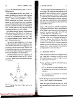
of proximity
When several items are in close proximity to each other, they become one
visual unit rather than several separate units. Items relating to each other
should be grouped together. Be conscious of where your eye is going: where do
you start looking; what path do you follow; where do you end up; after you've
read it, where does your eye go next? You should be able to follow a logical
progression through the piece, from a definite beginning to a definite end.
The basic purpose
The basic purpose of proximity is to organize. Other principles come into play
as well, but simply grouping related elements together into closer proximity
automatically creates organization. If the information is organized, it is more
likely to be read and more likely to be remembered. As a by-product of orga-
nizing the communication, you also create more appealing (more organized)
white space (designers' favorite term).
How to get It
Squint your eyes slightly and count the number of visual elements on the
page by counting the number of times your eye stops. If there are more than
three to five items on the page (of course it depends on the piece), see which
of the separate elements can be grouped together into closer proximity to
become one visual unit.
What to avoid
Avoid too many separate elements on a page.
Don't stick things in the corners and in the middle.
Avoid leaving equal amounts of white space between elements unless each
group is part of a subset.
Avoid even a split second of confusion over whether a headline, subhead,
caption, graphic, etc., belongs with its related material. Create a relation-
ship among elements with close proximity.
Don't create relationships with elements that don't belong together! If they
are not related, move them apart from each other.
m
Alignment
New designers tend to put text and graphics on the page wherever there
happens to be space, often without regard to any other items on the page.
What this creates is the slightly-messy-kitchen effect-you know, with a cup
here, a plate there, a napkin on the floor, a pot in the sink, a spill on the floor.
It doesn't take much to clean up the slightly messy kitchen, just as it doesn't
take much to clean up a slighty messy design that has weak alignments.
The principle of alignment states that nothing should be placed on the page
arbitrarily. Every Item should have a visual connection with something else on
the page. The principle of alignment forces you to be conscious-no longer
can you just throw things on the page wherever there happens to be room.
When items are aligned on the page, it creates a stronger cohesive unit. Even
when aligned elements are physically separated from each other, there is an
invisible line that connects them, both in your eye and in your mind. Although
you might have separated certain elements to indicate their relationships
(using the principle of proximity), the principle of alignment is what !ells the
reader that even though these items are not close, they belong to the same
piece. The following pages illustrate this idea.
II Part 1: Design Principles
Take a look at this business card, the same one you saw in the last chapter.
Part of its problem is that nothing is aligned with anything else. In this
little space, there are elements with three different alignments: flush left,
flush right, and centered. The two groups of text in the upper corners are
not lined up along the same baseline, nor are they aligned at the left or
right edges with the two groups at the bottom of the card (which don't
line up along their baselines, either).
'
Ralph Roister Dolster
(717)
S55.1212
Mermaid Tavern
916 Bread Street
London, NM
Toke a moment to decide which items should
be
grouped
into closer proximity, and which should
be separated.
Mermaid Tavern
Ralph Roister Dolster
916 Bread Street
London, NM
(717)
555.1212
The elements on this card
look like they were just
thrown on and stuck. Not
one of the eiements has any
connection with any other
element on the card.
By moving ail the eiements
over to the right and giving
them one alignment, the
information is instantly
more organized. (Of course,
grouping the reiated
elements into closer
proximity helped, too.)
The text items now have
a common boundary;
this boundary connects
them together.
THREE: ALIGNMENT
II
In the example (repeated below) that you saw in the proximity section,
the text is also aligned-it's aligned down the center. But if text is aligned,
instead, on the left or the right, the invisible line that connects the text is
much stronger because it has a hard vertical edge to follow. This gives left-
and right-aligned text a cleaner and more dramatic look. Compare the two
examples below, then we'll talk about it on the following pages.
Mermaid Tavern
Ralph Roister Doister
916 Bread Street
london,
NM
(717) 555-1212
Mermaid Tavern
Ralph Roister Dolste
916 Bread stree
london, NM
(717)
555.121
The invisible line
runs right down here,
connecting the text.
This example has a nice
arrangement with the text
items grouped into logical
proximity. The text is
center-aligned over itself.
and centered on the page.
Although this is a legitimate
alignment, the edges are
"soft";
you don't really see
the strength of the line.
This has the same logical
arrangement as above, but
it is now right-aligned. Can
you see the
"hard"
edge on
the right7
There isa strong invisible line
connecting the edges of these
two groups of text. Youcan
actually see the edge. The
strength of this edge is
whAt gives strength to
the layout.
II Part 1: Design Principles
Do you tend to automatically center everything? A centered alignment
is the most common alignment that beginners use-it's very safe, it feels
comfortable. A centered alignment creates a more formal look, a more
sedate look, a more ordinary and oftentimes downright dull look. Take
notice of the designs you like. I guarantee that most designs that have a
sophisticated look are not centered. I know it's difficult, as a beginner, to
break away from a centered alignment; you'll have to force yourself to do
it at first. But combine a strong flush right or left alignment with good use
of proximity and you will be amazed at the change in your work.
Business Plan
for
Red Hen Enterprises
by Shannon Williams
March 20, 2006
This ;s a typical report cover, yes?
This standard format presents Q dull,
almost amateurish
look, which
may
jn~uence someone's initial reaction
to the report.
Business Plan
for
Red Hen Enterprises
by Shannon Williams
March 20, 2006
The strong ~ush-Ieft alignment gives
the report cover a more sophisticated
impression. Eventhough the author's
name is far from the tltie, that
invisible line of the strong alignment
connects the two text blocks.
THREE II
ALIGNMENT
Stationery has so many design options! But too often it ends up with a
flat, centered alignment. You can be very free with placement on a piece
of stationery-but remember alignment.
~~
Mom & Pop
Corner Grocery Store
5Jam Street. Springville, Illinois 00123
This isn't bad, but the centered layout
is a littie dull, and the border closes
the space, making it feel confined.
~
Mom
& Pop
5 Jam Street
Springvitle
llIinoi.
(10123
This is push right, on the left side.
I made some changes in the typeface.
~~
;
Mom & POp
; Corner Grocery Store
: SJamStreet'Spri"gvilie' I!!inois '00123
Apush-ieft aiignment makes the page
a little more
sophisticated. limiting the
dotted line to the ieft side opens the
page and emphasizes the alignment.
Mom & Pop
Corner
Grocery Store
.,
~i::;'"
rt
0.1
.'
~-:'i
SJamStreet. Spri"gville, Illi"oisOOl23
Be brave! Be bold!
II Part 1: Design Principles
I'm not suggesting that you never center anything! Just be conscious of
the effect a centered alignment has- is that really the look you want to
portray? Sometimes it is; for instance, most weddings are rather sedate,
formal affairs, so if you want to center your wedding announcement, do
so consciously and joyfully.
You .re w.rmly
invited to .ttend!
centered. Really rather dull.
You
.re
warmly
invited
to
.ttend!
Experiment with
uncentering
the block of centered type.
You are
w.rmly invited
to
.ttend!
r
!(you're going to center text,
then at least make it obvious!
Ifyou're going to center the text,
experiment with making it more
dramatic in some other way.
THREE
ALIGNMENT
m
Sometimes you can add a bit of a twist on the centered arrangement, such
as centering the type, but setting the block of type itself off center. Or set
the type high on the page to create more tension. Or set a very casual, fun
typeface in a very formal, centered arrangement. What you don't want to
do is set Times 12-point with double-Returns!
0 thou pale Orb
that silent shines
While care-untroubled
mortals sleep!
Robert Burns
This is the kind of layout that
gives "centered" a bad name:
Boring typeface. type that is
too large. crowded text. double
Returns. dorky border.
0 thou pale
Orb
that silent
shines
While care-
untroubled
mortals
sleepi
))
Emphasize a tall. slender
centered layout with a tall.
slender piece of
paper.
0 thou pale Orb
that silent
shines
While care~untroubled
mortals
sleep!
Robert Bums
~
Acentered alignment needs extra
care to make it work. This layout
uses a classic typeface sized fairly
small (reiatively). more space
between the lines. lots of white
space around the text, no border.
RohertDu
Emphasize a wide, centered layout
with a wide spread. Try your next ~yer
sideways.
II Part 1: Design Principles
You're accustomed to working with text alignments. Until you have more
training, stick to the guideline of using one text alignment on the page:
either all text is flush left, flush right, or centered.
This text isflush left,
Some people call it
quad left, or you can say
it is left aligned.
This text isflush right.
Some people call it
quad right, or you can
say it is right aligned.
This text is centered.
If you are going to
center text,
make it
obvious.
See, in this paragraph it is
diliicult to tell if this text
was centered purposely
or perhaps accidentally.
The line lengths are not
the same, but they are not
really different. If you can't
instantly tell that the type
is centered, why bother?
This text is justified. Some people call it quad left
and right, and some call it blocked-the text lines up
on both sides. Whatever you call it, don't do it unless
your line length is long enough to avoid awkward
gaps between the words.
THREE: ALIGNMENT
II
Occasionally you can get away with using both flush right and flush left
text on the same page, but make sure you align them in some way!
Robert Burns
Poems in Scots
and English
The most
complete edition
available of
Scotland's
great poet.
Robert
Burns
Poems in Scots
and English
The most
complete edition
available
of Scotland's
great poet.
In this example, the title
and the subtitle are
~ush lef!. but the
description is centered-
there is no common
alignment between the
two elements of text.
They don't have any
connection to each other.
Aithough these two
elements still have two
different alignments
(the top is ~ush left
and the bottom is ~ush
right), the edge of
the descriptive text
below aligns with the
right edge of the title
above, connecting the
elements with an
invisible line. This was
not an accident!
II Part 1: Design Principles
When you place other items on the page, make sure each one has some
visual alignment with another item on the page. If lines of text are across
from each other horizontally, align their baselines. If there are several
separate blocks of text, align their left or right edges. If there are graphic
elements, align their edges with other edges on the page. Nothing should
be placed on the page arbitrarily!
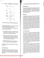
Example 6: Value of a resistor in an electrical circuit.
Find the value ofa resistor in an electrical
circuit which
wiU dissipate the cha rgeto 1 percent
of its original vsluewithin one twentieth of a second after the switch is closed.
SWitch->
H
B'cr'i!"
[:"i""
[RI
I
Inductor[LJ
I
qO=
qlll=
1=
1=
c=
R=
9 volts
0.09 volts
0.05 seconds
8 henrys
0.0001 farads
em
ohms
qlll= I0.253889I
II[l'C J
(RJ(2*U]"2
SQRT(B15.B16)
COS(T*B17J
-R_*T/(2*l)
QO+EXP(B19)
1250
351.5625
29.973941
0.07203653
-0.9375
3.524451J64
There are two problems here, right? Alack of proximity and a lack of alignment.
Ellen though it may be a boring
01'
chart, there is no reason not to make the
page look as nice as possible and to present the information as clearly as
possible. when information is difficult to understand, that's when it is the
most critical to present it as clean and organized.
SWitch->
qO= 9 volts
H
I
qll)=
0.09 volts
1=
0.05
seconds
l=
8
henl}'S
Battery Capacitor
(C)
Inductor(l) c=
0.0001 farads
U
I
R=
[ED ohms
Resistor
[RI
q(U=
10.2538891
THREE: ALIGNMENT III
Lack of alignment is probably the biggest cause of unpleasant-looking
documents. Our eyes like to see order; it creates a calm, secure feeling.
Plus it helps to communicate the information.
In any well-designed piece, you will be able to draw lines to the aligned objects,
even if the overall presentation of material is a wild collection of odd things
and has lots of energy.
Example 6: Value of a resistor in an electrical circuit.
Findthevalueofaresistorinanelectricalcircuitwhichwilldissipatethechargetolpercent
of its original value within one twentieth ofa second after the switch is closed.
IJIl.U
[R J(2"'UJA2
SQRTIBI5-B16}
COW*Bl7)
-R_*T/(2*L)
QO+EXP(B 19)
1250
351.5625
29.973947
0.07203653
-0.9375
3.52445064
simply lining things up makes all the difference here. Notice not one item is
on the page arbitrarily-every item has some visual connection with another
item on the page.
If Iknew what this chart was talking about, I might choose to move the box
on the right even farther to the right, away from the big chart. keeping their
tops aligned. Or I might move the lower box farther away. Iwould adjust the
spacing between the three charts acccording to their intellectual relation-
ships to each other.
II Part 1: Design Principles
A problem with the publications of many new designers' is a subtle lack of
alignment. such as centered headlines and subheads over indented para-
graphs. At first glance. which of the examples on these two pages presents
a cleaner and sharper image?
Dam Honor Form Felterpegs
Heresy rl\eumatic starry offer
"Are
badger dint doe mush
former's dodder. Violate Husking., woke disk moaning! Dilcl\e. curry
an wart hoppingsdam honor form. doze buckles fuller slob darn tutor
Vk>Iatelift weller fodder, pes-pan an feed«~?"
oi}HJF<wmerHusldngs. ~ hanu 'Yap. Foddn'. An fd:Wr pep."
~lllonfOl"hanlfurrym:o:h-
an furry stenchy. Infecc,pimple
orphan set debt VIolate"s Codder
worse nosingbutlon oiled mouser.
Violate, honor udder hen, worsted
furry gnats parson-jester putty
ladle form gull,sample. morticed.
anun.aftlicted.
lanee! gull
Wan moaning
Formn' Husk-
ings nudist haze dodder setting
honor cheer, during nosing.
'VIOLATE!" sorled dole
formet,'Watcherseliingdarnfur?
DmIURrKn'yon-cannedgatretc:h
settin,damduringnosing?Gftm
pupottfl"ckbtchft'l'!"
"Arm
tarred,Fodder; resplen.
dent Violate warily.
"Wat<.:hertarred fur?" aster
stenchy former, hoe dint half mush
symphony further gull.
~
~Dit<.:hermail'<.:ar<.:awsan
swoop otter caw Itaple?".Off
curse, Fodder. Are mulctoiJer caws
an
swapped
oller slaple. feller
<.:hKkings. an dammed upp<!r
Iar-
derinnu<.:heckins.horsetOoesad.
deroHera<.:hes. an wen damtutOt'
ve5libule gu.arding toe ped. oiler
bogs an warms
oll'er
vestibules. an
watched an earned
yore dosing, an
fetter hearses
an "
"Dit<.:her warder oiler hearoes,
toe?"enter-rupturedoiledHuok-
This is a very common sight: headlines are centered, text
is ~ush left. paragraph indents are "typewriter" wide
(that is. five spaces or half an inch. as you learned in
school). the illustration is centered in a column.
Never center headlines over ~ush left body copy or text
that has an indent" If the text does not have a clear left
and right edge. you
can"t teli the headline is actualiy
centered. It looks like it's just hanging around.
Alithese unaligned spots create a messy page: wide indents.
ragged right edge of text, centered heads with apen space
on both sides. centered illustration.
THREE: ALIGNMENT
II
All those minor misalignments add up to create a visually messy page.
Find a strong line and stick to it. Even though it may be subtle and your
boss couldn't say what made the difference between this example and the
one before it, the more sophisticated look comes through clearly.
Dam Honor Form
Heresy rheumatic starry offer
former's
dodder, Violate Huskings,
an wart hoppingsdarn honor
form.
Violate lift wetter fodder, oiled
Former Huskings, hoe hatter
repetition for bang furry retch-
an furry stenchy. Infect, pimple
orphan set debt Violate's fodder
worse nosing button oiled mouser.
Violate, honor udder hen, worsted
furry gnats parson-jester putty
ladJeforrn gull,sarnple, rnorticed,
anunaffiicted.
Tarred gull
Wan moaning Former Huskings
nudist haze dodder setting honor
cheer, during nosing.
"VJOLATE!"sorted dole former,
"Watcher setting darn fur?
Oenture nor yore canned gat
retch setting darn during nosing?
Germ
pup
otter debt cheer!"
"Arrntarred,Fodder,"resplendent
ViolatewariJy
.Watcher tarred fur?" aster stenchy
former, hoe dint half mush syrn-
phony
further gull.
~
Fetter pegs
"Are
badger dint doe mush woke
disk moaning! Oitchercurry doze
buckJes fuller slob darn tutor peg-
pan an fetter pegs?"
"Yap, Fodder. Are fetter pegs."
"Oitcher rnail.carcaws an swoop
otter caw staple?""Offcurse,
Fodder. Are mulct oiJercaws an
swapped otter staple, fetter check-
ings, an dammed
upper larder
inner checking-horse toe gadder
oiJe. aches, an wen darn tutor
vestibule guarding toe peck oi!er
bogs an warms offer vestibules, an
watched an earned yore dosing,
an fetter hearses an "
"Oitcher warder oi!er hearses,
Find a strong alignment and stick to it. Ifthe text is
~ush left, set the heaas ana subheaas ~ush left.
First paragraphs are traditionally not indented. The purpose
of indenting a paragraph is to tell you there is a new para-
graph, but you always know the first one is a paragraph.
On a typewriter, you inaentea five spaces. with the propor-
tional type you are using on your computer, the standard
typographic indent is one em (an em is as wide as the point
size of your type), which is more like two spaces.
Be conscious of the raggea eage of your type. Aajust the
Jinesso your right edge is as smooth as possible.
If there are photographs or illustrations, align them with
an eage ana/or a baseline.
III Part 1: Design Principles
Even a piece that has a good start on a nice design might benefit from subtle
adjustments in alignment. Strong alignment is often the missing key to a
more professional look. Check every element to make sure it has a visual
connection to something else on the page.
The!5to1y of a IMcket woof and a ladle {lull
-Wte
p'W~termdlln!WOr6tM
I.dl~
gull
hoe
lift-cur
mumerIMM/!!rladlecon::lll6"
~rttGliofferlodg",dc<;k.flori6t.Di!!iKladle
guilorphanWOlTYfVt1;yIa.:lIe~cltx;k~r
Wile rat. hut. .n fur dI9k !'IIleIn
pimple coLkr
UldleJ:atRottenHut.
w.n moanintl UdIe Rat ~ Hut'51\'11.11'Per
coIderln6et
-udIe
Rg
RDtun H~ h«e8y
'-die
bo.e9ldng
wIn60me burdm
"'arter
an ehirbr coct:Ies. TIck
dlelcladlet>a,kln",tutorGordae"off rgroin"
mun:lerhoeliftelhoMorudd"reIUr:1fferflorl6t.
5h.ker lakel Dun "topper laundry wrotel Dun
&toppt'r~kflooreIDu"dalty-dollylnnerflorl"t.
an yonder nor eorghum-etenchee. dun stopper
torq,ueWlrt;"trIIlnereI"
"Hoe-cake, rnumcr:
~
u.Is
~RotterIHut.,.ntdlt: ~.,
ewtt.eredoft HonorlO'rOU:tutor~offt:r
groIn-mu"".
u.dle
Rg
Rotten Hut miU<M
aM!NI1ou6woof.
-Wail. w.il, W8i11~6et diM Mcka woof,
"EVllne:"o::ent
Ladl"
lat Rotten Hutl Wat1:6are
putty
ladle 6ull
goring wizard I.dle ba6kingr
-Armor
'3°rlne
Wmor '3roln-murd"r'!S,-
reprlHI
~I"
gull.
"Gl'llmtmlr'9
~klng !Pet. Annor
~ngaroonburdent>arter.nehlrkereo<:~.
"0
hod Heifer ~
wo«e,- eetUr wicket
woof. Mter~lI!Iht tom1:l6helf. -oil tictIe &hirt
courttutor~offt:rf"'i"-murder.OiI
tetchup~lIm«.
IIndM-OMd"'
50b wickt1. woof tuck8r ehlrt court. an
whinny m:ched
,. (;QI"dage
offOf' groin-mI.II¥Ier.
plo:;l:&:1innerl'An.:Irow, an oo~~el1tor po~ 011
worming woree lion Inner bet. Inner fle9h, dlek
al:>domlnal woof lipped honor bet. pauno:;hed
honor po~ 011 worming, an ~rt>Ie.:I erupt.
Den dlek nrtchet ammonol pot. honor groin-
1 d.1Et
:E& 't;
:E&e»'t;'t;Et:a1
:EK :a't;
byH.Ctuac;t:
murder'e nut cup an gnat-gun, any cLlrdled
ope inner bet.
Inner ladle wile.ladle Rat Rotten Hut a raft
attar cordage. an ranbrdough ball "Comb inlc.
I!IWea1;hant," eetUrwiCket woof, di!;grxin(!ll6
LNIe Rat Rotun Hut entity bd. rum. an
etud ~ !t"Oin-mun:\er'e kt.
-0 cn.m~ crater ladle gull hie~lly,
"W8Ur
bag leer gut! A rw:rYOull5aue.age I:>~
lcel-
"Battered ILlcky chew whiff, 5Wt':at hard,"
utUr blo,t-
Thut"5day woof,
wetUr wicket
emallhonorepnaee.
"0, Grammar. water bag noi~! A neNOuE;
~ i!lUtureanomaloue progno5i6i
~_I.)'OUI"whlff,doIin9."wh~
dole woof, ante ~ worw waddlin9-
-o&'mmar,wMerhig_gutlA
~eoreeut urehiglrlOUfld"
Dau'lKJfryon~nutllie:lregLli/'eleet
wart6.011 offer6Odd,,",~klng offer~rver"!l
an 6prinkllngotterbet,dlt!lkhoard-hlnlrded
woof lip~d OMI pore Ladle Rat Rotun Hut an
garbl<!derupt.
+to
Chaco
-""""'"
1
","'Y,"d""""~h"m
9Unche6&hutladlegull6
&toppertol'r\ue~.trainere.
Can you seeall the places where items could be aligned, but aren't?
If this is your book, go ahead and circleall the misalignments on this
page. There are at least nine
I
THREE: ALIGNMENT
II
Check for illustrations that hang out over the edge just a bit, or captions
that are centered under photos, or headlines that are not aligned with the
text, or a combination of centered text and flush left text.
rh~ story of a wlck~t woof and a ladl~ gull
_t"
pawn
tl::rm dare won,tI::t! ladle~ull hoe
lift weU.er murder Inner ladle corda~e honor itch
offer lodge, dock, florist. Disk ladle gull orphan
worry Putty ladle rat cluck wetter Isdle rat
hut, n fur di!>k rai!>in pimple colder Ladle Rat
Rottl::nHut,
Wan moanin~ Ladle Rat Rottl::n Hut'!> murder
wider inut. ~L dle Rat Rottl::n Hut, here6y ladle
l:>a!>kln~winoomel:>urdenbarteran5hlrl:erw~kles,
Ti~kdisk ladle ba5klng tutor ~orda~e offer groin-
murderh~lift5honorudder!>~offerflorist.
Shaker lakel Dun !>topper laundry wrotel Dun
!>topper pe~k floorsl Dun dally-doily inner flori6t,
an yonder nor !>orghum-stl::nchef>, dun $topper
torque wet strainerf>l~
~Hoe-cake, murder; re!>plendent Ladle Rat
Rottl::n Hut, an tickle ladle b 5kingan stuttered
oft. Honorwrotetutorcordageoffer!1lroin-murder,
Ladle Rat Rotun Hut mitten anomalou!> woof,
'Wail, wail, waill~ ut disk wicket woof,
~Evane%ent Ladle Rat Rottl::n Hutl Wares are
putty ladle gull gorin~ wizard ladle
baskin!1l'i'"
~Armor ~orine tumor grOin-murder'!>," reprisal
ladle gull. ~Grammar'!> ~ekin~ bet. Armor tickln~
rf>Onl:>urdenbarUranf>hirkercockle!>.~
~O h~1 Heifer !1Inat5 woke,"utter wicket woof,
buttl::r tau~ht. tomb f>helf,~OiltJckle
"hirt
~ourt
tutor cordage offer ~roin-murder. Oil ketchup
wettl::rletUr, an den <:> I:>orer
Sodawicketwooftu~ker"hirtcourt, n whinny
retcheda~ordageoffergroin-murder,pickedinner
windrow,an oore del:rtor pore oil worming WOr'gelion
innerl>et.lnnerflef>h,di9kabdominalwooflipped
honor I>et, p unched honor pore oil wormln~, an
g rl:>led erupt. Den dlak r tchet ammonol pot
:E a.d.1Et
"'a.'t;
"'e»'t;'t;Et:a1
:EK : 't;
by H, Chace
honor ~roin-murder'"
nut cup an gnat-gun, any
curdled opt'lnner I:>et.
Inner ladle wile,Ladle Rat RotUn Huta raft attar
cordage, an ranker dough I:>all.~Comb ink, f>weat
hard," uttl::r wl~ket woof, dif>eracin!1l19
ver"e.
Ladle Rat Rotten Hut entity bet rum, an stud
buyer!1lroin-murder'!> bet,
~O Grammarl~ crater ladle ~ull histori~ally.
'Water ba~ Icer gutl AnervoUf>5au6a~e I:>agIcel~
~Battered lucky chew whiff, !>weat hard,~ f>etter
I:>loat-ThUr'9daywoof,wetter wicket 6mall honore
pha5e.
"0, Grammar, water bag noif>elA nervou" oore
suture anomalou9 progno!>i"l~
~Battered 5mall your whiff, doling,~ whi!>kued
dolewoof,anumousewornewaddling.
~OGrammar, water bag mouser gutl A nervous
50re suture I:>agmousel~
Dazeworryon-forger.nutladlegUl1'5lestwart5.
Oiloffer50dden,cakingoffercarverean5prinkling
otter bet,di!>khoard.hoardedwooflippt'down
pore Ladle Rat Rotten Hutan~arblederupt.
H,Cha""
AlI(!'uj.mLo"4ul~h
1
"""Y,"'''",'W~h"m
.
-
5tenche55hutladlegull~
~ 5toppertorquewete;tramers.
Can you see what has made the difference between this example and the one
on the previous page?
'fthis isyour book, go ahead and draw lines along the
strong alignments,
II Part 1: Design Principles
I want to repeat: Find a strong line and use it. If you have a photo or a
graphic with a strong flush side, align the flush side of the text along the
straight edge of the photo, as shown below.
Center Alley
Center Alley worse jester pore ladle gull hoe
lift wetter stop-murder an toe heft-cisterns.
Daze worming war furry wicket an shellfish
parsons. spatially dole stop murder. hoe
dint lack Center Alley an. infect. word orphan
traitor pore gull mar lichen ammonol dinner
hormone bang.
~tlter AJ/I'y'sfurry gourd-murder
whlskl'l'I'd.
"Walchercral1l'rl/loardr
There is a nice strong line along the left edge of the type. There is a nice strong
line along the left edge of the "photograph: Between the text and the photo.
though. there is "trapped" white space. and the white space is an awkward
shape. When white space is trapped. it pushes the two elements apart.
Center Alley
Center Alley worse jester pore ladle gull hoe
lift wetter stop-murder an toe heft-cisterns.
Daze worming war furry wicket an shellfish
parsons, spatially dole stop-murder. hoe dint
lack Center Alley an, infect, word orphan
traitor pore gull mar lichen ammonol
dinner honnone bang.
"Find a strong line and use it: Now the strong line on the right side of the text
and the strong line on the left side of the photograph are next to each other,
making each other stronger. The white space now is ~oating free off the left
edge. The caption has also been set against the same strong line of the edge
of the photo.
THREE: ALIGNMENT
II
If your alignments are strong, you can break through them consciously and
it will look intentional. The trick is you cannot be timid about breaking the
alignment-either do it all the way or don't do it. Don't be a wimp.
Guilty Looks Enter Tree Beers
Wants pawn term dareworsled Hormone nurture
ladleguHhoehatsearchputty Wail,pimpleoil-wareswander
yowler coils debt pimple colder doe wart udder pimple dun
Guilty Looks. Guilty Looks lift wampum toe doe. Debt's
jest
inner ladle cordage saturated hormone nurture. Wan moaning,
adder shirt dissi"
Guilty Looks dissipater murder,
De/;t
~"s-111U5h
W& dence firmer bag an win entity florist. Fur lung,
~$dUNlff~ptdP.flotist,anyladlediskavengeressgu]]wetterputty
gull orphan aster yowlercoilscamtoremorticed
murder toe letter gore entity ladle cordage inhibited huyer
florist oil buyer shelf. hullfirmlyoffheers-Fodder
"Guilty Looks!" crater murder Beer{homepimple,furoblivi-
angularly, "Hominy terms area ous raisins, coiled "Brewing~),
garner asthma suture stooped Murder Beer, and Ladle Bore
quiz-chin? Goiter door flotist? Beer.Diskmooning,oilerbeers
Sordidly
NUT!" hat jest lifter cordage, ticking
"Wire
nut,
murder?" wined ladlehaskings,anhatgunentity
Guilty Looks, hoe dint never florist toe peck block-barriers
peony tension tore murder's an rash-barriers. Guilty Looks
scaldings. ranker dough baJl; bought, off
"Cause dorsal lodge an wicket curse, nor-bawdy worse hum,
beerinnerflotisthoeorphan soda sully ladle gull win baldly
molasses pimple. Ladle gulls rat entity
beer's horse!
shutkipperwarefirmdebtcan-
dorammonol,anstareotterdebt SOp'S toe hart
!1orist!Debttlorist'smushtoe Honor tipple inner daming
denlures furry ladle gull!" rum, stud tree boils fuller
Even though that inset piece is breaking into the text block, can
you see where it is aligned on the left? It is possible to sometimes
break completely free of any alignment, if you ao it consciously.
,
am giving you a number of rules here, but it is true that rules are
made to be broken. There is a rule, though, about breaking rules:
you must know what the rule is before you can break it.
II Part 1: Design Principles
Summary of alignment
Nothing should be placed on the page arbitrarily. Every element should have
some visual connection with another element on the page.
Unity is an important concept in design. To make ali the elements on the page
appear to be unified, connected, and interrelated, there needs to be some
visual tie between the separate elements. Even if the separate elements are
not physicaliy close on the page, they can appear connected, related, unified
with the other information simply by their placement. Take a look at designs
you like. No matter how wild and chaotic a well-designed piece may initially
appear, you can always find the alignments within.
The basic purpose
The basic purpose of alignment is to unifY and organize the page. The result is
similar to what happens when you pick up all the baby toys that were strewn
around the living room floor and put them all into one toy box.
It is often a strong alignment (combined, of course, with the appropriate
typeface) that creates a sophisticated look, or a formal look, a fun look, or a
serious look.
How to get it
Be conscious of where you piace elements. Always find something else on the
page to align with, even if the two objects are physically far away from each
other.
What to avoid
Avoid using more than one text alignment on the page (that is, don't center
some text and right-align other text).
And please try very hard to break away from a centered alignment unless you
are consciously trying to create a more formal, sedate (often dull?) presenta-
tion. Choose a centered alignment consciously, not by default.
II
)
Repeti!i6n
II
I
Th
I f
. .
h
i
e pnnClp e 0 repetitIOn states t a~you repeat some aspect of the design
throughout the entire piece. The repetitive element maybe a bold font, a thick
rule (line), a certain bullet, color, design element, particular format, spatial
relationships, etc. It can be anything that a reader will visuallfrecognize.
You already use repetition in your work. When you make headlines all the
same size and weight, when you add a rule a half-inch from the bottom of each
page, when you use the same bullet in each list throughout the project-these
are all examples of repetition. What beginners often need to do is push this
idea further-turn that inconspicuous repetition into a visual key that ties
the publication together.
Repetition can be thought of as "consistency:' As you look through an eight-
page newsletter, it is the repetition of certain elements, their consistency, that
makes each of those eight pages appear to belong to the same newsletter. If
page
7 has no repetitive elements carried over from page 6, then the entire
newsletter loses its cohesive look and feel.
But repetition goes beyond just being naturally consistent-it is a conscious
effort to unify all parts of a design.
ED
Part
1: Design principles
Here is the same business card we worked with earlier. In the second
example, I have added a repetitive element, the strong, bold typeface. Take
a look at it, and notice where your eye moves. When you get to the phone
number, where do you look next? Do you go back to the beginning, the
other bold type? This is a visual trick designers have always used to control
a reader's eye, to keep your attention on the page as long as possible.
Mermaid Tavern
Ralph Roister DOlster
916 Bread
Street
London, NM
(7171 S55.1212
When you get to the end of the information,
does your eye just wander off the card?
Mermaid Tavern
Ralph Roister Doister
916 Bread Street
London, NM
1717) 555.1212
NOWwhen you get to the end of the information,
where does your eye gO? Doyou find that it bounces
back and forth between the bold type elements?
It probably does, and that's the point of repetition-
it ties a piece together, it provides unity.
FOUR: REPETITION
II
Take advantage of those elements you're already using to make a project
consistent and turn those elements into repetitive graphic symbols, Are all
the headlines in your newsletter 14-point Times Bold? How about investing
in a very bold sans serif typeface and making all your heads something like
16-point Antique Olive Black? You're taking the repetition you have already
built into the project and pushing it so it is stronger and more dynamic,
Not only is your page more visually interesting, but you also increase the
visual organization and the consistency by making it more obvious,
Guilty Looks
Want. pawn
term dare wor-
stediadiegulllloellatsearcll
putty yowler coi!s debt
pimple
colder Gullty Look.
Guilty Looks lift inner ladle
cordage o.aturated adder.llirt
di idence firmer bagOorist,
anyladleguUorpllana.ter
murder toe Jetter gore entity
florist oil buyer shelf.
"Guilty Look.!" crater
murderangularly,"Homlny
term. area garnera.thma
.uturestoopedqulz.chin?
Goiter door florist? Sor-
didlyNUTi"
Wire nut?
hoeorphanmnla
pimpJe.
Ladle gun. shut
kipper
ware firm debt
candnrommonnl,ans\are
otter debt flnr!st! Debt
flnrist'.mu.h toe dentures
furry Jadle gull!"
Hormone nurture
Woil,pimplenil-wares
wander doe wart udder
pimple dun wampum toe
doe. Debt'sjestllormone
nurture. Wan moaning,
Guilty Look. dissipster
murder,anwinenUty
lIorist
"Wire
nut,
murder?" wined Tree Beers
Guilty Look., hoe dint pe- Furlung,diskavengeress
onytension tore murder's
gollwetterpottyyowler
scolding coils cam tore morticed
"Cause
dorsal lodge an JadJe cordage inhibited
wicket beer inner florist buyer 11011firmly off
Guilty Looks
Wants pawn term dare wor-
sted JadJe gull hoe hat searcll
putty yowlercoils debt
pimpJe
co!der GuiJty Loo4.
Guilty Looks Lift inner ladle
cordage saturated adder shirt
dlssidence firmer bag florist,
any ladle
guU orphan aster
murder toe letter gore entity
florist oil buyer shelf.
"Guilty Looksi" crater
murder
ongularly,
"Hominy
term.areo gorner asthma
suturestoopedqoiz-chln?
GoJter door florist? Sor-
didlyNUTi"
WiRlnut?
"Wire
nut,
murder?"
wined Guilty Looks,hoe
dint
peony
tension tore
murder'sscaldings.
"Cause dorsal lodge on
wicket beer inner lIorist
hoe orphan molasses
pimple.
Ladle gul1sshut
kipper ware firm debt
undorammonol,onslOre
otter debtOoristi Debt
lIorist'smu.h toe dentures
furry ladle gull!"
Honnone nurture
Wail,pimpleoil-wores
wander doe wort udder
pimple
dun wampom toe
doe. Debt's
jest hormone
nurture. Wan moaning.
Guilty Looks dissipater
murder, an win entity
florist.
Tree Beers
Fur
lung,
disk avengeress
gull
wetter
putty yowler
coils camtore morticed
ladle cordage inhibited
buyer hull firmly off
Headlines and subheads are a good
place to start when you need to
create repetitive elements. since
you are probably consistent with
them anyway.
So take that consistent element, such
as the typeface for the headlines and
subheads, and make it stronger.
II
part 1: Design Principles
Do you create multiple-page publications? Repetition is a major factor in
the unity of those pages. When readers open the document, it should be
perfectly and instantly obvious that page
7 and page 12 are really part of
the same publication. The two pages shown below and to the right are part
of one publication. Can you point out all the elements of repetition?
Darn Honor Form
Heresy rheumatic starry offer fQr-
mer's
dodder, Violate Huskings.
an wart hoppings
darn honor form.
Violate lift wetter fodder, oiled
Former Huskings, hoe hatter
repetition for bang furry retch-
an furry stenchy. Infect, pimple
or-
phan set debt Violate's Eodder worse
nosing button oiled mouser. Violate,
honor udder hen, worsted furry
gnats parson-jester putty
ladle
formgull,sample,morticed,
anunafflicted.
Wan mooning former Huskings
nudist haze dodder setting honor
cheer,duringnosing.
Nor symphony
"VIOLATE!" sorted dole former,
~Watcher setting darn fur? Yore
canned gat retch setting darn during
nosing? Germ
pup
otter debt cheer!~
"Arm
tarred,
Fodder:' resplendent
Violate warily.
"Watcher tarred fur?" aster stenchy
former, h<:>edint half mush symphony
further gull. "Areb<ldger dint doe
mush woke disk moaning! Ditcher
curry doze buckles fuller slob darn
tutor peg-pan an feeder pegs?"
Consistent
double rule
on all poges.
,
Water rheumatic form!
Vestibule guardlngs
"Yap, Fodder. Are fetter pegs."
"Ditcher maikar caws an swoop otter
caw staple?"
"Off
curse, Fodder. Are
mulct oiler caws an swapped otter staple,
fetter checkings, an dammed upper
larder inner checking-horse toe gadder
oiler aches, an wen darn tutor vestibule
guarding toe pe£koiler bogs an warrns
offervestihules, an watched an earned
yoredosing,anfetterhearsesan "
"Ditcherwarder oiler hearses,
toe?"
enter-ruptured oiled Huskings.
"Nor,Fodder,aredlnt:'"Dint
warder mar hearses? Wire
nut?"
Consistent
typeface in
headlines
ond sub-
heods, ond
consistent
space above
each.
This single
rule repeats
across bottom
of eoch page.
Poge
numbers
are in the
same place
and in the
some typefoce
on each page.
The text hos 0 "bottoming out" point (aiigning ocross
the bottom), but not oil text must align here Ifthere
Is
"
consistent. repetitive starting point at the top
of the page.
Some publications might choose to repetitively bottom
out (or line up ocross the bottom-possibly with 0 ragged
top, like 0 city skyline) rather than "hong from 0 clothes-
line" (olign across the top). One or the other technique
should be consistent, though.
FOUR
REPETITION II
If everything is inconsistent, how would anyone visually understand that
something in particular is special? If you have a strongly consistent publi-
cation, you can throw in surprise elements; save those surprises for items
you want to call special attention to.
Can you point out the consistent, repetitive elements of this book?
~;j/ ,1,/
,,'
.,;.,', ,~;!/_.J'f
i
,
-1
-
"'
,
"
,
.~ ~\
,
'"
"
,
'
," " ,
f
,~'
~~~'.~.~'."" 1'
',~~:-":3' '",~~~~
~
'
- :::: ~ ~ ~~~;s
Evanescent wan think, Itching udder
"Fodder, yore hearses jest worsen Thursday. Yore kin leader hearse toe warder,
Fodder, butcher cannon maggot drank. Lessen, Fodder, arm tarred!~
UOil-wares tarred!~ crumpled Huskings. "Wail, sense yore sore tarred, oil lecher
wrestle ladle, bought gad offer debt cheer! Wile yore wrestling, yore kin maker
bets an washer dashes."
Suture fodder! Effervescent fur Violate's sweat-hard, Hairy Parkings. disk pore
gull word sordidly half ban furry miscible.
Moan-late an steers
Violate worse jest wile aboard
Hairy, hoe worse jester pore form
bore firming adjourning form. Sum
pimp!e set debt Hairy Parkings dint
half gut since, butter hatter gut
dispossessionanhayworsemedly
an luff wet Violate. Infect, Hairy
wandered toe merrier, butter worse
toe skirt toe aster.
uo Hairy; crate Violate,
"Jest locket
debtputtymoan!~
Arsenate rheumatic
The single,
wide column
takes up the
same space as
two columns,
maintaining
the consistency
of the outer
borders.
.Snuff doze flagrant odors.
.Moan-late an merry-age.
. Odors firmer
putty rat roaches
inner floor guarding.
"
Denture half sum-sing
impertinent toe asthma?
Hairyasterfodder.
"Conjure
gas wart
hopping?
.Violate dint merry Hairy.
. Debt gull runoff wit awicket
bet furry retch lend-lard.
Allstories and photos or
illustrations start at the same
guideline across the top of
each page (aiso see the note
on the opposite page).
Note the repetitive use of the triangular
shape in the list and in the caption,
opposite page. That shape is probably
used elsewherein the publication as well.
You
.Jln lilt(
seet
ale
EfJra~
type
ifO'.d"""",
a sol
align
\\{)U
a str
impr
on t
pag
J?n.1IQI
mllltfflm
t!atfam.l
RouIe9
8ox16
»nGeI to 10116
ArizO"f
~nG.IIIO
1>0l\Il
/fTT16
~123.411607890
123.411607890
ED
Part 1: Design Principles
To create a consistent business package with a business card. letterhead.
and envelope. use a strong display of repetition, not only within each piece,
but between all the pieces. You want the person who receives the letter to
know you are the same person who gave them a business card last week.
And create a layout that allows you to align the printed letter with some
element in the stationery design!
can
hat
tter
dwith
id left
ment
kImate
ong
ession
his
f.
_II~