Tài liệu Oracle CRM On Demand Dashboards- P7 pptx
Bạn đang xem bản rút gọn của tài liệu. Xem và tải ngay bản đầy đủ của tài liệu tại đây (379.23 KB, 20 trang )
/ Oracle CRM On Demand Dashboards / Michael D. Lairson / 174 534-3
Oracle CRM On Demand Dashboards
/ Oracle CRM On Demand Dashboards / Michael D. Lairson / 174 534-3
Chapter 6: Displaying Reports on the Dashboard
Wrapping up our tour of the Report object on the dashboard, we have the Delete
button. Its function is obvious. If you click the Delete button on the report, the entire
report is removed from the dashboard layout. You do not receive a confirmation
dialog, so take care that you do not accidentally delete your report while trying to
click the Properties or Rename button. Clicking Delete does not delete the report
from Oracle CRM On Demand, however. It simply removes the report from the
dashboard.
An interesting thing happens when you combine some of the properties mentioned
earlier. The properties are additive. If you turn on the Report Links feature on a
report that you have embedded as a link, for instance, the resulting report screen
that opens when a user clicks the report link will have the report links that you
selected on the Report object. If you have identified a single view using the Show
View option, this, too, is passed to the target report screen on a report that is
embedded as a link. This gives you a great deal of control over how your linked
reports appear.
In the remainder of this chapter, I provide a high-level overview of report design for
readers who are interested in working with custom dashboards but do not necessarily
develop reports. The functionality that is the focus of this section will be report
columns, filters, and views, with a bent toward reports designed for use on dashboards.
I begin from the point in your dashboard development where you have added a report
to your dashboard and chosen the Modify Request option, described earlier.
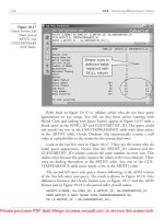
As described, selecting Modify Request takes you to the Build and View Analysis
screen in Answers On Demand. Since you are modifying an existing report, you
should already have a report with columns, and those columns appear here on this
Step 1 screen, a sample of which is shown in Figure 6-5.
Let us take a moment to examine the Build and View Analysis screen. In the
upper-left corner of the screen, you see the current subject area identified. Below
the subject area name are all of the columns available within the subject area. You
will find each column listed inside of one of the folders in this columns list. The
folder names generally refer to the source data table of the enclosed columns or the
types of columns it contains. For instance, you will always find the Metrics folder at
the bottom of this list. The columns inside this folder are calculated metric columns.
The Preview Analysis button, located in the header below the step number
indicators, allows you to have a look at your report in its current state. You will find
Please purchase PDF Split-Merge on www.verypdf.com to remove this watermark.
/ Oracle CRM On Demand Dashboards / Michael D. Lairson / 174 534-3
Oracle CRM On Demand Dashboards
/ Oracle CRM On Demand Dashboards / Michael D. Lairson / 174 534-3
Chapter 6: Displaying Reports on the Dashboard
yourself using this preview function frequently. When you click this button, a new
window opens and generates your report. This is helpful as you experiment with
different formatting and column arrangements.
In the main body of the screen, you see that we are on the first of four steps.
Clicking the Next button moves you to the next step in the process. The Save button
allows you to save your current report edits without closing the report. The Finish
button also allows you to save the report, but then closes the report and takes you to
the Getting Started screen. The Getting Started screen allows you to begin the
development process on another report. You bypassed this screen when you
accessed Answers On Demand from the Dashboard Editor. We will have a closer
look at this screen in the next chapter when developing dashboard filter prompts.
The Cancel button allows you to exit the current report without saving any changes
you have made.
The columns section of the Build and View Analysis screen is where columns
included in the report appear. You are able to configure exactly how you want the
data in these columns to appear in your report.
Below the columns section, you see the Filters section. This shows all of the
active filters affecting your report.
When modifying your existing report, you have the options of adding or removing
columns from the report, reordering the columns that are in the report, or leaving
the columns as they are and moving to the next step in the report design wizard to
modify the views.
Answers On Demand Build and View Analysis – Step 1 screen
Please purchase PDF Split-Merge on www.verypdf.com to remove this watermark.
/ Oracle CRM On Demand Dashboards / Michael D. Lairson / 174 534-3
Oracle CRM On Demand Dashboards
/ Oracle CRM On Demand Dashboards / Michael D. Lairson / 174 534-3
Chapter 6: Displaying Reports on the Dashboard
Once you locate a column that you want to add to your analysis, simply click
the column name to add the column to the report. The column will appear in the
Columns section of the Build and View Analysis screen. Each column has a table
heading and a column heading. For example, if you add the Account Name column
to your report, the top heading is Account and refers to the table name. The second
heading on the column is Account Name, referencing the column name. You can
change the order of the columns by clicking and dragging. Click the column
heading and drag to move just that column. Click the table heading and drag to
move all of the columns under that heading at once.
You may also find that you need to remove one or more columns from the
report. Removing a column will eliminate the column from the report in its entirety,
so all views referencing the column will be affected. To remove a column from your
analysis, click the X button next to the column name.
Once you are happy with the columns in your report, you may want to format the
data in the columns to suit your dashboard requirements. Before we get into
formatting, notice the five buttons present on each column. The button on the left,
which bears an icon of a hand, is the Column Properties button. The next button,
which has the letters “fx” on it, is the Edit Formula button. The third button with the
image of a funnel is the New Filter button. The red X button removes the column from
the report, and the button next to the column name with the up and down arrows
is the Order By or Sort button. If you have trouble remembering what these buttons
are, hover your mouse pointer over each one to see a tooltip of the button name.
In this section, I discuss the Column Properties and Sort buttons. Let us begin with
the Column Properties button. When you click this button, the Column Properties
window opens. As you can see in Figure 6-6, this window contains four tabs: Style,
Column Format, Data Format, and Conditional Format. The intent of this book is not to
exhaustively document report development, but to provide you with the information
you need to create great dashboards, so we will take a quick look at each of these tabs.
The Style tab of the Column Properties window allows you to make decisions on the
way the fonts and table cells appear on your report. The font settings available here
allow you to set the font family, size, color, style, and effects. The default font is 10
point Arial, and the color is black with regular styling and no effects.
Your font options are Arial, Arial Black, Arial Narrow, Courier New, Garamond,
Lucida Sans Unicode, Microsoft Sans Serif, Times New Roman, Tahoma, and
Verdana. If your company has a standard font, you may want to select a font for
your reports that adheres to this standard.
To change the font color, click the white box to open the Color Selector. There
are 48 standard colors available here from which to choose. Alternatively, if you
know the HTML color code for your desired color, you can enter and the six-digit
Please purchase PDF Split-Merge on www.verypdf.com to remove this watermark.
/ Oracle CRM On Demand Dashboards / Michael D. Lairson / 174 534-3
Oracle CRM On Demand Dashboards
/ Oracle CRM On Demand Dashboards / Michael D. Lairson / 174 534-3
Chapter 6: Displaying Reports on the Dashboard
code in the field at the bottom of the Color Selector pop-up. This is true for all of
the color options throughout Answers On Demand, enabling you to match your
company colors precisely. You may also make your font bold, italic, or both using
the Style field. The available effects are underlined and strikethrough.
Within the cell portion of the Style tab, you are able to apply horizontal and
vertical alignment and add a background color to the cell. The default horizontal
alignment is left for text fields and right for numeric data. The default vertical
alignment is center. To apply a background color, click the white box next to
Background Color, and select the desired color.
You can add single, double, or thick borders to one or more sides of your cell.
You are able to select only one style of border for the cell. You apply the selected
style to any side of the cell to which you add a border. You can choose All from the
Position field to apply a border to all four sides, or you can click on the sides of the
cell in the diagram below the Position field. The Color Selector beside Border Color
works exactly like the others on this window and allows you to change the color of
all borders applied to this cell.
Expand the Additional Formatting Options section, and you find fields that allow
you to adjust the size of your column cell and the padding around the value within
the cell. The Height and Width fields allow you to adjust the size of the cell by
entering a desired size in pixels or by adding a percentage to make the column size
relative to the size of the report table. A column width value of 50 is 50 pixels,
while a value of 50% is half the width of the table. Adjusting the height of a column
Column Properties window
Please purchase PDF Split-Merge on www.verypdf.com to remove this watermark.
/ Oracle CRM On Demand Dashboards / Michael D. Lairson / 174 534-3
Oracle CRM On Demand Dashboards
/ Oracle CRM On Demand Dashboards / Michael D. Lairson / 174 534-3
Chapter 6: Displaying Reports on the Dashboard
cell will affect cells across all columns because the table will adjust to the height of
the largest cell in order to align the data in the table.
Cell padding provides space between the sides of the cell and the value in the
cell. Adding padding around the cell values will override any specified height or
width if the padding results in a larger cell size than the cell size setting. The inverse
is also true. If the specified cell height and width settings result in a larger cell than
the padding would cause, the height and width measurements apply.
There are three small icons in the upper-right corner of the Style tab. The left
icon, an eraser, resets all of the style settings to the default values. The copy icon
copies all of the style settings so that you can access the column properties of
another column and paste the settings into that column in one click.
These height and width settings can play an important role in your design when
considering the role of the report in the dashboard. The combination of your report
design settings and your section properties on the dashboard give you a great deal of
flexibility in how reports appear on the dashboard and the amount of real estate that
they occupy. I encourage you to experiment with different combinations of settings
to achieve the layouts you are looking for in your dashboards.
The Column Format tab (see Figure 6-7) permits you to change the way values
in the column repeat or group together across related rows of data, change the way the
Column Properties window – Column Format tab
Please purchase PDF Split-Merge on www.verypdf.com to remove this watermark.
/ Oracle CRM On Demand Dashboards / Michael D. Lairson / 174 534-3
Oracle CRM On Demand Dashboards
/ Oracle CRM On Demand Dashboards / Michael D. Lairson / 174 534-3
Chapter 6: Displaying Reports on the Dashboard
column heading and data react to a user’s click of the mouse, or even hide the column
from view.
To hide a column, select the Hide Column check box on the Column Format
tab. The column will still be part of the report, and will affect the data on the report
as if you are displaying the column.
If you want to change the grouping behavior of your columns, you can adjust
the value suppression settings on the Column Format tab. To force values to repeat,
select the Repeat setting in the Value Suppression section. You should make this
change to all columns that you want to repeat.
Often, the field name in Oracle CRM On Demand just does not fit your report.
In such cases, you can change the headings to whatever pleases you by clicking the
Custom Headings check box and typing the headings you want. The column
headings appear in your reports; the table headings typically do not.
You can apply custom formatting to your headings as well. Click the Edit Format
button, located to the right of each field, to open the Edit Format screen. This screen
is exactly the same as the Style tab, with the same options that you can apply to the
table or column heading.
The final two fields on the Column Format tab allow you to adjust the
interactivity of the column heading and the column value. The values in each of
these fields are Default, None, Drill, and Navigate. Columns have different default
interactivity behaviors depending on the column and the subject area you are using.
If you know that you do not want any interactivity, select the None option. This will
remove any default interactivity that may exist.
The drill interactivity allows users to drill down to see additional detail by
filtering data on the value that the user clicks in the report. The navigate interactivity
setting allows users to click a value in your report to navigate to another report. The
report passes the value that the user clicks to the target report. When you select
Navigate from the interactivity field, a new Select Navigation Target button becomes
available. Clicking this button opens up two additional fields. These fields are the
Target field, to identify the target report, and the Caption field, to provide the value
that will appear in the pop-up menu that appears when there are multiple target
reports available. To identify a target report, click the Browse button and navigate
through the report folders to select the target report. Add a suitable caption to the
Caption field if you are planning to add more targets. If identifying only one target,
the caption is not necessary.
The Data Format tab allows you to transform the data in the column into another
format. This tab changes, depending on the type of column. To change the format of
the data in the column, click the Override Default Data Format check box. Doing so
activates the fields on the tab, allowing you to select the desired format.
Please purchase PDF Split-Merge on www.verypdf.com to remove this watermark.
/ Oracle CRM On Demand Dashboards / Michael D. Lairson / 174 534-3
Oracle CRM On Demand Dashboards
/ Oracle CRM On Demand Dashboards / Michael D. Lairson / 174 534-3
Chapter 6: Displaying Reports on the Dashboard
Dashboard report developers often want to highlight data that is below or above a
particular threshold, or that meets some other criteria that make the data special in
some way. Perhaps you want to assign a color to every salesperson and highlight
their opportunity data in their particular color. Perhaps you want to call out service
requests that have been open for longer than a week. You might even want to
display some sort of graphic next to records that meet some given requirement.
You can accomplish all of these things with conditional formatting. The
Conditional Format tab in the Column Properties window, shown in Figure 6-8 with
a few conditions already added, allows you to add formatting to column data that
meets a defined condition. You access this tab for the column you wish to apply the
formatting to. The conditions may be based on this column or on another column in
the report.
To add a condition, click the Condition button on the tab, and select the column
on which you want to base the condition. You are able to select from any of the
columns present in your report, including the column you are formatting. Upon
selecting a column, the Create/Edit Filter window opens. Here, you select the
condition and enter the value with which to compare the column data. Upon
clicking OK, the already familiar Edit Format window appears for you to define the
format for data meeting the condition. This formatting applies only to the column
Column Properties window – Conditional Format tab
Please purchase PDF Split-Merge on www.verypdf.com to remove this watermark.
/ Oracle CRM On Demand Dashboards / Michael D. Lairson / 174 534-3
Oracle CRM On Demand Dashboards
/ Oracle CRM On Demand Dashboards / Michael D. Lairson / 174 534-3
Chapter 6: Displaying Reports on the Dashboard
you are currently editing. If you want to apply a background color for an entire row,
for instance, you will need to replicate your conditional formatting for each column.
You may continue to add conditions to the column to set formatting options
for multiple conditions. When multiple conditions exist, the report evaluates the
conditions beginning with the first condition in the list. When the report encounters
data that meets a condition, it applies the conditional formatting and evaluates no
additional conditions for that data cell. This means that the order of your conditions
is very important.
After adding conditions to the Conditional Format tab, you can change the order
of your conditions using the up and down arrow buttons next to each condition. Use
these buttons to adjust the order to get the behavior you desire, remembering that for
each row, the report evaluates the conditions starting with the first one in the list, and
once a matching condition applies, no further evaluation occurs for that row.
The Order By button is located to the right of the column name on Step 1 of the
Build and View Analysis screen. This button shows two arrows: one pointing up and
the other pointing down. When the button appears this way, the column is unsorted.
Clicking the Order By button will toggle the sort direction. Click once for an
ascending sort. The button now appears with a single green triangle pointing up.
Click the button again, and the column changes to a descending sort. The triangle
on the button now points down. Click the button a third time, and you return to the
initial unsorted state.
The sorts are alphanumeric sorts with numbers coming before letters. You are
able to sort by multiple columns in your reports. The column you specify a sort on
first will be the primary sort. The column you specify a sort on next will be your
secondary sort. A small number 2 appears in the lower-right corner of the sort
button, indicating that this column is the secondary sort. Likewise, the next column
you set a sort on is the tertiary sort and the button shows a small number 3 in the
lower-right corner.
Filtering your report data is easily the most important aspect of report design.
Fortunately, there are several different ways to filter report data and dashboard data.
In the next chapter we will discuss the dashboard filter prompt. In this section, I
describe some of the more basic report-filtering mechanisms that can affect your
dashboard reports.
Applying filters to your report allows you to control which data you use to
populate your report. You can think of a filter as a method of identifying which data
the report will use, or will not use. Each filter is made up of three components: a
column to filter, the value you want to use within the filter, and the condition that
describes how the filter value is applied to the filter column. Many of these
conditions, called operators, are available for your filters.
Please purchase PDF Split-Merge on www.verypdf.com to remove this watermark.
/ Oracle CRM On Demand Dashboards / Michael D. Lairson / 174 534-3
Oracle CRM On Demand Dashboards
/ Oracle CRM On Demand Dashboards / Michael D. Lairson / 174 534-3
Chapter 6: Displaying Reports on the Dashboard
You can apply filters to one or more columns. These columns may or may not be
included in your report results. Filters may be connected with an AND or an OR
statement to affect the logic of how multiple filters work together. You can group
filters together to create more complex filter logic. The options and possible
combinations are plentiful, and range from simple to extremely complex.
The most common way to initiate the creation of a filter is by clicking the New Filter
button on the column you intend to filter. Doing so opens the Create/Edit Filter
window shown in Figure 6-9. You use this method to create a column filter on a
column that you have included in your report. Of course, it is possible, and often
desirable, to filter a report on a column not visible in the report. To open this
window for a column without adding it to your report, hold down your c t r l key
while clicking the column in the column list.
You will create most of your filters using the Create/Edit Filter window. On this
window, you see the three basic components of the column filter. At the top of the
window, you find the filter column. Below that is the Operator field, where you will
select one of the operators for your filter. In the Value field you will enter the filter
value, or select the value from the right to populate the Value field. With a text
column, you have the option of displaying the possible values in a list and then
clicking the value in the list to add it to the filter.
You have several options when displaying values to choose from. Click the All
Choices hyperlink to display all valid values for the current field. This often results in
Create/Edit Filter window
Please purchase PDF Split-Merge on www.verypdf.com to remove this watermark.
/ Oracle CRM On Demand Dashboards / Michael D. Lairson / 174 534-3
Oracle CRM On Demand Dashboards
/ Oracle CRM On Demand Dashboards / Michael D. Lairson / 174 534-3
Chapter 6: Displaying Reports on the Dashboard
a lengthy list with multiple pages. Each page of this list displays ten values, and you
are able to scroll through the pages using the number bar and arrows at the bottom
of the window. If displaying all of your choices is a little too much, you can click the
Limited Choices hyperlink. The resulting list of values is dependent on any other
filters already added to the report.
You may also perform a search on the valid values using the fields just above the
All Choices and Limited Choices hyperlinks. Select Begins With, Ends With, or
Contains from the drop-down list, and enter a search value in the field to the right.
Then click one of the links to see a list of values that meet your search criterion.
Now, since you are modifying an existing report that you have added to your
dashboard, you may have some existing filters that you want to modify or delete
from the report. To reopen the Create/Edit Filter screen for a filter that is already on
your report, click the Filter Options button to the right of the filter. Select Edit Filter
from the resulting menu to open and make changes to the filter. You will notice that
you also have the option to cut or copy the filter. To remove a filter, click the Delete
button to the far right of it.
As you continue to add filters to the report, Answers On Demand ties these filters
together with the AND statement. This is the default setting, but you are able to
change the way your filters work together by clicking the AND link, changing it to
an OR connector between the filters. When you have both an AND and an OR
connection between filters, the filters will automatically group together.
Continuing to click the AND/OR statements and ungrouping filters enables you
to configure your filters to get the data you want in your reports. Often, report
developers mistakenly think that it takes more than one report to collect different
sets of data when perhaps a report with the appropriate groups of filters will do
exactly what they need.
Answers On Demand also contains some predefined filters that you can use in your
reports. These predefined filters are often quite useful on dashboard reports, as they
are all time-based and dashboards often tend to group reports together that are all
filtered by the same rolling date parameters.
To add a predefined filter to your report, click the Open Saved Filter button. This
opens a window displaying the folder structure. Drill down into the filter’s folders by
double-clicking the folders to display the contents. Select from one of the available
filters, and click the OK button. Answers On Demand reacts by displaying the Apply
Saved Filter window shown in Figure 6-10. This window shows you the location of
the filter, and more importantly, the contents of the filter.
You also have a couple of options when applying this filter to your report. You
may choose one or both of these options. The first option you have is to clear all
Please purchase PDF Split-Merge on www.verypdf.com to remove this watermark.
/ Oracle CRM On Demand Dashboards / Michael D. Lairson / 174 534-3
Oracle CRM On Demand Dashboards
/ Oracle CRM On Demand Dashboards / Michael D. Lairson / 174 534-3
Chapter 6: Displaying Reports on the Dashboard
existing filters before applying the filter. This might suit you if you are working on
building filters for your report and after trying a filter or two, you determine that a
prebuilt filter would better serve your purpose. Click the Clear All Existing Filters
Before Applying check box, and when you add the predefined filter to your report, it
replaces all other filters already on your report. Leave this option unchecked, and
this filter appears at the end of the list of filters already on your report, if any.
The other option is to apply the contents of the filter instead of a reference to the
filter. If your report contains the Active Filters view, this may be a preferable option,
just so the filter description looks a little better in your dashboard.
Using variables in your filters is a bit advanced for this book on dashboards, but in
the next chapter you will encounter presentation variables, so I want to take this
opportunity to point out how they are added to a filter. To use a presentation
variable in your filter, click the Add button on the Create/Edit Filter window and
select Variable. There is a small Variable submenu that contains the following
options: Session, Repository, and Presentation. Select Presentation from this menu to
add the Presentation Variable field to the filter. The presentation variable value can
then be entered in the filter. The presentation variable value is the name of the
variable that you create in a dashboard filter prompt. This is described further in the
next chapter.
While most other variables are more appropriate topics for an advanced report
development discussion, there is one session variable that is quite useful and
appropriate to discuss here. The session variable REPLUSER returns the current user’s
sign-in ID, which is also the value of the User Email column in the Owned By User
folder in the column list. An example use of this simple variable is to create a report
Apply Saved Filter window
Please purchase PDF Split-Merge on www.verypdf.com to remove this watermark.
/ Oracle CRM On Demand Dashboards / Michael D. Lairson / 174 534-3
Oracle CRM On Demand Dashboards
/ Oracle CRM On Demand Dashboards / Michael D. Lairson / 174 534-3
Chapter 6: Displaying Reports on the Dashboard
that filters records owned by the individual running the report, or by association, the
dashboard containing the report.
To add a session variable to your filter, follow the same process as the one for
adding a presentation variable and select Session from the Variable submenu. Next
you will type the variable name in the Session Variable field on the Create/Edit Filter
window.
Another nice use of the REPLUSER variable involves applying the filter to the
Manager Email field. Doing so provides managers with a dashboard report that lists
records that are owned only by users who fall into their direct line of management.
Step 2 of the Build and View Analysis screen is all about the report views. Views are
the visible elements of the report. Similar to the objects you place on your
dashboard layout, views are objects on the report layout. Every report, when first
created, contains a Title view and a Table view. The report you are modifying from
your dashboard may have additional views that the report developer added.
Next I provide a brief look into some of the primary views that typically appear
in a dashboard report. As you modify your reports, you will at times want to edit
existing views, add views, or remove views from the layout. To add a view, you will
click the Add View button on the Build and View Analysis – Step 2 screen
(see Figure 6-11) and select the type of view you wish to add to the report.
Each view has three buttons in its upper-right corner. The first of these three
buttons is the Format View button. This button opens the Edit Format window, which
Build and View Analysis – Step 2 screen
Please purchase PDF Split-Merge on www.verypdf.com to remove this watermark.
/ Oracle CRM On Demand Dashboards / Michael D. Lairson / 174 534-3
Oracle CRM On Demand Dashboards
/ Oracle CRM On Demand Dashboards / Michael D. Lairson / 174 534-3
Chapter 6: Displaying Reports on the Dashboard
allows you to set vertical and horizontal alignments for the view and modify the
border around the view.
The second button is the Edit View button, which opens the Edit View screen.
This is where most of your view configuration takes place, as described for the
following views.
The third button is the Delete View button, which should be more appropriately
named Remove View. Clicking this button does not exactly delete the view from the
report. It does remove the view from the report layout, however.
Clicking the Edit View button on the Title view takes you to the Edit View: Title
screen where you can adjust the settings for the title. On this screen you can modify
the text that appears in the Title view of the report.
If you want to show a custom title rather than the saved report name, type the
title you want to appear in the Title field and clear the Display Saved Name check
box. If you add a custom title and do not clear the Display Saved Name check box,
both will show on your report.
Place an image URL in the Logo field to include a logo or other graphic in your
Title view. The logo is placed to the immediate left of your title text.
If you want a subtitle on your report that appears just below the title, add your
subtitle text to the Subtitle field. Only text may be included in the Title and Subtitle
fields.
It is often helpful to include information about when the report was run. In the
Started Time field you have the option of selecting Date, Time, or Date And Time for
display in your title view. Of course, you may leave the default setting of Do Not
Display if you do not want to display a date or time in your Title view.
Most of the Title view elements have their own formatting settings. You will find
a Format Values button next to the Title, Logo, Subtitle, and Started Time fields.
Within each of these Edit Title windows you are able to apply formatting to each
individual element. The relative location of each element is fixed, though it is
possible to change alignment, size, and colors.
As you adjust the settings for this and other views, you are able to see a preview
of how the view will appear on your report. The Display Results section at the bottom
of the edit screens usually updates automatically as you make changes to the view
format. You may also refresh the preview by clicking the Display Results link. If you
do not want to see the preview, you can remove the check mark from the check box
and the preview will not show. With some complex views, you may find it helpful to
turn off the Display Results preview for better performance during your layout edits.
Every report also starts with a basic Table view. The Table view includes all visible
columns that you have included in your report. The formatting of the cell values in
Please purchase PDF Split-Merge on www.verypdf.com to remove this watermark.
/ Oracle CRM On Demand Dashboards / Michael D. Lairson / 174 534-3
Oracle CRM On Demand Dashboards
/ Oracle CRM On Demand Dashboards / Michael D. Lairson / 174 534-3
Chapter 6: Displaying Reports on the Dashboard
the Table view is based on the column format set on the columns in Step 1. The
header row displays the column name of each column. If you set a custom name for
any columns on Step 1, those custom names are applied on the Table view. The sort
order set on Step 1 also controls the sort order of the data in the Table view. If no
specific sorts are set, the table sorts data in ascending order beginning with the
leftmost column.
Paging controls appear in the Table view if there are more than 25 records in the
result set. These paging controls provide navigation buttons to page through the
results one page at a time and buttons to display all pages and to return to the first
page of results. The default location for these paging controls is below the table.
Click the Format View button on the Table view from the Step 2 screen, and the
Edit Format window appears. Here you may set the horizontal and vertical
alignment to adjust how the table appears on top of the base layer. Background
color, borders, size, and padding are also available here, just like the other Edit
Format windows we have used.
Clicking the Edit View button takes you to the Edit View: Table screen, where you
can apply formatting to your table. By default, any format settings you made to your
columns on Step 1 are set here on the table. You can change your column formatting
here using the same format tools as on Step 1. You can also add, move, and remove
columns while editing your table, but it is usually easier to do these actions on the
Step 1 screen.
Something you will see here that you did not see back on Step 1 is the Total By
button on your nonmetric columns. This button has a sigma (Σ) on it and appears to
be grayed out or unavailable. This simply indicates that you have not added a
subtotal for that column. Click a column’s Total By button to activate totaling and
include a subtotal in all metric columns for each value in the column. The
aggregation rules on the metric columns dictate how the values are aggregated.
Once you have activated totaling on a column, if you click the Total By button
again, you receive the pop-up menu with some additional settings.
Select None on the pop-up menu to remove the subtotals from your report
column. The only location option for the subtotals is After, so you will always see a
check mark next to the After option on this menu. Likewise, the Report-Based Total
selection will have a check mark next to it by default. This indicates that the total
will include only the values that appear in the report. In rare instances, you may try
clicking this menu item to remove the check mark and see how it affects your
report. I have never needed to do this.
Click the Format Labels menu item to apply formatting to the subtotal
measurement label. The default value is the value in the column field followed by
“Total.” If you would rather have some other label for your subtotals, or if you want
to apply a new format to the label cell in the table, click Format Labels to open the
Edit Format window. The Edit Format window is one you should be familiar with at
this point in the book, but you will see a new field here. The Folder field, while
Please purchase PDF Split-Merge on www.verypdf.com to remove this watermark.
/ Oracle CRM On Demand Dashboards / Michael D. Lairson / 174 534-3
Oracle CRM On Demand Dashboards
/ Oracle CRM On Demand Dashboards / Michael D. Lairson / 174 534-3
Chapter 6: Displaying Reports on the Dashboard
bearing a misleading name, is actually the measurement label, and entering a new
value into this field changes your measurement label.
Click the Format Measure Values menu item to open the Edit Format window
and adjust the format settings of the column subtotal values.
Moving up to the title bar above the columns, you will find another button with
a sigma on it. This is the Grand Total button, and it functions as and contains the
same options as the Total By button. The difference here is that the Grand Total
button adds a Total row at the bottom of your table.
To the immediate right of the Grand Total button you will find the Edit Table
View Properties button. Clicking the Edit Table View Properties button opens the Edit
View window. The lower half of this window should be familiar to you. The five
fields at the top of this window are properties specific to the Table view.
The Paging Controls field allows you to control if and where the table-paging
controls will appear. Paging controls are the navigation arrows that appear in a Table
view when the result data contains more than 25 records. You can choose to display
the paging controls at the top or the bottom of the Table view. If you select Hide This
Column in the Paging Controls field, the paging controls will not appear on your
report. A word of warning on hiding the paging controls: If your result data contains
more than 25 records and you have hidden the paging controls, your users will not
be able to access the records beyond the first 25, unless you have changed the
number of rows displayed on each page.
The Rows Per Page field is a freeform numeric field where you can set the
number of rows to include on each table page. The minimum value accepted is one.
This setting can come in handy when you are tweaking the layout of reports on your
dashboard and find that showing fewer rows in the table is more aesthetically
pleasing next to another report in the dashboard.
The Display Column & Table Headings field gives you control over which values
appear in the column headings and how they should appear. The default setting is to
display only column headings. You may also choose to display both column and
table headings. You can display the table headings as a separate row or before the
column heading on the same row. The As Table.Column (Where Needed) option
results in both the table name and column name appearing in the column heading
for those columns that have the same name. You also have the option not to display
a heading row on the table by selecting No Column Or Table Headings.
The Enable alternating row “green bar” styling check box applies light green
background shading to every other row in the table. This can enhance readability of
tabular reports with many rows. If you want to use the green bar styling, my advice
is to be sure to set your table columns to repeat values rather than suppress values.
This setting is on the Column Format tab of the Column Properties window.
The Enable column sorting in Dashboards option activates column sorting in
your table. Users will be able to click a column header to sort the data by that
column. This feature works very much like the column sorting in a record list.
Please purchase PDF Split-Merge on www.verypdf.com to remove this watermark.
/ Oracle CRM On Demand Dashboards / Michael D. Lairson / 174 534-3
Oracle CRM On Demand Dashboards
/ Oracle CRM On Demand Dashboards / Michael D. Lairson / 174 534-3
Chapter 6: Displaying Reports on the Dashboard
The next two tools on this view only affect the way your table appears in the
preview on the Edit View: Table screen. The Refresh button refreshes the data in the
table. Do not use the browser’s Refresh button while editing your table. Doing so will
return you to Step 1 of the Build and View Analysis screen, and any changes are lost.
The display selector allows you to control what displays in the preview on the
Edit View: Table screen. By default, the display includes header toolbars with results.
You may choose to display header toolbars only or results only by selecting a
different value from the Display field.
On Step 2 of the Build and View Analysis screen, you will find the Add View button
just above the preview of your report views. Clicking this button opens a menu of
views that you can insert into your report. One of these options is Chart. Selecting
Chart from the Add View menu will insert a basic chart into your report. You will
also see among the options in the Add View menu two other chart views that I will
describe in this section. Those are the Gauge view and, under the Advanced
submenu, the Funnel Chart view.
Whether you are adding a new chart or editing an existing chart, you will find
yourself on the Edit Chart View screen at some point. Here, the buttons and picklists
in the header bar above the chart allow you to set the properties and chart type for
your chart view. These charting controls are similar across all chart types.
In the Graph field, select the type of chart that you want to insert into your
report. Your options here include Area, Horizontal Bar, Bubble, Vertical Bar, Line,
Line Bar Combo, Pareto, Pie, Radar, Scatter, and Step. When you select a value from
the Graph field, the chart preview updates to display the selected graph with the
current settings.
The Type field varies slightly, depending on the value you have selected in the
Graph field. In most cases, you can choose between a three-dimensional
appearance and a two-dimensional appearance for your chart. The bar style graphs
(horizontal, vertical, and line bar combo) have added options for two- and three-
dimensional stacked types. The scatter graph type values are Scatter and Scatter
With Lines. When you select a value from the Type field, the chart preview updates
accordingly and displays the chart.
Finally, the Style field allows you to select shapes and shading formats, depending
on the graph selected. Not every graph has options available in the Style field.
The first button on the title bar is the General Chart Properties button. The icon
for the General Chart Properties button is similar to the Column Properties icon you
are accustomed to seeing on the columns in Step 1. Click this button, and the
General Chart Properties window opens.
On the General Chart Properties window, you can format the title, data labels,
and chart size. By default, your chart will not have a title. To add a title, click the
Custom Title check box and type your desired title in the Title field. Click the Text
Please purchase PDF Split-Merge on www.verypdf.com to remove this watermark.
/ Oracle CRM On Demand Dashboards / Michael D. Lairson / 174 534-3
Oracle CRM On Demand Dashboards
/ Oracle CRM On Demand Dashboards / Michael D. Lairson / 174 534-3
Chapter 6: Displaying Reports on the Dashboard
Format button next to the Title field to set the font family, color, style, and font size
for your title on the Text Format window.
In the Data Labels section of the General Chart Properties window, you can set
how and when data labels will appear in your chart. The default setting for showing
data labels is to show them on rollover. This means that the amount reflected by an
element on your chart displays whenever the mouse pointer moves over it. You may
click the Text Format button next to your chosen data label setting to modify the font
appearance.
Click the Override Default Data Format check box if you want your values to
display in a different format. Your choices are to display your numbers as numbers,
currency, or percentages. Make this selection in the Treat Numbers As field. You may
also adjust the format for negative values in the Negative Format field. Finally, you
are able to select the number of decimal places to include in the data values and
choose to use a thousands separator within the values.
If you have identified a new data format on the columns already, then that
selected format is used by default. You can change that format using the fields
described earlier.
The Size section of the General Chart Properties window allows you to adjust the
overall size of the chart in your report. You may enter the height and width in points
to adjust the chart size, or you can use the sliders beneath and to the right of the
chart preview to set the chart size. The benefit of using the Height and Width fields is
that you can set the size precisely and beyond the limits of the sliders. Using the
sliders, the width range is 90 to 810 points and the height range is 60 to 540 points.
The next button on the title bar is the Axis Titles And Labels button. This button
opens the Axis Titles & Labels window, which contains two or three tabs, depending
on the chart type. The Left tab (and Right tab for some charts) allows you to
configure the title and label formats of the vertical axis. The Title section controls the
axis title, which will default to the column name for the values displayed along that
axis. You can change the title by clicking the Custom Title check box and typing a
new value in the Title field. Format the title’s appearance using the Text Format
button next to the Title field.
The Labels section of the Left or Right tab contains a series of fields allowing you
to format the scale labels. The Display Scale Labels check box permits you to turn
the labels off by removing the check mark. If you want to keep the labels, you can
format their appearance by clicking the text format button next to the check box
field and the remaining check boxes and fields on the tab.
The fields that appear on the tab depend on whether your scale labels are text or
numerical. When formatting either text or numeric scale labels, you can choose to
rotate those labels. Click the Rotate Labels check box and select the angle you want
to use. Your options are between 90 and –90 degrees. Answers On Demand may
apply a rotation to the labels automatically if the rotation if necessary to fit the
labels onto the chart.
Please purchase PDF Split-Merge on www.verypdf.com to remove this watermark.
/ Oracle CRM On Demand Dashboards / Michael D. Lairson / 174 534-3
Oracle CRM On Demand Dashboards
/ Oracle CRM On Demand Dashboards / Michael D. Lairson / 174 534-3
Chapter 6: Displaying Reports on the Dashboard
Two settings for text scale labels are options for staggering the labels or skipping
labels if necessary. These two check boxes appear only on the tab when the scale
labels are alphanumeric. When your scale labels are numeric, you have the option
of abbreviating the number in percentages, thousands, millions, billions, or trillions.
Simply click the Abbreviate check box and select the abbreviation type. You can
also override the numeric data format by clicking the Override Default Data Format
check box and then identifying how you want to treat the numbers, the negative
format, and the number of decimal places. You also have the option of using the
thousands separator.
The Bottom tab also has a Title section and Labels section for modifying the title
and scale labels of the bottom axis. The options here are exactly the same as the Left
tab for an alphanumeric data type.
The next button is the Axis Scaling button. Clicking this button takes you to the
Axis Scaling window, which will have one or two tabs, depending on the type of
chart. A line bar combo, for instance, has a scale on the left vertical axis and the
right vertical axis. Both the Left and the Right tabs on the Axis Scaling window
contain the same fields, but may have different settings within those fields.
The Axis Limits section in the Axis Scaling window allows you to control the
value range for your chart axis. Within the Axis Limits section, you have three
choices. You can keep the default scale, which is determined dynamically based on
the upper and lower numbers within the data you are charting. You can also zoom
to the data range, which is similar to the default scale, but adjusts the axis scale so
that the data represented in the chart occupies roughly three-quarters of the scale.
The third option is to specify the scale manually. This is where you risk skewing the
perception of the data significance. Upon selecting the Specify Manually option,
you use the Minimum Value and Maximum Value check boxes and fields to
manually set the upper, lower, or both thresholds of the chart.
The next section on the Axis Scaling window, Tick Marks & Scale Type, allows
you to adjust the number of horizontal major and minor ticks present on your axis
scale. The easiest way to figure out how many ticks you should insert is to take the
top number of the scale and divide by the size of each major section of your scale,
and then add one. You may also specify the number of minor ticks. This is the
number of ticks between your major ticks. To determine the number of minor ticks,
divide the span between major ticks by the size of your desired minor tick and then
subtract one.
The final check box on this window changes your scale from a standard scale to
a logarithmic scale. The logarithmic scale of measurement uses the logarithm of a
physical measurement rather than the measurement itself. Logarithmic scales have
specific applications—usually with datasets that have very large ranges or some
statistical analyses.
Click the Edit Scale Markers button on the Axis Scaling window to open the
Scale Markers window. Here you can add markers in the form of lines or ranges to
Please purchase PDF Split-Merge on www.verypdf.com to remove this watermark.
/ Oracle CRM On Demand Dashboards / Michael D. Lairson / 174 534-3
Oracle CRM On Demand Dashboards
/ Oracle CRM On Demand Dashboards / Michael D. Lairson / 174 534-3
Chapter 6: Displaying Reports on the Dashboard
your chart. To add a marker, click the Add button. Give the marker a name in the
Caption field. This caption will appear in the chart’s legend. Select the type of
marker, either Line or Range, in the Type field. The purpose of next two fields
depends on your selection in the Type field.
For a line marker, the first field is the width of the line in points. The second field
identifies the position of the marker line on your axis scale. The Advanced Options
button, located to the right of the Position field, opens the Advanced Options
window that allows you to use a column value to position your marker line. For
instance, if you have included a column that calculates an average value, you could
use that column to locate your marker in order to identify the average value on your
chart. If you identify a column for your marker that contains different values across
the rows of your table, the marker will appear at the first value that it encounters in
the table. Sorting your data may affect which record determines the marker position.
You can also set the color for your marker line by clicking the color box and
selecting a new color from the palate, or enter an HTML color code and click OK.
For a range marker, the first field identifies the low end of the range and the
second field identifies the high end of the range. The advanced options for each of
these fields are the same as I described for the line marker. A range marker applies
shading on the background across the width of your chart between the marker
amounts specified.
To the right of the Axis Scaling button is the Additional Charting Options button.
This opens the Additional Charting Options window. This window contains four
tabs, each dedicated to a different element of your chart.
The first tab is the Grid Lines tab. Here you can change the color of the major
and minor grid lines. Clicking the Override Defaults check box enables the check
boxes on the tab that allow you to disable major and minor vertical and horizontal
grid lines.
The Legend tab provides some control over if and where your chart legend
appears. You can choose to display your legend on the right (default), left, top, or
bottom of your chart. You may also select None in the Location field to remove the
legend from your chart. The format button next to the Location field provides some
typical text-formatting controls. You may also indicate the number of columns that
your legend should contain if there are enough items in the legend to spread the
items across more than one column.
The Interaction tab allows you to select the type of interaction that will occur
when a user clicks on part of the chart. The default setting is Drill. You may disable
interactivity or set up a navigation path to another report. If you have set your
dashboard section to Drill In Place, navigation in a report within that section will
cause the target report to open in the Dashboard window.
The fourth tab, Borders & Colors, allows you to set a color for your chart’s
background, text, and border. To change the color for any of these, click the color box
next to its label and select a new color from the palate, or enter an HTML color code.
Please purchase PDF Split-Merge on www.verypdf.com to remove this watermark.
/ Oracle CRM On Demand Dashboards / Michael D. Lairson / 174 534-3
Oracle CRM On Demand Dashboards
/ Oracle CRM On Demand Dashboards / Michael D. Lairson / 174 534-3
Chapter 6: Displaying Reports on the Dashboard
The border and background encompass the entire chart, including the title and
legend. The text elements that the color setting affects are the axis titles.
The Format Chart Data button opens the Format Chart Data window, where you
can format the appearance of your chart data elements. You can specify the color
and style for each series and each chart component. This window appears differently
based on the particular chart. The Format Chart Data window for basic bar charts is
the least complex. To change the color of the bars in your chart, clear the Use
Default check box for the series position you want to recolor, and then click the
color box and select or enter your new color.
With the Format Chart Data window for a line chart, you have the same coloring
settings plus some additional settings for the line type and width. You have the
option of choosing a plain line (the default), dotted line, dashed line, or the dash-
and-dot line for each series. You can set the width of your line from zero to six
points. Lines may also have symbols at each data point. You can select the symbol
shape from the Symbol Type field. Your choices of symbols are square, triangle,
round, diamond, and a plus sign. You can also choose to turn the symbol off.
The line bar combo chart uses both the line and bar versions of the Format Chart
Data window. The Chart Component field allows you to switch between formatting
your lines and your bars.
The Format Chart Data window for the Pareto chart combines the line and bar
formatting fields onto one screen, allowing you to set the color of the bar with the
upper color box at each position, and the line formatting with the lower set of fields
at each position.
With a pie chart, you have the option of exploding one of the chart wedges out
of the circle. With a bubble chart, you have the additional option of making the
bubbles appear three-dimensional or two-dimensional. Regardless of the chart type,
one final common element on the Format Chart Data window is the Clear All
button. Any time you feel you have gone a little too far with your formatting, click
the Clear All button to reset all options back to their default values.
With the bubble, line bar combo, and pie charts, you are able to make
additional special formatting changes by clicking the Advanced Properties button.
On the bubble chart, this button opens the Chart Type Special window containing a
slider for adjusting the bubble size percentage. On the line bar combo chart, the
Chart Type Special window contains a single check box that allows you to
synchronize the line and bar axis scales. Finally, the pie chart’s advanced properties
permit you to format the data values as a percentage of the total or the actual value
represented by each wedge. You can also define what information is included in the
data label—you can display the value only, the name only, or both name and value.
Each Edit view for the charts contains a series of check boxes that you use to
indicate which columns to include in your chart and where the column data should
appear. Depending on the chart type, you will see a column of check boxes beneath
icons representing chart elements. You will have between two and five columns of
Please purchase PDF Split-Merge on www.verypdf.com to remove this watermark.


